Can paint really make a room look bigger?
You’ve probably bought furniture, rearranged things, and decluttered, yet your room still feels tiny. It’s exhausting.
But certain paint colors trick the eye into seeing more space than exists. I’ve found that work like magic.
These colors actually work, and I’m sharing them all with you today.
Your small room doesn’t have to feel like a shoebox.
How do Colors Impact the Size of The Room?
Colors play tricks on your eyes.
They change how you perceive space, even when the room’s actual size remains the same.
Light colors reflect more light, which makes walls seem farther away. Dark colors absorb light and pull walls inward.
Think of it this way: when you walk into a bright white room, your eyes can see the corners clearly. Everything feels open.
But step into a room painted deep navy, and those corners disappear into shadow. The space closes in.
Here’s what different colors do to your room:
- Light colors reflect light: white, cream, and pale shades reflect both natural and artificial light. This reflection creates the feeling of more space.
- Warm colors bring walls closer: Reds, oranges, and yellows feel cozy but can make rooms feel smaller.
- Cool tones push walls back: Blues, greens, and grays seem to recede. Your walls appear farther away than they are.
- Glossy finishes add depth: Shiny paint reflects more light than flat paint. The extra reflection expands visual space.
Many people skip the trim colors, but the trim’s color choice can amplify these effects.
Colors like Alabaster increase brightness and make spaces feel larger, while bold options like Moscow Midnight or Black Magic create striking contrast.
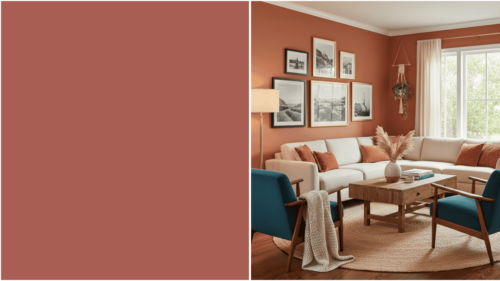
Paint Colors That Make a Small Room Look Bigger Fast
The right paint color can transform your small room in hours.
These shades have been tested in real spaces, and they deliver results. Let me show you which ones work best.
1. Sherwin-Williams Foxy
Foxy is a soft, greige that opens up tight spaces beautifully. It has warm undertones that keep rooms from feeling cold.
The color shifts throughout the day, looking lighter in morning sun and cozier at night.
I’ve used it in narrow hallways where it made the space feel twice as wide.
2. Benjamin Moore Paper White
Don’t let the name fool you, this Paper White isn’t stark white.
It’s a warm, creamy shade that reflects light without the harshness of pure white. Works perfectly in rooms with limited natural light.
The subtle warmth prevents that clinical feeling you get with cooler whites.
3. Farrow & Ball Sulking Room Pink

Yes, pink can make rooms look bigger.
Sulking Room Pink is a dusty rose with gray undertones that create depth rather than closing in the space.
It feels soft and calming while still reflecting plenty of light.
Tip: Pair it with white trim to maximize the sense of space.
4. Sherwin-Williams Zircon
A cool, silvery gray that pushes walls back visually.
The blue undertones of Zircon create a sense of distance, making your room feel airy and open.
It works especially well in modern spaces or rooms with lots of metal fixtures and hardware. The color remains consistent across different lighting conditions.
5. Benjamin Moore Sea Pearl
This pale aqua brings outdoor freshness inside.
The green-blue tone recedes naturally, creating the illusion of more square footage.
I painted a cramped bathroom with Sea Pearl, and guests consistently comment on how spacious it feels.
The color literally breathes life into tight quarters.
6. Farrow & Ball Shaded White
Shaded White is a classic off-white with gray and green undertones.
It looks different on each wall depending on the lighting, adding visual interest and depth.
The complexity keeps it from feeling flat or boring.
Tip: Use it in rooms facing north for best results.
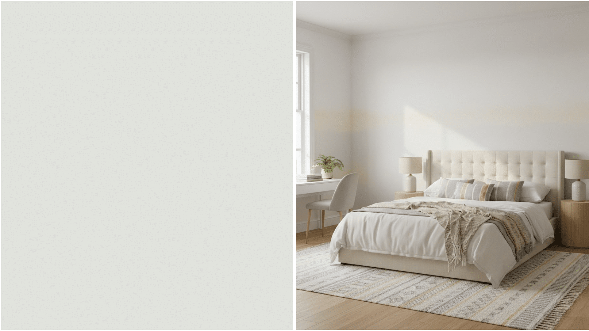
7. Sherwin-Williams Alabaster
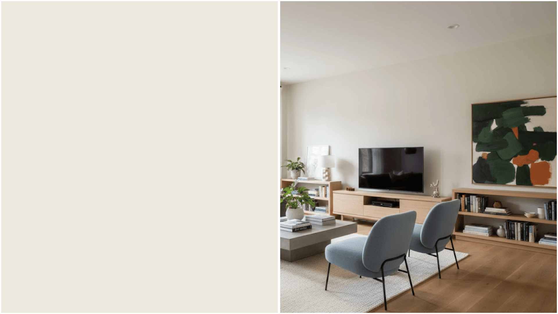
I always choose Alabaster White for my cramped spaces; it reflects light beautifully, creating an airy, expansive feel.
The soft, warm undertones prevent that stark hospital vibe while instantly doubling my room’s perceived size.
I’ve effortlessly transformed every tiny room with this shade.
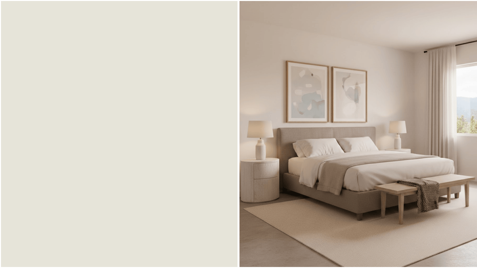
8. Benjamin Moore Maritime White
A cool white with the slightest hint of gray and blue.
Maritime White makes small rooms feel like they’re filled with fresh ocean air.
The subtle coolness pushes walls outward while maintaining a clean, crisp look.
It works in any room but shines in kitchens and bathrooms.
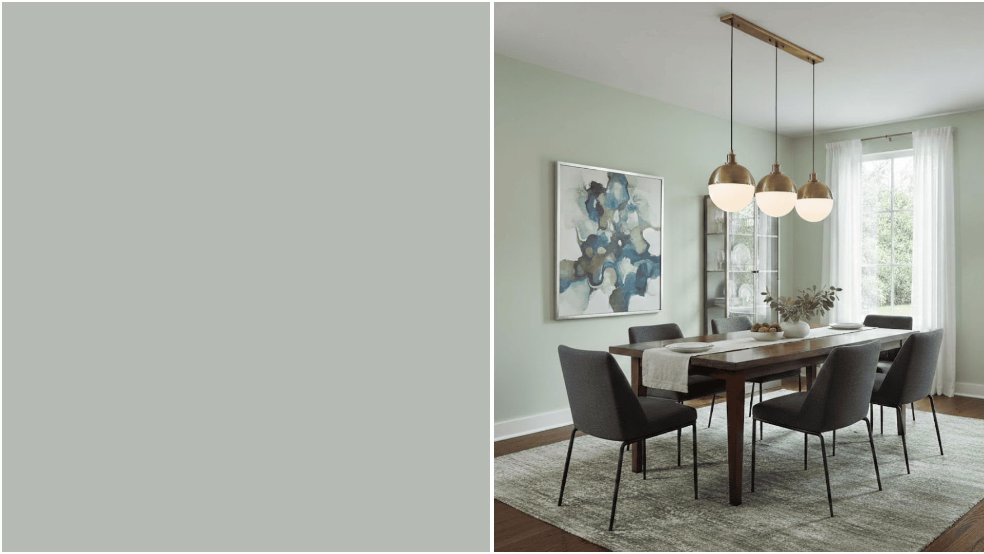
9. Sherwin-Williams Lacewing
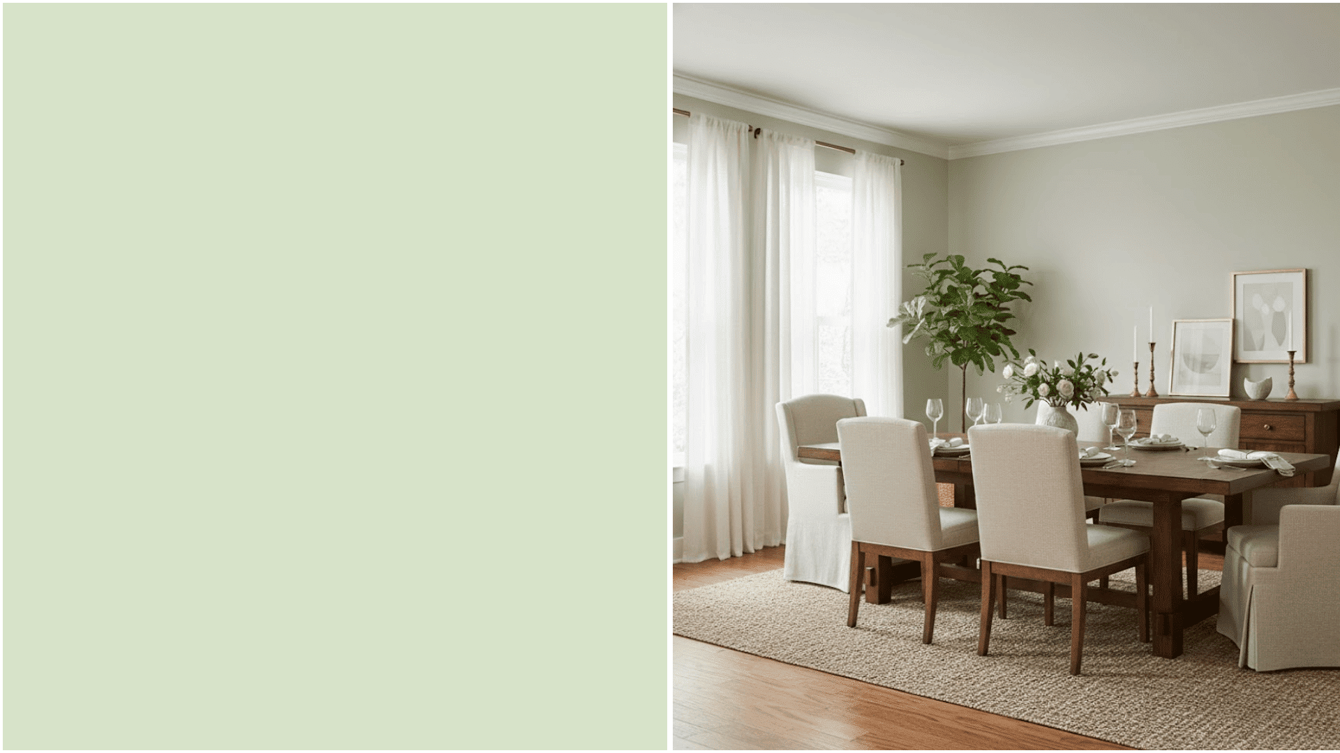
This barely-there green has incredible light-reflecting properties.
The neutral base means of Lacewing coordinates with any decor style you throw at it.
I’ve seen it transform cramped living rooms into spaces that feel genuinely roomy.
Tip: Use a satin finish instead of flat for extra light reflection.
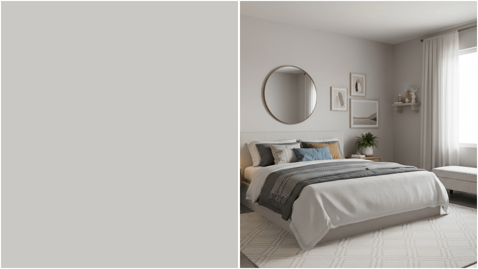
10. Benjamin Moore Silver Satin
A true light gray without warm or cool leanings.
The balanced tone creates a Silver Satin visual calm, which tricks your eye into perceiving more space than is actually there.
It’s particularly effective in rooms with mixed lighting sources.
The color stays true morning, noon, and night without shifting awkwardly.
11. Farrow & Ball Light Blue
This soft, powdery Light Blue that instantly lifts the ceiling height.
This shade has enough color to feel intentional but remains light enough to open up the space.
The historical depth of the pigment adds richness without heaviness.
Your room will feel like it gained both width and height overnight.
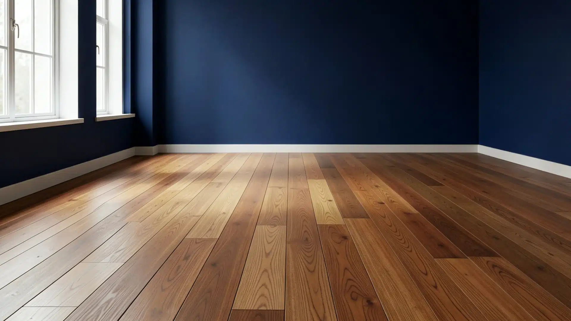
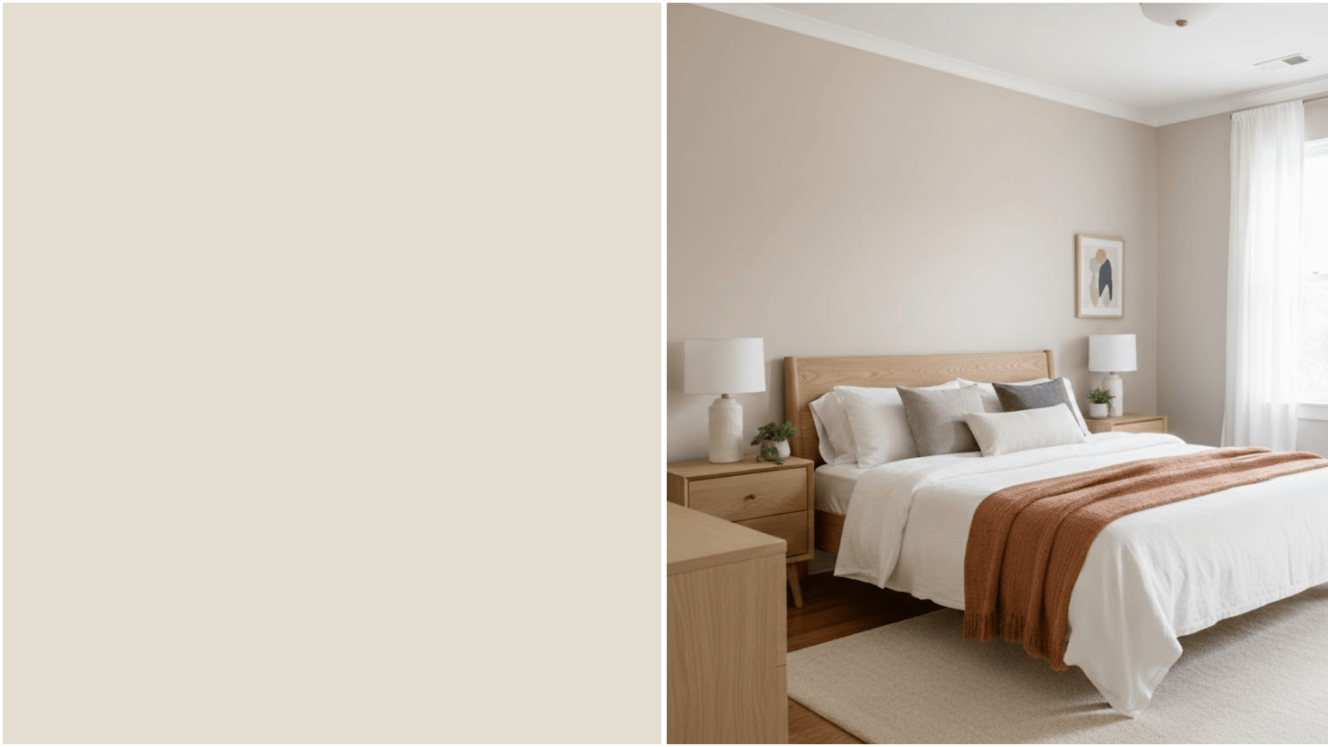
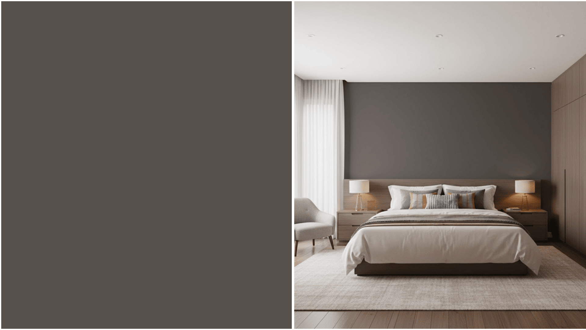
12. Benjamin Moore Midnight Blue 1638
Here’s where things get interesting: dark can actually work in small spaces.
This deep navy, Midnight Blue, creates drama and makes walls recede into shadow, blurring boundaries.
Only use this in rooms with excellent natural light and pair with bright white trim for maximum impact and contrast.
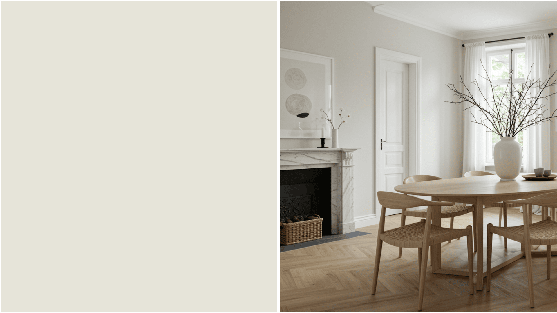
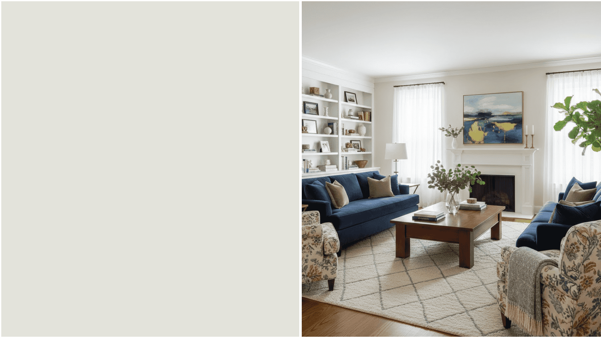
13. Sherwin-Williams Spare White
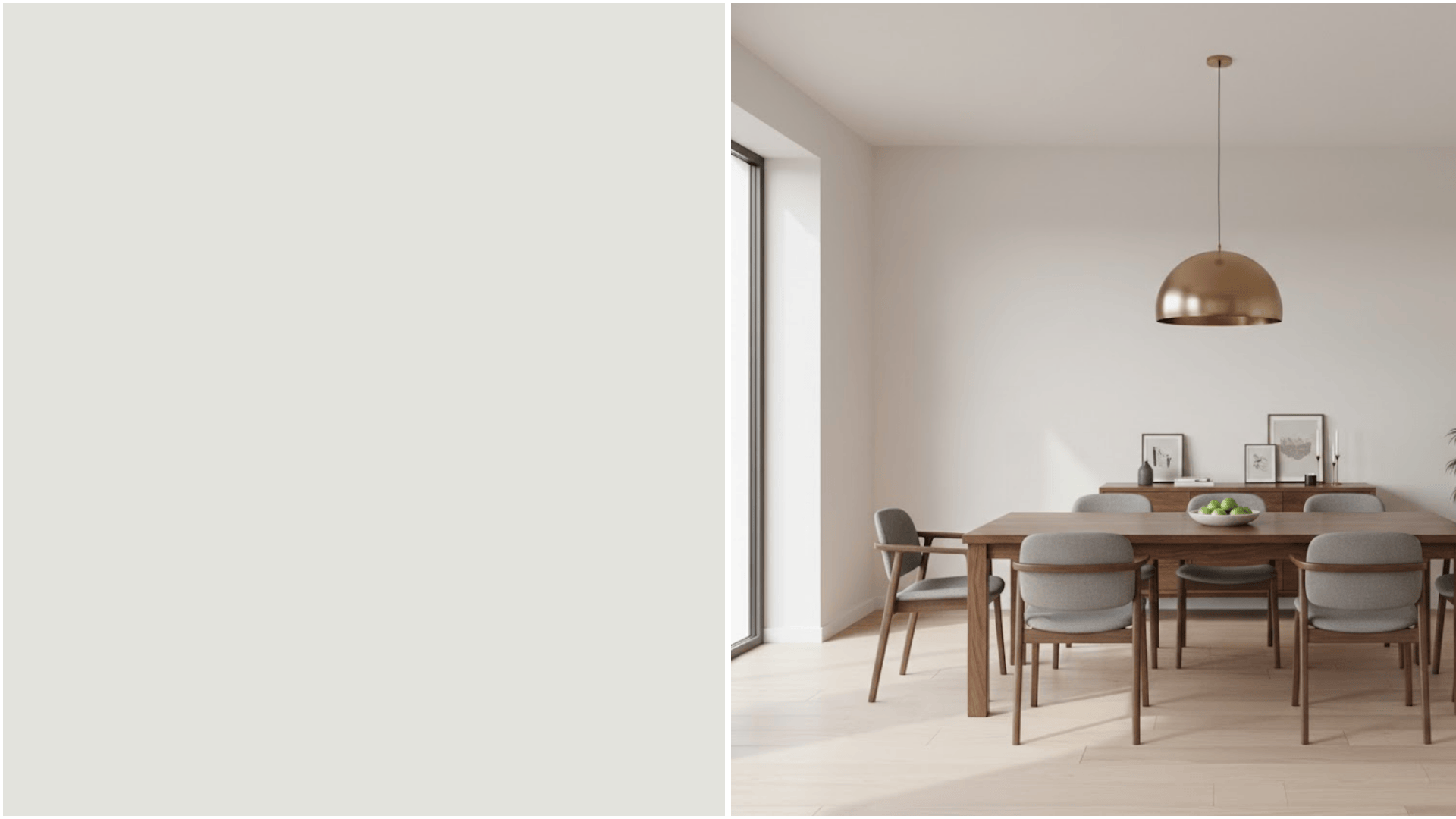
Clean, pure white without being cold. Spare White shade maximizes every bit of available light in your room.
It’s particularly effective in spaces with small windows or limited light sources.
The simplicity creates a backdrop that makes furniture and art pop while expanding perceived space.
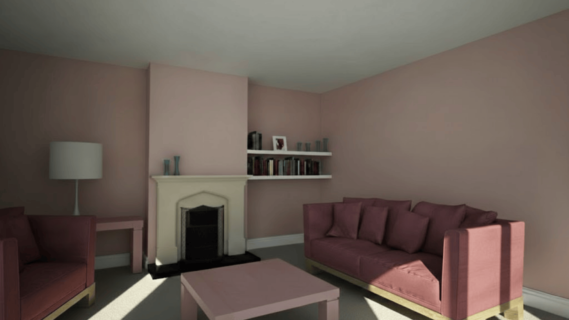
14. Benjamin Moore Carter Plum
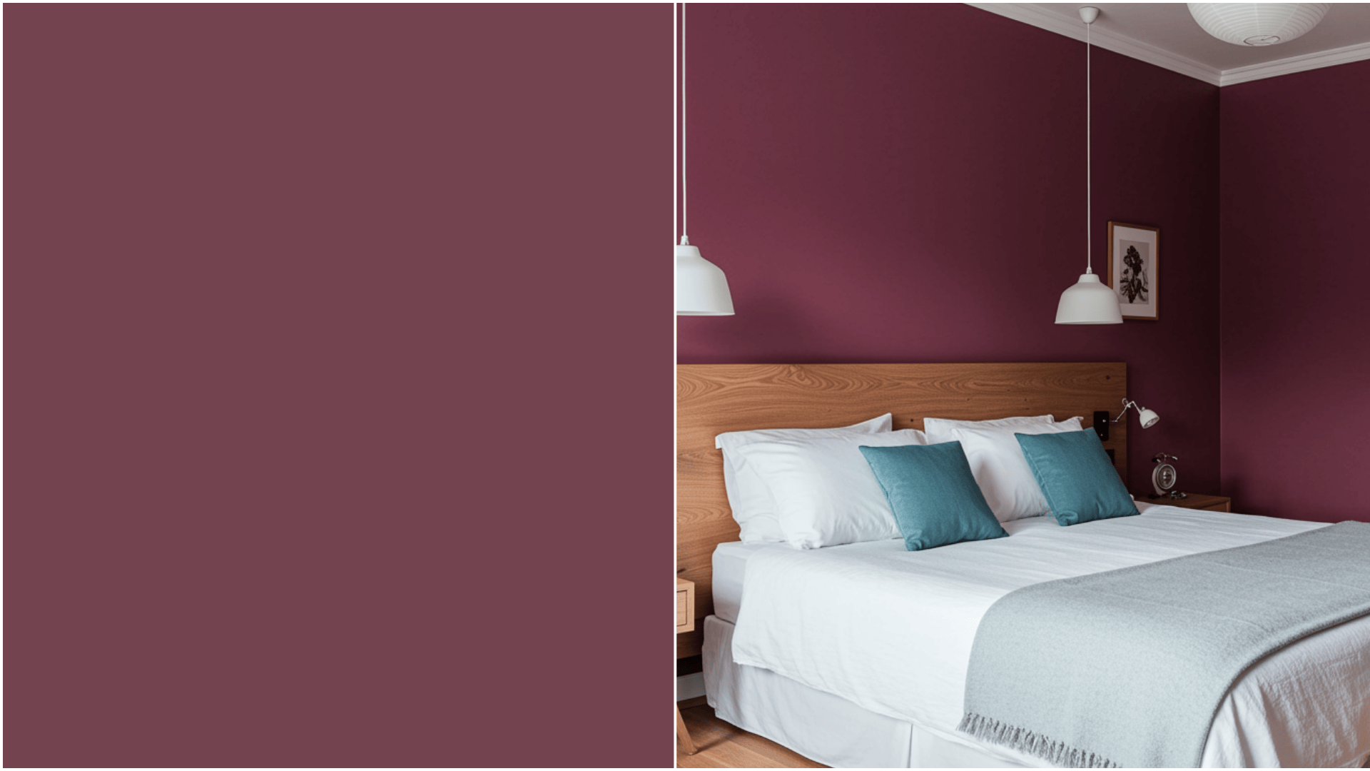
A moody mauve that shouldn’t work but does.
This Carter Plum has dusty rose and purple tones, with enough gray to create distance rather than enclosure.
I was skeptical until I tried it in a windowless office; the room felt bigger and more interesting.
It’s proof that you don’t always need pale colors.
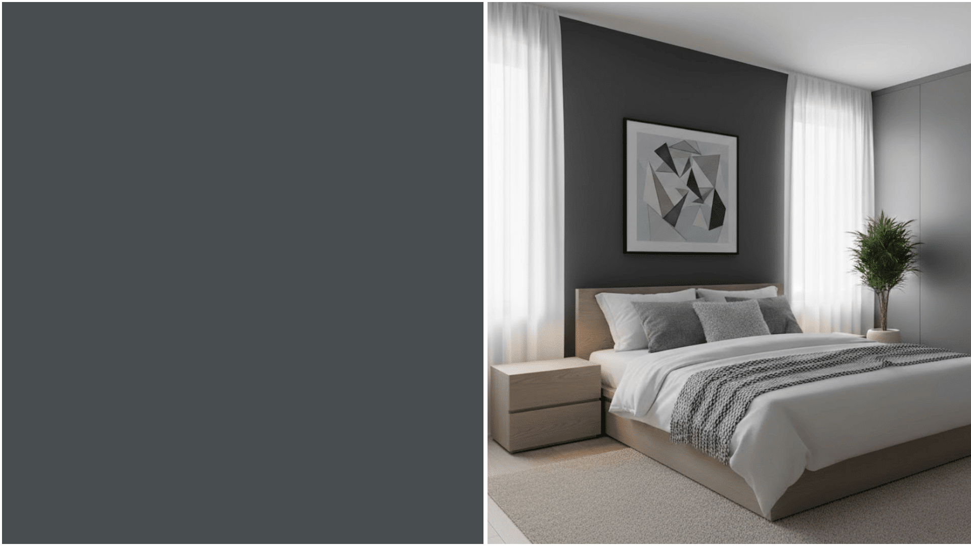
15. Benjamin Moore Silhouette AF-655
Silhouette charcoal gray creates sophisticated depth in small rooms.
Like Midnight Blue, it works by making walls disappear rather than reflect.
The key is to flood the room with good lighting so the dark color becomes atmospheric rather than oppressive.
Tip: Add mirrors to reflect light and double the sense of spaciousness.
Common Mistakes to Avoid When Choosing Paint for Small Rooms
Picking the wrong paint color can make a small room feel even smaller. Here are mistakes that shrink your space rather than expand it.
- Choosing dark colors: Dark paint absorbs light, making the walls feel closer. Save bold, deep colors for larger rooms where they won’t overwhelm the space.
- Using too many colors: Multiple paint colors break up your walls and create visual clutter. Stick to one color throughout the room for a cohesive, spacious look.
- Picking flat paint finishes: Flat paint doesn’t reflect light as satin or eggshell finishes do. The lack of sheen makes rooms feel darker and smaller than they need to be.
- Forgetting about the ceiling: Painting the ceiling the same dark color as the walls reduces perceived height. Keep ceilings white or lighter than the walls to create a sense of vertical space.
- Ignoring your lighting: Paint looks different in natural versus artificial light. Test samples on your walls and observe them throughout the day before committing to a color.
Wrapping It Up
Small rooms don’t have to feel like boxes.
The right paint color opens up your space without requiring construction or major renovations.
Light, cool tones work best because they reflect light and visually recede the walls.
Pick one color from this list that speaks to you. Grab a sample pot and test it this weekend. You’ll be surprised how much bigger your room feels with just a fresh coat of paint.
Ready to transform your small space?
Frequently Asked Questions (FAQs)
What is the Most Unappetizing Color?
Brown-green or muddy colors suppress appetite as they resemble spoiled food, triggering instinctive avoidance responses in humans.
What Colors Trigger Hunger?
Red, yellow, and orange stimulate appetite by increasing heart rate and creating a sense of urgency, and are commonly used in restaurant branding.
What is the Calmest Color to Paint a Room?
Soft blue and green reduce blood pressure and heart rate, promoting relaxation and tranquility, making it ideal for bedrooms.