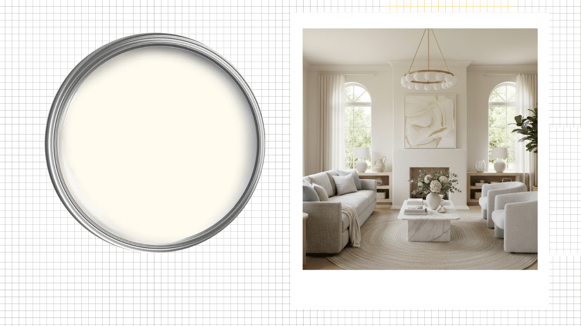

 next to an image of a bright, modern living room with neutral furnishings and arched windows (1)")
Ever repainted a room three times because the white just looked wrong? I have.
Whites that looked perfect on the paint chip turned blue-gray on my walls. Or they went straight-up yellow in the afternoon light. It’s frustrating.
You waste money, time, and patience. Plus, you’re stuck staring at walls you don’t even like.
Alabaster White is different. It brings warmth without overpowering your furniture or decor. It makes rooms feel bigger and brighter naturally
Let me break it down for you.
Why Will You Love Alabaster White?
Alabaster White has specific qualities that set it apart from other white paints.
I’ve noticed these features make a real difference in how rooms feel and look throughout the day.
1. Warm Undertones That Feel Inviting
The subtle warmth in Alabaster prevents that cold, clinical hospital feel. I’ve seen it create cozy spaces without crossing into beige territory.
It reads as true white while maintaining approachability in every room.
2. Pairs Well With Other Colors
I’ve successfully matched Alabaster with bold accent walls, such as Sherwin-Williams Moscow Midnight, and soft pastels.
It provides a clean backdrop without competing with the subject. Dark furniture pops against it. Light furniture blends beautifully.
The versatility really shows when you start decorating.
3. Light Reflective Value of 82
This LRV means Alabaster reflects most of the light hitting it. I find this brightness level perfect for smaller rooms.
It opens up spaces without creating that harsh, overly bright glare you get with pure whites.
In fact, Alabaster is one of the paint colors that make a room look bigger.
4. Works in Any Lighting Condition
Morning sun, afternoon shadows, or artificial light, Alabaster handles them all.
I’ve watched it shift gracefully throughout the day.
North-facing rooms stay warm, while south-facing spaces don’t get washed out or look yellowish.
5. Hides Minor Wall Imperfections
The soft, creamy quality of Alabaster is forgiving on less-than-perfect walls.
I’ve noticed it doesn’t highlight every tiny bump or drywall flaw.
Stark whites make imperfections obvious, but this shade offers gentle coverage throughout.
6. Stays Neutral Across Different Rooms
I’ve used Alabaster in kitchens, bedrooms, and hallways with consistent results. It doesn’t shift weirdly between spaces.
The color maintains its character whether you’re painting one room or your entire house, from top to bottom.
Can You Use Alabaster White for The Whole House?

Yes, absolutely. I’ve seen entire homes painted in Alabaster, and it works beautifully.
The color creates flow between rooms while adapting to each space’s unique lighting.
Your living room won’t look identical to your bedroom, which keeps things interesting. I recommend testing it in different areas first.
Paint large swatches and observe them for a few days.
Some people prefer varying whites for contrast, but Alabaster’s versatility makes whole-house application completely feasible.
It simplifies your paint choices significantly.
Trims Colors When You Paint Your Walls Alabaster
I’ve tested several combinations over the years, and these pairings create beautiful contrast while maintaining a cohesive look throughout your space.
1. SW Pure White (SW 7005)

Pure White offers a crisp, clean contrast against Alabaster walls without feeling too stark.
I love how it brightens up baseboards and crown molding.
The difference is noticeable but not jarring. It beautifully adds definition to architectural details.
2. SW High Reflective White (SW 7757)

High Reflective White creates maximum contrast with Alabaster walls for a fresh look. I’ve used it on trim in modern homes where sharp lines matter.
It reflects light beautifully and makes molding pop. The crispness feels contemporary and polished throughout.
3. SW Extra White (SW 7006)

Extra White provides a slightly softer contrast than Pure White, but it still clearly defines trim.
I find it perfect for traditional homes with lots of millwork. It highlights details without overwhelming the space.
The combination feels balanced and well-planned in every room.
4. SW Agreeable Gray (SW 7029)

Going with Agreeable Gray on trim creates a subtle, sophisticated look I really appreciate.
The warm gray complements Alabaster’s undertones perfectly.
This combination works especially well in contemporary spaces. It’s unexpected but creates a calming, monochromatic feel that’s quite lovely.
5. SW Accessible Beige (SW 7036)

Accessible Beige trim with Alabaster walls creates a tone-on-tone effect I’ve grown to love.
The minimal contrast feels soft and cohesive. This pairing works beautifully in bedrooms and cozy spaces.
It’s subtle enough that architectural details blend rather than stand out dramatically.
6. SW Repose Gray (SW 7015)

Repose Gray offers a cool-toned contrast that I’ve found surprisingly versatile with Alabaster.
The gray trim adds depth without introducing starkness. This combination feels modern and fresh.
It works particularly well in spaces with consistent natural light coming through windows.
Is Alabaster White Too Creamy for Your Interior?
It depends on your preference and lighting. I won’t lie, Alabaster does have warmth to it.
If you want a cool, crisp white, this isn’t your color. But I’ve found the creaminess is exactly what makes it livable.
It feels less sterile than stark whites.
In bright, south-facing rooms, the warmth of the sunlight balances it beautifully. Test it first. Paint samples in your actual space.
Live with them for a few days before committing to the entire room.
Alabaster as Trim Colors

Alabaster works beautifully as trim color, too. I’ve used it on baseboards and molding with darker wall colors, and the soft contrast looks refined.
Here are my favorite pairings:
- Chantilly Lace (BM OC-65): Creates a crisp, clean look with just enough distinction
- Simply White (BM OC-117): Offers gentle contrast that feels cohesive and intentional
- Ultra Pure White (Behr 1850): Gives you brightness, while Alabaster adds warmth
- Snowbound (SW 7004): Works beautifully for a monochromatic, layered effect
- Eider White (SW 7014): My favorite combo for a soft, welcoming feel
- Greek Villa (SW 7551): Provides depth without dramatic contrast
- Silver Drop (PPU18-11): Balances cool and warm tones perfectly
I’ve used these combinations in countless homes with great results.
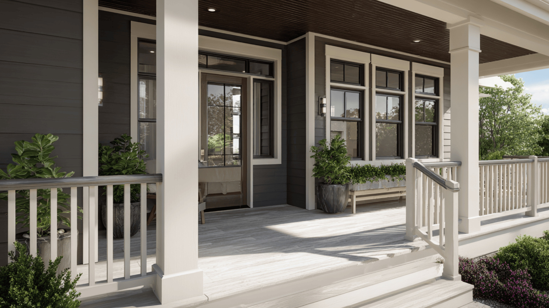
Does Alabaster White Work on the Exterior?
Absolutely. I’ve seen Alabaster look stunning on home exteriors, especially farmhouse and colonial styles.
The warm undertones prevent that blinding white effect some exterior paints create. It photographs beautifully and maintains its color well.
I recommend pairing it with darker trim for contrast. The color holds up in different weather conditions without looking dingy.
However, test it on your specific siding material first.
Different surfaces can affect how the color appears once it dries completely outdoors.
Wrapping It Up
Alabaster White has earned its reputation for good reason. The warmth keeps spaces from feeling cold.
Grab some sample pots and paint large test patches on your walls.
Watch how the color changes throughout the day. See it in morning light and evening shadows. Live with it for at least three days before making your final decision.
Ready to commit? Start with one room to build your confidence.
You can always extend it to other spaces later. Trust your instincts and what looks good to your eyes.
Frequently Asked Questions (FAQs)
How Does Alabaster Compare to Benjamin Moore White Dove?
White Dove and Alabaster have a lot in common, but White Dove is much more muted and grayed out.
Does Alabaster Look Dingy?
Alabaster can look dingy in rooms with poor natural lighting or inadequate artificial lighting, where its warm undertones may appear muted and creamy.
Does Alabaster Work in Low-Light Rooms?
Alabaster’s warm undertones make it a great white color option for rooms with less direct sunlight.