

Is White Dove the wrong white for your room?
You spent money on that paint, hours rolling it on, but your walls look dingy, yellow, or just wrong.
You thought White Dove was foolproof. Turns out, it’s not.
I’ll show you when White Dove fails, when it works, and more. Plus, I’ll give you fixes and better options, too.
First, Let’s Talk About Why Benjamin Moore White Dove is Loved
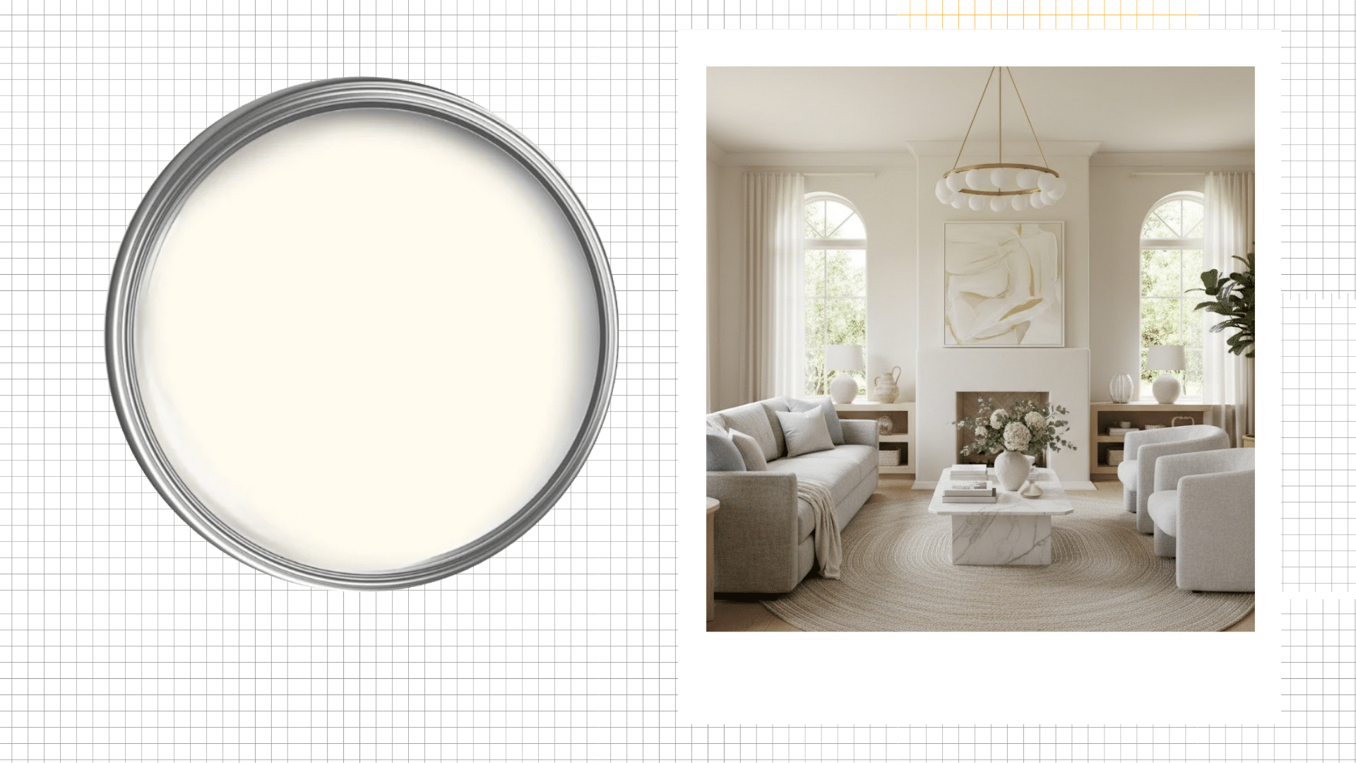
It’s Benjamin Moore White Dove OC-17, a soft, warm white that people love for good reason.
The color has an LRV of 83.16, which means it reflects plenty of light without being too bright.
White Dove has subtle yellow and gray undertones that give it depth.
It adapts to your lighting, which is the thing I love the most. In natural light, it feels crisp and fresh. Under warm bulbs, those undertones soften everything beautifully.
But, there are a few Most Popular Benjamin Moore White Paint Colors Ranked that I recommend looking at before finalizing a white for your home.
When Not to Use Benjamin Moore White Dove with Fixes (I got you!)
Now let’s talk about where White Dove fails. I’ve made these mistakes myself, so I’m saving you the trouble.
1. North-Facing Rooms
North light is cold and blue. White Dove’s yellow undertones fight against this light.
The result looks gray, flat, and depressing.
I painted my north-facing bedroom with White Dove once. It looked like dirty snow for two years until I repainted it.
Fix: Add warm-toned lighting or switch to Simply White or Chantilly Lace instead.
People often confuse Simply White with White Dove. If you’re one of them, then check our blog, Choosing Between White Dove vs Simply White, for a detailed comparison.
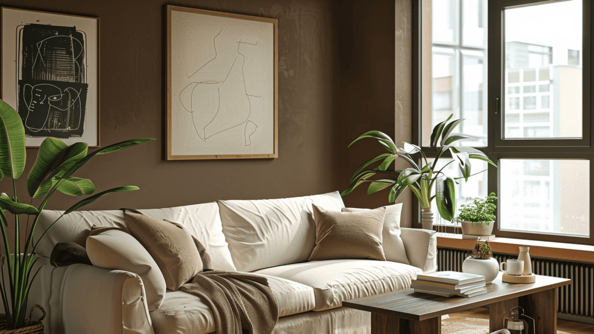
2. Rooms With No Natural Light
Basements and windowless rooms kill White Dove’s charm. The color needs natural light to show its warmth.
Artificial light alone makes it look dull and lifeless. I’ve seen it turn almost beige in a basement bathroom.
Save this color for rooms with windows.
Fix: Install daylight LED bulbs at 5000K or use Super White for better brightness.
3. Modern Minimalist Spaces
White Dove is too warm for sleek modern design. Modern spaces need crisp, cool whites that feel clean.
This color reads traditional and soft instead. If you’re going for a gallery look, skip White Dove.
It won’t give you that sharp, contemporary feel.
Fix: Switch to Decorator’s White or Pure White for a cooler, more modern look.
4. Rooms With Warm Oak Flooring
Yellow undertones plus yellow oak equals too much yellow. The combination feels dated and cluttered.
I tested this in a room with honey oak trim. Everything looked like it had a yellow filter over it.
Cool-toned floors work better with White Dove.
Fix: Use cool-toned area rugs, or switch to Cloud White for balance.
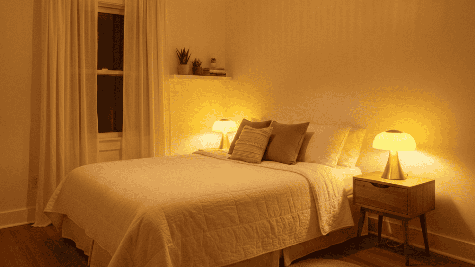
5. Spaces With Yellow-Based Lighting
LED bulbs with warm color temperatures make White Dove look dingy.
The paint already has yellow undertones. Warm bulbs amplify that yellow even more. I recommend using daylight bulbs if you insist on White Dove.
Otherwise, the walls look creamy in a bad way.
Fix: Replace bulbs with 4000K-5000K daylight LEDs to neutralize the yellow cast.
6. Small, Dark Bathrooms
White Dove needs space and light to shine. Cramped bathrooms with one small window don’t provide that.
The color in these spaces looks gloomy and cave-like.
I’ve seen powder rooms where White Dove felt heavy. A brighter white would serve you better here.
Fix: Add a large mirror to reflect light or switch to Simply White.
7 . Rooms Painted With Oil-Based Primer
Oil-based primers can make White Dove look different from what is expected.
The primer’s color affects how the top coat appears. I’ve seen White Dove look more yellow over certain primers.
Always test a sample board with your actual primer underneath first.
Fix: Use Benjamin Moore Fresh Start Primer or test samples with your primer first.
So, Where Can We Use White Dove?
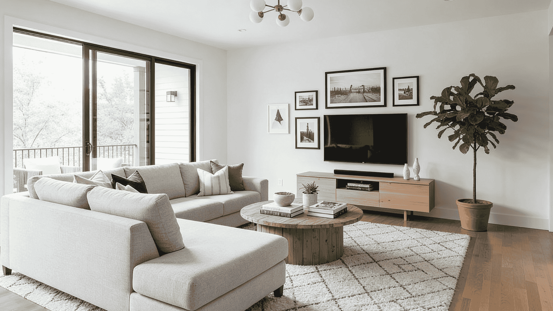
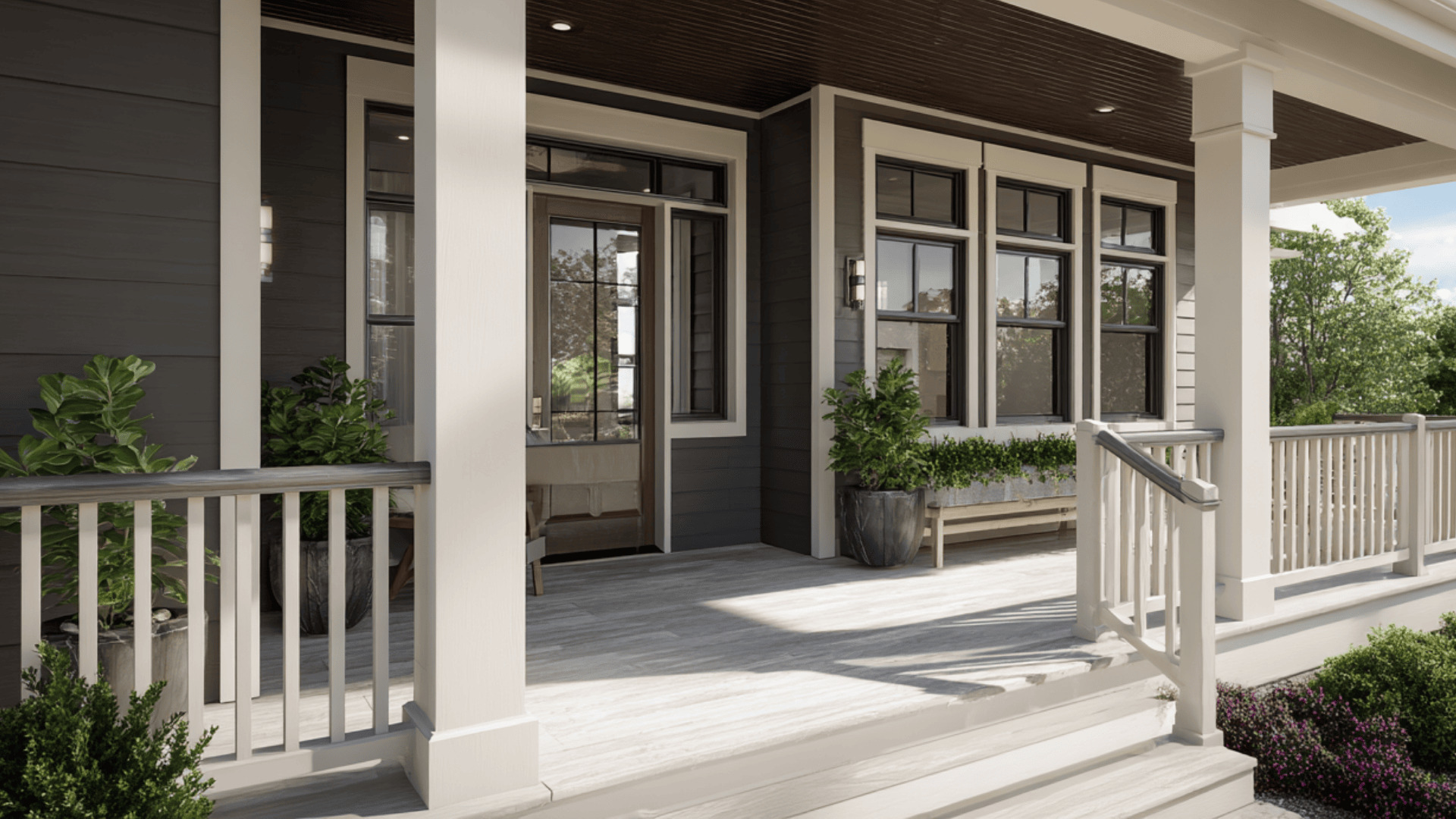
White Dove shines in specific conditions. I’ve found it works best in south and west-facing rooms where natural light is abundant.
The warmth feels inviting instead of dingy.
It also succeeds in:
- Living rooms with large windows
- Bedrooms with good light exposure
- Kitchens with white or light wood cabinets
- Open-concept spaces that flow together
Traditional and farmhouse styles love this color. The soft, warm tone complements shiplap, wood beams, and vintage details.
White Dove Top Pairings and Trim Substitutes
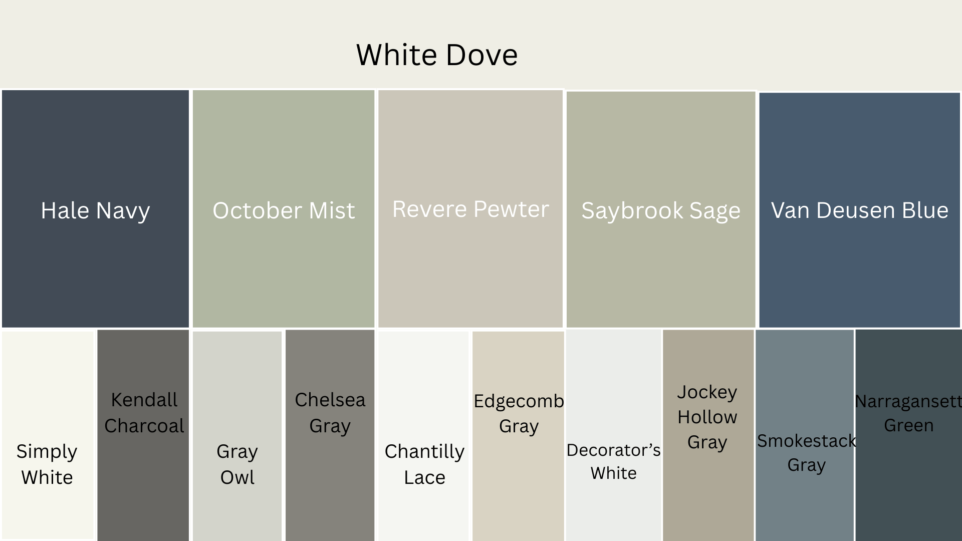
White Dove pairs beautifully with the right colors. I’ve tested dozens of combinations over the years.
Hale Navy HC-154
Benjamin Moore Hale Navy is a deep navy blue that creates a stunning contrast against White Dove trim.
I used this combo in a dining room, and the pairing feels classic being too formal or stuffy.
Trim Options:
- Simply White OC-117: Adds a slightly cooler, crisper edge to the navy walls.
- Kendall Charcoal HC-166: Offers a softer transition than black but still feels strong.
October Mist 1495
This soft greige sits perfectly between gray and beige. White Dove trim makes October Mist walls feel light and airy.
This combination feels very calm in bedrooms.
Trim Options:
- Gray Owl OC-52: Adds a cool gray tone that complements the greige beautifully.
- Chelsea Gray HC-168: Creates depth with a deeper gray that grounds the space nicely.
Revere Pewter HC-172
Revere Pewter is another greige that pairs well with White Dove trim. This is probably the most popular combination I see in homes.
It works equally well in traditional and transitional spaces.
Trim Options:
- Chantilly Lace OC-65: Offers a brighter, cooler white that makes Revere Pewter pop more.
- Edgecomb Gray HC-173: Creates a tone-on-tone look that feels sophisticated and understated.
Saybrook Sage HC-114
Saybrook Sage is a muted sage green that pairs beautifully with White Dove’s warmth. I painted my kitchen this way, and it transformed the whole space.
The green brings calm while the white trim keeps things feeling clean.
Trim Options:
- Decorator’s White CC-1: Provides a neutral white that doesn’t compete with the sage tone.
- Jockey Hollow Gray HC-108: Creates an interesting gray-green harmony that feels very organic.
Van Deusen Blue HC-156
This blue complements White Dove’s traditional feel. The warm white trim prevents the Van Deusen Blue from feeling too cold.
Trim Options:
- Smokestack Gray 2132-40: Adds charcoal trim, making the blue feel more modern.
- Narragansett Green HC-157: Creates a blue-gray combination that feels beachy and relaxed.
Wrap Up
White Dove isn’t a bad paint color. It’s just not right for every space.
I’ve shown you where it fails and how to fix those problems.
Test your samples under different lighting conditions before committing. Check morning, afternoon, and evening. See how it looks with your floors and furniture.
Got questions about White Dove in your specific space? Drop a comment below. I’d love to help you figure it out.
Frequently Asked Questions (FAQs)
1. Best Finish for White Dove Walls?
Eggshell or satin works well for walls, balancing durability with a subtle sheen. Matte suits low-traffic areas; semi-gloss for trim.
2. How does White Dove compare to Chantilly Lace?
White Dove is warmer and creamier; Chantilly Lace is crisper and cooler. Use Chantilly for brighter contrast.
3. Does White Dove Yellow Over Time?
Minimal yellowing occurs with proper application; the gray undertones remain neutral over the long term. Avoid direct sun exposure.