

Urbane Bronze never really goes out of style.
I’ve used it in modern condos, older homes, and everything in between. It just works.
This Sherwin-Williams neutral sits between brown and gray with warmth that shifts throughout the day. A lot of dark colors don’t?
People keep choosing it because it adds depth without making a room feel heavy.
It feels grounded but still interesting.
I’ll show you the rooms where it works best, which colors pair well, and how to test it before you commit.
Urbane Bronze Sherwin-Williams in Interiors
Urbane Bronze interior is one of those colors you actually notice once it’s on the wall.
I’ve used this color enough times to know.
It shifts throughout the day, reacts to your lighting, and honestly, it has a bit of a mood.
But that’s what I find interesting about it!
Urbane Bronze is a Sherwin Williams color with the code SW 7048.
It’s technically a neutral, but it sits way deeper than your average beige or taupe.
You’re looking at something that falls between brown and gray, which gives it room to work in lots of different spaces without feeling locked into one vibe.
Color Characteristics
At its core, it’s a grounded brown gray neutral.
But look more closely, and you’ll see green and warm undertones hiding beneath.
Morning light reveals green notes, afternoon sun brings warmth, and evening lamps deepen the comfy feel.
It changes with the room, and that’s the point.
Urbane Bronze Undertones
They’re the hints of other shades that show up depending on the light and what’s around them.
This color has a few tricks up its sleeve, and understanding them helps you use the color better.
| Undertone | When It Shows Up | What It Does |
|---|---|---|
| Green | Bright natural light, especially daylight | Keeps the color from reading as flat brown or plain gray. Gives it an earthy, grounded quality. |
| Warm Brown/Taupe | Afternoon light, warm artificial lighting | Adds softness and prevents the color from feeling cold or sterile. Works in both warm and modern spaces. |
| Cool Gray | Low light, north facing rooms, evening | Balances the warmth so it doesn’t tip too far into brown territory. Adds flexibility to different settings. |
Why It’s Trending for Interiors
Sherwin-Williams called it their Color of the Year back in 2021, and people are still using it because it doesn’t box you in.
Modern spaces love how clean it looks.
Minimalist rooms appreciate the warmth without the noise.
Traditional homes use it to freshen things up without throwing out the whole playbook.
Decor tip: Keep some lighter colors and natural textures in the mix. Wood, linen, and soft whites help the room breathe.
Urbane Bronze’s LRV
LRV stands for Light Reflectance Value.
Basically, it tells you how much light bounces back off your wall.
Urbane Bronze has a low LRV of 8, meaning it absorbs more light than it reflects.
That’s what makes it feel rich and deep, but it also means lighting matters more than usual.
1. In Bright Natural Light
When sunlight floods a room, Urbane Bronze shows its true colors.
Those green undertones come forward, and the warmth becomes more obvious.
South-facing rooms or spaces with large windows handle this shade beautifully because the light keeps it from feeling too closed in.
You’ll see the color shift slightly as the sun moves, which keeps things interesting.
2. In Low Light
Evening light or rooms with little natural light pull Urbane Bronze deeper.
It takes on an almost velvety look, feeling warm rather than dark.
This works well in dining rooms or reading nooks where you want that wrapped-up feeling.
Just balance it with enough artificial light so the room doesn’t disappear at night.
Urbane Bronze Interior Applications
You don’t have to use Urbane Bronze everywhere to make it work.
In fact, it’s better when you’re a little selective!
Some rooms handle the depth better than others, and knowing where it shines helps you avoid mistakes later.
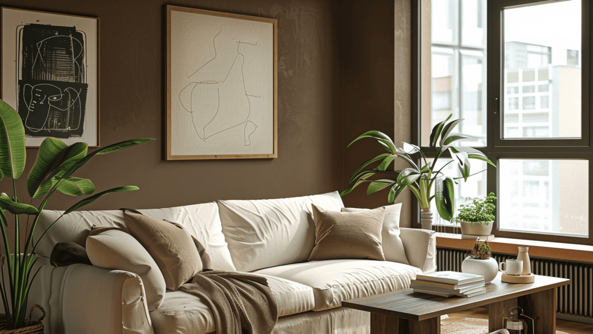
1. Living Rooms

I usually start clients with one accent wall behind the sofa or paint the whole room if you’ve got good natural light.
It creates a backdrop that makes lighter furniture and artwork pop without fighting for attention.
Why it works here:
- Anchors the space without overwhelming it
- Makes white or cream furniture stand out
- Feels intentional in a room where people gather
The color gives you a grounded foundation that pulls the whole room together. It’s solid but not heavy, which is precisely what you want in a space where people hang out.
2. Bedrooms

Bedrooms are one of my favorite places to use this shade!
I painted my own bedroom this color two years ago, and it worked exceptionally well.
If you’re going for a calm, restful vibe.
Pair it with soft bedding in cream or light gray, and you’ve got a space that feels put together without trying too hard.
What makes the Urbane Bronze interior perfect for bedrooms:
- Creates an intimate, restful atmosphere
- Hides imperfections on walls better than lighter shades
- Works with both modern and traditional bedroom styles
Just make sure you have enough light sources so it doesn’t feel like a cave.
3. Kitchens & Cabinets

This is where Sherwin Williams Urbane Bronze gets bold!
One of my favorite kitchen projects used this on the lower cabinets.
Paint your lower cabinets in this shade and keep the uppers light, or go full tilt and paint them all.
It pairs well with brass or gold hardware and looks sharp against white countertops or butcher block.
Why it’s a wise kitchen choice:
- Hides fingerprints and everyday wear
- Adds depth without feeling outdated
- Works with both farmhouse and contemporary styles
Quick Tip for Cabinets: A lesson I learned the hard way: If you’re painting cabinets yourself, use a high-quality primer first. Urbane Bronze is dark enough that any uneven coverage will show up, and you don’t want to deal with streaks after all that work.
4. Hallways & Entryways

Don’t sleep on hallways and entryways for this color.
Urbane Bronze makes a narrow hallway feel intentional instead of awkward.
It also sets the tone when people first walk in.
Add a mirror or some light-colored art to reflect light, and the space opens up even with a darker wall color.
The richness tells guests you put thought into every corner of your home, not just the main rooms.
Urbane Bronze Coordinating Colors for Interiors

An urbane bronze interior doesn’t demand much from the surrounding colors, but some pairings work better than others.
After using it in real homes, these options bring out the best in this rich neutral.
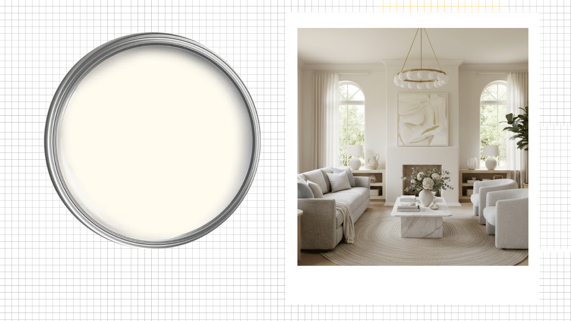
1. Whites & Creams
Pure whites and creams create the cleanest contrast with the Urbane bronze interior.
This pairing works best for trim, ceilings, and accent walls where you want bright balance without harshness.
Sherwin Williams: Alabaster (SW 7008)
Alabaster is a soft, warm white that doesn’t feel sterile. It has just enough cream to soften the contrast while still creating definition.
Benjamin Moore: White Dove (OC-17)
White Dove is a creamy white with just enough warmth to balance darker tones. This popular choice feels fresh and inviting without looking yellow.
Behr: Swiss Coffee (12)
Swiss Coffee is an off-white with subtle warmth that works beautifully for trim. It complements Urbane Bronze without competing for attention.
2. Warm Grays
Warm grays offer soft contrast that feels safe and polished.
This pairing creates a cohesive, layered look that works across different design styles.
Sherwin Williams: Agreeable Gray (SW 7029)
Agreeable Gray is a true warm gray that works in almost any lighting. It pairs seamlessly with Urbane Bronze without clashing.
Benjamin Moore: Edgecomb Gray (HC-173)
Edgecomb Gray is a greige with warmth that complements rather than competes. The subtle contrast adds dimension while keeping everything feeling balanced.
Behr: Dolphin Fin (790C-3)
Dolphin Fin is a soft, neutral gray with just enough warmth to feel inviting. It creates visual flow throughout the space.
3. Soft Greens
Soft greens naturally bring out the hidden undertones in Urbane Bronze.
Since this shade has green lurking beneath the surface, sage and muted olive tones feel organic rather than forced. This combination works beautifully in spaces where you want calm, grounded warmth.
Sherwin Williams: Clary Sage (SW 6178)
Clary Sage is a muted sage that pulls out the green in Urbane Bronze. The pairing feels earthy and intentional.
Benjamin Moore: October Mist (1495)
October Mist is a soft, earthy green with gray undertones. It brings out those hidden notes without shouting about it.
Behr: Jojoba (N390-3)
Jojoba is a gentle oil that feels grounding and calming. The two colors balance each other without overwhelming the room.
4. Earthy Terracotta
Terracotta and rust tones add personality and warmth to Urbane Bronze spaces.
They bring energy without feeling out of place.
Sherwin-Williams: Cavern Clay (SW 7701)
Cavern Clay is a rich terracotta that adds bold warmth without overwhelming. It pairs beautifully with Urbane Bronze for a grounded, earthy vibe.
Benjamin Moore: Potters Clay (1221)
Potters Clay is a warm rust tone perfect for accent pieces. It brings visual interest while keeping the overall feel balanced.
Behr: Spiced Cider (PPU2-15)
Spiced Cider is a burnt orange with enough depth to hold its own. It adds a pop of warmth that feels intentional.
5. Blacks & Charcoals
Blacks and charcoals create the boldest pairing with Urbane Bronze.
This combination feels layered and intentional, working perfectly in modern or industrial spaces.
Sherwin-Williams: Tricorn Black (SW 6258)
Tricorn Black is a true, pure black that creates sharp contrast. It adds drama and depth to any space.
Benjamin Moore: Wrought Iron (2124-10)
Wrought Iron is a deep charcoal with subtle warmth. It’s slightly softer than true black but still adds plenty of depth.
Behr: Cracked Pepper (PPU18-01)
Cracked Pepper is a soft black with a hint of warmth for a less harsh look. It layers beautifully with Urbane Bronze.
Decor tip: Stick to two or three accent colors max. Too many competing tones will muddy the whole space.
Using Sherwin-Williams Urbane Bronze on Trim
Interior trim color might seem like a small detail, but it changes how the whole room reads.
1. White Trim
This is what I recommend 90% of the time!
It creates a crisp line that breaks up the depth of Urbane Bronze. Your eye follows the trim, which makes the room feel more structured. Extra White or Pure White both work well here.
The contrast is firm but not harsh, keeping the space from feeling too heavy.
2. Cream or Off White Trim
If you want something softer, go with a warm cream like Alabaster or Dover White.
The contrast is still there, but it’s gentler.
This works exceptionally well in traditional homes or spaces where you want a more relaxed, lived-in feel.
I used Dover White in a 1920s bungalow last year, and it softened everything perfectly.
3. Matching Trim
I’ve only done this twice, both times in modern spaces.
It’s not for everyone!
It creates a cohesive, wrapped look that works well in modern or minimalist spaces.
It’s bold, but if you’ve got interesting architecture or furniture to highlight, it lets those pieces take center stage.
Urbane Bronze vs Similar Colors

Clients ask me about these colors all the time!
1. Iron Ore (SW 7069)
Iron Ore leans cooler and darker with more gray. Urbane Bronze brings warmer brown and green undertones, making spaces feel less stark and more inviting.
I’ve used both, and Iron Ore feels colder every time.
2. Black Fox (SW 7020)
Black Fox appears lighter, with more visible brown tones, in good light.
Urbane Bronze reads deeper and moodier, especially when the sun goes down. Black Fox is lighter and easier if you’re nervous about going too dark.
3. Gauntlet Gray (SW 7019)
This one’s predictable. Urbane Bronze isn’t.
Gauntlet Gray is a true warm gray without hidden green notes. Urbane Bronze feels earthier and less predictably neutral overall.
4. Sealskin (SW 7675)
Sealskin plays it safe. Urbane Bronze takes more risk.
It appears softer and grayer, with less warmth underneath.
Urbane Bronze has more personality and depth, making it the bolder choice.
Mistakes to Avoid and Testing Tips for Using Urbane Bronze in Interiors
I’ve made plenty of mistakes with this color. I wish I’d known from the start.
- I once painted a windowless bathroom this color without adding sconces first. Felt like a cave until I fixed the lighting.
- Avoid pairing it with cool-toned floors or furniture. They clash with the warmth.
- Never paint everything the same shade. Add lighter colors somewhere so the room can breathe.
- I always paint a two-foot sample and check it in the morning, afternoon, and at night. Saves headaches later.
- Hold your sample next to your existing furniture before you commit.
- Use peel-and-stick samples or buy a small can first. Live with it for three days.
Is Urbane Bronze Right for Your Home Interiors?
This shade tends to work best in homes with decent natural light and warm or neutral furnishings.
Go for it when you want
- Want a rich neutral that adds depth without feeling dark.
- Prefer moody, intentional spaces over bright and airy ones.
- Have white or cream trim already installed.
- Enjoy warm environments with character.
Skip it when you
- Love light, bright color palettes.
- Have limited natural light in your space.
- Prefer cool-toned grays and blues.
- Already own cool-toned furniture or flooring.
Final Thoughts
I’m not going to tell you that Urbane bronze interior is perfect for everyone, because it’s not.
But if you’ve got decent natural light, some warm-toned furniture, and you’re ready for something deeper than beige?
It might be exactly what your space needs!
Paint that sample, live with it for a few days, and see how it makes you feel.
And hey, if you end up painting your whole living room and loving it?
Send me a photo. I’d love to see how it turned out.”
Frequently Asked Questions
1. What is the LRV of Urbane Bronze?
The LRV sits at 8. That’s low, which means it soaks up light instead of bouncing it back
2. Does Urbane Bronze Look Different in Matte versus Satin Finish?
Yes. Matte looks deeper and richer. Satin brings out those undertones more.
3. Can I use Urbane Bronze on exterior Surfaces?
I’ve done front doors and shutters with it. Looks great for curb appeal.
4. How Many Coats of Urbane Bronze do I Need for Full Coverage?
Two coats over primer usually do it. Three if you’re covering something dark.
5. Does Urbane Bronze Work Well in Open Concept Spaces?
Use it on one or two accent walls, not everywhere. Open concept spaces need breathing room.