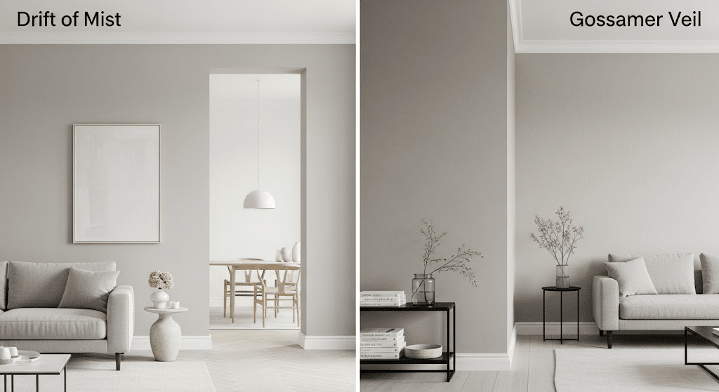
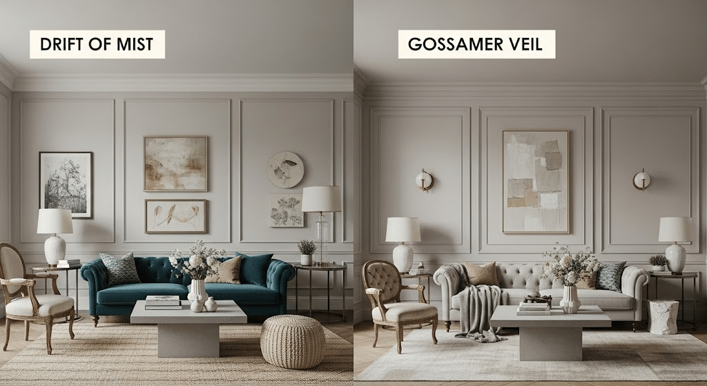
Choosing between two stunning neutral paint colors can feel overwhelming, I get it. When you’re staring at Gossamer Veil vs Drift of Mist paint swatches, they both look so similar that picking one feels impossible.
Gossamer Veil leans slightly warmer with subtle beige undertones, while Drift of Mist carries cooler gray notes. But there’s so much more to consider.
I’ll walk you through everything you need to know about these two popular neutrals.
We’ll compare their undertones, see how they work in different rooms, and look at real homes that showcase each color beautifully.
What Sets Gossamer Veil Apart from Drift of Mist?
Let me walk you through the key differences between these two popular grey colors.
Both Gossamer Veil and Drift of Mist are neutral, mid-toned paint colors that work well in similar homes. They share warm undertones that make them crowd favorites. When deciding between Gossamer Veil vs Drift of Mist, it’s important to consider their subtle differences
But here’s where things get interesting. These colors aren’t twins – they have distinct personalities
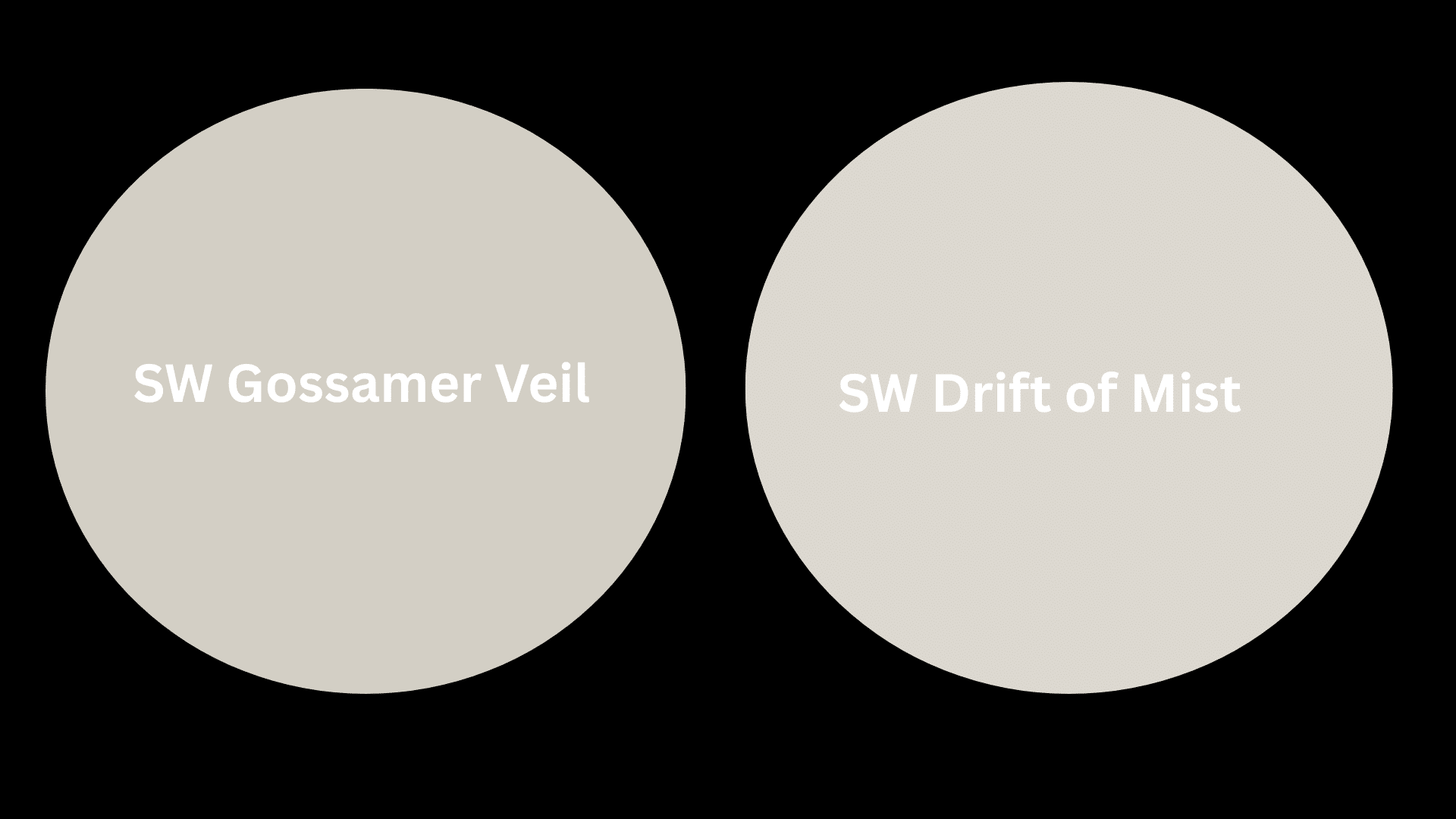
| Feature | Gossamer Veil | Drift of Mist |
|---|---|---|
| Color Family & Tone | Warm greige; mid-toned and cozy | Soft gray with beige; light and airy |
| LRV | 62: slightly darker | 69: noticeably lighter |
| HEX Code | #D3CEC4 | #DCD8D0 |
| Main Undertones | Subtle green with occasional purple hints | Warm greige with green and purple shifts |
How to Choose Based on Your Room Type and Style
I get asked about room-specific color choices all the time. Here’s how each color performs in different spaces around your home.
Entryway
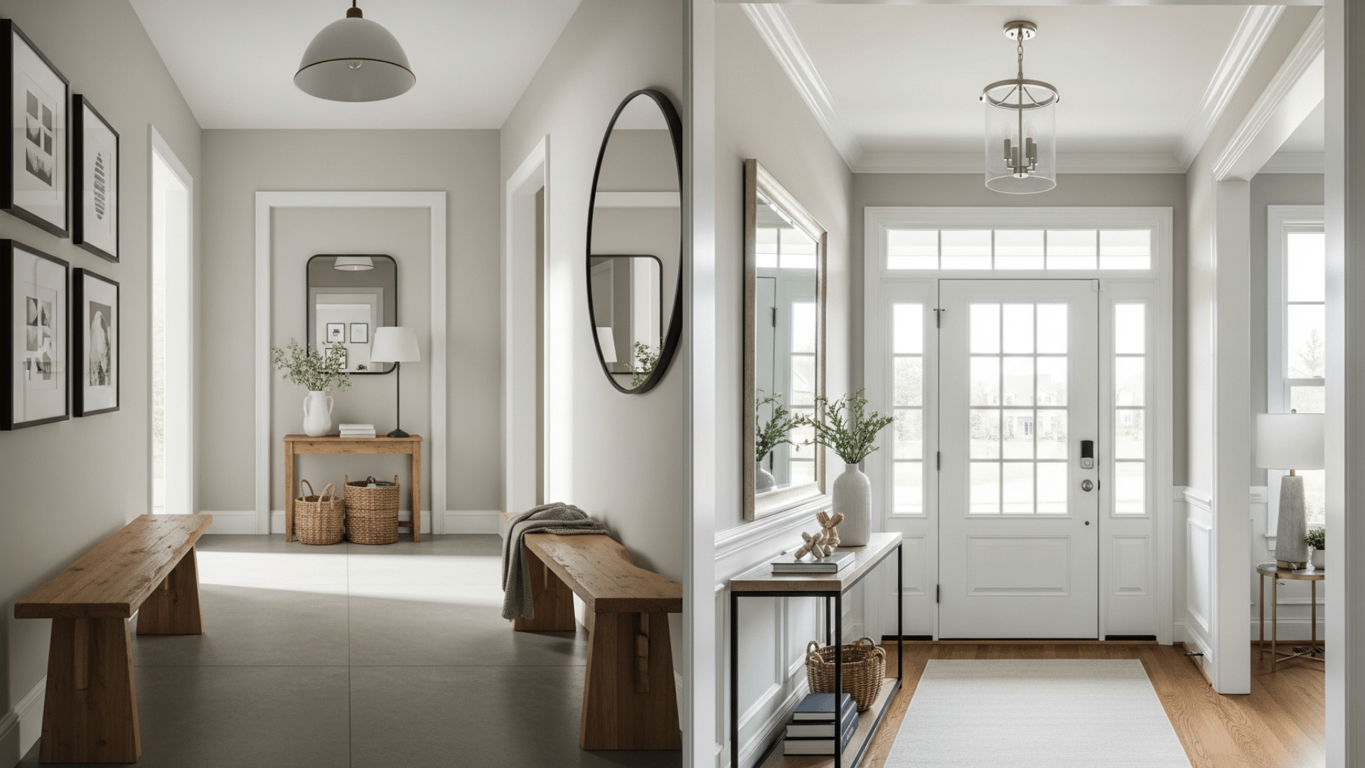
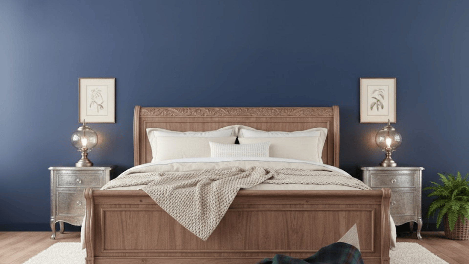
Gossamer Veil creates a warm, welcoming first impression. I love how it pairs with natural wood benches and matte black frames. The deeper tone holds up well against foot traffic and daily wear. Drift of Mist offers a clean, bright look that opens up smaller entry spaces. Works beautifully with crisp white trim and glass light fixtures.
Styling Tip: Use mirrors to bounce natural light around and really show off those undertones in both shades.
Dining Area
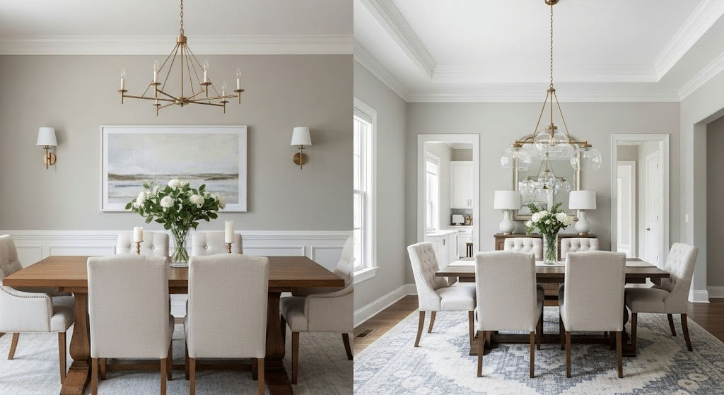
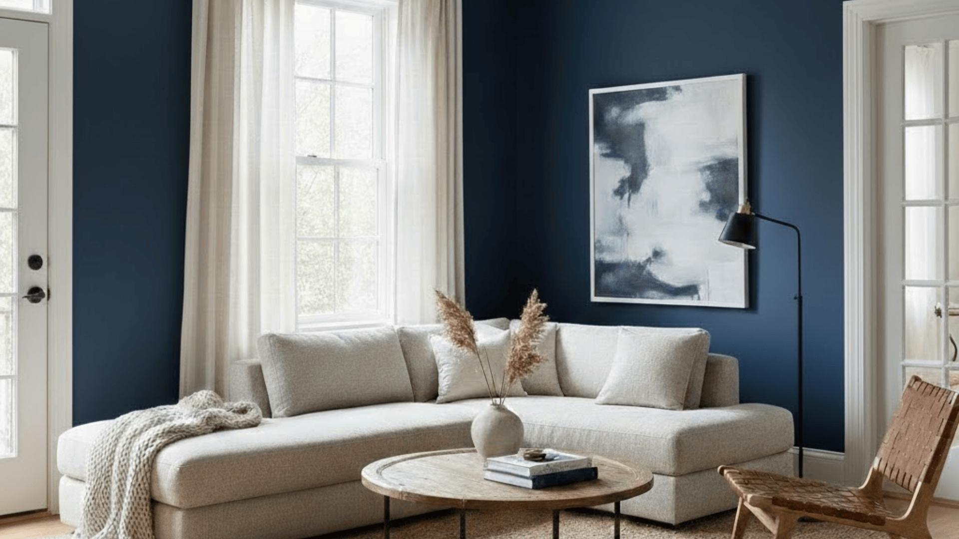
Gossamer Veil adds depth and coziness – perfect for creating a moody atmosphere. I’ve seen it look stunning with brass chandeliers and rich wood furniture. Drift of Mist keeps the space feeling fresh and open. This is my go-to choice if your dining room lacks windows or feels cramped.
Styling Tip: Ground the space with a statement rug that plays up the undertones. Try sage, ivory, or rust accents to complement either color.
Bathroom
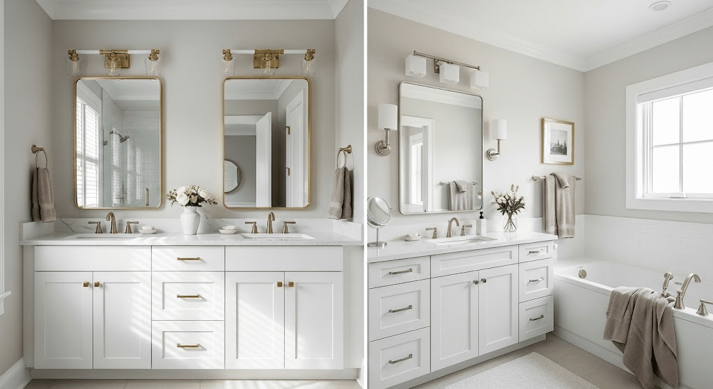
Gossamer Veil brings spa-like warmth to smaller bathroom spaces. I love how it works with warm tiles or gold fixtures; the color has enough depth to handle steam and humidity. Drift of Mist reflects light beautifully in bathrooms with little natural light. Gives that clean, fresh feeling we all want in our bathrooms.
Styling Tip: Pair with soft linens in taupe or oatmeal tones. Add metallic finishes for contrast and texture.
Home Office
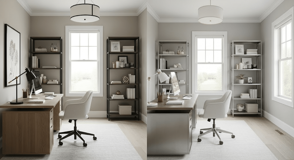
Gossamer Veil feels grounding and cozy – perfect for long work sessions. I find it pairs naturally with earthy wood tones and creates a focused atmosphere. Drift of Mist adds clarity and calm to workspaces. Ideal choice if your home office feels tight or lacks natural light.
Styling Tip: Use accent pieces like bookshelves, art, or curtains to balance warm and cool tones in your workspace.
Which Paint Suits Your Style Vision?
I always tell my clients that their paint choice should match their design goals. Choosing between Gossamer Veil vs Drift of Mist can define the entire mood of your space.
Here’s a breakdown to help you match each paint color to your unique design vision and achieve your ideal look.
Minimalist Spaces
Drift of Mist is my go-to for clean, minimal looks. That higher LRV of 69 keeps walls feeling light and uncluttered. The subtle warmth prevents the space from feeling cold or sterile. I love how it doesn’t compete with simple furniture lines or open spaces.
Gossamer Veil can work in minimalist designs, but you need to be intentional. The deeper tone adds more visual weight. Use it when you want your minimal space to feel grounded and cozy rather than stark.
Traditional Charm
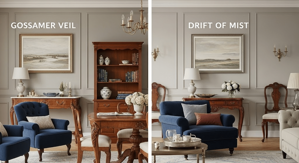
Gossamer Veil wins here. Traditional spaces love depth and character, and that LRV of 62 delivers both. The green-purple undertones complement antique woods and classic fabrics beautifully. It feels established and timeless.
Drift of Mist works in lighter traditional spaces. Think bright breakfast nooks or sun-filled sitting rooms. The purple undertones pair nicely with floral patterns and soft furnishings.
Coastal Vibes
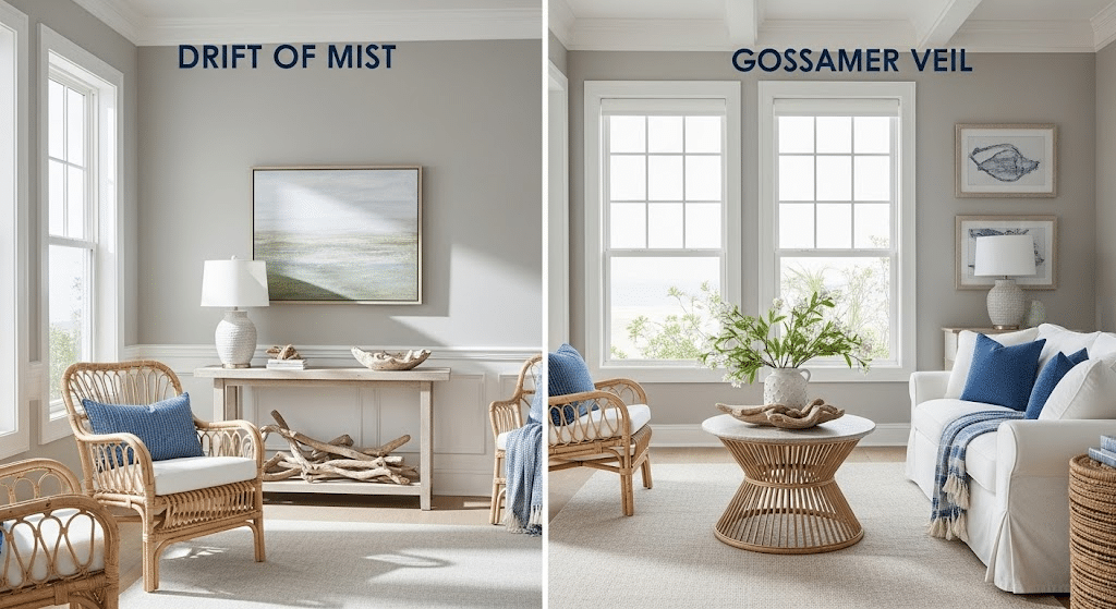
Drift of Mist feels more beachy and relaxed. The lighter tone mimics weathered driftwood or sea glass. Just watch that green undertone – it can clash with cool coastal blues.
Gossamer Veil creates a classy coastal style. Think upscale beach house rather than cottage. The deeper tone grounds rooms filled with whites and blues.
Transitional Balance
Drift of Mist works when you lean more contemporary. It keeps traditional elements from feeling heavy while adding warmth to modern pieces.
Gossamer Veil suits transitional spaces that lean traditional. It softens contemporary furniture while supporting classic architectural details.
Pro Tips to Consider Before Making Your Choice
I always suggest testing both colors in their actual space before deciding. Paint looks completely different on your wall than it does on a tiny chip at the store.
- Create a simple mood board by placing fabric swatches, wood samples, and metal finishes next to your paint samples. This shows you how everything works together in real life.
- One interior designer friend told me she uses the “24-hour rule” – live with your samples for a full day and night cycle to see how they change in different lighting conditions.
- Get the largest paint samples you can find, or better yet, paint a poster board section. Those tiny 2×2-inch samples just don’t give you enough color to make a confident choice.
- I’ve learned that north-facing rooms will pull out the green undertones in both colors, while south-facing rooms make them look warmer and more beige.
- Always paint your sample next to existing elements like trim, flooring, or built-ins. The contrast will help you see which color flows better with what you already have.
To Conclude
So there you have it, the real story behind gossamer veil vs drift of mist comes down to depth and light. Gossamer Veil gives you more color richness with its LRV of 62, while Drift of Mist keeps things brighter at LRV 69.
The right choice modifies how your space feels every single day. Get it wrong, and you’ll be staring at walls that feel off for years.
Grab large samples of both colors and test them in your actual room for at least 24 hours. Watch how they change from morning coffee to evening wind-down.
Your walls deserve better than a quick decision. Take the time to test, and you’ll end up with a color that makes you smile every time you walk through the door.