

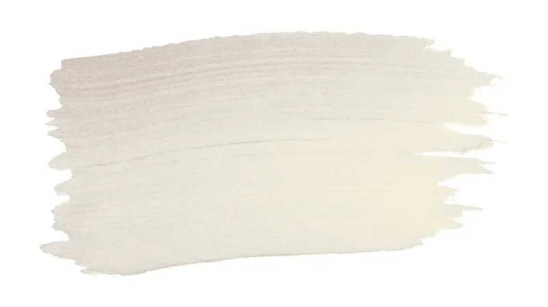
Did you know Agreeable Gray is one of Sherwin-Williams’ best-selling paint colors?
Most grays go cold or purple once the sun moves, but this one doesn’t.
It holds a warm, balanced tone from morning to night, which is why it photographs well and feels just as good in person.
Below are seven Agreeable Gray living room ideas — from Scandinavian-simple to high-contrast bold, so you can see what actually fits your space before you buy a can.
Agreeable Gray Color Description
Sherwin-Williams’ Agreeable Gray (SW 7029) sits right between beige and gray, which makes it easy to work with. It doesn’t lean too cool or too warm.
Put it next to warm wood and it looks earthy. Pair it with bright white trim and it reads clean and modern.
That flexibility is the whole point.
- Undertones: Soft beige and faint violet undertones that stay balanced in most lighting conditions.
- LRV: 60 out of 100, so it reflects a solid amount of light — enough to keep a small room feeling open without washing out.
- Natural light: Reads as a clean, warm gray.
- Artificial light: Can pull slightly warmer or creamier.
Colors That Pair Well with Agreeable Gray
One of the best things about it is how well it gets along with other colors.
Whether you want something calm and classic or a little bolder, this shade works with a surprising range of colors.
Here’s what holds up well:
1. Creamy whites: SW Alabaster sits beautifully against this color’s trim and walls.
2. Warm wood tones: The tonein furniture and flooring adds richness without clashing.
3. Soft terracotta or rust accents: They bring comfort and depth to the space.
4. Bright white trim: SW Extra Whitecreates a clean, sharp contrast.
5. Soft navy or slate blue: Theywork well as an accent wall or in cushions and throws.
6. Sage green: It adds a fresh, natural feel without overpowering the gray.
7. Black fixtures or frames: They give the room a polished, modern edge.
8. Charcoal gray furniture: It layers tones beautifully without looking flat.
Because it’s so neutral, Agreeable Gray won’t compete with whatever accent you bring in. Test a few swatches side-by-side and trust what you see in your light, not a photo online.
Agreeable Gray Living Room Ideas
It gives you a lot to work with; whether your living room is big or small, bright or dim, there’s a way to make this shade work for your space.
These ideas will help you find the look.
1. The Warm Scandinavian Look
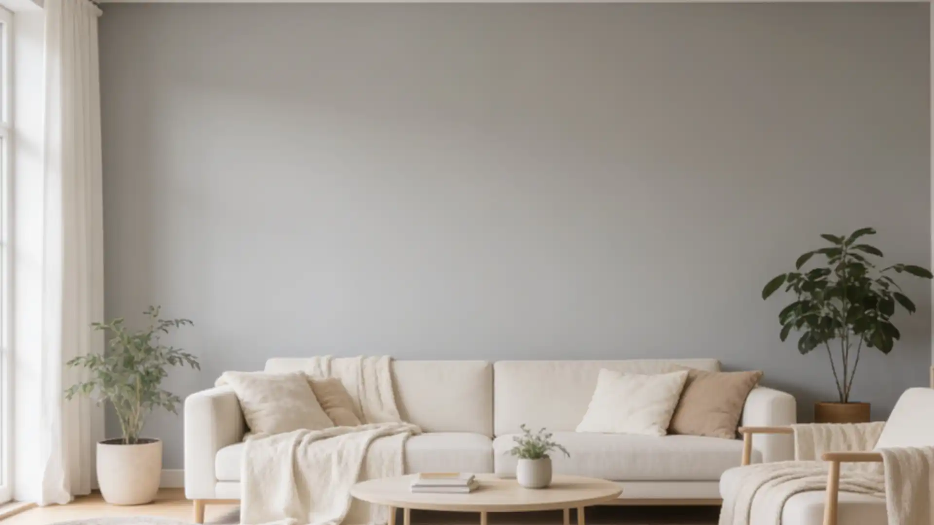
It’s quiet, unfussy, and genuinely relaxing to be in.
Layer oak or walnut furniture against Agreeable Gray walls for an instantly comfy feel.
Add creamy throws, linen cushions, and soft lighting. A jute rug and a few natural wood accents tie the whole room together beautifully.
2. High Contrast, Modern Edge
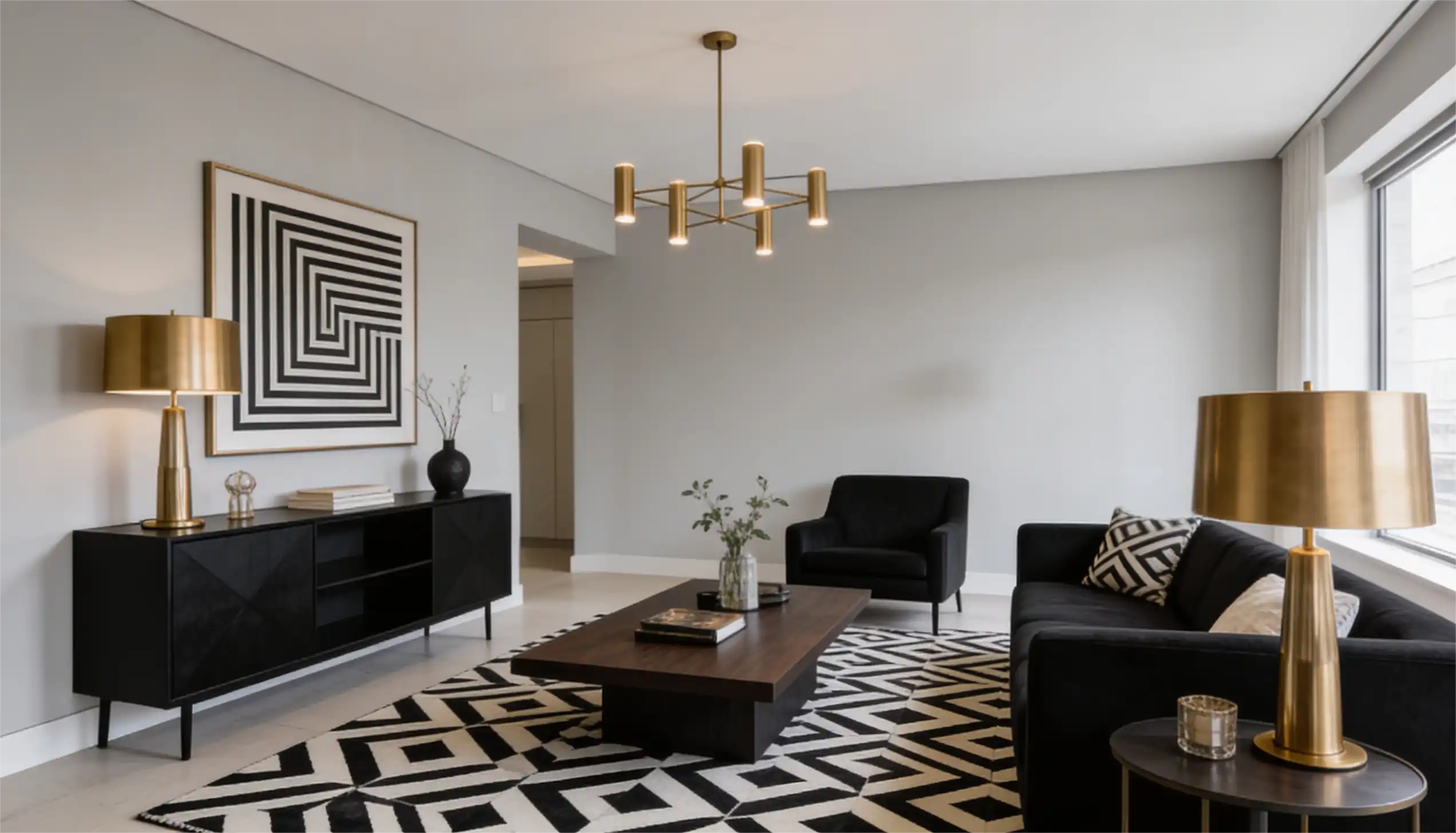
If you want something bold. Pair this color with charcoal or black furniture and clean-lined pieces.
Brass or gold fixtures add the right amount of richness. The contrast feels sharp and intentional without making the room feel heavy or cold.
3. Relaxed Coastal
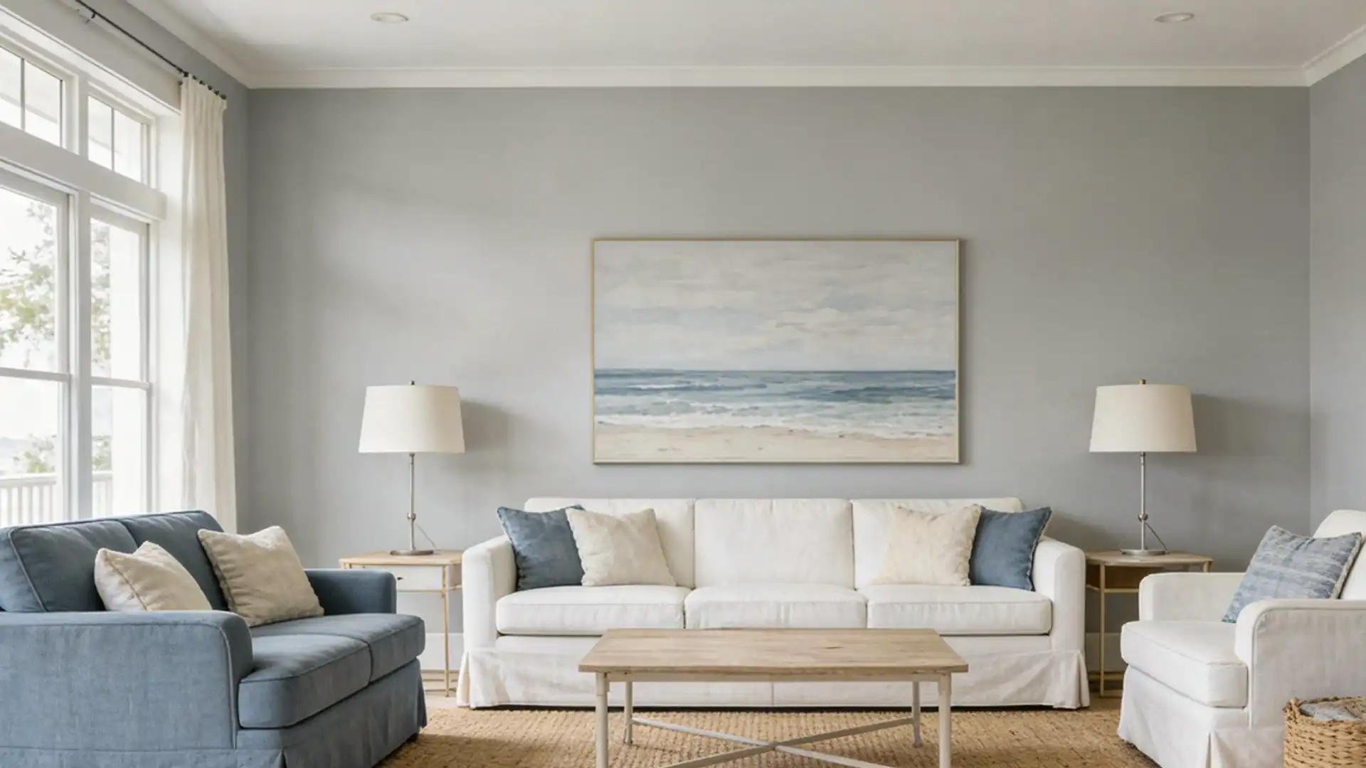
Bring in dusty blues and soft greens through cushions, curtains, or an accent chair.
White trim against Agreeable Gray walls keeps things fresh.
Add nautical textures like rope, rattan, or linen to carry through the coastal feel without it tipping into kitsch.
4. Earthy and Organic
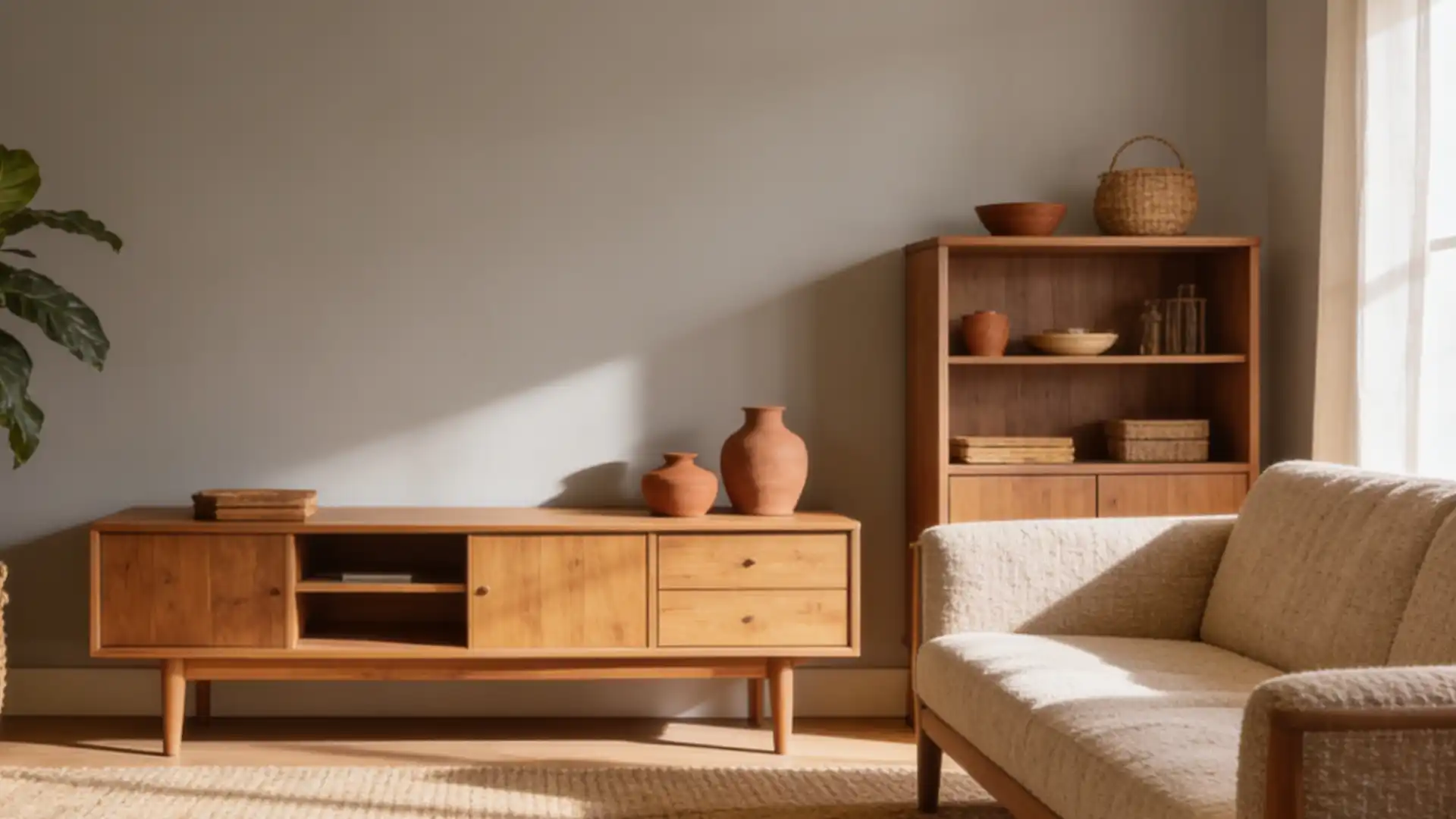
This idea brings the outdoors in, making everything feel grounded, cozy, and inviting.
Go for terracotta pots, muted orange accents, and botanical green cushions. Woven baskets, jute rugs, and a few indoor plants add texture and life.
5. Transitional (Classic Meets Contemporary)
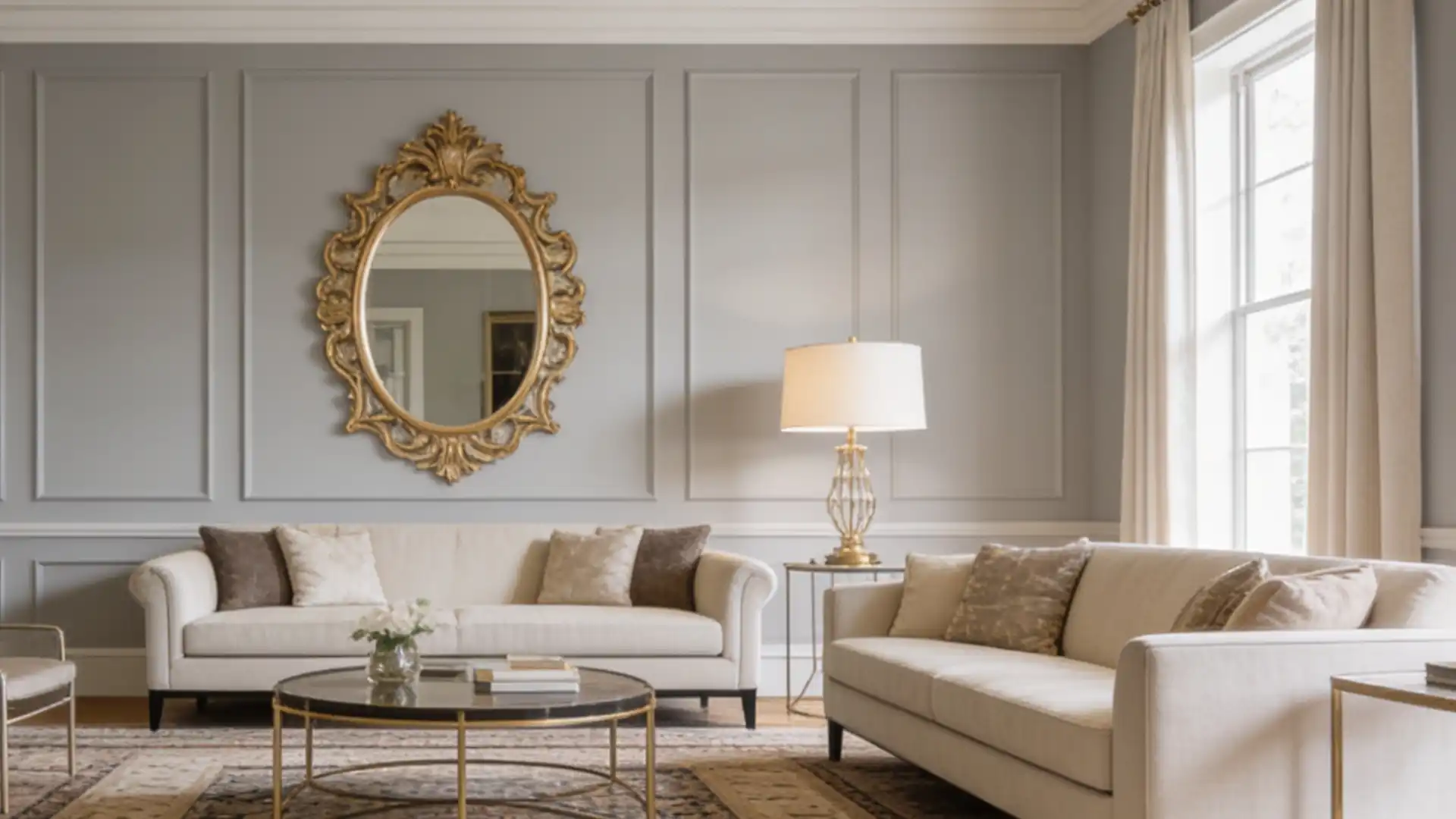
This style brings classic and contemporary together in a natural way.
Classic crown moldings on Agreeable Gray walls add a sense of depth and detail. Pair them with modern furniture, layered rugs, and gold accents.
Done right, it avoids feeling like a period room — the modern furniture keeps it grounded in the present.
6. Modern Farmhouse Done Right
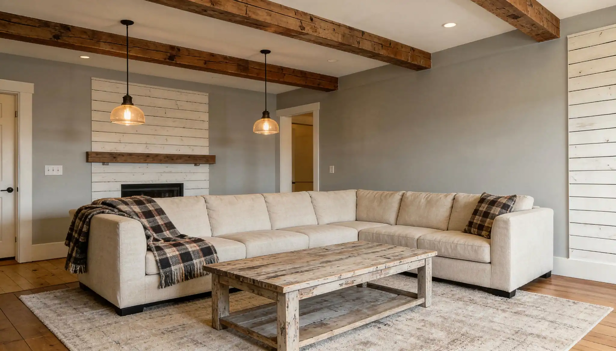
The paint color sets the perfect base for a modern farmhouse feel. Add shiplap walls, dark iron fixtures, and chunky knit throws for character.
Mix in white linen sofas and reclaimed wood accents. The result feels settled rather than staged.
7. Jewel Tones Against a Quiet Wall
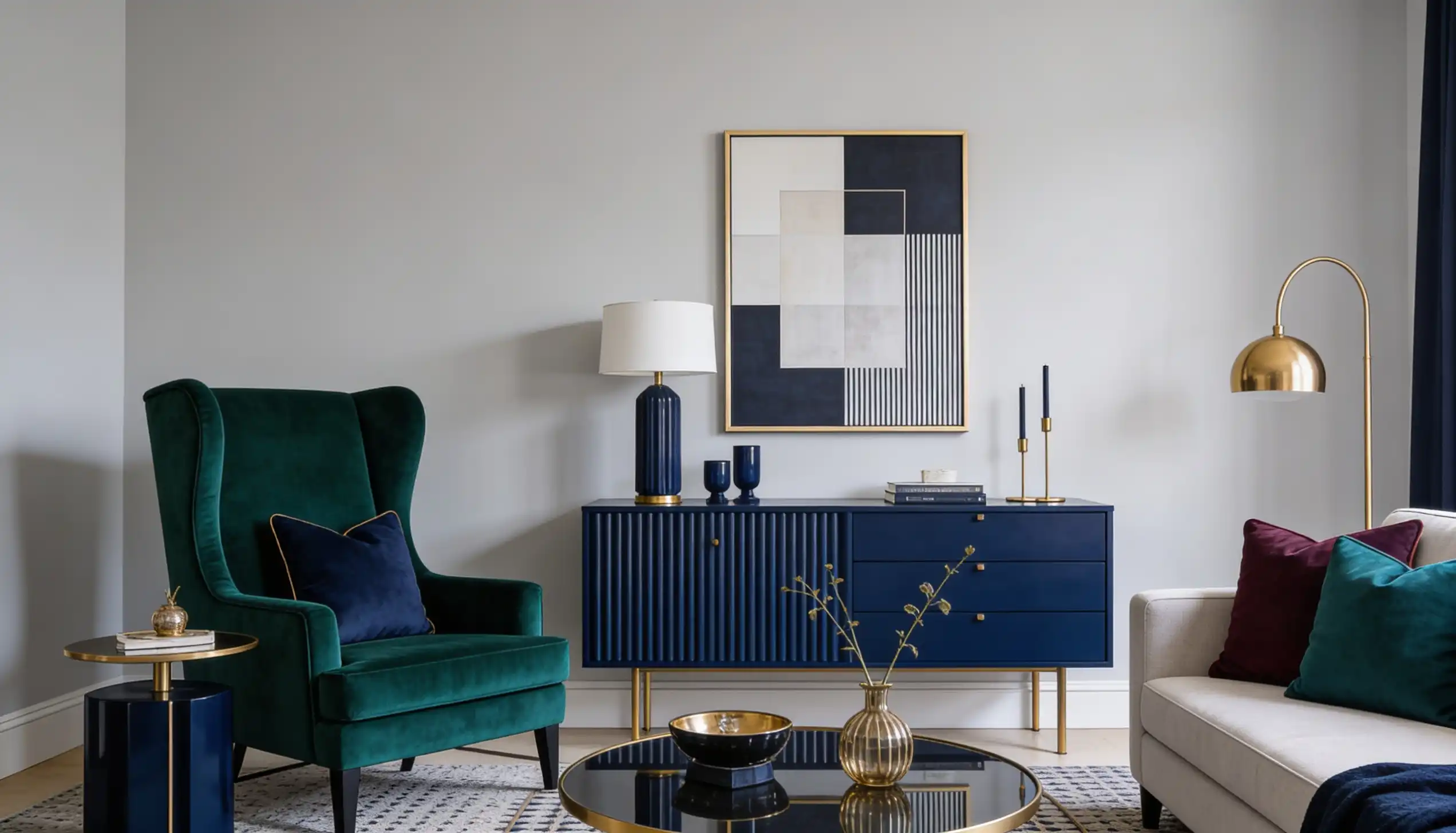
This one is for those who love a little personality. Use the color as your base and bring in deep navy, rich emerald, or warm terracotta as statement pieces.
A bold sofa or a set of accent cushions is all you need. The neutral walls keep the color in check without letting it take over the room.
Before You Paint: What to Test
Before you commit to a full paint job, always test a paint swatch on a small section of the wall first.
Watch how it looks in both natural and artificial light throughout the day.
North-facing rooms tend to bring out its slightly cooler side, while south-facing rooms keep it looking warm and fresh.
Think about your existing furniture and flooring, too. If you have warm wood tones or cream upholstery, the color will sit beautifully alongside them.
For trims, Sherwin-Williams Alabaster or Extra White both work really well. Alabaster reads warmer; Extra White is crisper — choose based on whether you want the room to feel cozy or clean.
Start with your largest wall, see how it feels, and build the rest of your color choices around it.
End Note!
Agreeable Gray works because it doesn’t ask for attention. It just makes whatever you put next to it look more considered.
That’s a harder thing to achieve than it sounds.
Grab a swatch, put it on your wall, and check it at different points in the day.
It won’t look the same at 8am and 6pm — and that’s the version you’re actually living with.
Share how your Agreeable Gray living room turned out in the comments (especially if the lighting surprised you).
Frequently Asked Questions (FAQs)
1. Is Agreeable Gray a Good Choice for Rented Spaces?
Yes. It’s a safe, neutral shade that appeals to most people and works well across many different interior styles.
2. Is Agreeable Gray too Dark for a Small Living Room?
Not at all. With an LRV of 60, it reflects enough light to keep smaller spaces feeling open and comfortable.
3. How Many Coats of Agreeable Gray Do I Need?
Typically, two coats give the best, most even result. Always apply a good primer coat before painting for better coverage.


