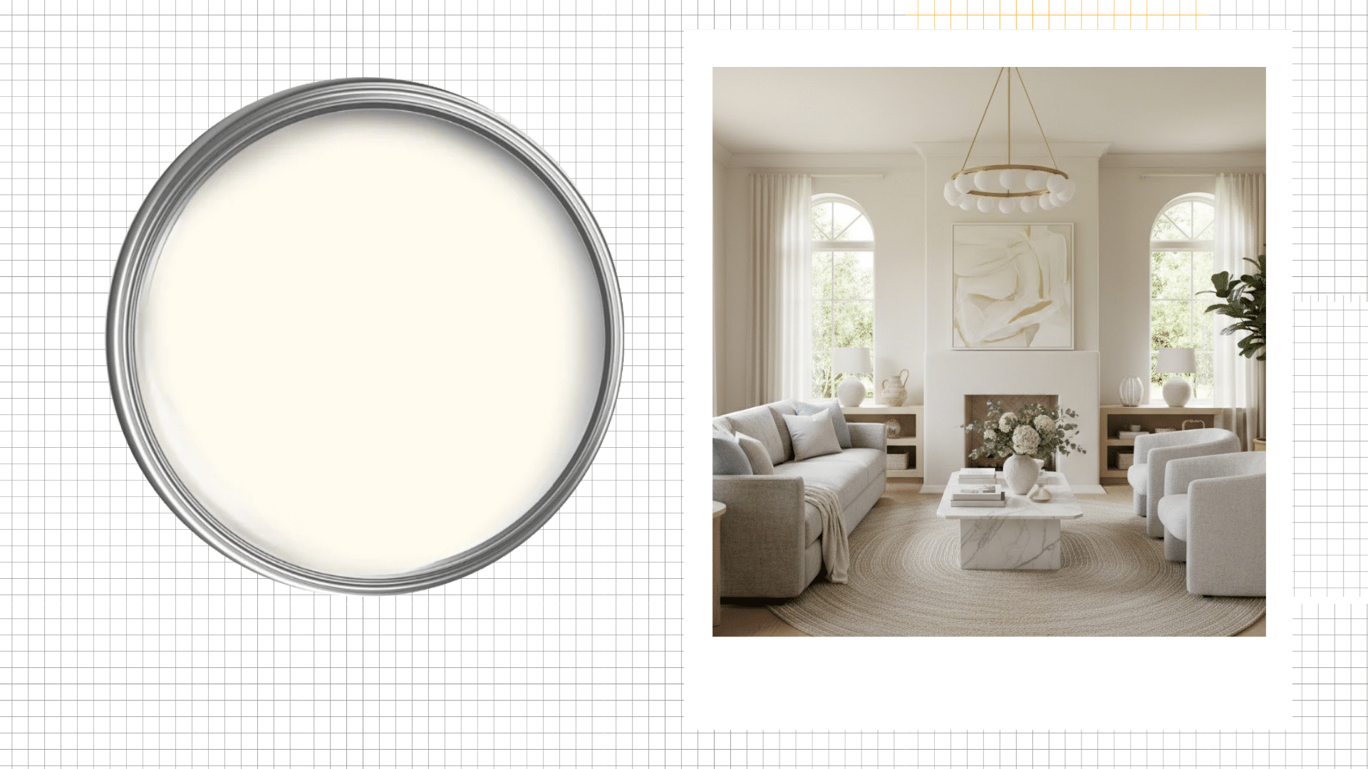
")
The first time Urbane Bronze was used on an exterior, it was a real learning experience.
The sample card looked great, but once it was applied to the siding, the color looked completely different. This color transforms outside in ways it never does indoors.
Sunlight brings out different tones!
The roof, landscaping, and even neighboring houses all play a role in how it looks.
Unlike interiors, Urbane Bronze in the exterior responds to its surroundings, so testing it first is absolutely essential.
I have broken down where it shines, what to consider, and how to use it successfully on your exterior.
Using Urbane Bronze Sherwin-Williams on Your Home’s Exterior
SW Urbane Bronze is one of those colors that stands out once it’s on a house.
After using this shade on multiple homes, I’ve learned one thing for sure:
It behaves differently every hour of the day. It shifts with the light, reacts to its surroundings, and honestly, it has a bit of personality.
And that’s exactly why it works.
Technically, it’s a neutral, but it sits way deeper than standard beige or taupe.
Think somewhere between brown and gray, so it fits into different home styles without getting stuck in one lane.
Describing the Color
At the base, it’s a grounded brown gray neutral.
Look closer, though, and green undertones start showing up, along with some warmth hiding underneath.
The Light Reflectance Value is low, so it’s not bouncing light back at you. It holds onto it instead.
That’s where the depth comes from.
Morning sun pulls out those green notes, afternoon light warms everything up, and evening shadows make it feel richer.
With an LRV of 8, this color absorbs significantly more heat than lighter shades. On south and west-facing walls that get afternoon sun, that’s worth factoring into your material choice before you commit.
Color Characteristics
| Category | Details |
|---|---|
| Color Code | SW 7048 |
| Color Family | Neutral / Dark Greige |
| General Description | Deep brown-gray neutral with earthy, charcoal-like depth |
| Light Reflectance Value (LRV) | 8 |
| RGB Values | 84 / 80 / 74 |
| HEX Code | #54504A |
| Primary Undertones | Brown, gray, subtle green |
| Warm or Cool | Warm-leaning neutral |
Why People Keep Choosing it for Exteriors
This was Sherwin-Williams Color of the Year back in 2021, and homeowners are still reaching for it on exteriors because it doesn’t box you into one style.
- Modern homes love how sharp it reads
- Farmhouse builds get the depth without things feeling cluttered
- Contemporary designs use it for weight without changing their whole direction
Something that helps: mix in lighter tones and natural textures like stone accents, wood details, and soft white trim. It keeps the exterior from feeling closed off.
How Urbane Bronze Actually Looks Outside
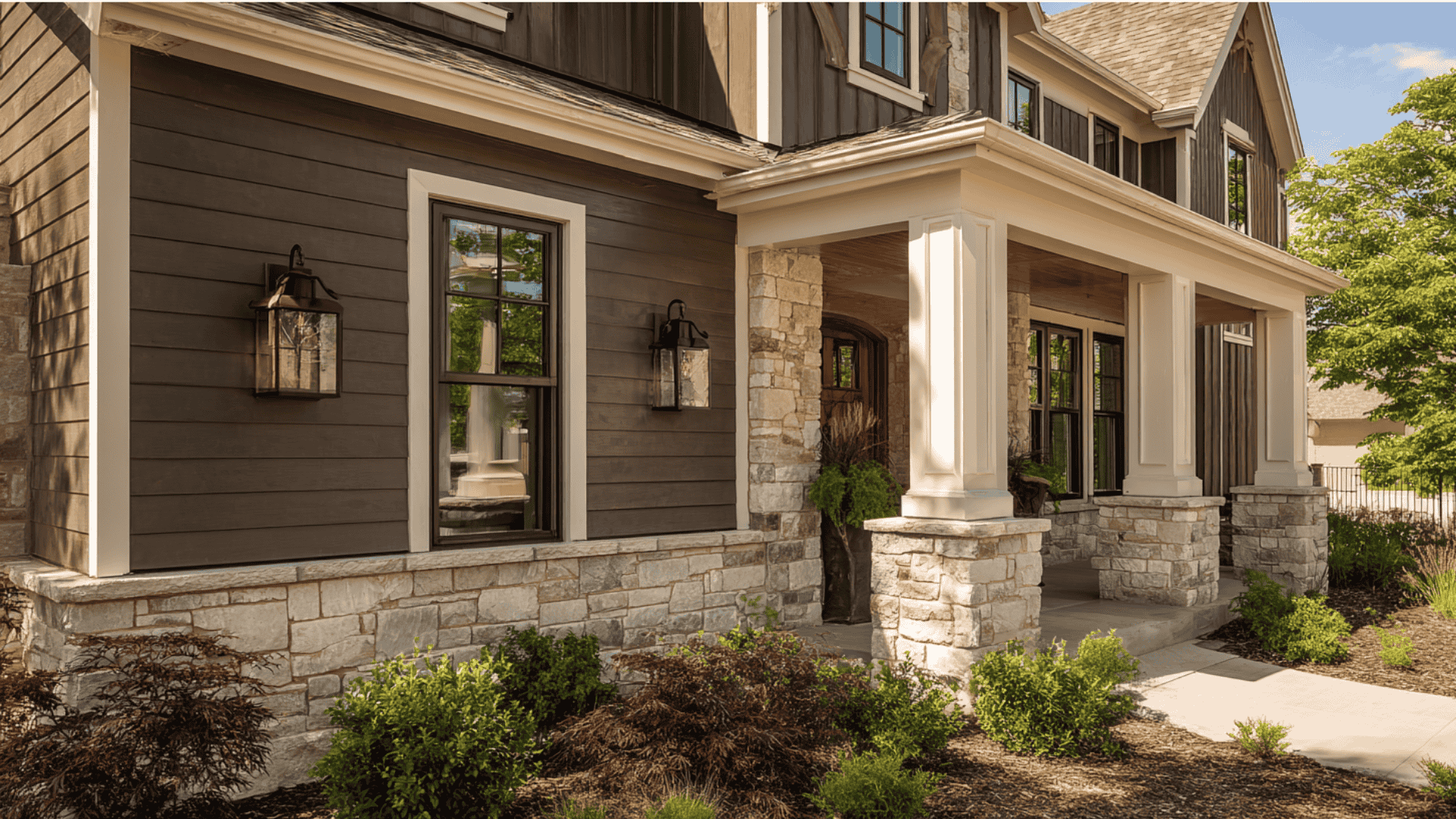
You don’t need Urbane Bronze covering every surface for it to work.
Be selective about placement. Some spots handle this kind of depth better than others. It reads as a brown-based neutral with subtle green undertones that shift depending on the light.
Direct sun brings out warmth and bronze tones, while shade pulls it cooler and grayer.
Light Changes Everything Here
Full sun most of the day!
This color reads warmer and richer. Brown tones step forward; everything feels grounded.
Partial shade or north-facing walls?
Green undertones start creeping in. I’ve seen it look almost olive on homes that don’t catch much direct light.
Not bad, just unexpected!
Quick tip: Paint test patches on both the sunny and shaded sides. Two completely different reads on the same color.
Is Urbane Bronze Right for Your Climate?
Climate affects how the Urbane Bronze performs.
1. Hot Climates
Dark colors absorb heat.
In hot, sunny regions (the Southwest and Southern states), Urbane Bronze siding becomes noticeably warm, which can warp vinyl siding.
Vinyl siding generally starts showing heat stress when surface temperatures exceed 160°F.
Dark colors in full southern sun can get there faster than you’d expect. If your siding is vinyl, check the manufacturer’s heat tolerance before committing to full coverage.
What helps: Heat-reflective paint, lighter roof colors, or using Urbane Bronze on trim and doors instead of full siding.
2. Snow Heavy Climates
Urbane Bronze looks sharp against snow.
The contrast is clean, making homes in snowy regions (Northeast, Mountain West) handle this color beautifully.
Watch for: Salt and road spray can dull the finish. Regular spring washing maintains the richness.
3. Coastal Climates
Salt air and intense sun are tough on dark exteriors.
The color fades faster in coastal areas without proper prep and UV-resistant paint.
What helps: Marine grade exterior paint, annual washing to remove salt, and semi-gloss or high-gloss sheens that hold up better.
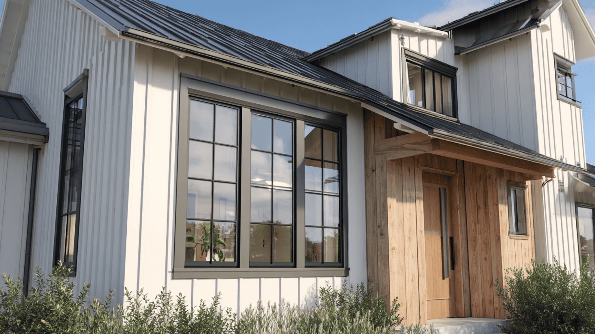
Where Urbane Bronze Works Best on the Exterior
You don’t have to cover your entire house in Urbane Bronze to make it work outside better when you’re selective, actually.
Some spots handle this depth beautifully, while others just don’t.
1. Full Exterior Siding
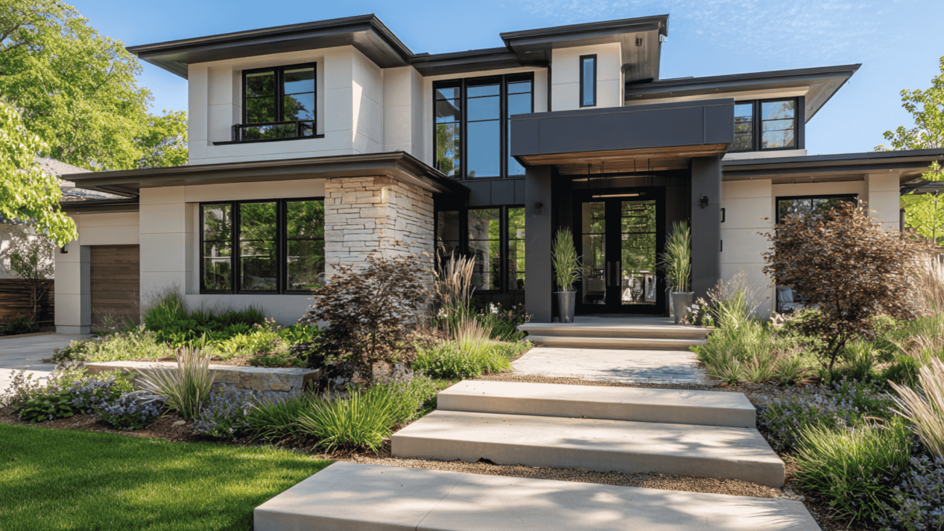
Full siding is where I’ve seen this color make the biggest statement.
Modern homes with clean lines love this color: flat panels, minimal trim, oversized windows.
The simplicity lets the richness shine, farmhouse styles handle it beautifully with white trim and lighter roofs, and contemporary builds with mixed materials make the textures feel intentional.
Thinking, why does it work for full siding?
- Creates dramatic curb appeal without feeling aggressive
- Grounds modern architecture, adds warmth to farmhouse styles
- Makes landscaping and natural materials pop
Watch your roof color: A dark roof and dark siding feel like too much weight. A lighter roof (warm gray, tan, soft brown) gives the house breathing room.
2. Front Doors
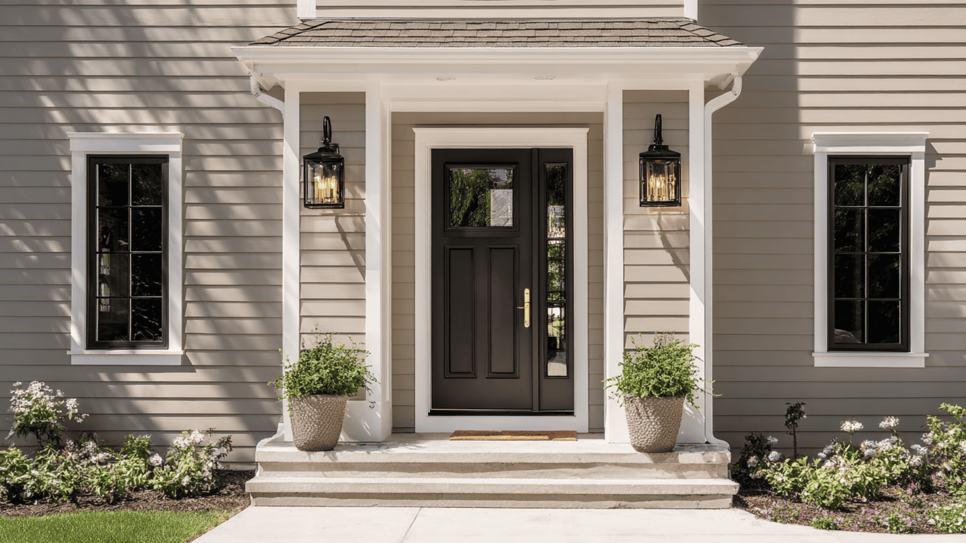
Easiest, lowest risk way to use the color.
Compared to black, it feels softer. Compared to charcoal, it’s got more personality.
Having a thought about which might be the best sheen? Semi gloss or high-gloss. Doors take a beating, and glossy finishes hold up better.
3. Trim, Shutters, and Accents
Using Urbane Bronze as an accent is smart!
Works as trim against light siding, shutters next to white walls, and even garage doors.
Why accents work:
- Adds depth without committing to full dark coverage
- Creates visual interest and breaks up monotonous exteriors
Catch?
Don’t overdo it. Saw a house where trim, shutters, and garage were all Urbane Bronze with siding only slightly lighter.
Everything mushed together. No contrast, no definition.
Formula that works: Dark accents? Light siding. Dark siding? Light accents.
4. Garage Doors
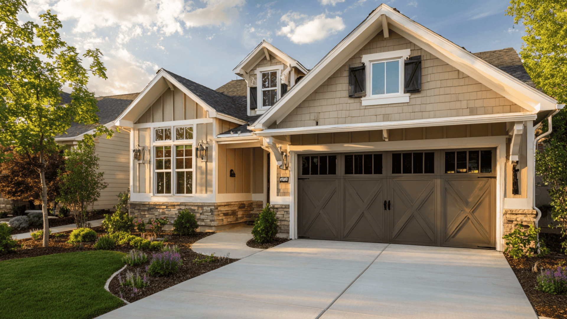
Garage doors are often overlooked when it comes to this Sherwin Williams color.
Most people default to white or beige.
But a garage door is huge visual real estate, and painting it Urbane Bronze can shift how the whole exterior reads. Works especially well when the garage faces the street.
The garage went from eyesore to anchor. The owner said it was the best decision on the renovation.
5. Porch Ceilings and Soffits
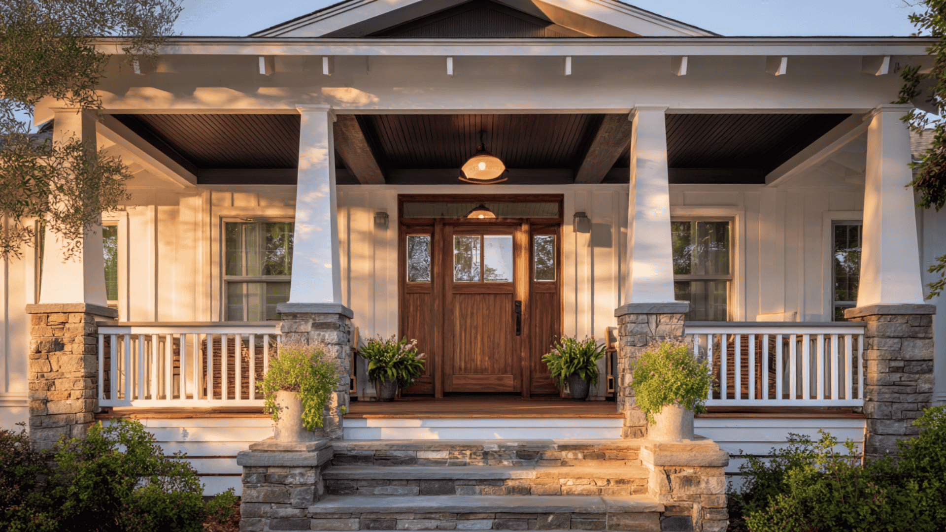
Porch ceilings are a sneaky good spot for using Urbane Bronze in the exterior.
The dark porch ceiling creates a sheltered, enclosed feeling, making the porch feel like an actual room. Looks especially good with white or cream posts and railings.
Painted a deep front porch ceiling in Urbane Bronze on a craftsman bungalow once.
White posts, white railings, dark ceiling. The porch felt like a room you wanted to hang out in.
Pros and Cons of Using Urbane Bronze Exterior
Every exterior color has trade offs.
| Pros | Cons |
|---|---|
| Works across modern, farmhouse, and contemporary styles | Needs strong natural light to avoid looking flat |
| Hides dirt and minor wear better than lighter colors | Requires more coats for even, full coverage |
| Pairs well with warm whites, stone, and natural materials | Clashes with cool grays and blue-toned stone |
| Flexible works as full siding or accent (doors, trim) | Fades faster in harsh sun without UV protection |
Urbane Bronze Coordinating Colors for Exterior
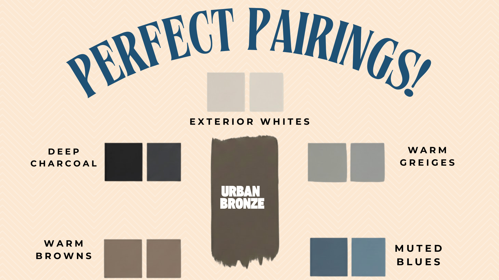
Urbane Bronze in exteriors doesn’t work in isolation.
It needs supporting colors that either create contrast or blend softly, depending on the look you’re going for.
1. Exterior Whites
Clean whites create the sharpest contrast with the Urbane Bronze exterior, but they need warmth to avoid clashing with those green undertones.
Sherwin Williams: Greek Villa (SW 7551)
Greek Villa is the warm White with just enough cream. Used this on trim for a modern farmhouse, and the contrast was clean without feeling harsh.
Benjamin Moore: Simply White (OC-117)
Simply White is the crisp White that still reads warm in natural light. No blue cast outdoors, which makes it perfect next to the Urbane Bronze.
Behr: Ultra Pure White (PPU18-06)
Pure White is bright but not stark. Handles full sun well and creates definition without overwhelming darker siding.
2. Warm Greiges
If stark whites are too strong, warm greiges offer a softer alternative.
These work as secondary siding or when paired with natural stone.
Sherwin Williams: Shoji White (SW 7042)
Shoji White is barely there but still creates a sense of separation. Let the darker color be the star without competing with it.
Benjamin Moore: Pale Oak (OC-20)
Pale Oak is like Light greige that feels organic next to Urbane Bronze. Bridges trim and siding without adding visual noise.
3. Muted Blues
Muted blues complement Sherwin Williams Urbane Bronze, especially on traditional homes.
They add personality without clashing!
Sherwin Williams: Smoky Blue (SW 7604)
Smoky Blue is the soft blue gray that feels classic on shutters. Paired this with Urbane Bronze on a colonial, and it looked like it had been there for decades.
Benjamin Moore: Boothbay Gray (HC-165)
Boothbay Gray reminds me of a coastal blue that works anywhere. Muted enough to feel sophisticated, not beach-themed.
4. Warm Browns
When your exterior has wood beams, cedar, or warm stone, these tie everything together seamlessly.
Sherwin Williams: Anew Gray (SW 7030)
Anew Gray is the warm, greige brown that bridges Urbane Bronze and natural wood. Works well with warm brown or tan roofs.
Behr: Toasty Gray (N320-2)
Toasty Gray is perfect when you want the exterior to feel cohesive with natural materials.
Just warm and inviting!
5. Deep Charcoal
Deep charcoals give contrast without going full black. They add weight and definition while staying modern.
Sherwin Williams: Peppercorn (SW 7674)
Peppercorn reads almost black in some light but stays softer. Used on garage doors with Urbane Bronze siding, created just the right drama.
Benjamin Moore: Kendall Charcoal (HC-166)
Kendall Charcoal is the deep gray for shutters or metal accents. Bold but not harsh.
Behr: Carbon (N520-6)
Carbon is like warm charcoal that avoids coldness. Layers well with Urbane Bronze without competing.
Common Mistakes With SW Urbane Bronze Exterior
Some mistakes keep showing up.
1. North facing homes without contrast
- I painted a north facing house in full Urbane Bronze once, without adding any contrast, and the color just looked flat and lifeless in the shade.
- Ended up going back and adding crisp white trim to save the whole project.
2. Pairing with cool gray stone or concrete
Paired Urbane Bronze exterior with cool gray stone on a modern build, and the green undertones clashed so badly that the whole thing looked muddy
The blue gray materials fought with the warmth in the paint, and nothing looked right
Rescue tip: If you’re stuck with cool materials, add warm wood accents or switch to warmer trim colors to bridge the gap
3. Skipping large test patches
- Had a client skip the test patch completely because they loved it online, went straight to painting the full exterior, then panicked three days later when it looked totally different in real sunlight
- It costs way more to fix than it would to test first
4. Choosing the wrong sheen
Used flat sheen on Urbane Bronze exterior siding early in my career, and it showed every single imperfection, plus it started looking chalky after one season.
Also tried semi gloss on full siding once, and it looked way too plasticky and reflective.
Rescue tip: If sheen’s wrong, you’ll likely need to repaint, but adding a clear protective topcoat in the right sheen can sometimes help flat finishes hold up better
Best Sheen for Urbane Bronze Exterior Surfaces
Sheen matters more than most people think, especially with dark colors like this.
The wrong finish can make the color look flat or too reflective, and it affects how well the paint holds up over time.
1. Siding
Satin is the go to for siding.
Durable, easy to clean, just enough sheen to catch light without looking shiny. Hides minor imperfections better than flat and doesn’t show dirt as easily.
Flat can work for a super matte look, but it’s harder to maintain and shows every scuff, handprint, and water stain.
Dark colors fade faster in direct sunlight.
High quality exterior paint with UV protection is worth the extra money. I’ve seen cheap paint turn chalky after one summer, and repainting an entire exterior isn’t cheap.
2. Doors
Semi gloss or high gloss for doors?
Both wipe down easily, withstand the weather, and make the color look richer. Doors take constant abuse from hands, keys, packages, and weather, so durability matters here.
Semi gloss is classic!
Works on traditional and modern homes without looking out of place.
High gloss is more modern and dramatic. Gives the door a polished, almost jewel-like finish that really makes it pop.
3. Trim
Satin or semi gloss both work for trim, depending on how much contrast you want.
- Satin – Softer, more understated. Blends with the siding while still creating definition. Good choice if you want the trim to frame the house without stealing focus.
- Semi gloss – More punch, stands out against siding. Creates a sharper contrast and makes architectural details more noticeable. Works well on homes with interesting trim work you want to highlight.
If your siding is satin, matching the trim sheen creates a cohesive look.
If you want more dimension, bump the trim up to semi-gloss.
Think about the look you want and go from there. The sheen you choose affects how the entire exterior looks, so it’s worth getting right.
Interior Vs Exterior
How does Urbane Bronze Change?
| Aspect | Interior | Exterior |
|---|---|---|
| Light | Controlled, consistent | Natural, constantly shifting |
| Undertones | Green stays subtle | Green is much more visible |
| How It Reads | Darker, moodier | Lighter in the sun, shifts all day |
| Best Spots | Accent walls, bedrooms | Siding, doors, trim |
| Pairs With | Soft whites, dark woods | Warm whites, stone, brick |
| Sheen | Eggshell or satin | Satin (siding), semi-gloss (doors) |
| Challenge | Keeping rooms bright enough | Managing color shifts |
Exterior application also has a narrower application window than interior.
Most exterior paints need surface temperatures between 50°F and 90°F to cure properly. Painting in direct afternoon sun on a hot day can cause the surface to dry too fast and affect adhesion.
Wrapping Up
An Urbane Bronze exterior can transform a house’s look, but only when you work with how the color actually behaves.
My old mentor used to say, “Paint doesn’t live on a chip, it lives on the house.”
Took a few failed projects to really get what that meant.
This color shifts with light, reacts to surroundings, and needs the right supporting cast to shine.
Test it on your actual siding. Check it over a few days in different lights.
If it still feels right after living with it? That’s your answer.
Frequently Asked Questions
1. Can Urbane Bronze be Used on Vinyl Siding or Only on Wood?
Works on both vinyl and wood, but vinyl requires specialized exterior paint formulated for plastic surfaces to prevent peeling.
2. How does Urbane Bronze Hold up In Coastal Climates with Salt Air?
Holds up well with high-quality exterior paint and proper prep, but needs periodic washing to prevent salt buildup that can dull the finish.
3. Does Urbane Bronze Work on Brick or Stone Exteriors, or Just Siding?
Works beautifully on brick when properly primed, but painted brick is permanent; you can’t easily go back to natural brick.
4. How Often Does the Urbane Bronze Exterior Need Repainting?
Typically, every 7-10 years, with quality paint, similar to lighter colors, but fading may show slightly sooner in harsh sun.
5. Can Urbane Bronze be Used on Stucco Exteriors?
Yes, works great on stucco and actually highlights the texture beautifully, but surface prep and primer are critical for proper adhesion.