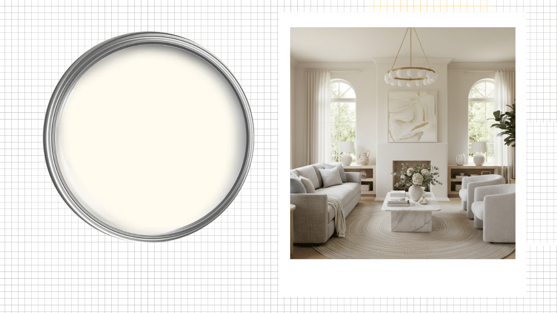


Benjamin Moore Santorini Blue shows up on every “best blue paints” list you’ll find. But does it actually deliver in your home?
I wondered the same thing before testing it myself. And what I learned about this popular shade was unexpected.
This color shifts dramatically based on light, pairs beautifully with whites and grays, and creates a serene mood that’s hard to beat.
Want to know if it’s right for your space? Keep reading for the full breakdown.
What Color is Santorini Blue?
Santorini Blue (HC-151) is a soft, muted blue with distinct gray undertones.
The hex code is #A7B9BE, placing it firmly in the blue-gray family. Its Light Reflectance Value sits at 48, meaning it reflects nearly half the light that hits it.
This medium LRV prevents rooms from feeling too dark or too bright.
This color has earned its reputation for good reasons. After working with this color extensively, I’ve identified what makes it stand out from other blues on the market.
1. Undertones
The color sits perfectly between warm and cool.
Gray undertones keep it from looking too tropical or bright. You won’t get that overpowering blue that screams for attention.
Instead, it whispers poise while maintaining enough depth to feel intentional and purposeful in any space.
2. Light-Responsive Nature
Natural light transforms this shade throughout the day.
Morning sun brings out its softer side, while afternoon light reveals richer tones. Evening artificial light keeps it calm and restful.
This quality means your walls never look flat or one-dimensional, creating visual interest without busy patterns.
3. Pairs Well with Neutrals
White trim makes the blue pop beautifully. Gray accents complement its cool undertones perfectly.
Beige and cream also work surprisingly well, softening the overall look.
The color plays nicely with various decorating styles, from coastal to contemporary, making it a flexible choice for different design directions.
4. Medium Saturation Level
It’s not too bold, not too pale.
The saturation hits a sweet spot that feels present without cluttering. You get enough color to make a statement while maintaining a livable, everyday quality.
Guests notice it immediately, but you won’t tire of looking at it after years of living with it daily.
5. Works in Multiple Rooms
Bedrooms benefit from its calming properties. Bathrooms feel spa-like and clean.
Living spaces gain a collected, thoughtful atmosphere. Even kitchens can handle this shade when paired with white cabinets.
The adaptability across different room types makes it a smart investment for whole-home color schemes.
Using Benjamin Moore Santorini Blue in Real Homes
This color adapts beautifully to different rooms when applied thoughtfully.
I’ve tested this color in various spaces and watched it perform in homes of friends and family, too.
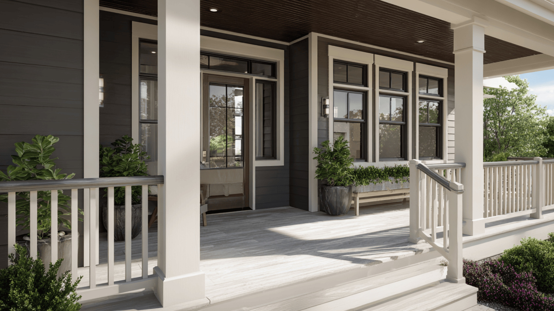
1. Porch
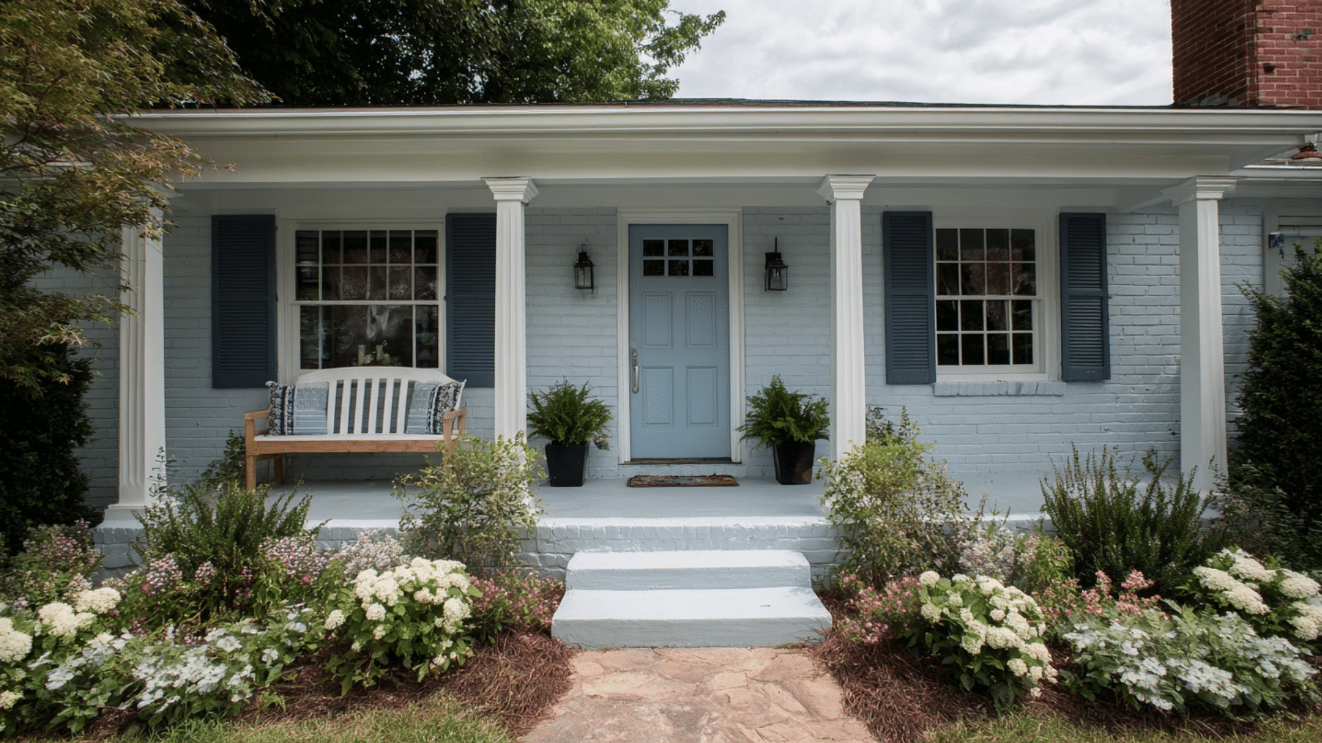
Covered porches benefit from the color’s calming presence immediately.
The color handles humidity and temperature changes better than darker shades. It reflects enough light to keep spaces bright during daytime hours.
The blue-gray tone feels fresher than standard porch colors without being too bold or tropical.
2. Entryway

First impressions matter, and this color sets the tone right away.
The color welcomes guests without overdoing small entry spaces. I used this shade in my entryway last year, and it makes the space feel larger than it actually is.
Good lighting is essential here to prevent the space from feeling dim.
3. Living Room
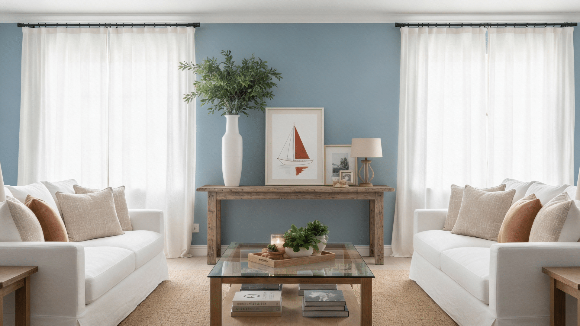
Living rooms painted in Santorini Blue by Benjamin Moore feel collected and intentional.
The color provides a calm backdrop for furniture and artwork without disappearing completely.
My sister used it in her living room with cream sofas and wood accents. The result looks pulled together and relaxing.
Tip: Paint all four walls for a cohesive look rather than just an accent wall.
4. Kitchen
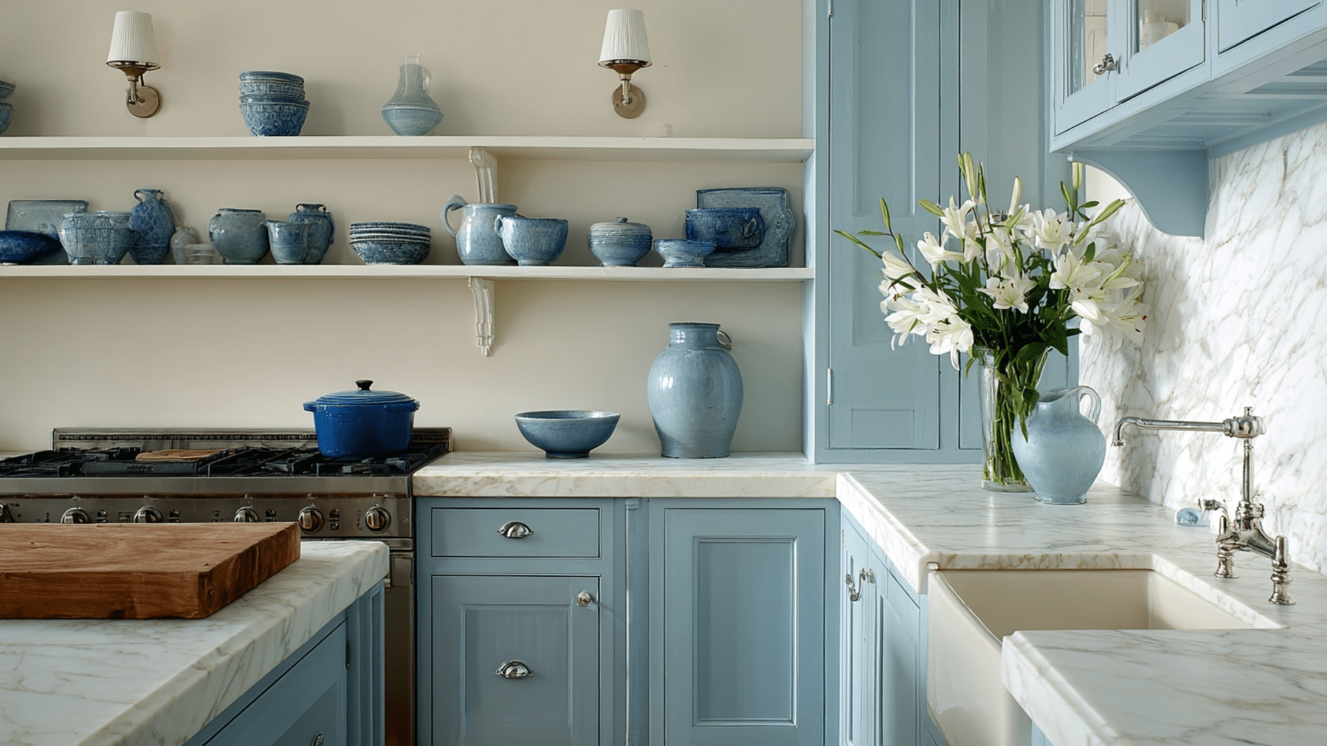
Kitchens gain a fresh, clean feeling with this Blue on the walls. It works surprisingly well with warm wood tones, too.
I’ve seen this combination at my friend’s house, and it changed a standard kitchen into something special.
The medium LRV keeps the space from feeling too dark while adding enough color to make it interesting.
5. Bathroom
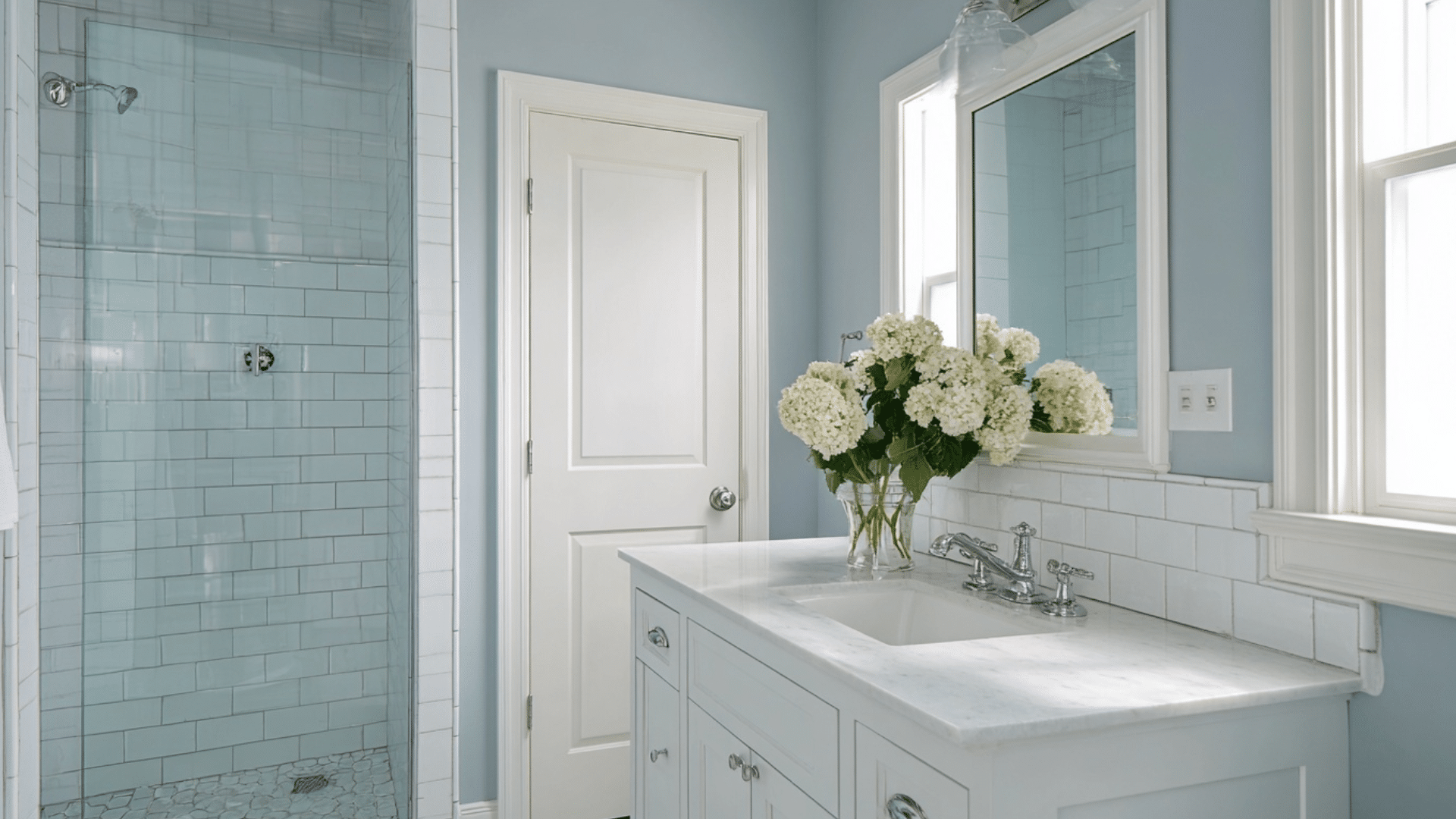
Bathrooms become spa-like retreats when painted in this shade.
The color handles moisture well and creates a calming atmosphere for morning and evening routines. White fixtures and chrome hardware complement the cool undertones perfectly.
The color hides minor water spots better than pure white walls do consistently.
Tip: Use semi-gloss or satin finish in bathrooms for easier cleaning and moisture resistance.
6. Home Office
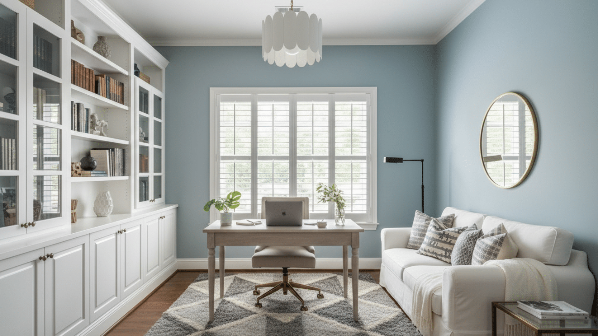
Home offices need focus without feeling cold, and Santorini Blue delivers both qualities.
The color stays calm enough to avoid distraction during long work sessions. White built-in shelving or a desk pops against these walls beautifully.
The tone makes video calls look professional without requiring special backgrounds or adjustments.
7. Bedroom
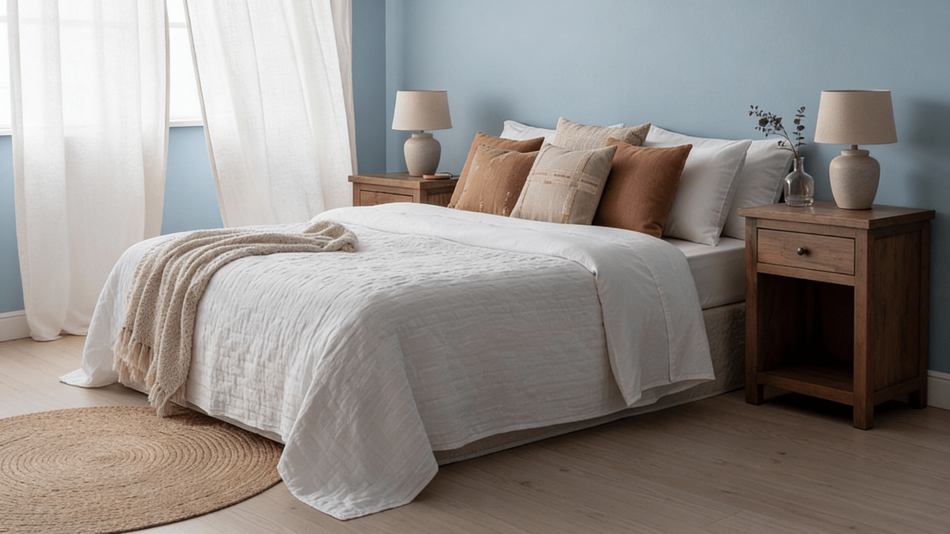
Bedrooms painted in Benjamin Moore Santorini Blue lead to relaxation and better sleep quality.
The color’s gray undertones prevent it from feeling too stimulating before bedtime. I painted my guest bedroom this shade, and visitors always comment on how restful it feels.
The medium tone works well whether you prefer light or dark window treatments for coverage.
Pros and Cons
Like any paint color, this color has its strengths and weaknesses.
The following is an honest look at what works and what doesn’t.
| Pros | Cons |
|---|---|
| Works beautifully in both natural and artificial light | Can look dull in rooms with limited windows |
| Complements a wide range of design styles | May feel too cool for those preferring warm tones |
| Creates a calming, spa-like atmosphere | Requires a quality primer for even coverage |
| Versatile enough for multiple rooms | Not bold enough if you want a statement wall |
| Medium LRV prevents extreme light or dark appearance | Can read as gray rather than blue in certain lighting |
| Timeless color that won’t feel dated quickly | Two coats minimum needed for proper color depth |
| Suitable for both modern and traditional spaces | May clash with warm yellows or orange undertones |
Trim Colors that Complement Benjamin Moore Santorini Blue

I’ve tested various combinations, and these seven options bring out the best in this go to shade.
1. Nebulous White – Sherwin-Williams 7063
This soft taupe trim brings unexpected warmth to the blue walls.
Cravat’s neutral quality prevents the space from feeling too cold or sterile. It’s an excellent choice when you want something different from standard white trim but still need versatility and broad appeal
2. White Sand – Benjamin Moore 964
The creamy warmth in White Sand softens this color’s gray undertones perfectly.
This combination feels beachy and relaxed without being too themed. It works especially well in bedrooms and living areas where you want a soothing vibe.
The subtle contrast adds dimension while keeping everything feeling light and airy throughout.
3. Distant Gray – Benjamin Moore OC-68
Gray-on-gray might sound boring, but this pairing is anything but. Distant Gray’s slightly warmer tone creates subtle definition against the blue.
Your trim doesn’t compete for attention, letting the wall color shine while adding just enough visual separation to define architectural features cleanly.
4. Repose Gray – Sherwin-Williams 7015
Repose Gray shares similar undertones with the Blue, creating seamless visual flow.
This greige trim adds subtle definition without harsh lines or jarring contrast. It works especially well when you want a sophisticated look that doesn’t rely on stark white for architectural interest.
5. Providence Blue – Benjamin Moore 1636
Using Providence Blue as trim creates a tonal, layered look with the blue walls.
The darker blue adds depth without introducing new colors into the scheme. This monochromatic approach feels intentional, perfect for modern spaces.
The combination keeps things calm while adding architectural interest through subtle contrast and variation
6. Accessible Beige – Sherwin-Williams 7036
This warm beige trim softens the blue’s cool nature considerably.
Accessible Beige adds an earthy quality that makes spaces feel more grounded and livable. The combination with creates a relaxed atmosphere without sacrificing style
7. White Dove – Benjamin Moore OC-17
White Dove offers a soft look that complements the blue’s cooler undertones perfectly.
This popular trim color has just enough cream to feel inviting without looking yellow. It’s my top recommendation for those wanting a foolproof combination that feels fresh and clean
8. Pure White – Sherwin-Williams 7005
Pure White provides the crispest, cleanest contrast with the Blue available. This bright white has minimal undertones, creating sharp architectural definition throughout the space.
The pairing feels fresh and contemporary, working in both minimalist and traditional settings.
Furniture to Pair with Santorini Blue
I’ve experimented with different styles and materials to find what truly works with this shade.
Natural Wood Furniture
Light oak and maple bring warmth that balances the cool wall color beautifully. Walnut and cherry add richness without overwhelming the space.
Natural finishes feel grounded and timeless, preventing the room from looking too cold or uninviting overall.
White Upholstered Pieces
Crisp white sofas and chairs create a fresh, airy feel against the blue walls.
The contrast is clean without being harsh or jarring. Linen and cotton fabrics add texture that keeps the look from feeling cold.
This combination works particularly well in living rooms and bedrooms where you want a light, breathable atmosphere.
Gray Velvet Seating
Soft gray velvet creates a luxurious monochromatic scheme.
The plush texture adds depth to the cool color palette. Charcoal to light gray works equally well, depending on your desired mood.
This pairing feels modern and collected, giving rooms an upscale boutique hotel vibe without trying too hard to impress.
Rattan and Wicker Pieces
Natural rattan brings coastal vibes without being too themed or obvious.
The woven texture adds an element to cool blue walls. These materials work brilliantly in sunrooms, bedrooms, and casual living spaces.
The combination feels relaxed and approachable, creating spaces where people actually want to sit and spend time comfortably.
Black Metal Accents
Matte black metal furniture creates a striking contrast against the Blue. Industrial-style pieces add edge to the otherwise soft color.
Coffee tables, chairs, and shelving units in black metal ground the space beautifully.
This combination works well in modern and transitional homes where you want a collected, curated look with personality.
Mid-Century Modern Wood Pieces
Teak and walnut furniture from the mid-century era complement Santorini Blue perfectly.
Tapered legs and minimal ornamentation let the wall color shine.
This combination feels both retro and contemporary, creating spaces that look collected over time rather than decorated all at once.
Santorini Blue 1634 vs. Similar Benjamin Moore Blues
This color often gets compared to other popular Benjamin Moore blues.
I’ve swatched and tested these similar shades to show you how they actually differ in real-world conditions.
| Color | Best Use Cases | Preview |
|---|---|---|
| Breath of Fresh Air 806 | Small spaces needing brightness, powder rooms, nurseries | 
|
| Shark Gray 2134-40 | Dining rooms, accent walls, and spaces with ample natural light | 
|
| Smoke 2122-40 | Home offices, master bedrooms, cozy reading nooks | 
|
| Silver Marlin 2139-50 | Kitchens, coastal-themed spaces, casual living areas | 
|
| Stonington Gray HC-170 | Whole-home color, hallways, spaces needing a neutral backdrop | 
|
| Gossamer Blue 2123-40 | Feature walls, powder rooms, spaces wanting bold statements | 
|
What to Avoid While Working With Santorini Blue
Not everything pairs well with this tricky color, and I learned this through trial and error.
The following are combinations and elements that clash or diminish this color’s natural beauty.
Orange and Rust Accents
Warm orange tones fight against this Blue’s cool undertones constantly. The colors compete rather than complement each other.
Rust-colored pillows or artwork create visual tension that feels uncomfortable. Your eyes don’t know where to focus.
Yellow-Toned Lighting
Incandescent bulbs with strong yellow casts turn the Blue muddy and gray.
The cool blue needs neutral or slightly cool light to shine properly. Warm lighting kills the color’s freshness completely.
Your walls end up looking dull and lifeless instead of calm and refreshing.
Heavy Dark Wood Furniture
Espresso and dark mahogany furniture create a heavy, dated look against these walls. The combination feels too traditional and closed-in.
Dark woods absorb the light that blue needs to showcase its subtle beauty. The room ends up feeling smaller and darker than it actually is.
Lighter wood tones work much better overall.
Red or Pink Undertone Furniture
Burgundy, mauve, or rose-toned upholstery clashes terribly with this blue-gray shade
The warm pink undertones and cool blue undertones cancel each other. Neither color looks good, and the space feels confused.
I made this mistake with a rose-colored chair once. It looked awful, and I had to go immediately.
Gold or Brass Accents
Warm metallic gold and brass fixtures fight against Santorini Blue’s cool nature. The combination feels disjointed and confused about its style direction.
Chrome, nickel, or matte black metals work far better with this shade. Gold makes the blue look dingy and outdated.
Busy Patterned Wallpaper
Using this color in patterns or heavily decorated wallpaper overwhelms its subtle beauty.
The color works best as a solid, allowing its nuances to shine. Busy patterns turn this shade into background noise.
You lose the calming effect that makes this blue special. Keep it simple and let the color speak for itself clearly.
So, is Santorini Blue Right for Your Home?
This color works best if you’re after a calming atmosphere. It suits homes with good natural light and neutral furnishings.
Consider this shade if you:
- Want a versatile blue that works across multiple rooms
- Prefer subtle color over bold statements
- Have white or light wood trim already installed
- Enjoy cool, spa-like environments
Skip it if you:
- Love warm, cozy color palettes
- Have limited natural light in your space
- Prefer dramatic, saturated colors
- Already own warm-toned furniture
Test samples in your actual lighting before committing.
Final Thoughts
Benjamin Moore Santorini Blue adapts to different rooms, lighting conditions, and design styles with ease. You get a shade that won’t feel dated in five years.
Does it work for everyone? No. Warm-palette lovers and low-light spaces should look elsewhere
But if you want a calming, collected atmosphere with enough presence to feel intentional, this shade delivers consistently.
Ready to try it? Grab samples and test them in your actual space first and let us know what do think about the color!