

Can’t decide between Revere Pewter vs Agreeable Gray?
You’re not alone; these two neutrals confuse thousands every year.
These colors behave completely differently depending on your room’s lighting and existing decor.
I’m breaking down the real differences between them with practical application in rooms.
You’ll learn which undertones each color carries, how they respond to natural versus artificial light, and which rooms suit each shade best.
Describing the Color Shades
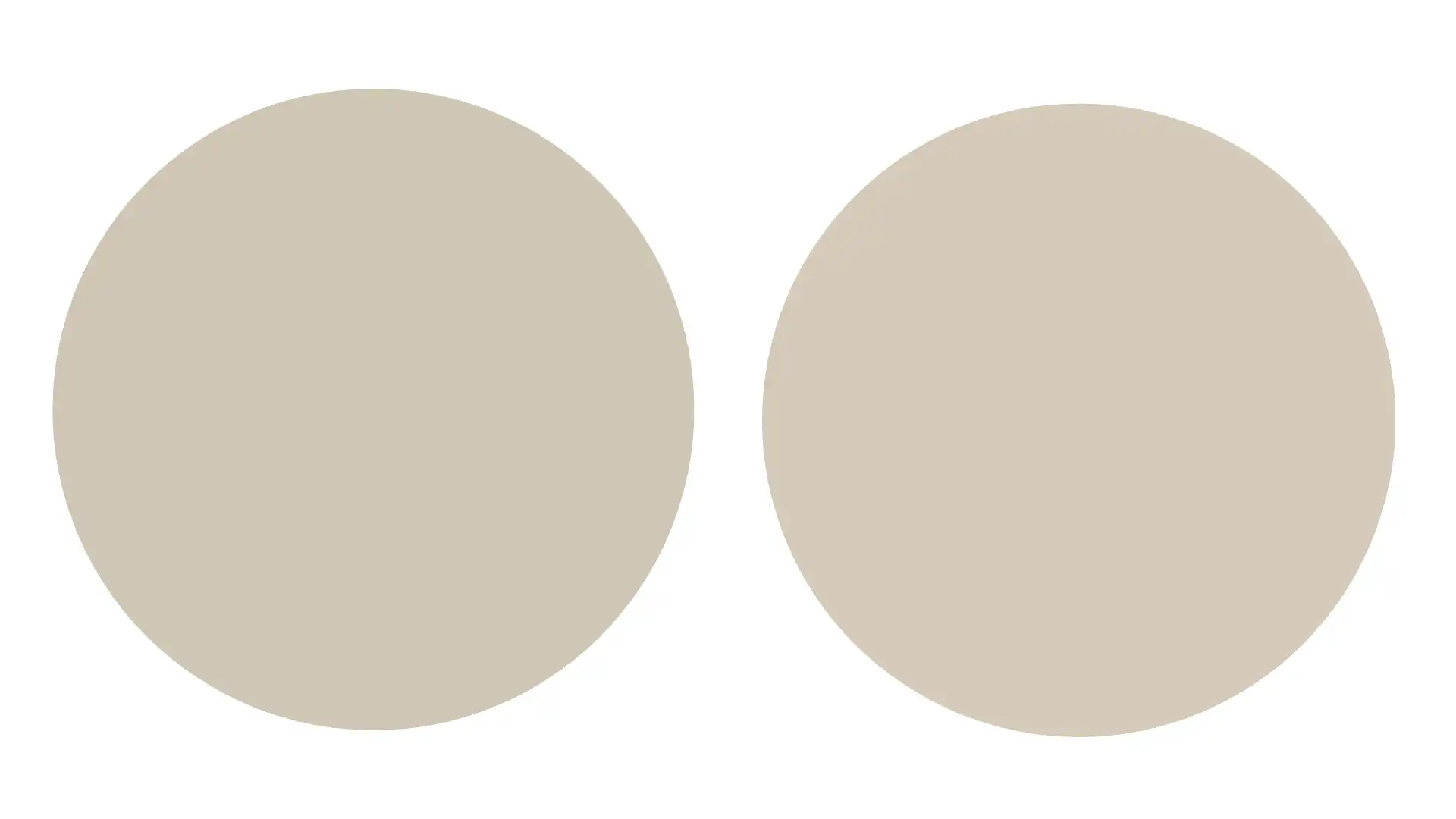
Revere Pewter (HC-172) sits between gray and beige, creating a soft greige.
It carries warm undertones with hints of green that become visible in certain lighting. The color feels light and inviting in most spaces.
Agreeable Gray (SW 7029) leans more toward true gray with beige influences. It has subtle violet and purple undertones that appear depending on your light source.
This color is cooler than Revere Pewter overall.
| Feature | Revere Pewter | Agreeable Gray |
|---|---|---|
| Hex Code | #C7C4B8 | #D1CFC7 |
| RGB Values | R: 199, G: 196, B: 184 | R: 209, G: 207, B: 199 |
| LRV | 55.51 | 60 |
| Brand | Benjamin Moore | Sherwin Williams |
| Temperature | Warm neutral | Cool neutral |
| Best Rooms | Living rooms, bedrooms | Kitchens, bathrooms |
| Lighting Response | Yellows in warm light | Grays in natural light |
If you think of designing your space with Agreeable Gray (SW 7029), then you can check out our blog on Agreeable Gray (SW 7029) Coordinating Colors.
Let’s Compare the Features of Revere Pewter vs Agreeable Gray
Let me break down how these shades compare across the features that actually matter when you’re choosing paint.
1. Undertones
Revere Pewter brings green and yellow undertones that warm up any room. These undertones peek through most noticeably in natural daylight.
Compared to other warm greiges like SW Wool Skein, Revere Pewter can be slightly more muted and earthy.
Agreeable Gray carries violet and purple undertones that lean cooler. You’ll spot these undertones in north-facing rooms, especially. This creates a softer, more neutral base.
2. Color Temperature
Revere Pewter reads as a warm neutral in most lighting conditions. This comes from those beige and yellow undertones working together.
Agreeable Gray maintains a cooler temperature overall. The gray base dominates while beige softens the coolness slightly.
3. Room Lighting Response
Revere Pewter shifts dramatically based on your light source. Morning sunlight brings out the green tones quite noticeably.
Afternoon light emphasizes the beige qualities instead. Evening artificial lighting pulls the yellow forward.
Agreeable Gray stays more consistent in different lighting. Natural light maintains its gray character without major shifts.
Artificial lighting brings out slight warmth but nothing dramatic.
4. Design Style Compatibility
Revere Pewter fits traditional and transitional design styles naturally. Farmhouse and cottage styles also love this greige shade.
It does not feel outdated, making it safe for long-term satisfaction and resale value.
Agreeable Gray suits modern and contemporary spaces better. The cooler tone supports minimalist design approaches effectively.
Scandinavian and coastal styles also pair well with it.
5. Color Consistency
Revere Pewter shows more variation between walls in the same room. Corner walls may look greener while others appear more beige.
Agreeable Gray maintains better consistency across all walls.
The color looks similar regardless of wall position or angle. This uniformity makes it feel more predictable and reliable.
Similarities Between the Two
Despite their differences, these two popular neutrals share several important qualities. That’s exactly why both colors consistently rank among the top choices.
| Feature | How They’re Similar |
|---|---|
| Neutral Base | Both are greige colors that blend gray and beige elements |
| Popularity | Consistently ranked among the most popular neutral paint colors nationwide |
| Whole-Home Use | Can be used throughout multiple rooms without feeling repetitive |
| Easy Coordination | Pair well with similar accent colors like navy, sage, and blush |
| Medium Depth | Neither too light nor too dark, sitting comfortably in the middle range |
| Natural Materials | Complement wood tones, stone, and natural textures equally well |
| Eggshell Finish | Both look best in eggshell or satin finishes for walls |
Revere Pewter vs Agreeable Gray in Every Room
Different rooms have different lighting and purposes, which changes how these colors perform.
Let’s walk through how each neutral works in specific spaces throughout the home.
Porch
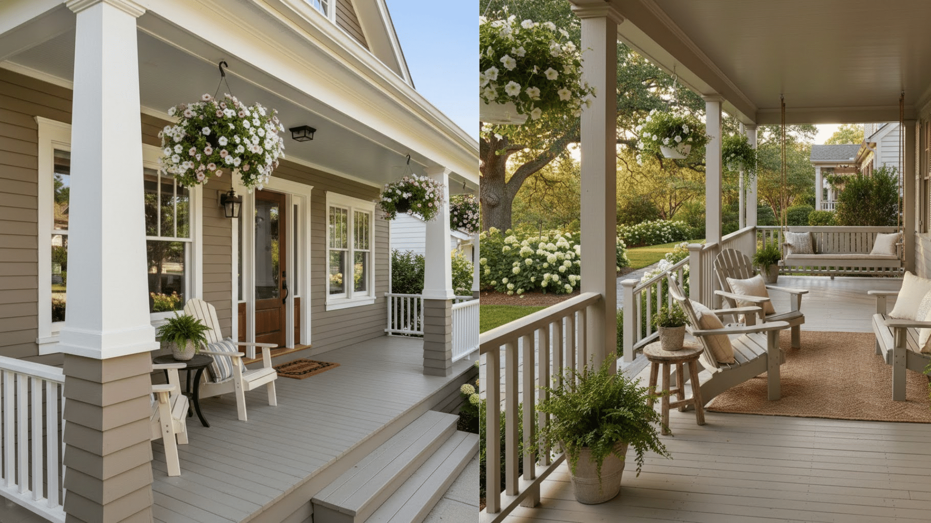
Revere Pewter adds warmth to covered porches and outdoor living spaces. The color holds up well against natural wood elements and wicker furniture.
However, it may look dull on porches without adequate natural light.
Agreeable Gray keeps porches feeling fresh and bright throughout the day. The cooler tone complements white railings and outdoor furniture perfectly.
It reflects sunlight well, preventing the porch from feeling too dark.
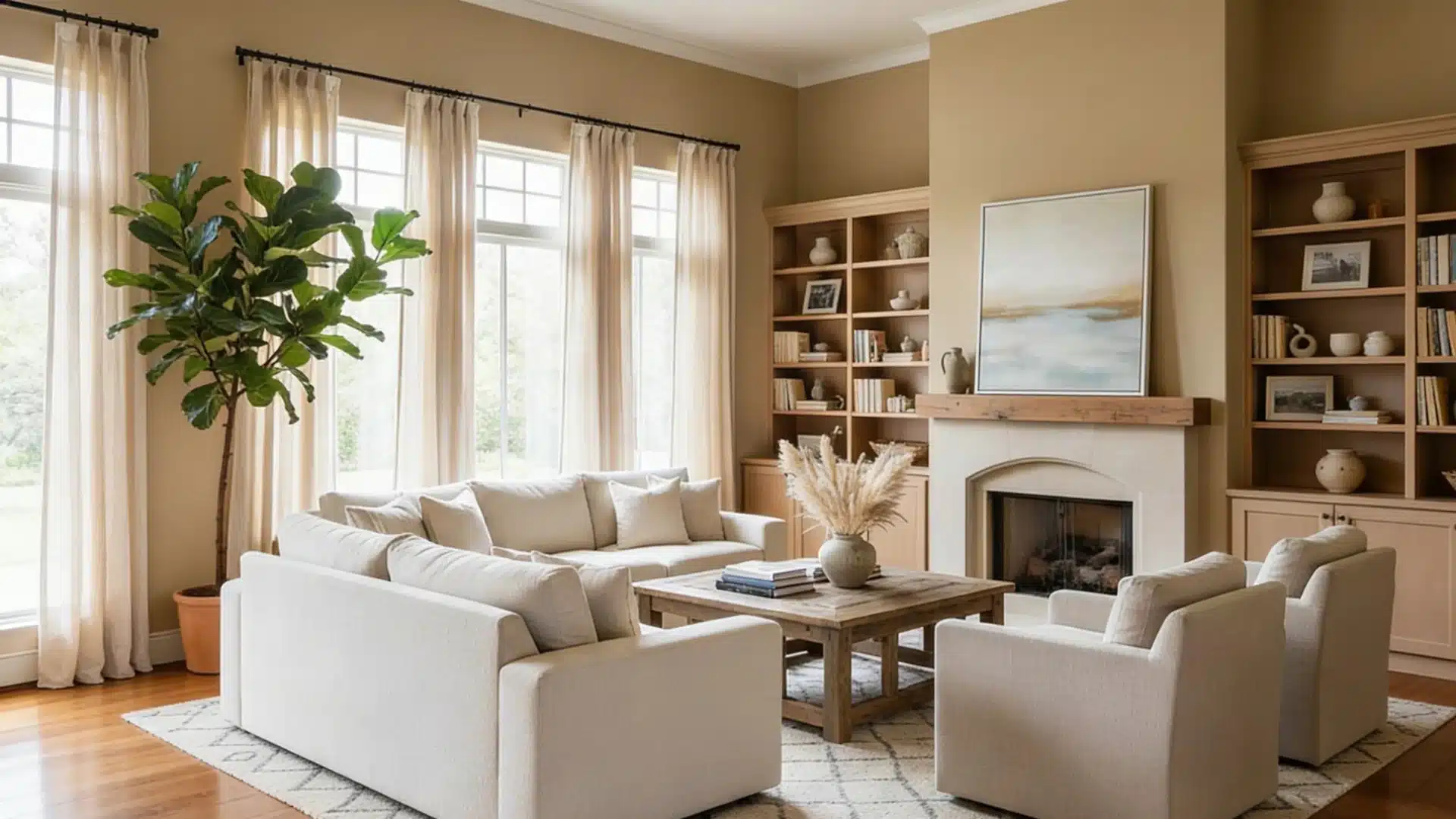
Living Room
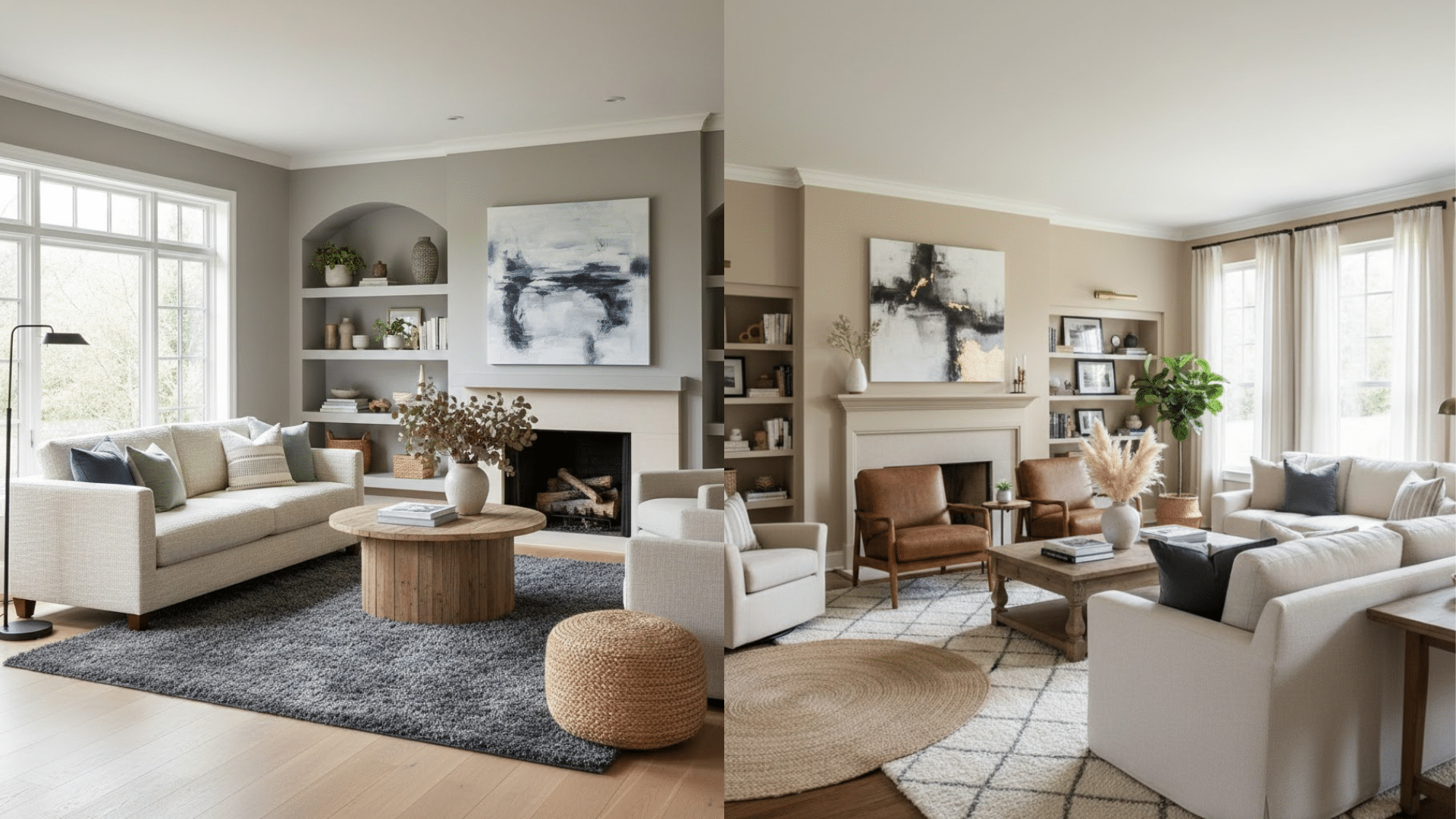
Revere Pewter creates an inviting living room atmosphere. It pairs beautifully with leather furniture and wood coffee tables.
Agreeable Gray keeps living rooms feeling bright and airy instead. The cooler tone works especially well in south-facing living areas.
Bedroom
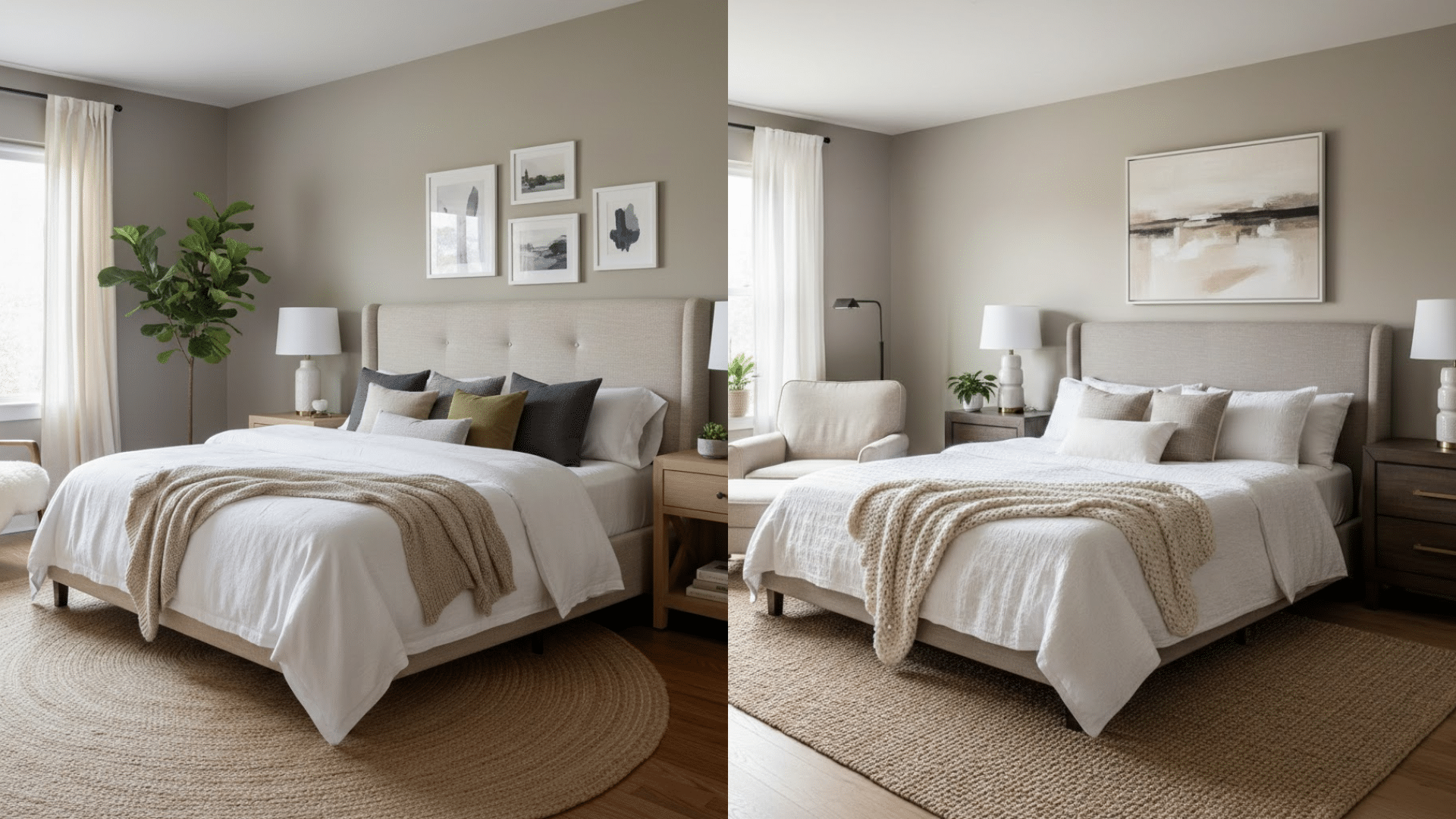
Revere Pewter changes bedrooms into restful retreats.
The warm undertones create a calming environment perfect for sleep. It works wonderfully in master bedrooms with plenty of natural light.
Agreeable Gray offers a serene bedroom atmosphere as well. The cooler tone feels peaceful and uncluttered for relaxation.
Bathroom
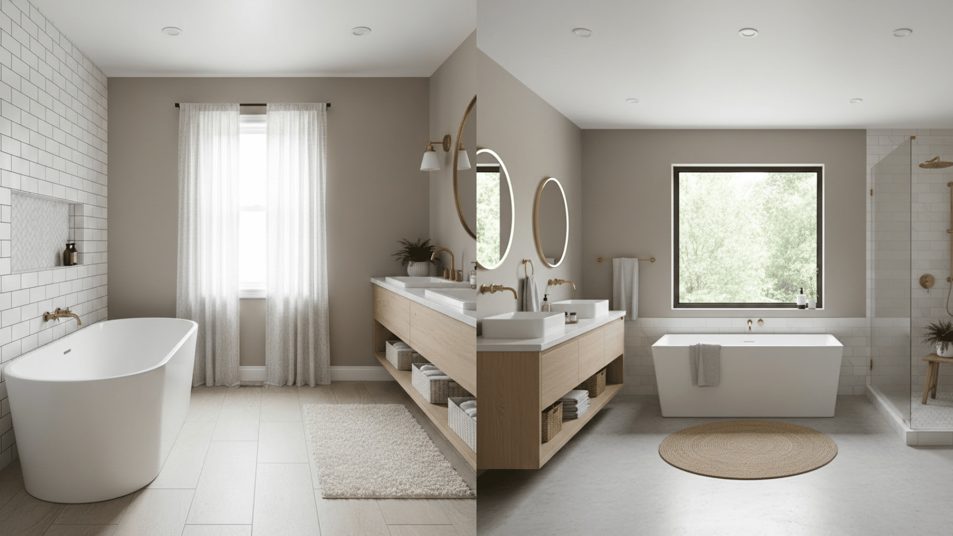
Revere Pewter needs careful consideration in bathrooms. The green undertones can look muddy in windowless bathrooms with artificial lighting.
However, bathrooms with natural light handle this color beautifully.
Agreeable Gray shines brightest in bathroom applications. The color feels crisp and hygienic in these functional spaces.
It handles bathroom humidity without showing water spots noticeably.
Hallway
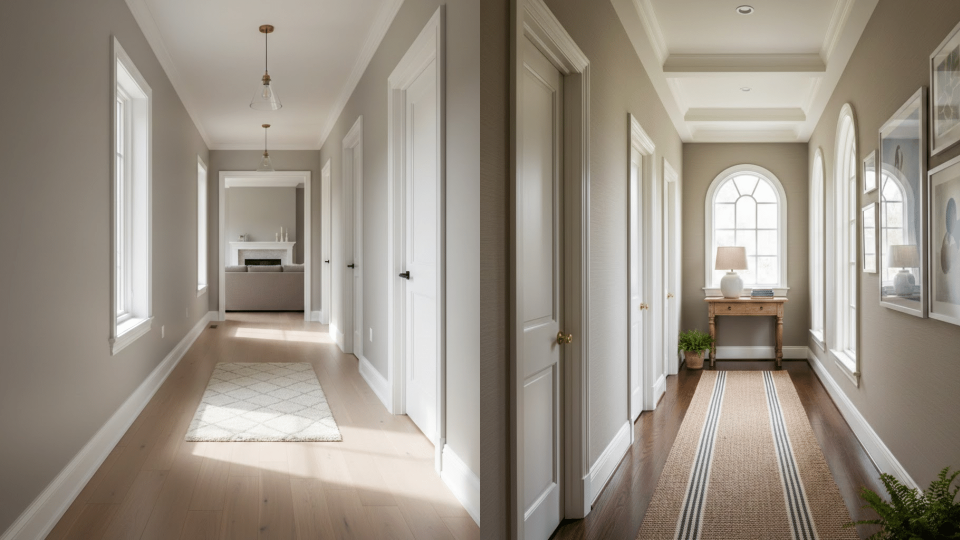
Revere Pewter warms up narrow hallways that might otherwise feel cold.
The color ties together different rooms when used consistently. However, it can make hallways without windows feel slightly darker.
Agreeable Gray brightens hallways and makes them feel more spacious.
The higher LRV reflects light down the corridor effectively. It creates smooth transitions between rooms in open floor plans.
Which Color Would be the Right Choice for You? Concluding Thoughts
Revere Pewter suits you if you prefer rooms with good natural light.
It works best in traditional or transitional homes with warm wood tones.
Agreeable Gray fits better if you want a cooler, more modern neutral. It handles artificial lighting well and brightens darker spaces effectively.
Your existing furniture and trim colors also matter; cordial trim loves Revere Pewter, while crisp white trim pairs perfectly with Agreeable Gray.
Grab sample pots of both. Paint them on poster boards, not directly on walls.
One color will simply feel like home. That’s the one you should choose, regardless of trends or popularity rankings online.
Frequently Asked Questions(FAQs)
1. Does Revere Pewter Look Green?
Yes, Revere Pewter can pull green in rooms with lots of natural light or green undertones nearby.
2. Is Revere Pewter Too Dark for Small Rooms?
It can feel heavy in small, poorly lit spaces. Pair it with bright whites and good lighting to keep the room from feeling closed in.
3. What is Benjamin Moore’s Most Popular Greige Color?
Excluding Revere Pewter – Pale Oak, and Edgecomb Gray are also top picks for a softer, lighter greige look.