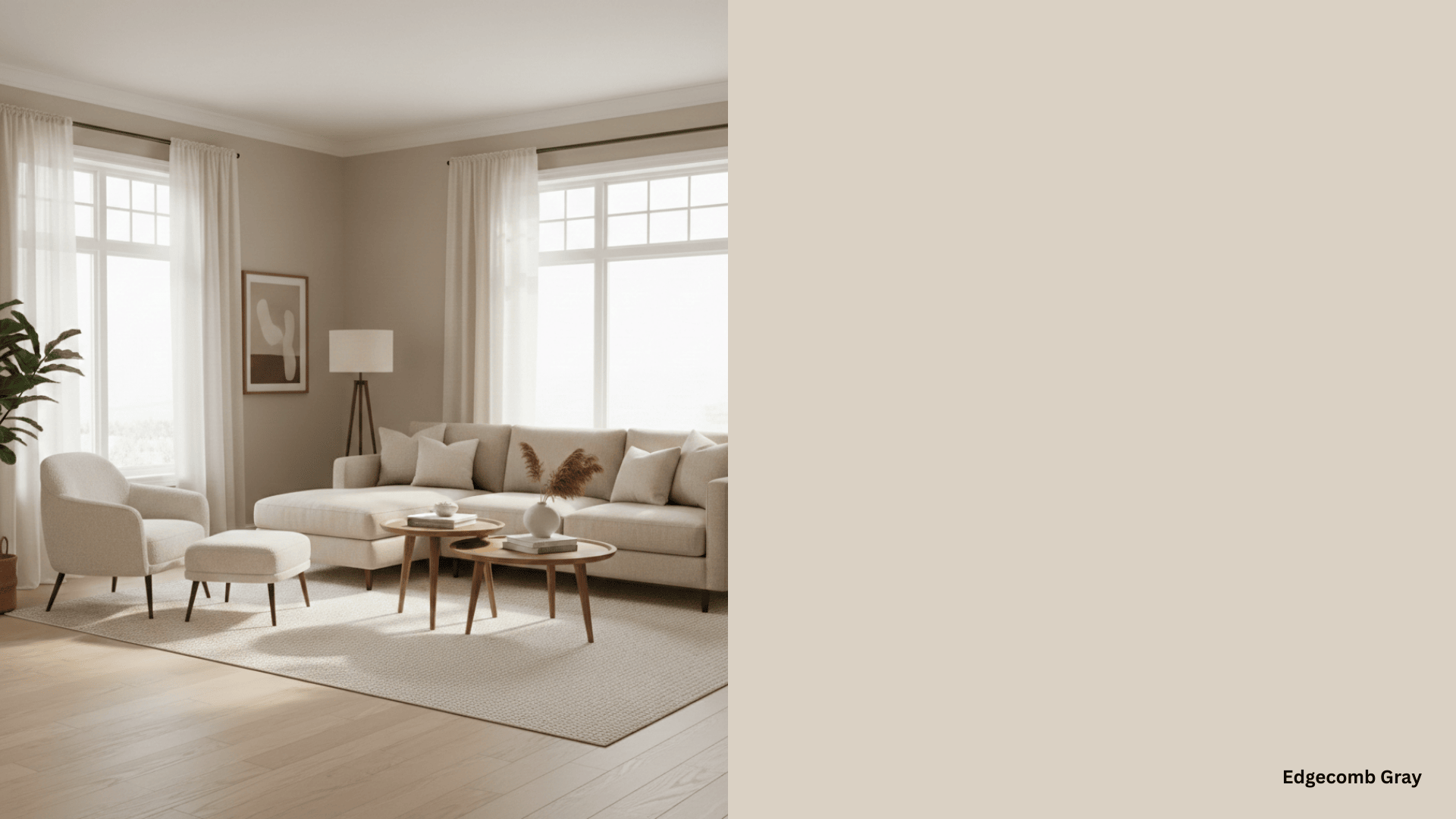
Agreeable Gray (SW 7029) is one of Sherwin-Williams’ most popular paint colors.
It is a warm greige with subtle beige and taupe undertones, making it appear soft in most lighting conditions.
It has enough gray to keep it modern and fresh, but the beige and taupe undertones prevent it from feeling cold or stark.
Natural light brings out warm beige tones, but the artificial lighting can emphasize the gray.
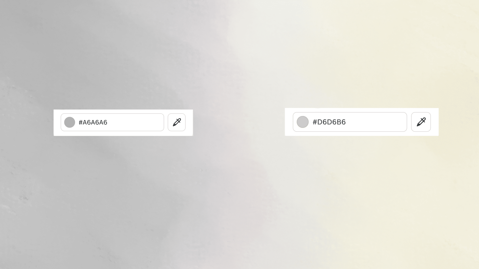
- Hex Code:#D1CBC1
- LRV: 60
- RGB Values: R: 209, G: 204, B: 192
Is Agreeable Gray More Gray or Beige?
Agreeable Gray leans more toward beige than gray. The beige undertones are what make it “agreeable” in the first place.
It’s officially a greige, which means it sits right between gray and beige.
In most lighting conditions, you’ll see more beige than gray. The gray just keeps it from looking too tan or brown. Think of it as beige with a gray filter over it.
This balance is why it pairs well with both warm and cool accent colors.
Agreeable Gray Coordinating Colors
Now that you know what Agreeable Gray is, let’s look at the colors that work best with it.
I’ve tested these combinations in real rooms, and they create beautiful spaces.
1. Coral Rose (SW 9004)
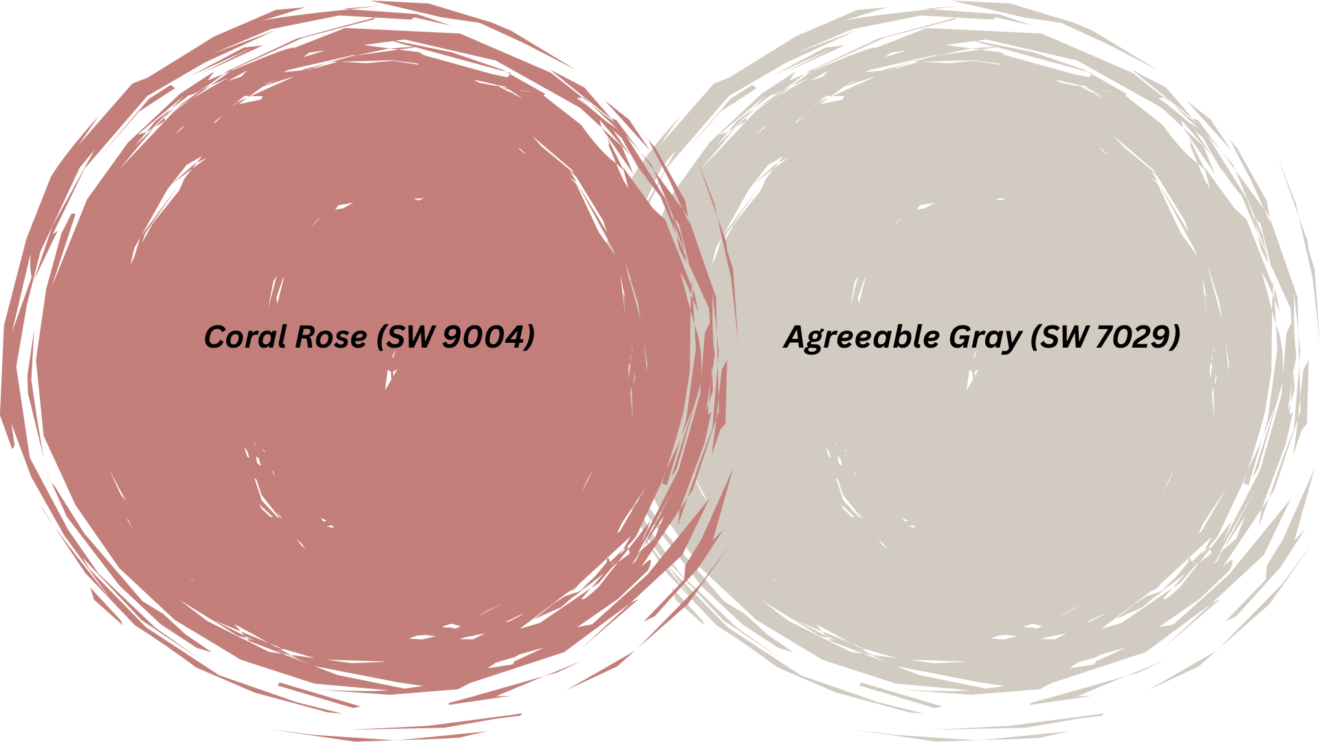
Coral Rose brings energy to Agreeable Gray. This soft coral has just enough pink to feel feminine without being too bold.
It works beautifully as an accent wall in bedrooms or bathrooms.
In my client’s nursery, we used Coral Rose on one wall with Agreeable Gray on the others. The result was calming but cheerful.
2. Urbane Bronze (SW 7048)
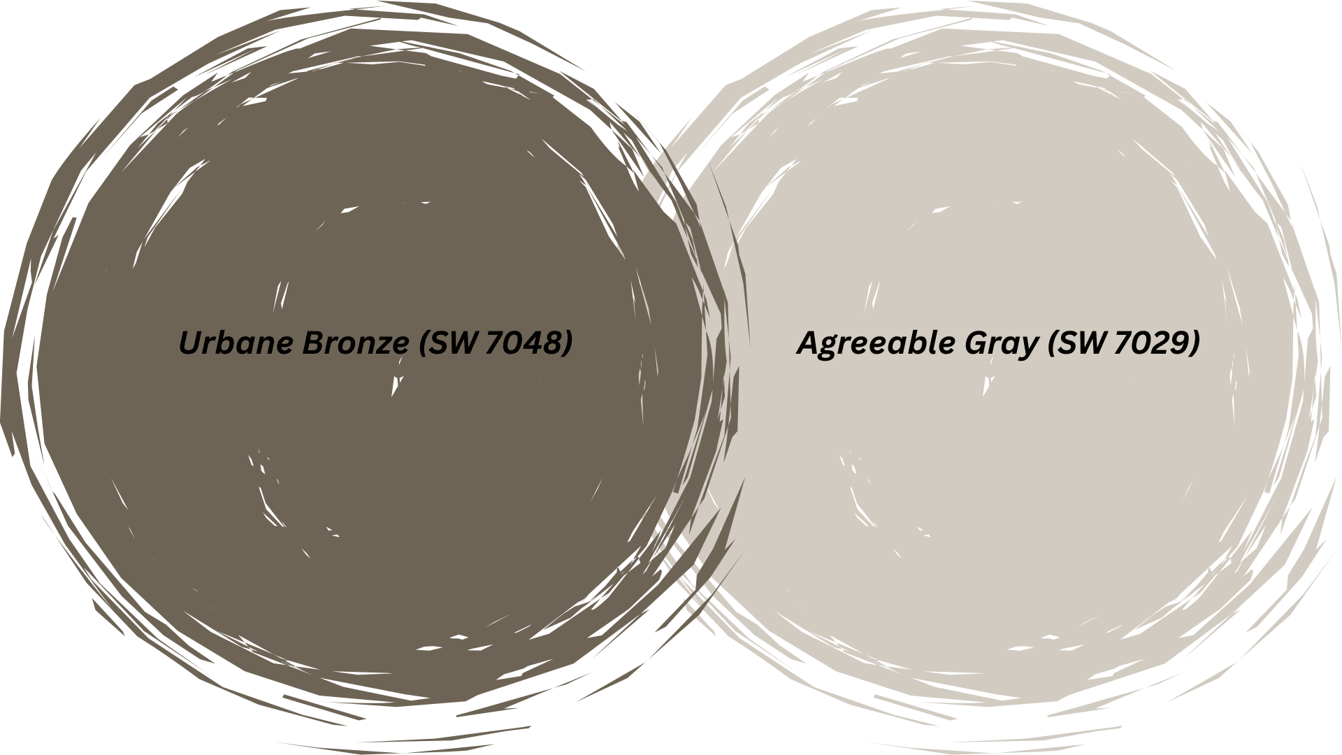
Urbane Bronze is a rich, deep brown that adds a classic feeling next to Agreeable Gray.
Use it on kitchen cabinets or an accent wall for instant depth. The contrast between light gray and dark bronze creates a space without feeling harsh or jarring.
This combination works especially well in living rooms and dining spaces.
3. Naval (SW 6244)
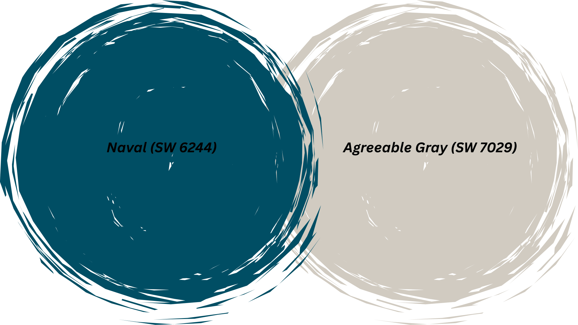
Naval is a classic navy blue that is one of my favorite Agreeable Gray coordinating colors.
This deep blue brings a traditional feel to any space. I love using Naval on front doors or built-in bookshelves against Agreeable Gray walls.
The combination feels pulled together and intentional, like something from a design magazine.
4. Baby Bok Choy (SW 9037)
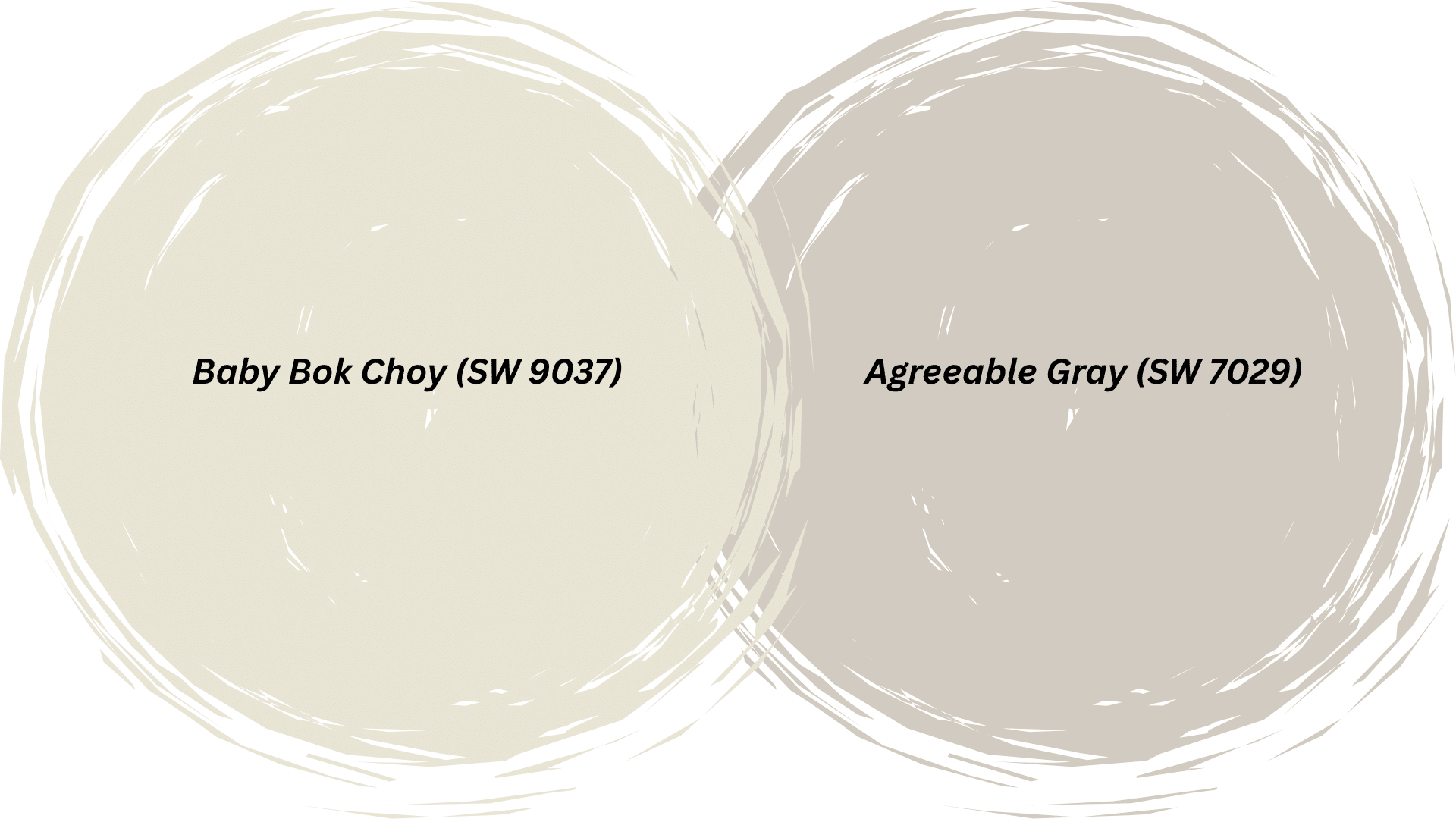
Baby Bok Choy is a fresh, light green that brightens up Agreeable Gray beautifully. This soft sage tone adds a natural, organic feel to your space.
It works great in kitchens, bathrooms, or sunrooms where you want a refreshing vibe.
The pairing feels clean and airy without being too cool or stark in temperature.
5. Alabaster (SW 7008)
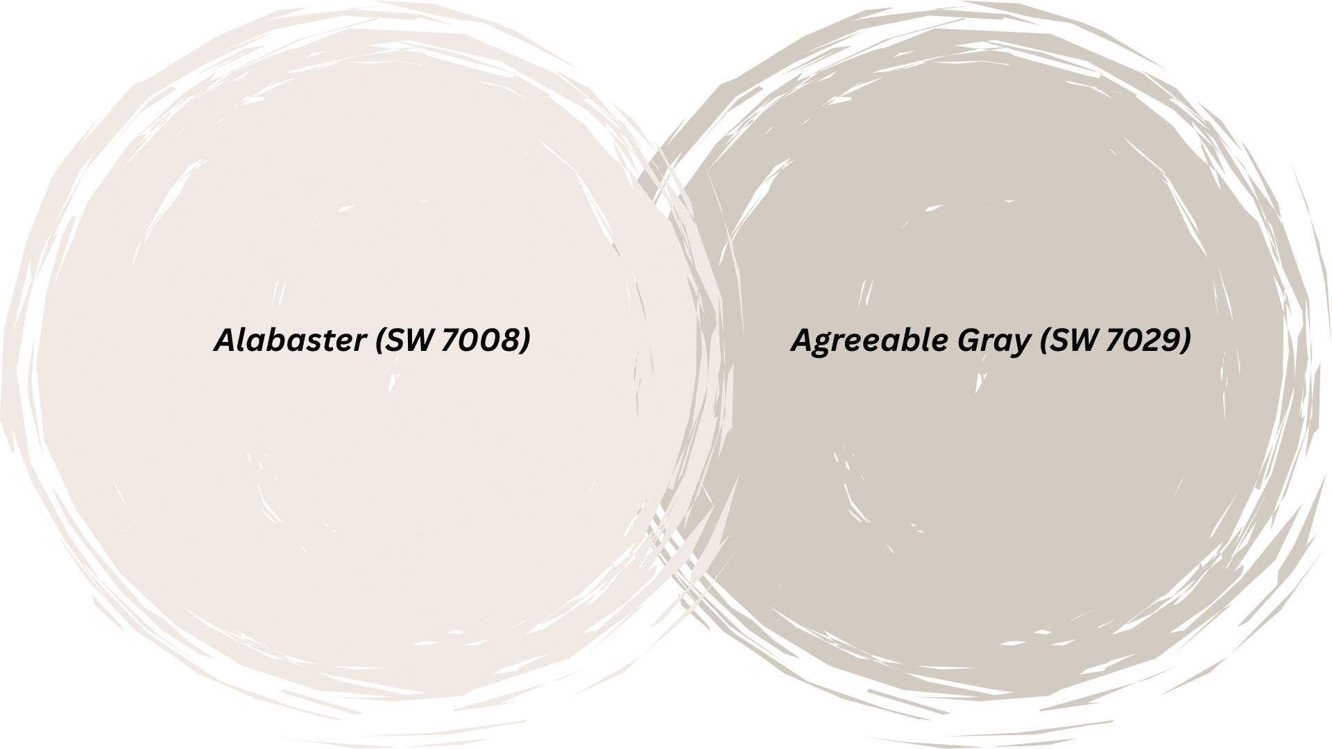
This is one of those Agreeable Gray coordinating colors that people are often unsure about.
Alabaster is a warm white that creates subtle contrast with Agreeable Gray. Use it on trim, ceilings, or cabinets for a soft, monochromatic look.
In my relative’s home, we used Alabaster trim with Agreeable Gray walls throughout; the combination flows beautifully from room to room without any jarring transitions.
6. Billowy Breeze (SW 9055)
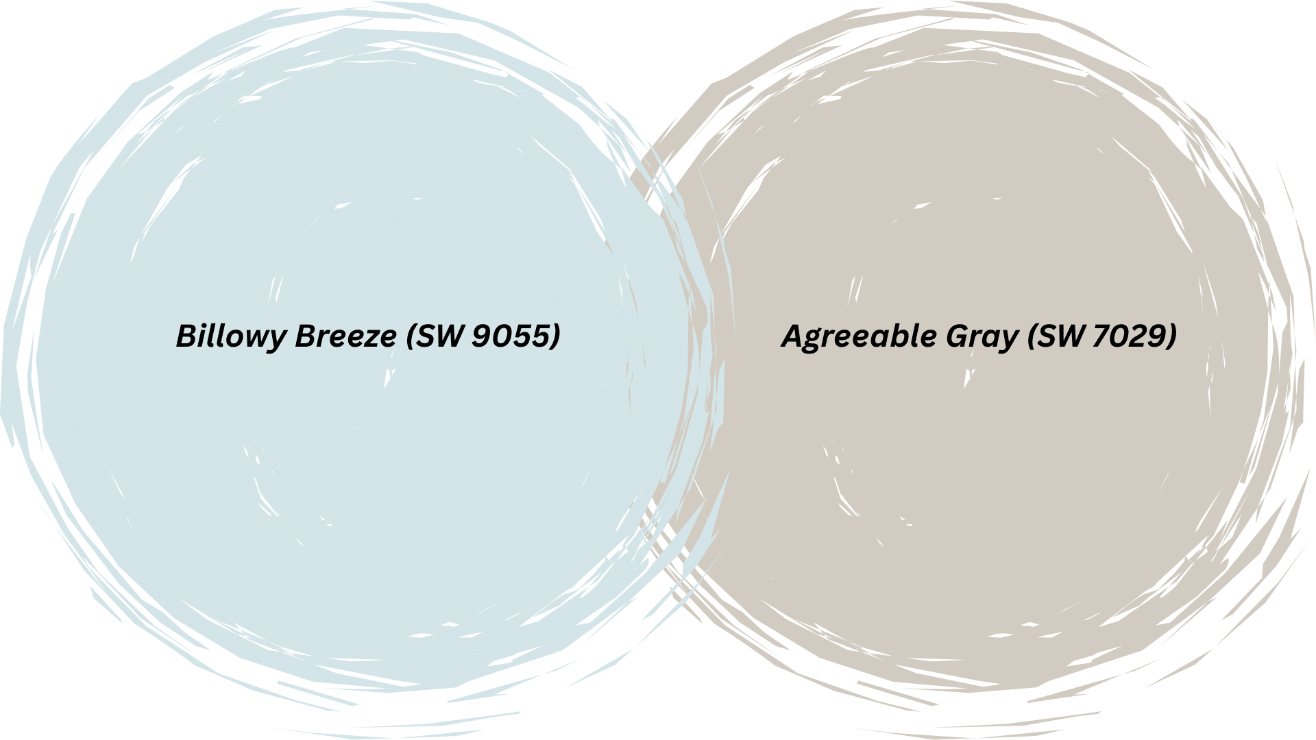
Billowy Breeze is a soft, pale blue that brings a coastal feel when paired with Agreeable Gray.
This light blue works wonderfully in bedrooms and bathrooms where you want a relaxing atmosphere.
7. Still Water (SW 6223)
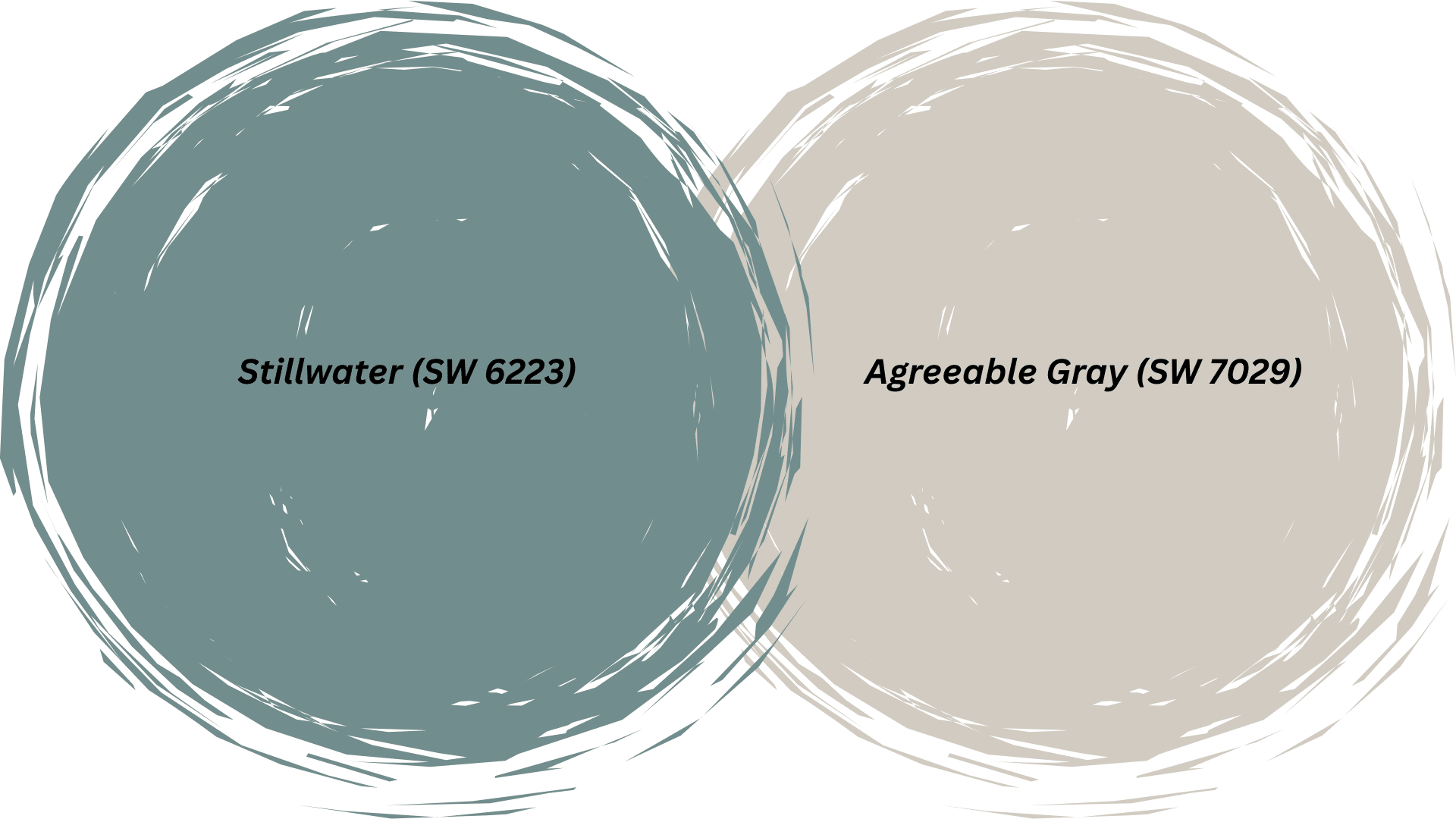
Still Water is a muted blue-green that complements Agreeable Gray’s warm undertones beautifully.
This color works as an accent wall or throughout an entire room; the pairing creates a calm look that feels both modern and classic.
It’s perfect for home offices or master bedrooms where you need focus.
8. Extra White (SW 7006)
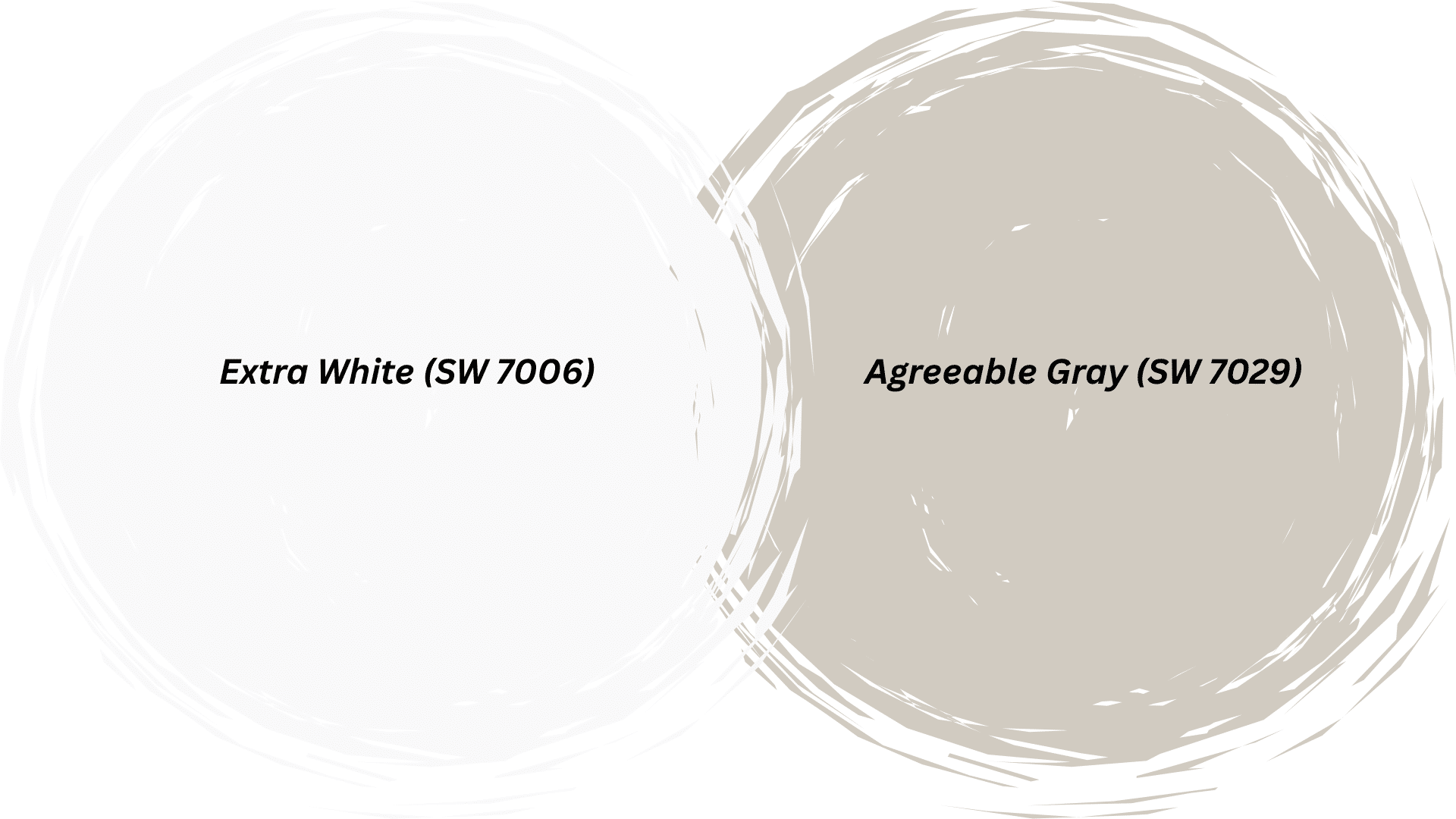
Extra White is a crisp, clean white that provides sharp contrast against Agreeable Gray.
Use it on trim, doors, and ceilings for a classic look. This pairing is traditional but never boring.
In my sister’s kitchen, we used Extra White cabinets with Agreeable Gray walls. The bright white keeps everything feeling fresh and clean.
9. Indigo (SW 6531)
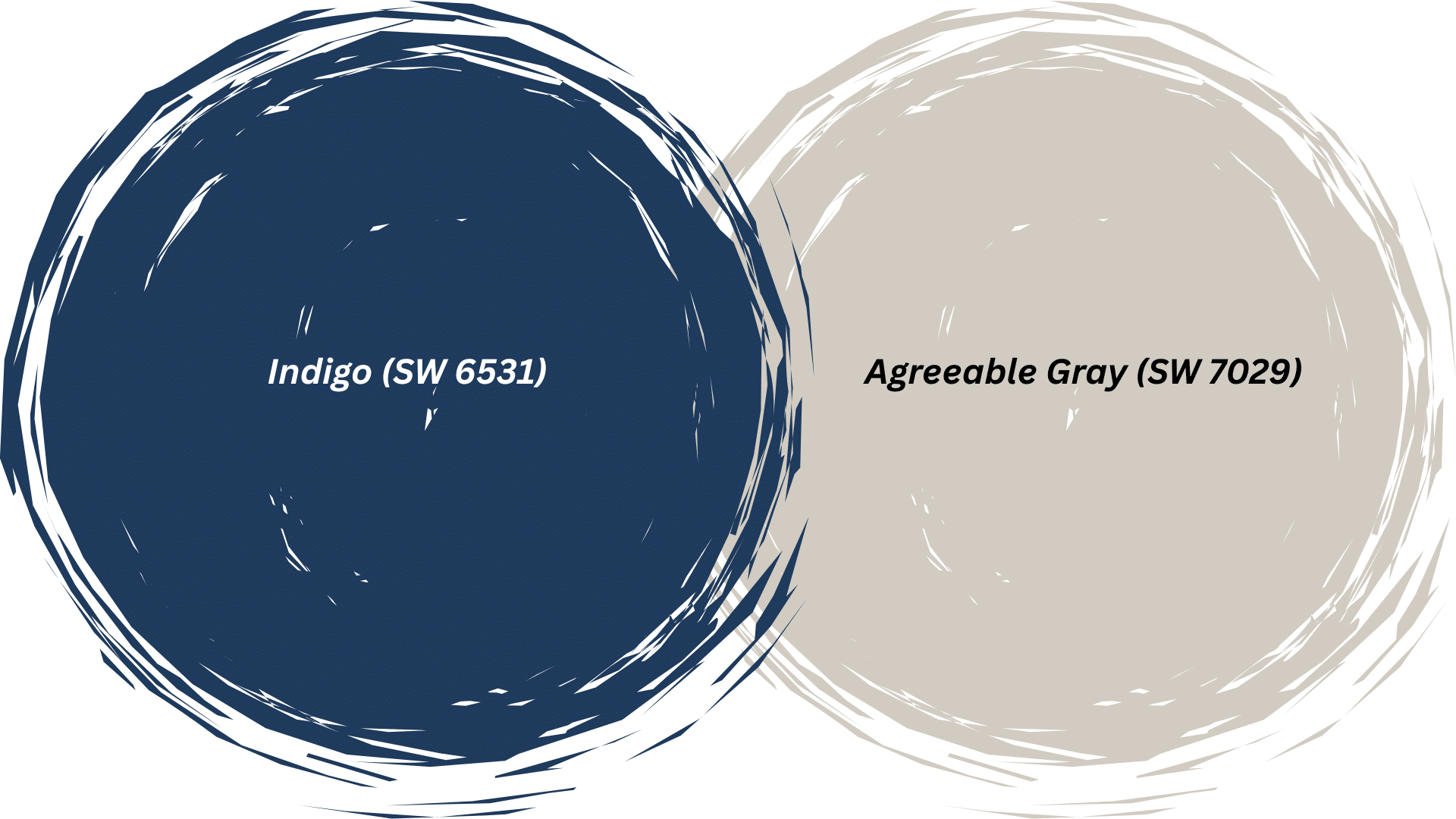
Indigo is a bold, saturated blue that makes a statement next to Agreeable Gray.
This rich color works best as an accent rather than throughout a whole room. Try it on a single wall or kitchen island for dramatic impact.
The combination feels confident and intentional, perfect for those who want personality.
10. Iron Ore (SW 7069)
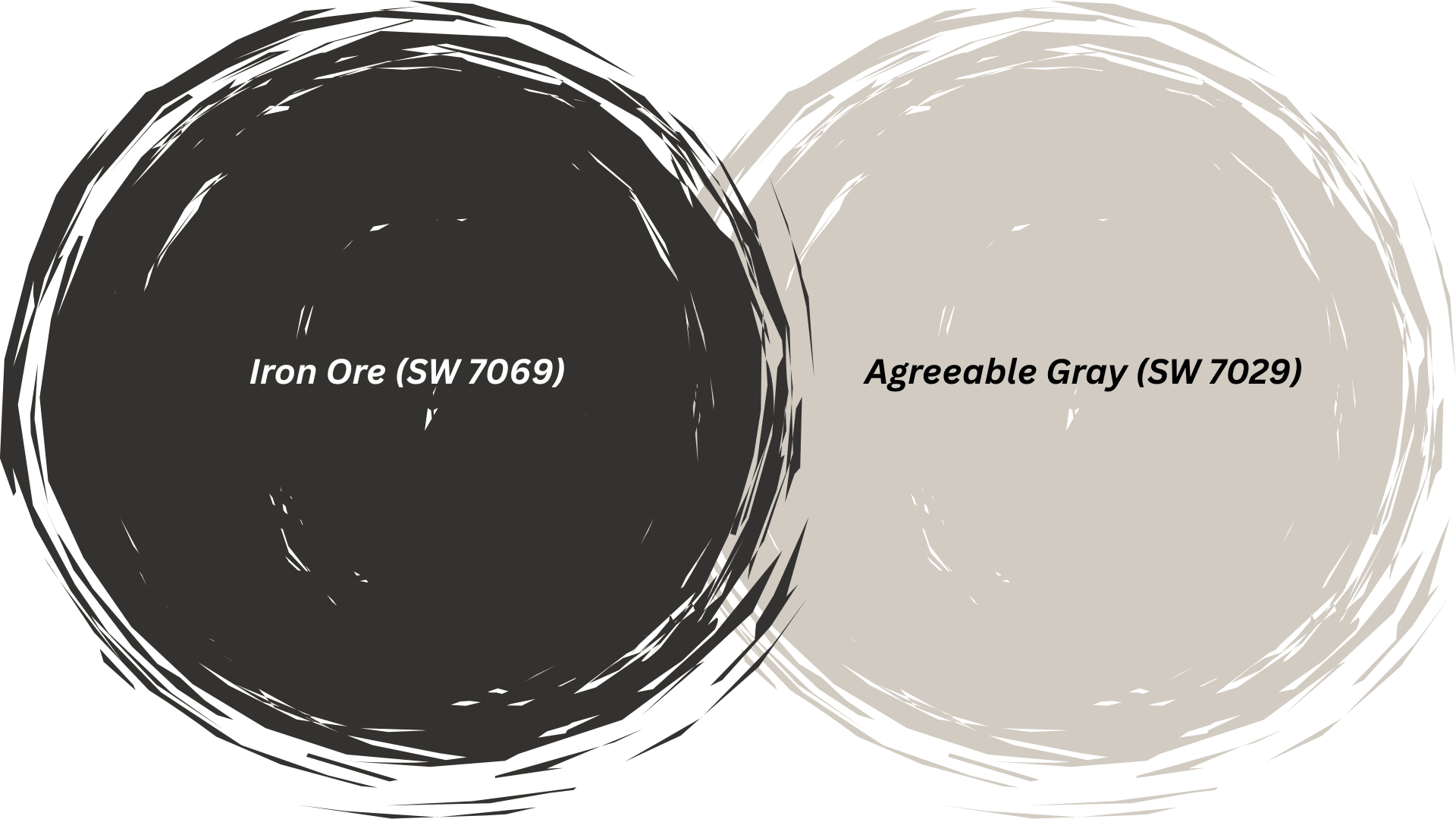
Iron Ore is an almost black charcoal gray, creating a strong contrast with Agreeable Gray.
Use it on exterior doors, shutters, or interior accent walls for depth. The pairing feels modern and architectural.
11. Cavern Clay (SW 7701)
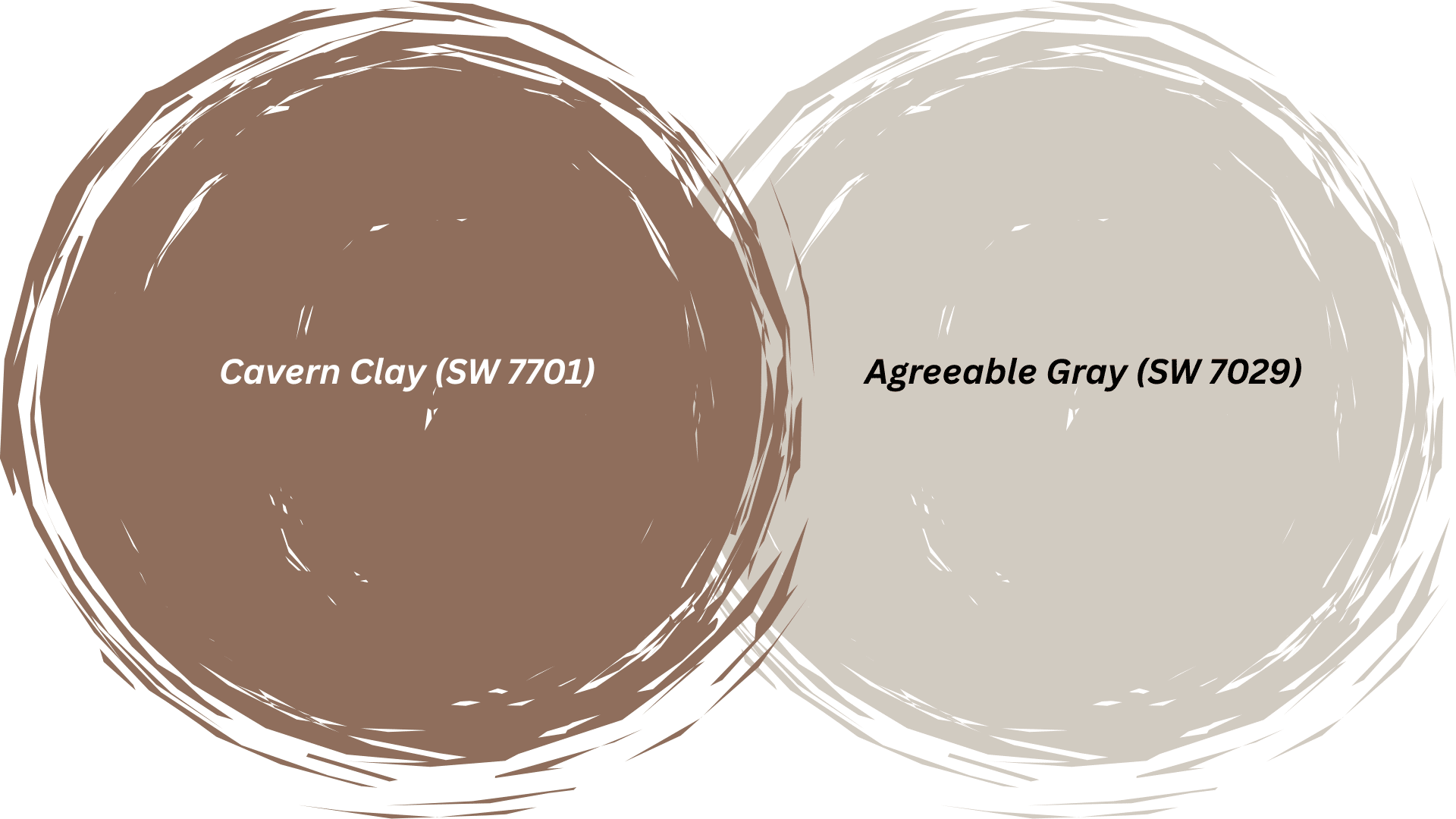
Cavern Clay is a warm terracotta that brings earthy richness to Agreeable Gray. This rust-toned color adds personality without being too bright.
The combination feels grounded and organic, perfect for southwestern or bohemian-style homes.
It works beautifully in living rooms or as a feature wall accent.
Best Trim Color Pairings with Agreeable Gray
Trim color can make or break your Agreeable Gray walls. The right trim creates clean lines and definition.
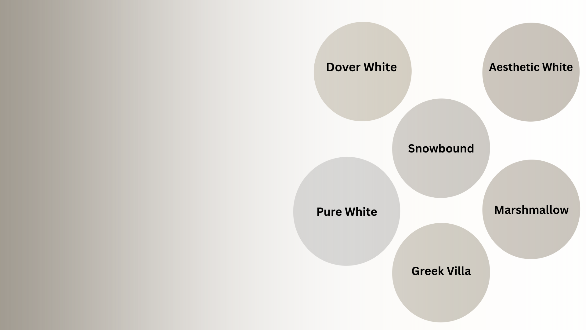
Pure White (SW 7005)
Pure White is a crisp, clean white that creates sharp contrast with Agreeable Gray walls. It makes your trim pop and gives rooms a fresh, modern look.
This pairing works well in contemporary homes where you want defined edges and clean lines throughout.
Dover White (SW 6385)
Dover White is a creamy, warm white that complements Agreeable Gray’s beige undertones. The combination creates a soft, monochromatic look.
This pairing works well in bedrooms and living rooms where you want a wrapped-up feeling.
Greek Villa (SW 7551)
Greek Villa is an off-white with slight gray undertones. It provides minimal contrast with Agreeable Gray walls, creating an almost monochromatic scheme.
This pairing works when you want trim to blend rather than stand out.
Aesthetic White (SW 7035)
Aesthetic White is a soft white with warm undertones that pairs beautifully with Agreeable Gray. The combination feels balanced and harmonious.
I use this pairing in homes where clients want noticeable trim without stark white contrast.
Snowbound (SW 7004)
Snowbound is a cool white that still works with Agreeable Gray’s warmth. It provides clean contrast without clashing with the beige undertones.
The combination is fresh and current while maintaining classic appeal in every room.
Marshmallow (SW 7001)
Marshmallow is a warm, creamy white that complements Agreeable Gray perfectly. The pairing creates a soft, cozy feeling throughout your home.
This combination works especially well in traditional spaces where you want warmth without stark contrast.
Colors to Avoid
Not every color works well with Agreeable Gray.
Some shades clash with their warm undertones or create muddy, unclear color schemes.
| Color to Avoid | Why It Doesn’t Work |
|---|---|
| Pure Gray | Makes Agreeable Gray look too beige and dirty by comparison. The contrast feels off. |
| Cool Purples | The warm beige undertones clash with cool purple tones. It creates visual confusion. |
| Bright Yellow | Too much contrast makes both colors look harsh. The yellow overpowers the subtle gray. |
| Cool Mint Green | The cool mint fights against the warm undertones. It creates an unbalanced look. |
| Stark White | Makes Agreeable Gray look dingy and brown rather than fresh and neutral. |
| Hot Pink | Too jarring next to the subtle, muted gray. It lacks harmony. |
| Pure Black | Creates too harsh a contrast with the soft, warm gray tone. |
Wrapping Up
This color works with so many colors and styles. You’ve now got a solid list of coordinating colors, trim options, and colors to avoid.
Start with one or two Agreeable Gray coordinating colors. You don’t need to use everything at once.
Pick colors that match your style and the mood you want.
Grab some samples this weekend. Paint large swatches on poster board and move them around your rooms. You’ll find your perfect combination quickly.