Hale Navy (HC-154) keeps showing up on exterior trim, kitchen cabinets, and accent walls, and there’s a specific reason it works where other navies fail.
Its gray-green undertone remains steady across lighting, not shifting to purple or warming in the evening.
Deep, deliberate, and surprisingly forgiving when paired right.
This blog covers exactly where it performs, where it doesn’t, and how to get the finish right the first time.
How I Evaluate Paint Colors
I don’t pull recommendations from manufacturer swatches. Every color in my reviews has been sampled in real rooms under real lighting conditions before we write about it.
For the Hale Navy specifically:
- Tested it in three lighting scenarios: north-facing with cool daylight, south-facing with warm afternoon sun, and under warm incandescent bulbs at night.
- Checked it against five trim whites: to identify pairings that work and ones that fight the undertone.
- Applied it in two finishes: eggshell and satin on walls, semi-gloss on cabinetry, to see how sheen changes the read at this LRV.
- Noted failure conditions: rooms where we’d recommend against it and why.
Decoding the Color
Hale Navy Benjamin Moore (HC-154) is a graceful navy blue from Benjamin Moore’s Historical Colors collection, inspired by classic American architecture. Here’s what makes it special:
| Attribute | Value |
|---|---|
| LRV | 8.36 |
| Undertones | Gray-green |
| Color family | Historical Colors (HC-154) |
| Recommended finish (walls) | Eggshell or satin |
| Recommended finish (cabinets/trim) | Semi-gloss |
| Closest competitors | Naval SW 6244 (darker, warmer), Stiffkey Blue F&B No. 281 (lighter, softer) |
With an LRV of 8.36, Hale Navy absorbs most light, creating a bold, dramatic effect that’s perfect for statement walls or furniture. Its gray undertones, with a touch of green, give it a refined edge, preventing it from feeling too stark or veering into purple tones.
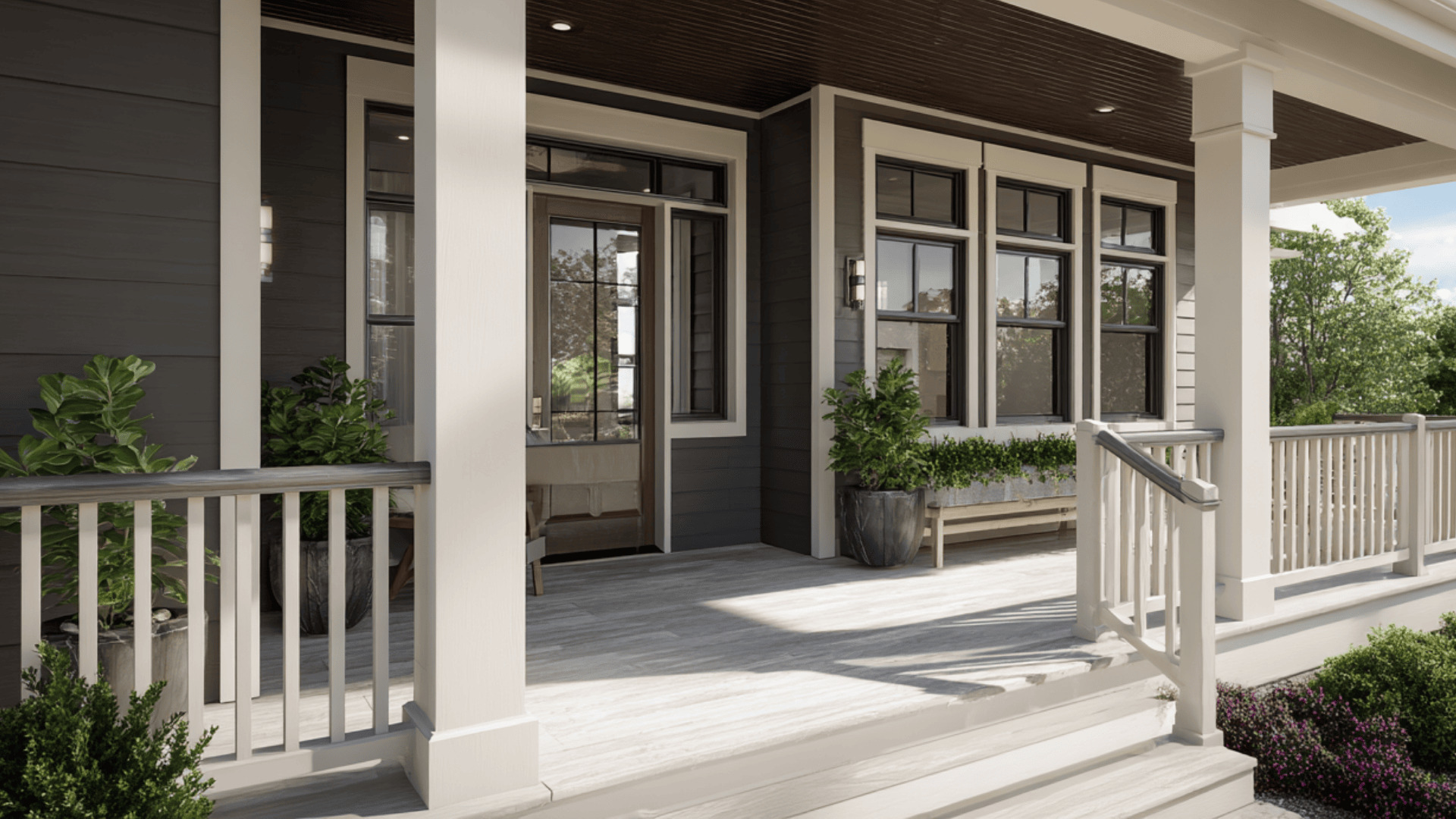
Best for: Exterior trim, siding, and front doors; interior accent walls in rooms with natural light; kitchen and bathroom cabinetry; home offices and dens; board-and-batten and shiplap feature walls.
Avoid if: Your room has no natural light and only cool-toned bulbs, you have honey- or orange-toned wood floors, or you need a subtle or soft navy; this reads dark and deliberate.
You’re painting a ceiling or a room under 100 sq ft on all four walls.
This balance of warm and cool undertones makes it a “use-anywhere” shade with a classic maritime feel.
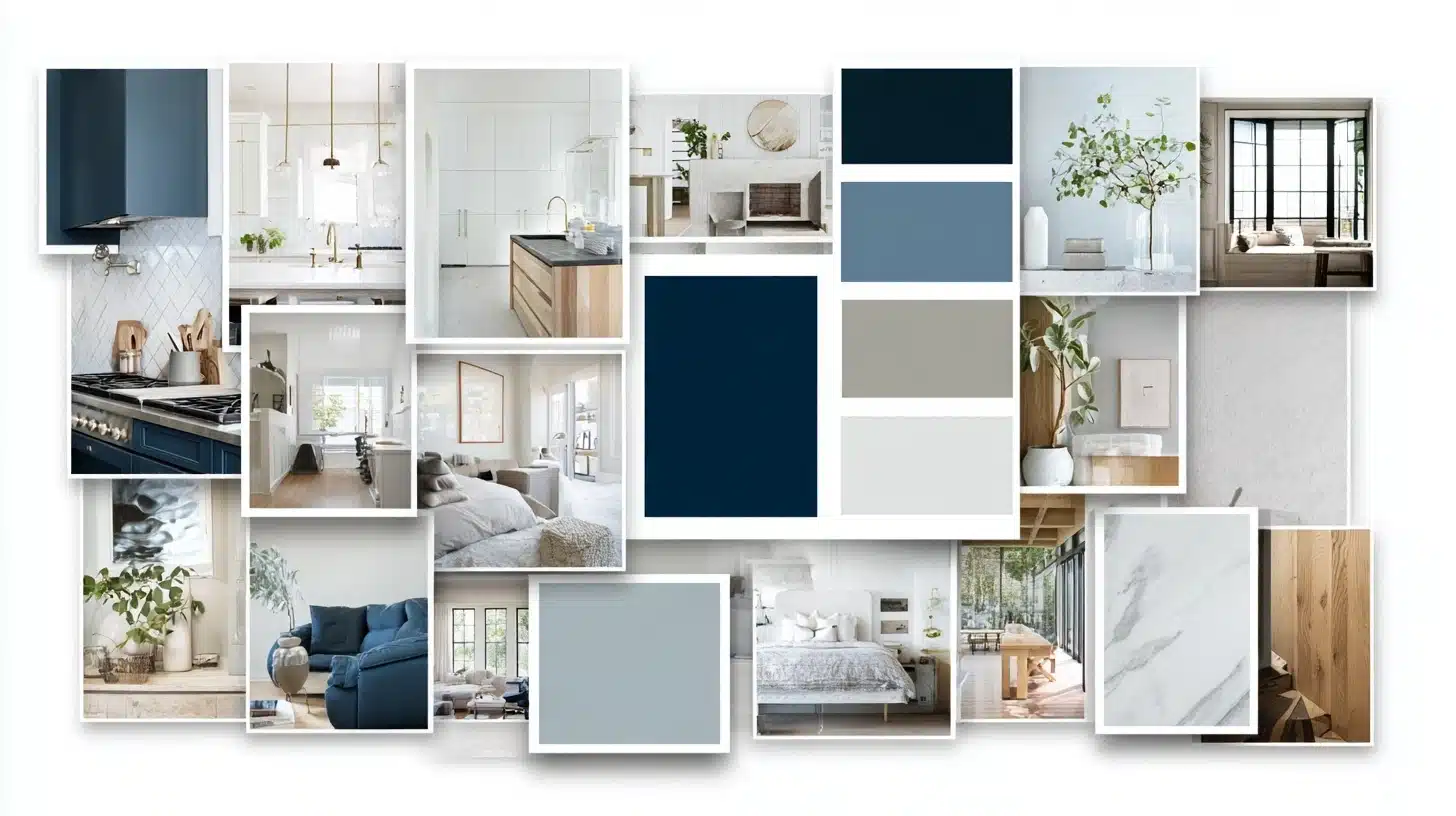
A Visual Gallery Featuring Hale Navy Benjamin Moore
I love showing you real examples of how colors work in homes.
Here are some of my favorite Hale Navy projects that show this color’s true potential. These spaces prove why Hale Navy has become such a popular choice.
1. Home Office
I recently worked on a client’s home office. We painted a board-and-batten wall in Hale Navy with an eggshell finish.
The other walls got Benjamin Moore Simply White.
The result?
A workspace that felt both professional and inviting.
The navy wall looked rich during the day, bathed in natural light. At night, it felt cozy under soft lighting. We added light wood desks and linen chairs. A white bead chandelier completed the look.
This created a nice mix of modern and classic styles.
Even a small element made the room feel important, and the contrast against the white walls enhanced its impact.
2. Powder Bath
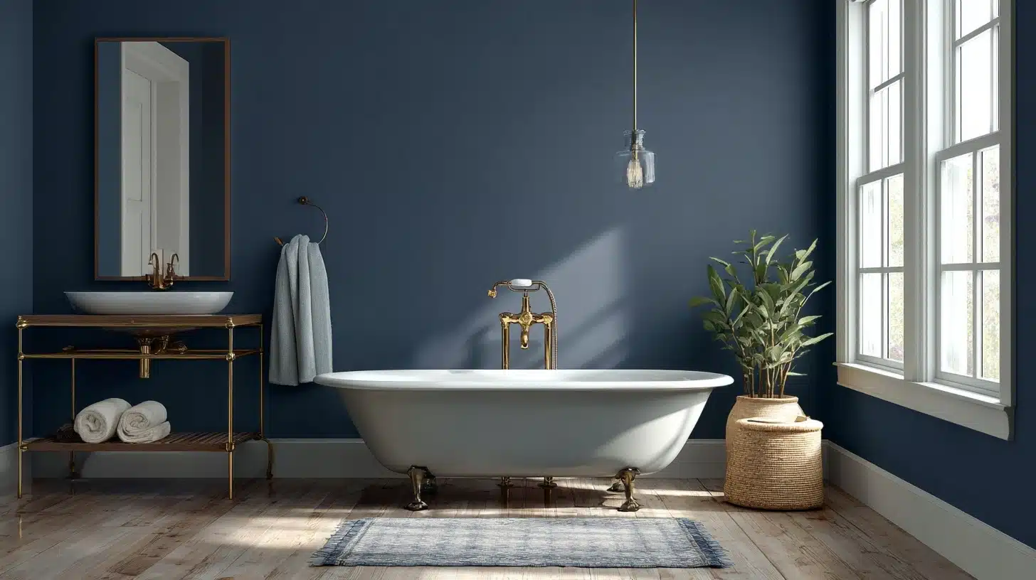
For a small powder bath, I painted the cabinets in Hale Navy semi-gloss.
The walls got Castle Path, a soft gray color. The navy cabinets added a touch of luxury to the space.
The glossy finish helped reflect light. This made the small room feel bigger than it was.
The gray walls highlight navy cabinets. We added a star-shaped light and a round mirror for a classy yet simple look. Hale Navy remakes a basic bathroom into something special.
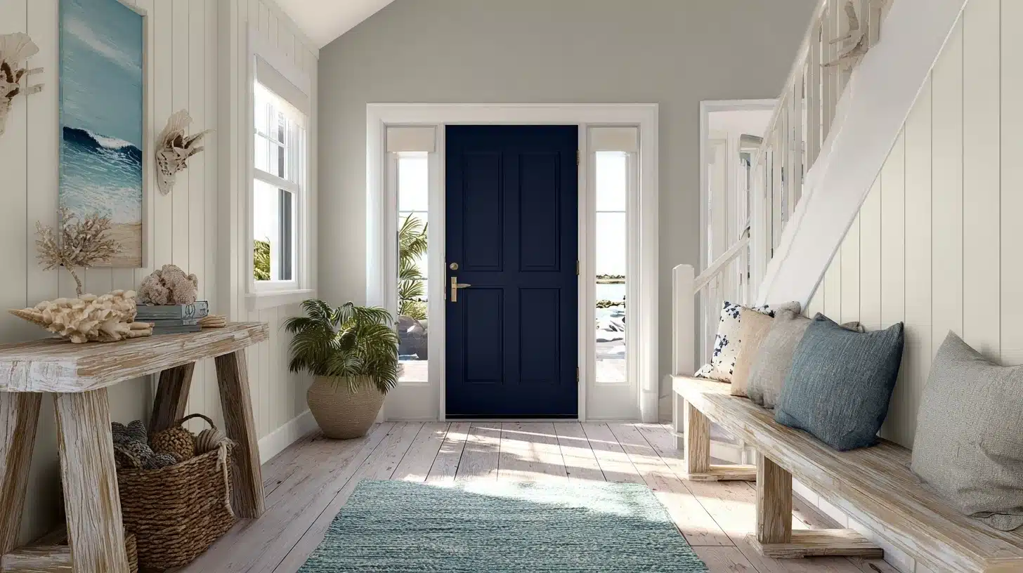
3. Interior Front Door
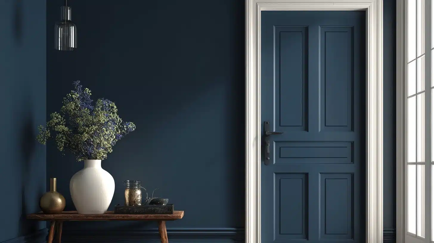
One of my favorite uses for Hale Navy is on interior doors. I recently painted a front door in this color. The walls stayed Simply White. This created a bold welcome for guests.
The navy door became the primary focus of the entry. We added coastal touches like a striped rug.
Even with less natural light, Hale Navy looked rich and inviting. It’s a simple way to add character to your entrance.
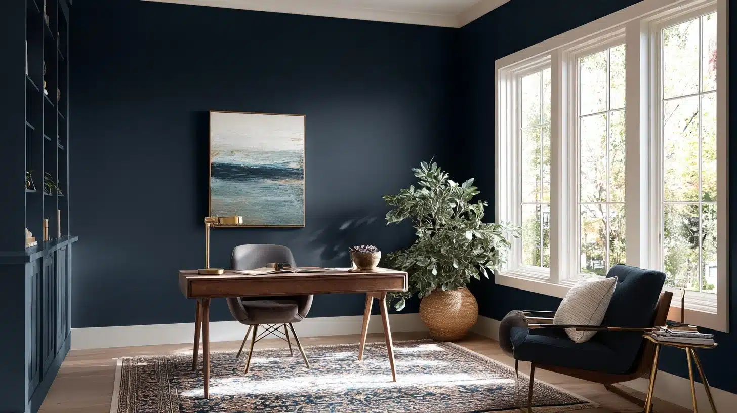
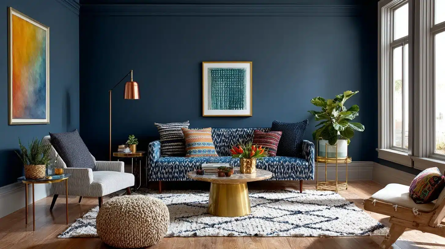
4. Den
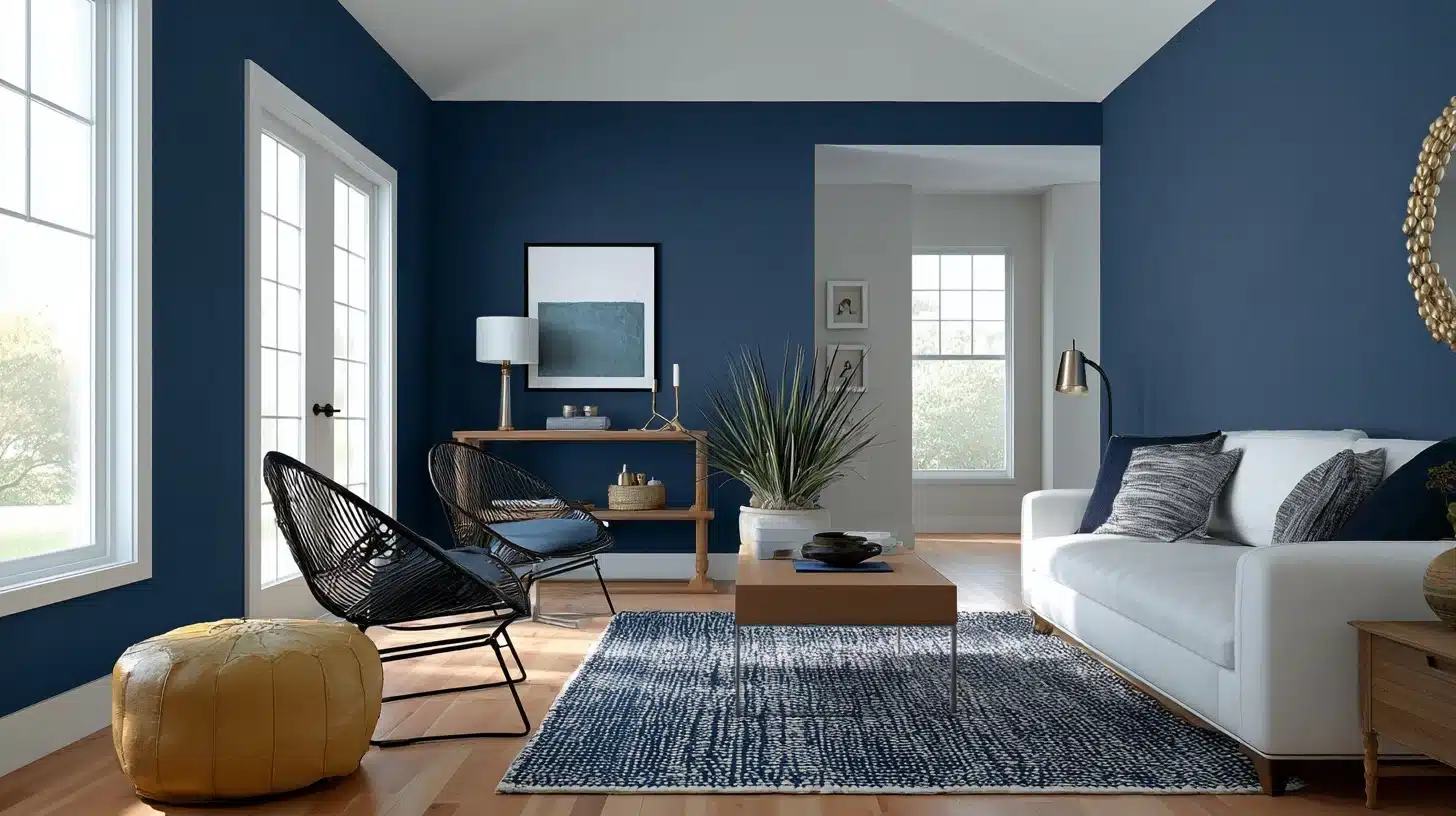
In a cozy den, we used Hale Navy on one feature wall. The wall featured board-and-batten details.
We paired it with a linen sofa and a round wood coffee table. White linen curtains kept things light. The navy wall made the space feel grounded and warm. The neutral furniture balanced out the bold wall color.
We added a gallery wall with large frames. This created a personal touch. The final result was both cozy and stylish.
Complementary Colors
Hale Navy lies in its ability to pair seamlessly with a wide range of colors.
Here are some of my favorite combinations, drawn from my projects and expert recommendations:
Whites:
- Simply White: A crisp, clean contrast that brightens Hale Navy.
- White Dove: A warmer white for a softer look.
- Glacier White: A cool white for a fresh, modern vibe.
Grays:
- Revere Pewter: A warm gray that complements Hale Navy’s depth.
- Effort Gray: A soft, versatile gray for a subtle contrast.
- Agreeable Gray: A popular gray for accent walls.
- Stonington Gray: A cooler gray for a modern feel.
- Coventry Gray: A classic gray with a hint of warmth.
These pairings, recommended by sources such as Carla Bast Design and Life On Virginia Street, enable Hale Navy to adapt to any style, from minimalist to vibrant.
Using Hale Navy Benjamin Moore in Different Aesthetics
Hale Navy’s neutral quality makes it a chameleon, fitting seamlessly into various design styles. Here’s how I’ve seen it shine across different looks, inspired by the genres from my design resources:
1. Traditional
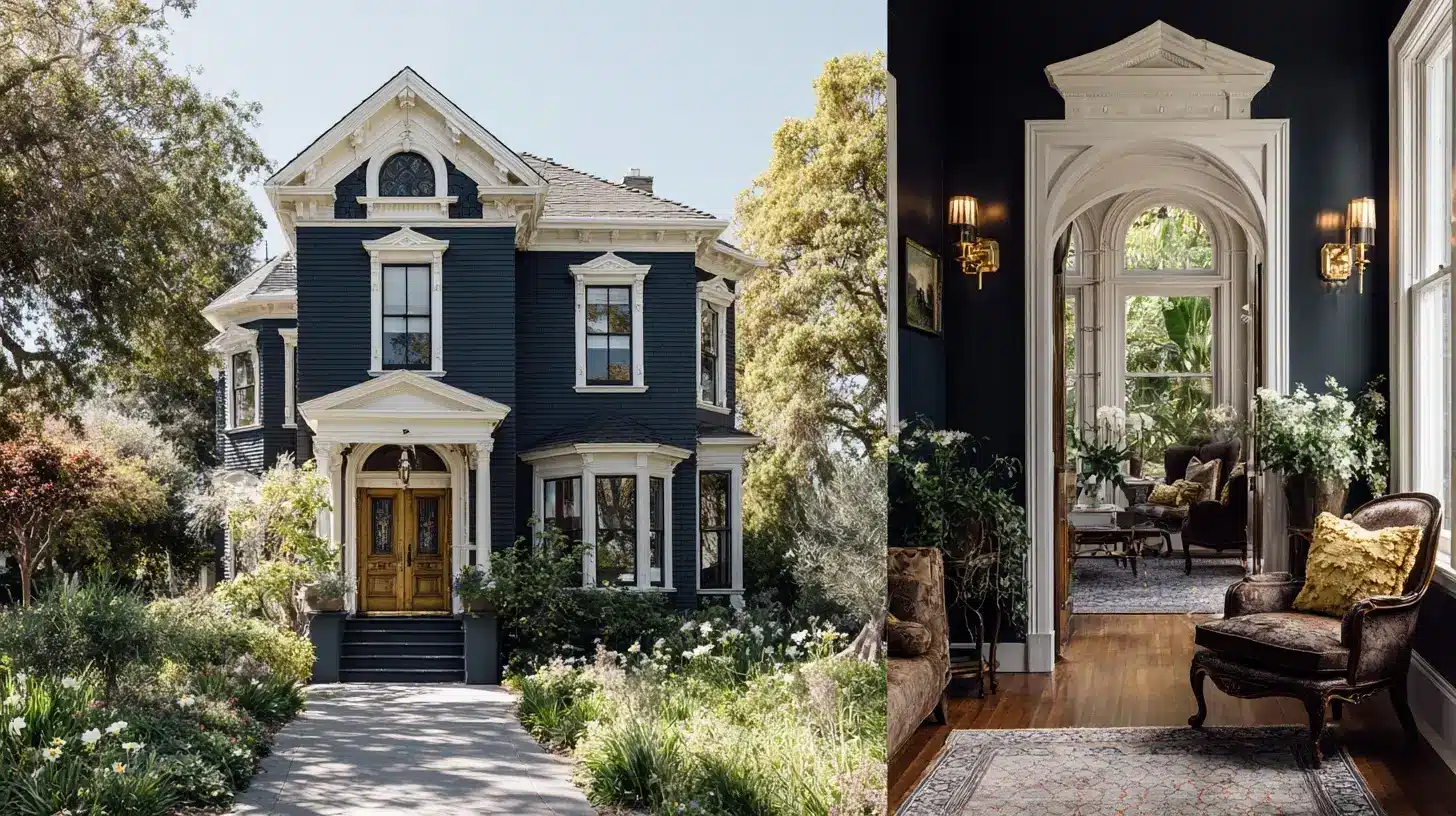
Hale Navy is a natural fit for traditional spaces. I’ve used it on the exterior of a Victorian home, paired with white trim and brass hardware, for an everlasting, graceful look.
The deep navy adds grandeur, while the lighter accents keep it balanced.
It’s also pretty on interior elements like wainscoting or cabinetry, as seen in Carla Bast Design’s review.
- Colors: Deep blues, warm woods, crisp whites
- Vibe: Classic, graceful, rooted in heritage
- Room Tips: Use Hale Navy on wainscoting or cabinetry, paired with white trim and antique brass fixtures. Add classic furniture and rich textiles for a polished look.
2. Coastal
For a coastal vibe, Hale Navy evokes the sea’s depth.
I painted a front door in Hale Navy and paired it with light wood furniture and white accents, creating a breezy, nautical feel. This look, inspired by Life On Virginia Street’s coastal entryway, is perfect for beach houses or spaces craving a relaxed, seaside charm.
- Colors: Soft blues, seafoam greens, sandy beiges, crisp whites
- Vibe: Breezy, relaxed, inspired by the beach
- Room Tips: Use Hale Navy on walls or furniture, paired with whitewashed wood and linen fabrics. Add sea-inspired decor, such as shells and driftwood, for a coastal touch.
3. Modern
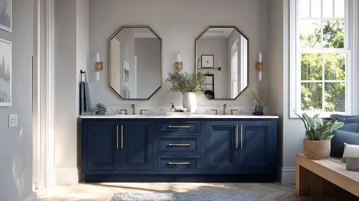
In modern settings, Hale Navy adds modern looks without overwhelming.
I used it on a bathroom vanity with crisp white shiplap and sleek fixtures, creating a clean, modern look.
The navy’s depth contrasts beautifully with minimal decor, as noted in Chrissy Marie Blog’s bathroom project.
- Colors: Neutral grays, metallics, crisp whites
- Vibe: Sleek, minimalist, worldly
- Room Tips: Use Hale Navy on a feature wall or furniture with clean lines. Pair with metallic accents and simple decor for a modern aesthetic.
4. Farmhouse
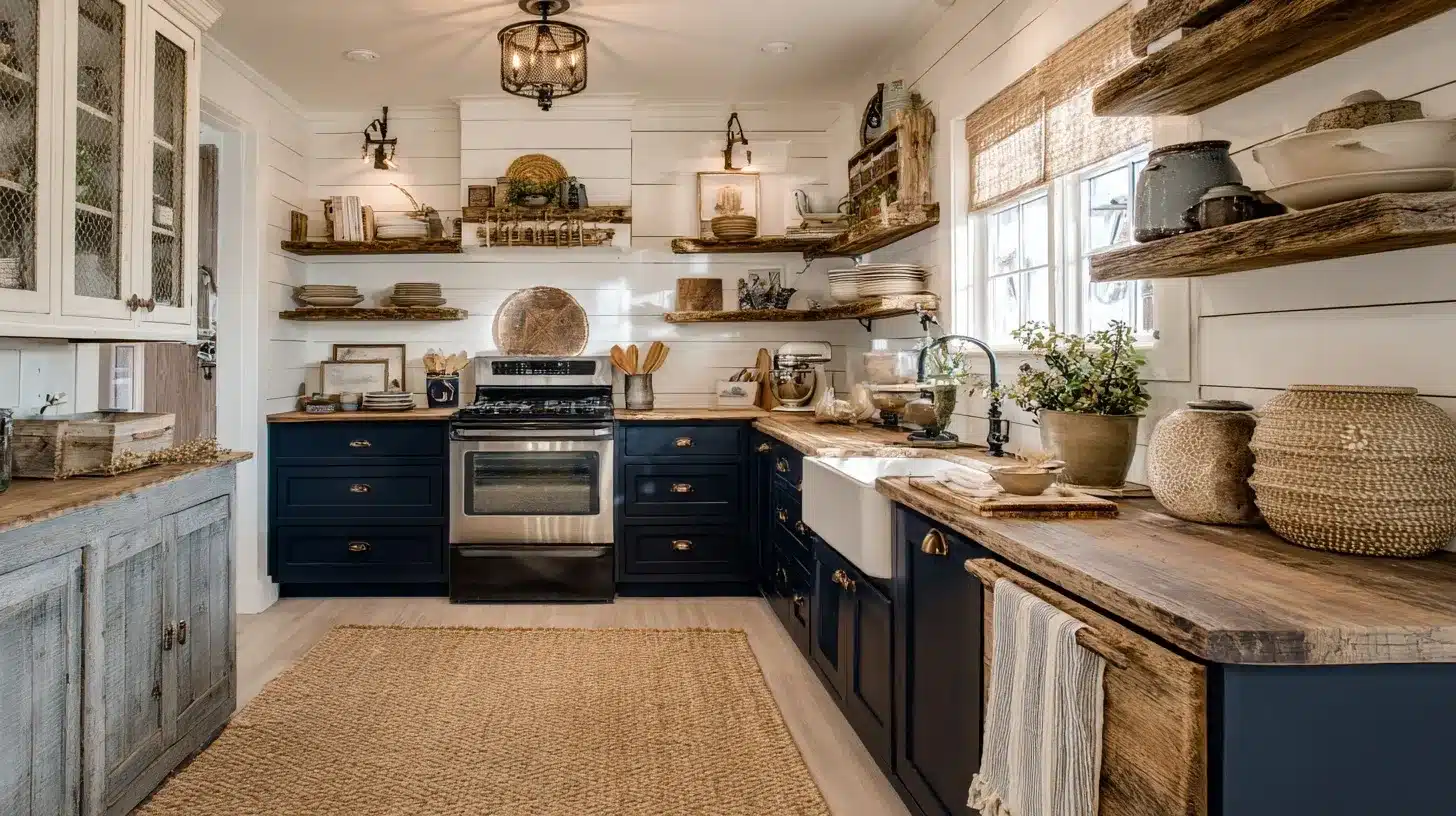
For a farmhouse aesthetic, Hale Navy works wonders on board-and-batten walls or kitchen cabinets.
I paired it with distressed wood furniture and jute rugs for a cozy, lived-in feel. The navy adds grace without sacrificing the rustic charm, as seen in Life On Virginia Street’s den design.
- Colors: Warm neutrals, distressed woods, soft whites
- Vibe: Cozy, rustic, inviting
- Room Tips: Use Hale Navy on accent walls or cabinets, paired with natural textiles and weathered wood furniture. Add simple, rustic decor for a farmhouse feel.
5. Eclectic
Hale Navy’s neutral quality makes it ideal for eclectic spaces. I’ve seen it used as a base for mixing bold patterns, such as florals or stripes, with metallics like brass or copper.
Its versatility allows it to anchor diverse elements without clashing, creating a cohesive yet vibrant look.
- Colors: Bold patterns, metallics, vibrant accents
- Vibe: Creative, vibrant, unique
- Room Tips: Use Hale Navy as a grounding color for walls or furniture. Mix with bold patterns, textures, and metallic accents for an eclectic, personalized space.
Competitor Colors for Benjamin Moore Hale Navy
| Brand | Paint Color | LRV | Undertones | Description |
|---|---|---|---|---|
| Sherwin-Williams | Naval (SW 6244) | 4 | Warm purple with hints of green-gray | A bright navy that’s darker than Hale Navy. Creates bold, dramatic effects. |
| Behr | Midnight Blue (N480-7) | 9 | True blue, less gray than Hale Navy | A deep navy similar to Hale Navy but less muted. |
| Farrow & Ball | Stiffkey Blue (No. 281) | 10 | Subtle green | A navy inspired by the Norfolk shoreline, slightly lighter than Hale Navy. |
| Clare | Nearly Navy | 7 | Teal tinge | A deep navy with a modern twist. Slightly darker than Hale Navy. |
| Backdrop | School Blazer Blue | – | Hint of gray | A deep navy blue that’s versatile for bedrooms and bathrooms. |
The key difference between Hale Navy and Naval (SW 6244)
Naval is darker (LRV 4 vs. 8.36) and warmer.
Under incandescent lighting, Naval can shift noticeably toward purple-blue. Hale Navy’s gray-green base resists that shift. If you’ve tested Naval and found it pulled too warm or too purple in the evening.
Hale Navy is the logical next sample.
Finishing it Up
After using Hale Navy Benjamin Moore in numerous projects, I can say it’s a color that never disappoints.
Its depth, versatility, and everlasting appeal make it a designer’s dream. It works well in both cool- and warm-toned rooms, and even shines in north-facing or darker spaces when paired with light contrasts, such as white or gray.
Start small with an accent wall, a piece of furniture, or even a front door to see its transformative power.
You can explore more ideas and order samples at Benjamin Moore’s Hale Navy page.
I’d love to hear how you plan to use Hale Navy; share your ideas in the comments below!
Frequently Asked Questions (FAQ’s)
1. What Colors Go Well with Hale Navy?
Simply White, White Dove, warm brass hardware, and natural linen all pair cleanly.
2. Is Hale Navy Too Dark for a Small Room?
One accent wall works. All four walls in a small room skip it.
3. What is the Lighter Version of Hale Navy?
Newburyport Blue (HC-155), same undertone family, LRV around 29, noticeably softer.
4. What is the Most Popular Benjamin Moore Blue?
Hale Navy consistently ranks among Benjamin Moore’s top-selling colors, not just blues.
5. What is Considered the Prettiest Shade of Blue?
Subjective, but Newburyport Blue and Wedgewood Gray (HC-146) get the most consistent praise.