for a Warm Home Decor")
Seeking a paint color that strikes a balance between warmth, grace, and Variety?
Sherwin-Williams Wool Skein (SW 6148) is turning heads for all the right reasons. This subtle grey tone blends seamlessly.
It seamlessly transitions into both classic and modern spaces, making it a go-to for designers and homeowners alike.
In this blog, we’ll cover everything you need to know about SW Wool skein, from its undertones and lighting behavior to where and how to use it.
What Color is Wool Skein By Sherwin-Williams?
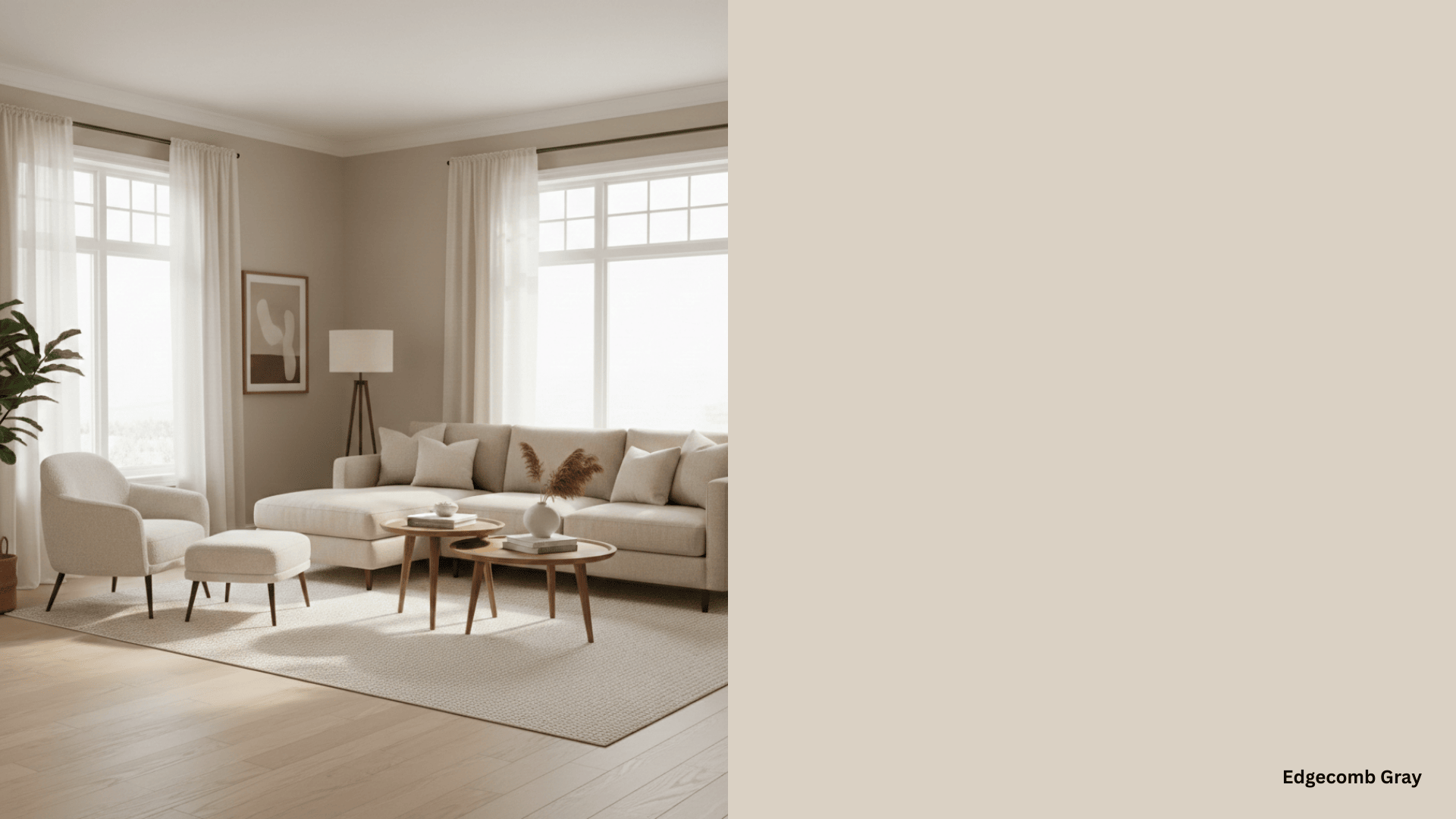
SW Wool Skein 6148 by Sherwin-Williams is a warm, versatile tan paint color with complex undertones that make it a timeless neutral choice.
With an LRV of 63, it reflects a moderate amount of light, making it bright enough to subtly enhance a space without overwhelming it.
The color is a warm, yellow-based neutral with soft beige and taupe undertones, but what makes it particularly interesting is its ability to reveal a subtle green “undertone” that can reveal itself under certain conditions.
The Beauty of Wool Skeins Under Different Lighting
The beauty of this color lies in its remarkable ability to transform throughout the day, creating a living color that brings depth and visual interest to any space.
Natural Light Performance
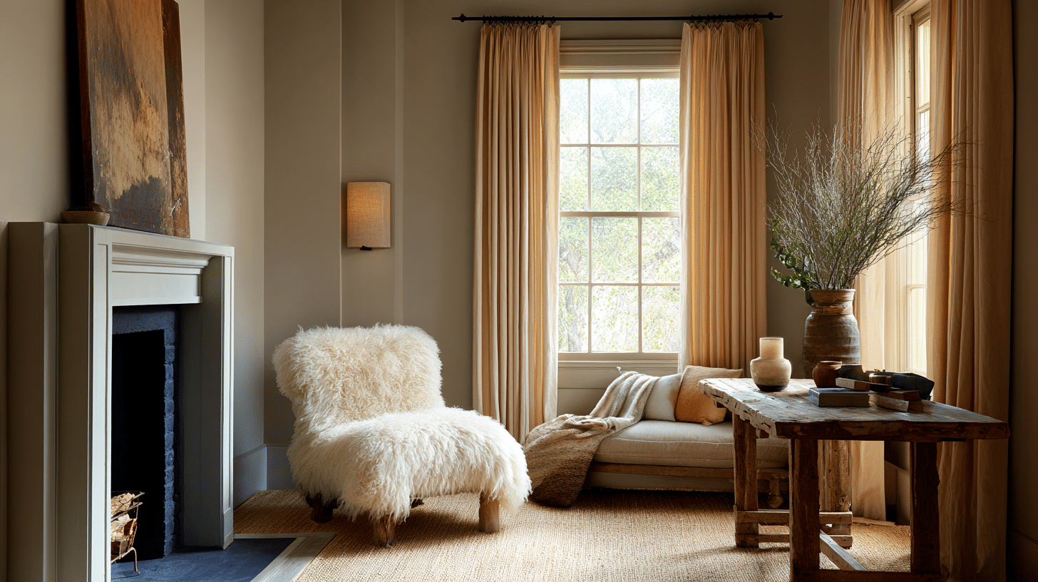
1. North-facing rooms: Wool Skein reveals its cooler personality, where the cool light from the northern light neutralizes the warm tones in Wool Skein and draws out the green undertones. This cooler exposure can make the color appear more muted and potentially fall flat in darker spaces.
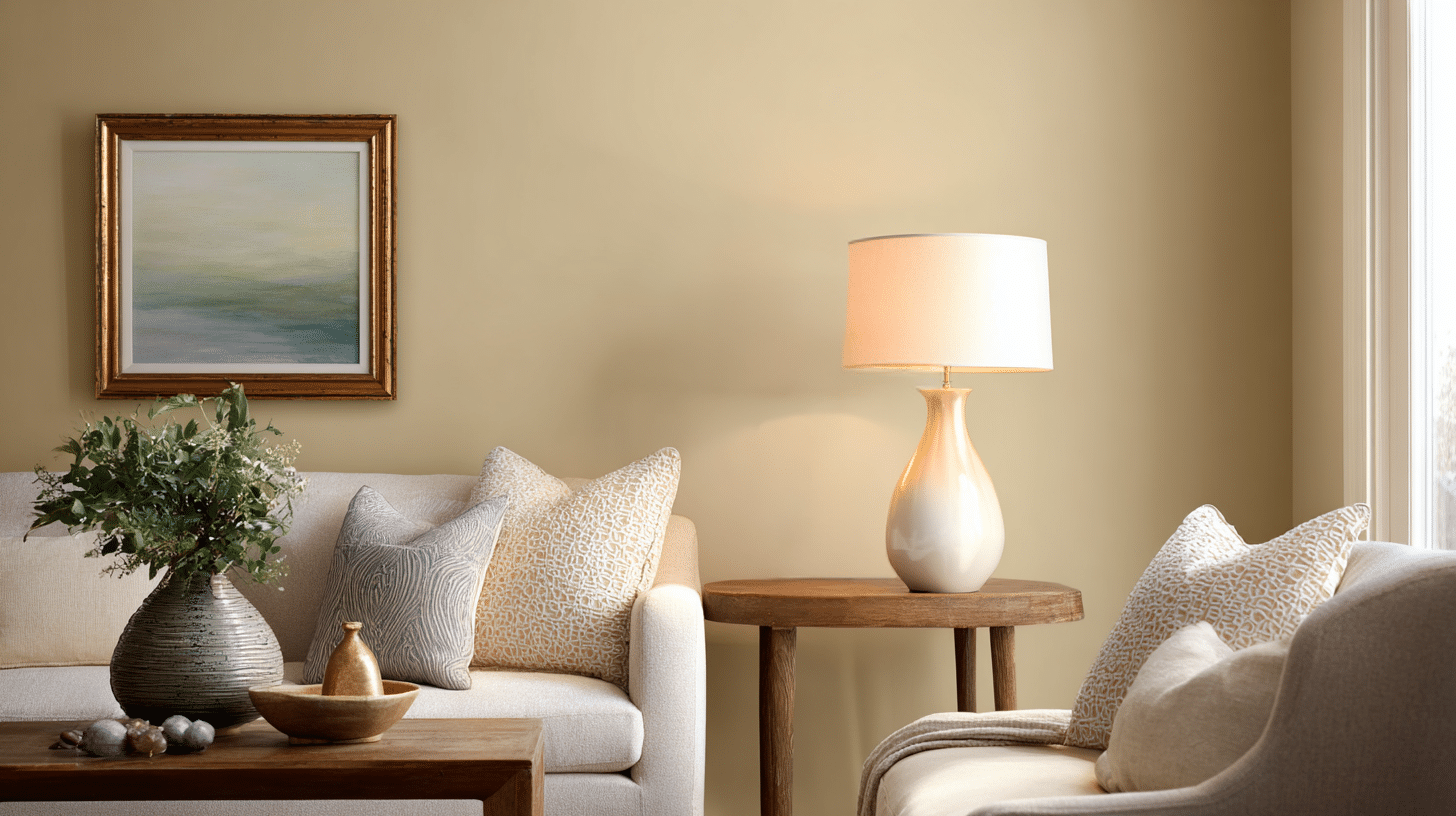
2. South-facing rooms: They showcase Wool Skein at its warmest, with consistent warm light that has a soft, yellow tone throughout the day, enhancing the color’s beige undertones while maintaining its inviting character without overheating.
3. East-facing rooms: experience warm, golden light in the morning, becoming neutral by noon.
4. West-facing rooms display a warm, orange-red light in the afternoon and evening, which can intensify Wool Skein’s warmth and yellow undertones.
Artificial Light performance
1. Regular artificial light tends to highlight the gray or lilac undertones, giving the walls a softer, calmer appearance.
This can be perfect for creating a relaxed atmosphere in bedrooms or quiet spaces where you want a peaceful feeling.
2. Warm glowing bulbs amplify the yellow undertones in Wool Skein, making the color appear more golden and cozy. This creates a welcoming, sunny feeling that’s ideal for living rooms, dining areas, and spaces where you want to encourage conversation and comfort.
3. Cool fluorescent lights draw out more of the beige aspects while muting the warmth, making the color look more neutral and less inviting.
This type of lighting can make the room feel less cozy and may not showcase the color’s best qualities.
Room by Room Makeover Using For Skein Wool
SW Wool Skein (SW 6148) has become a go-to choice for homeowners seeking that perfect balance of warmth and class.
Let’s see how this versatile neutral has completely transformed real spaces, creating atmospheres that feel both timeless and inviting.
Bedroom Makeover – Cold to Cozy
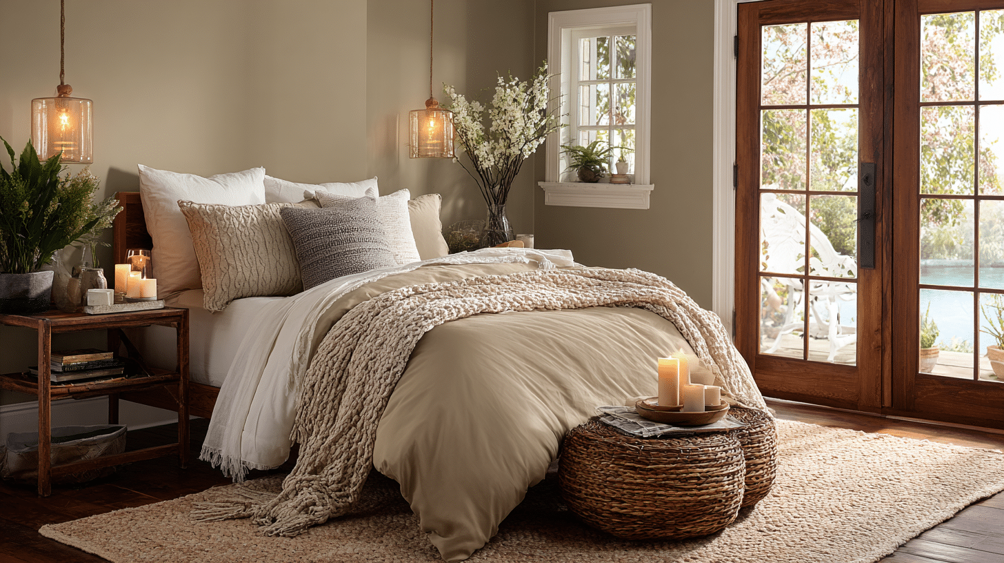
Wool Skein’s soft, warm color creates a cozy and welcoming feeling, making it perfect for rooms where you want to relax and unwind.
In bedrooms, this color helps you feel calm and peaceful, creating the perfect setting for a restful night’s sleep. Since it works well in any bedroom, you can use it safely to create a relaxing space, and it looks great paired with soft bed sheets and cozy blankets.
- Accents: Natural wood nightstands in warm oak, Ceramic or wooden table lamps, Natural fiber ottomans
- Accessories That Pair Well With It: Cream or sage green pillows, natural fiber rugs, candles, books, and ceramic vases.
- Best Color combination for the Bedroom: Canvas Tan with Accessible Beige, Soft blue-gray with Dover White
Living Room Modification- Bland to Inviting
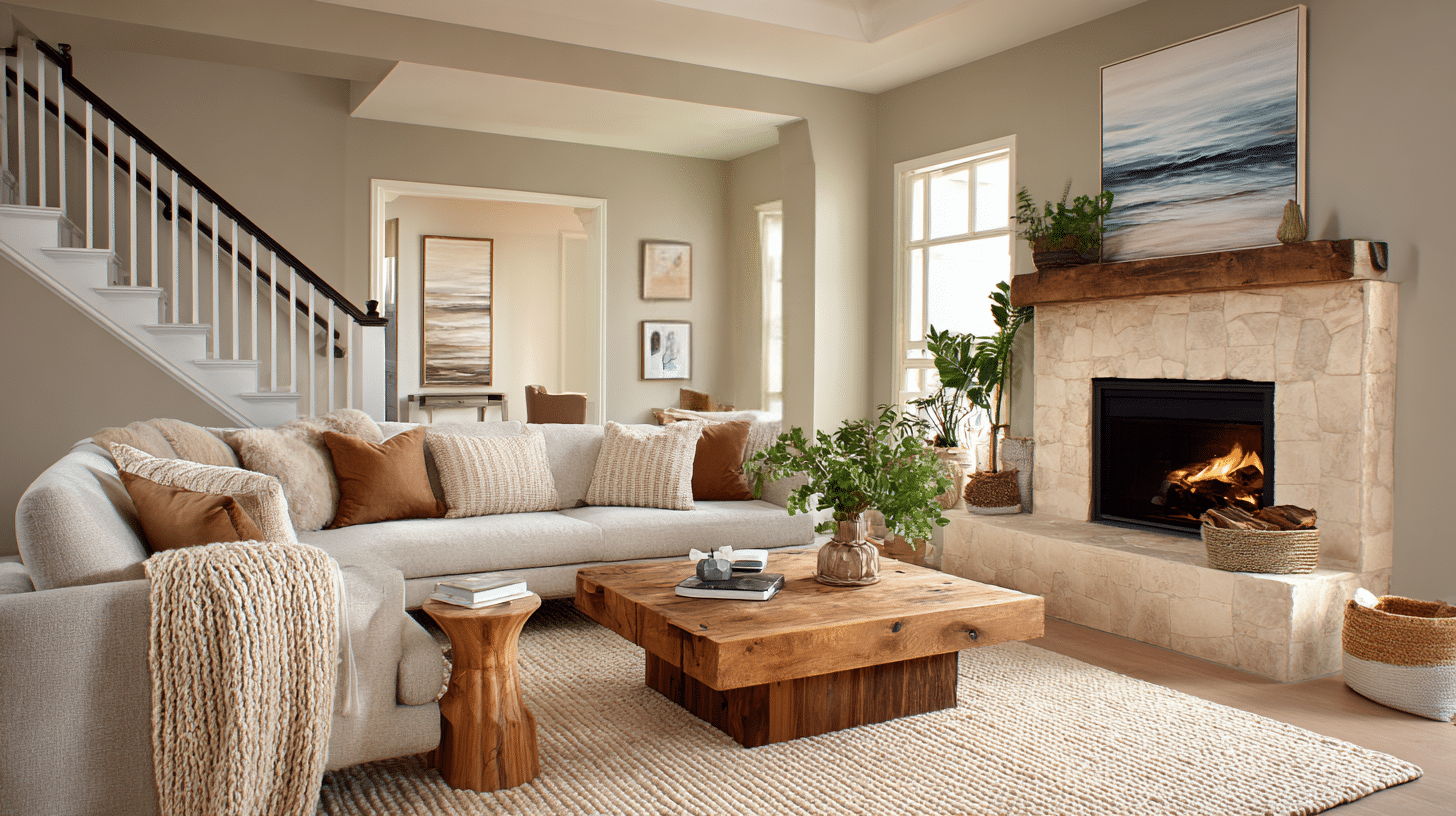
Living rooms showcase Wool Skein’s ability to be soft, warm, and cozy, making a space feel welcoming and friendly.
Use Wool Skeins on the walls, paired with soft fabrics in natural colors, and various types of lighting to create a relaxed and comfortable atmosphere.
It’s an excellent choice for busy living areas where you want everyone to feel warm and welcome.
- Accents: Linen curtains in natural or cream colors, Wooden or bamboo blinds with fabric valances
- Accessories That Pair Well With It: Coffee and side tables, Artwork pieces with warm tones, natural landscapes, or family photos in wood frames.
- Best color combinations for the Living room: Forest green with Creamy white, Soft blue-green with Pure white.
Home Office Shift- Simple to Special
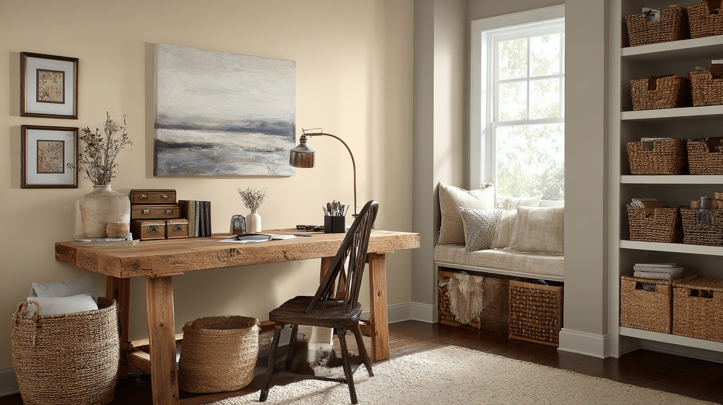
You can add peace and calm to your workspace with Wool Skein, as the soft colors help you focus better and feel less stressed, making it perfect for long video calls and meetings.
This paint color strikes the perfect balance for getting work done – it’s interesting enough to feel welcoming, yet not so bold that it diverts your attention from your tasks.
The warm, cozy feeling helps you stay motivated throughout the day.
- Accents: Floor lamp for ambient lighting in seating area, Built-in bookshelves painted in coordinating white
- Accessories That Pair Well With It: natural wood desks, woven baskets
- Best color combinations for the Home office: Deep forest green with Pure White, Terracotta with Cloud White
Bathroom Modification – Basic to Spa
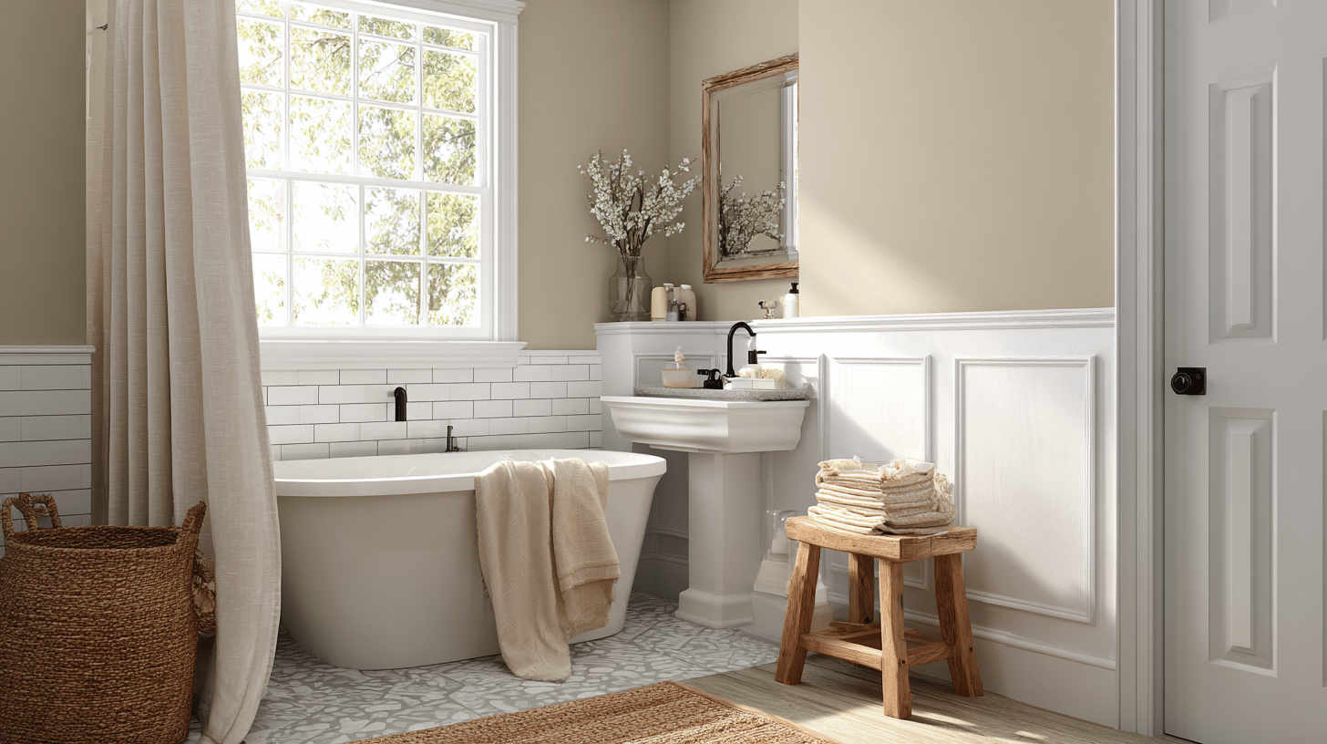
SW Wool Skein looks amazing in bathrooms, especially when paired with warm white trim, as it adds a classy touch without making the small room feel too busy or overwhelming.
This color works perfectly with white subway tiles and marble counters, creating a bathroom that feels like a relaxing spa, both clean and cozy at the same time.
Warm colors like Wool Skein are great for bathrooms because these are places where we go to unwind and take care of ourselves.
- Accents: Matte Black Faucets and shower hardware, bamboo bath mats, and linen towels.
- Accessories That Pair Well With It: Woven baskets, soft white or cream towels, natural fiber bath mats, and natural stone soap dispensers.
- Best color combinations for the bathroom: Sherwin-Williams Sea Salt, Sherwin-Williams Dried Thyme.
Comparing SW Wool Skein (SW 6148) with Similar Colors
This comparison table illustrates how SW Wool Skein (SW 6148) compares to similar neutral paint colors from Sherwin-Williams.
Each color is evaluated based on its Light Reflectance Value (LRV), which measures the amount of light it reflects, as well as its primary undertones that influence how the color appears in different lighting conditions.
| Color Name | Code | LRV | Undertones | Difference from Wool Skein |
|---|---|---|---|---|
| SW Wool Skein | SW 6148 | 63 | Yellow, Green, Beige | Base comparison |
| SW Accessible Beige | SW 7036 | 58 | Gray, Beige | More greige, less yellow |
| SW Natural Tan | SW 7567 | 61 | Beige, Gray | More muted, grayer |
| SW Canvas Tan | SW 7531 | 69 | Beige, Yellow | Lighter, less green |
| SW Balanced Beige | SW 7037 | 56 | Beige, Gray | Darker, stronger gray |
| SW Softer Tan | SW 6141 | 63 | Yellow, Beige | More yellow, softer |
The Bottom Line
The modification power of SW Wool Skein (SW 6148) extends far beyond simply changing the appearance of a space; it affects how we feel in our living environments.
From cold, boring rooms to warm, welcoming homes, this flexible neutral color shows that the right paint can significantly change a home’s mood and ambiance.
When you’re making a calm bedroom, a cozy living room, a focused home office, or a relaxing bathroom, Wool Skein’s classy warmth works perfectly in each room’s special needs.