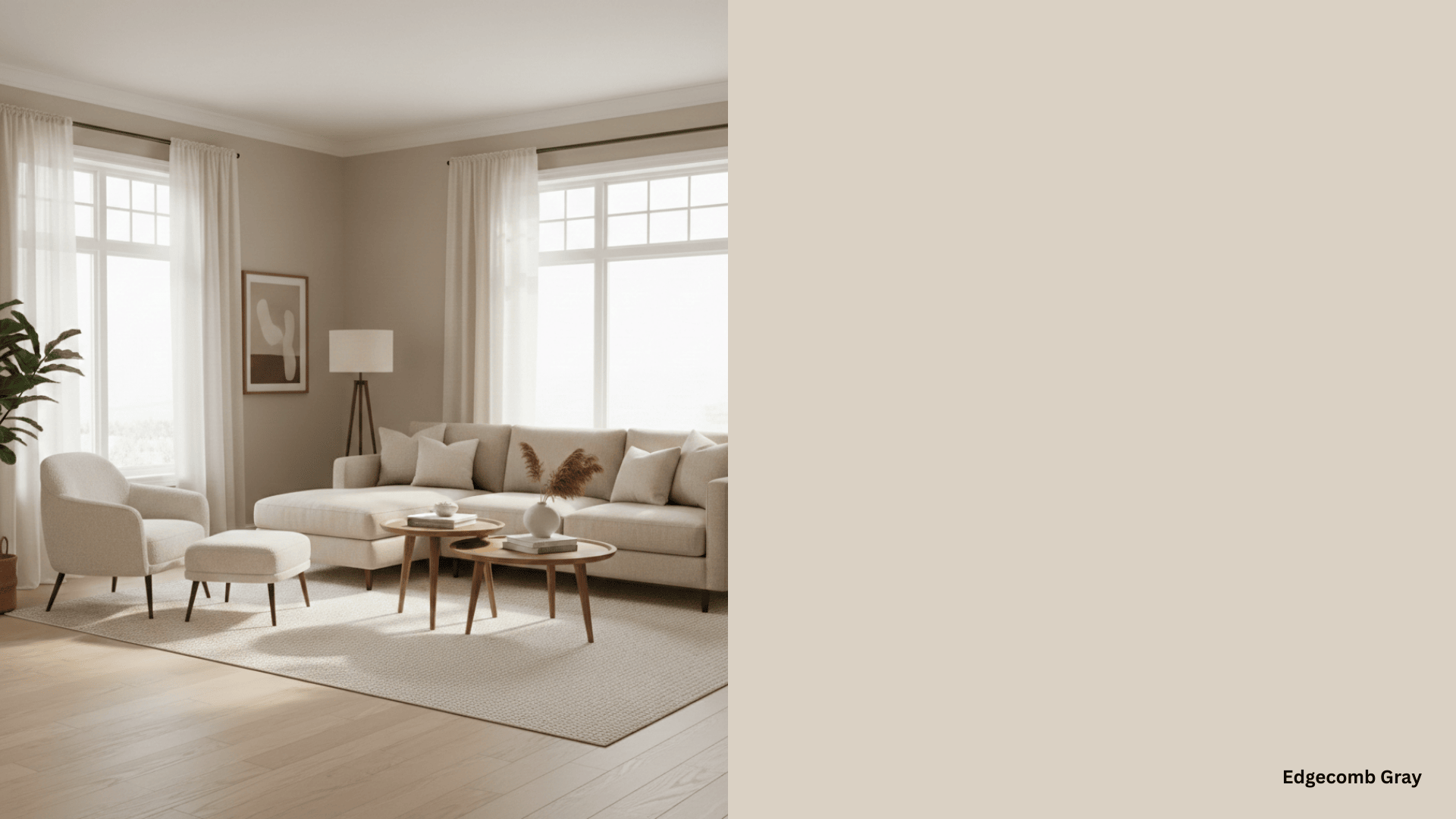
Looking for the perfect sage green shade that won’t make your room look like a hospital waiting area?
I get it. You want to stay trendy, but scrolling through hundreds of green paint swatches feels overwhelming. Plus, you’re worried about picking the wrong shade and ending up with walls that clash with everything you own.
I’ve spent months testing various sage green shades in real homes, and I’m excited to share the ones that work.
These aren’t just trendy picks, they’re colors that will make your space feel calm yet current.
Understanding Sage Green on the Color Wheel
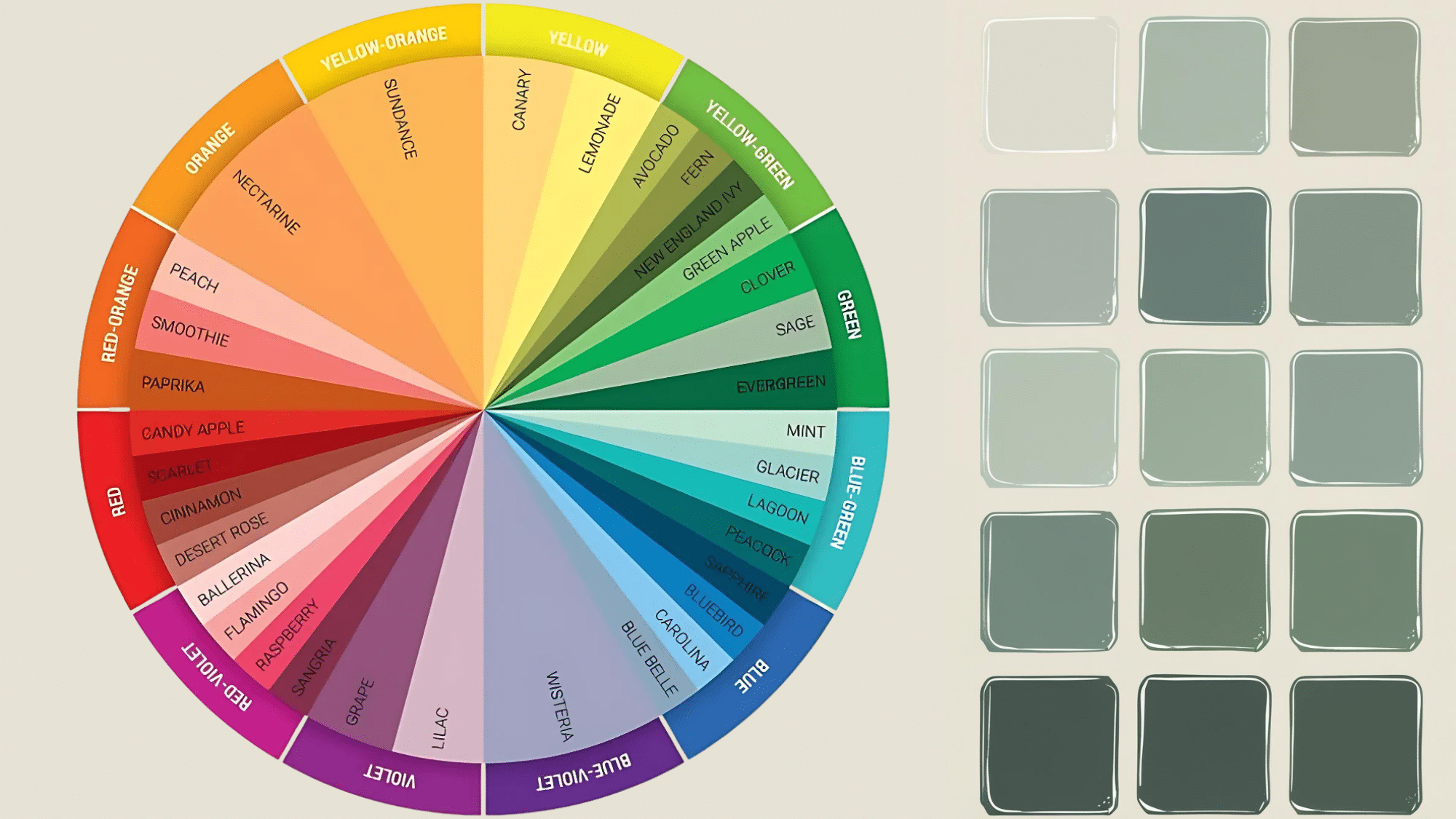
Sage green occupies a unique position on the color wheel – it’s not a pure hue but rather a complex blend that sits between true green and neutral gray. This positioning is what makes it so versatile and appealing.
On the traditional color wheel, sage green is created by adding gray to green, which desaturates the color and gives it that classy, muted quality. This gray addition moves it away from the bright, primary green toward the neutral center of the wheel.
This balanced position between pure color and neutral makes sage green incredibly harmonious.
It doesn’t compete aggressively for attention like saturated colors do, instead offering a gentle presence that enhances rather than dominates your space.
Top Sage Green Shades by Sherwin-Williams
After testing dozens of sage green paints in various rooms and lighting conditions, I’ve narrowed down the winners.
These aren’t just pretty colors on a paint chip – they’re shades that actually work in real homes. Here are my top picks:
1. Sherwin-Williams 2860 Sage
This warm green sage has yellow undertones that make it feel cozy and natural. SW Sage sits on the medium-darker end of the scale with good depth, making it perfect for creating spaces that feel grounded yet classy.
I love how this color works in both traditional and modern settings. It pairs beautifully with warm wood tones and creates that lived-in, comfortable feeling we all want at home.
| Specification | Details |
|---|---|
| Hex Code | #B3AE95 |
| LRV | 42 |
| Undertones | Yellow/Beige (Warm) |
| Complimentary Colors | Deep blues, rich purples, warm whites |
2. Sherwin-Williams 6204 Sea Salt
Sea Salt is famous for being a chameleon color that shifts between blue, gray, and green depending on the lighting. In natural light, it leans more green, while artificial lighting brings out cooler blue-gray tones.
This is the sage color I recommend when you want something that feels fresh and spa-like but isn’t too bold. It works in every room and makes spaces feel larger because of its high light reflectance.
| Specification | Details |
|---|---|
| Hex Code | #CDD2CA |
| LRV | 63 |
| Undertones | Blue/Gray (Cool) |
| Complimentary Colors | Crisp whites, soft blues, warm corals |
3. Sherwin-Williams 6176 Liveable Green
This muted green leans slightly warm with subtle gray and beige undertones that prevent it from feeling overly vibrant. Its adaptable nature allows it to harmonize with various color schemes and lighting conditions while evoking calm and natural warmth.
What I appreciate about Liveable Green is how it bridges the gap between modern and traditional styles. It’s perfect when you want color that doesn’t overwhelm.
| Specification | Details |
|---|---|
| Hex Code | #CECEBD |
| LRV | 61 |
| Undertones | Yellow/Gray (Warm) |
| Complimentary Colors | Soft blues, warm neutrals, deep navy |
4. Quietude HGSW6212, Color of the Year 2025
This soft sage green with blue undertones embodies tranquility and mindfulness for 2025.
Quietude promotes peace and balance, creating calming environments that encourage relaxation while remaining versatile enough for any room in your home.
| Technical Specs | Details |
|---|---|
| Hex Code | ADBBB2 |
| LRV | 46-48 |
| Undertones | Blue (Cool) |
| Complimentary Colors | Clean whites, warm neutrals, brass accents |
5. Sherwin-Williams Evergreen Fog SW 9130, Color of the Year 2022
Evergreen Fog is a chameleon color that beautifully blends green and gray with subtle blue undertones.
This versatile mid-tone creates spaces that feel both grounded and fresh, making it perfect for modern or traditional interiors seeking timeless appeal.
| Technical Specs | Details |
|---|---|
| Hex Code | 95978A |
| LRV | 30 |
| Undertones | Blue-Gray (Cool) |
| Complimentary Colors | Warm whites, natural browns, deep blues |
My Personal Favourite Beautiful Sage Green Shades from Benjamin Moore
After working with countless Benjamin Moore sage greens, these are the ones I keep coming back to.
They’re reliable, beautiful, and work in almost any space – my tried-and-true recommendations for makeover lovers.
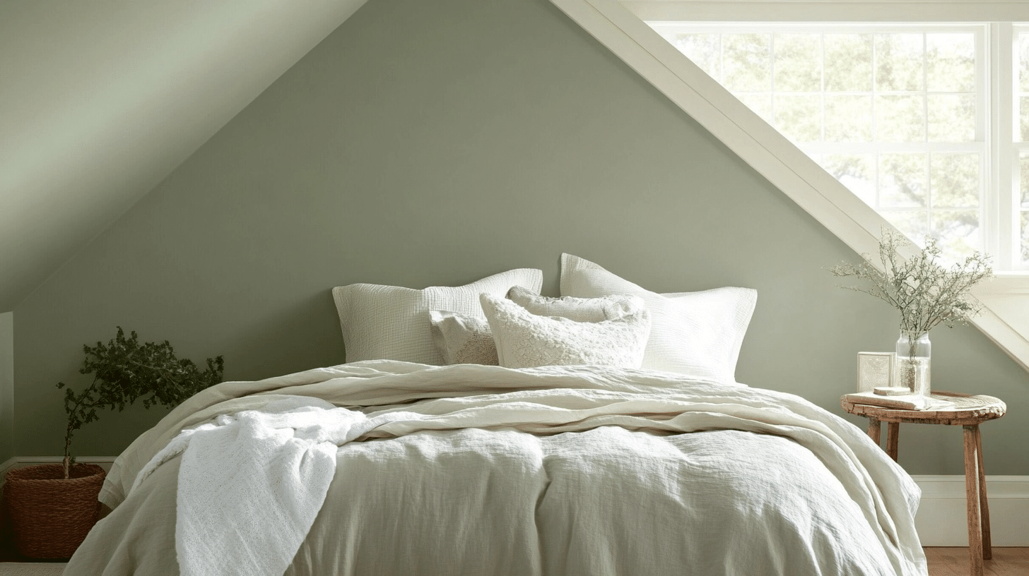
6. Benjamin Moore October Mist 1495, Color of the Year 2022
Evocative of a flower stem, this gently shaded vintage sage anchors and uplifts spaces with its warm green-gray blend.
October Mist creates the perfect canvas for self-expression while maintaining refined neutrality that works across all design styles.
| Technical Specs | Details |
|---|---|
| Hex Code | B6B8A5 |
| LRV | 47 |
| Undertones | Yellow-Green (Warm) |
| Complimentary Colors | Soft creams, warm whites, natural browns |
7. Benjamin Moore Georgian Green HC-115
This medium olive sage tone is warmed by muted yellow undertones, making it a classic choice that’s been popular for years. Georgian Green has more personality than typical neutrals while still being easy to live with.
I’ve used this in living rooms where clients wanted something timeless but not boring. It’s particularly beautiful with brass accents and natural materials.
| Specification | Details |
|---|---|
| Hex Code | #B9B790 |
| LRV | 45.15 |
| Undertones | Yellow (Warm) |
| Complimentary Colors | Rich blues, warm whites, deep grays |
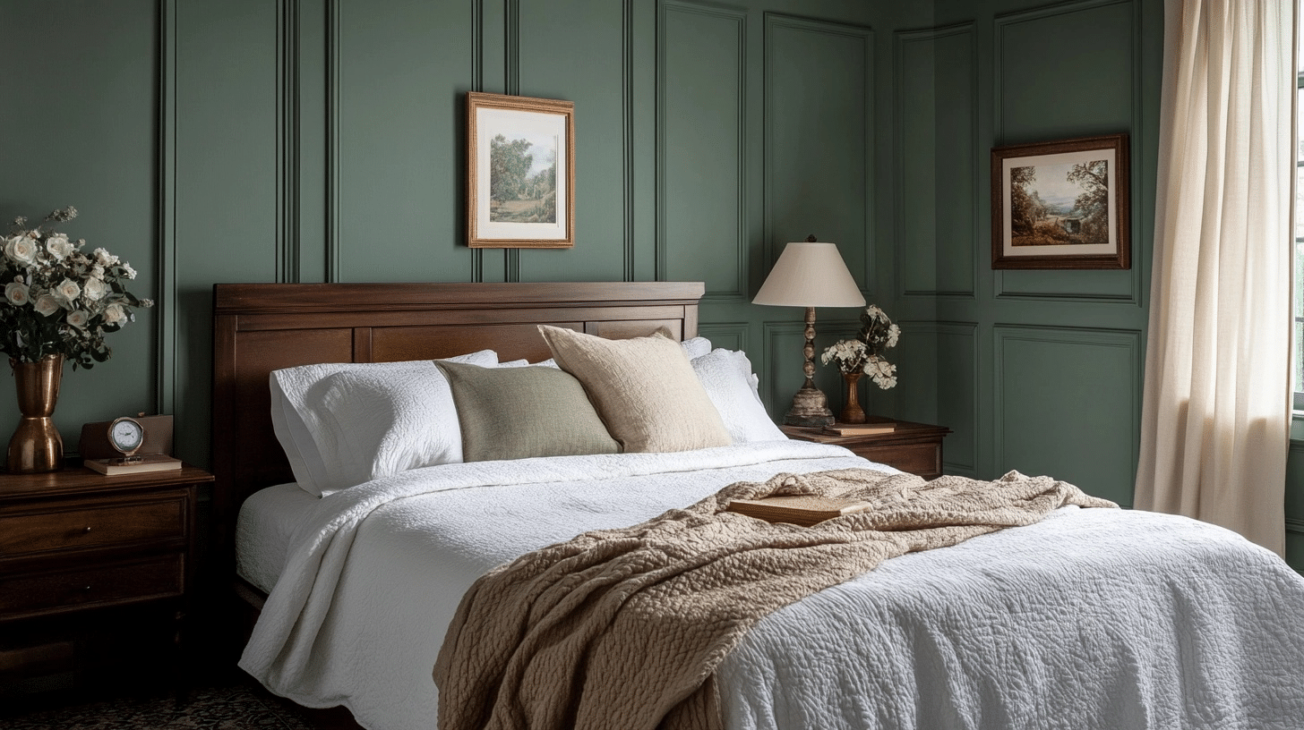
8. Benjamin Moore Rosepine 461
This forest green has hints of gray that bring versatility and depth. Rosepine has brown and gray undertones that make it feel more natural and earthy than typical greens, giving it a well-balanced, warm vibe.
This is my go-to for my sister’s renovation, who wanted dramatic color without going too dark. It creates that cozy, enveloping feeling perfect for her bedroom, which is exactly what she wanted.
| Specification | Details |
|---|---|
| Hex Code | #767C6A |
| LRV | 19-20 |
| Undertones | Brown/Gray (Earthy) |
| Complimentary Colors | Warm whites, rich creams, deep blues |
9. Benjamin Moore Gloucester Sage HC-100
An adaptable dark hue that can conjure rain-soaked moss to elegant wrought iron. The undertone leans toward yellow, giving this classy shade warmth and depth.
Gloucester Sage is perfect when you want the richness of a darker green but still need it to feel welcoming. I love using this in studies or powder rooms where you can be a bit bolder with color.
| Specification | Details |
|---|---|
| Hex Code | #7B7665 |
| LRV | 17-18 |
| Undertones | Yellow (Warm) |
| Complimentary Colors | Crisp whites, soft blues, warm beiges |
10. Benjamin Moore Hollingsworth Green HC-141
This feather-light green creates a relaxing oasis with its delicate balance of cool and warm tones. The gray undertones temper the green and prevent it from feeling overpowering, while subtle yellow hints add warmth and depth.
Hollingsworth Green is like the perfect neutral that happens to be green. It works everywhere and makes spaces feel calm and classy without any fuss.
| Specification | Details |
|---|---|
| Hex Code | #CCD4C4 |
| LRV | 63-64 |
| Undertones | Neutral/Gray with Yellow hints |
| Complimentary Colors | Soft whites, warm beiges, and Navy Blue |
Some Other Soft Sage Green Shades You Can’t Miss out On
While the major paint brands get most of the attention, several smaller companies make beautiful sage green colors worth considering.
These options might be perfect if you’re looking for something unique or want to support different manufacturers.
11. Valspar Sprig of Sage 8004-28D
A cool neutral with green influence that offers more depth than lighter sage options.
The Valspar Sprig of Sage is a medium-toned color that provides grounding for spaces while maintaining the calming qualities of sage green, perfect for creating intimate yet fresh environments.
| Specification | Details |
|---|---|
| Hex Code | A1A292 |
| LRV | 36 |
| Undertones | Cool Green |
| Complimentary Colors | Warm creams, light greiges |
12. Behr River Mist S410-1
River Mist is one of those colors that feels like a breath of fresh air. This very light sage green has cool gray undertones that make it feel crisp and clean without being stark. With its high LRV, it reflects lots of light, making rooms feel bigger and brighter.
I recommend using this when someone wants just a hint of color but still wants their space to feel neutral and calming.
| Specification | Details |
|---|---|
| Hex Code | D8E2D6 |
| LRV | 74 |
| Undertones | Gray/Green (Cool) |
| Complimentary Colors | Soft whites, warm woods, corals |
13. Behr Moss Mist S380-1
Like a small stone dusted with a touch of snowfall, Moss Mist creates a sense of stillness and ease. This is the warmest of the light shades of sage green, with subtle yellow undertones that make it feel cozy rather than clinical.
The high LRV means it bounces light around beautifully, but the warm undertones keep it from feeling too bright or harsh. Perfect for bedrooms or any space where you want tranquility.
| Specification | Details |
|---|---|
| Hex Code | E0E1D3 |
| LRV | 75 |
| Undertones | Yellow (Warm) |
| Complimentary Colors | Warm whites, rich browns, soft purples |
14. Behr Frosted Sage N400-2
Known for its versatility, Frosted Sage is a light gray-green with a can’t-go-wrong reputation for creating relaxed spaces.
This color has more depth than the lighter options but still feels fresh and calming.
The balanced undertones mean it works with both warm and cool accent colors, making it incredibly flexible for decorating. I recommend this when you want sage green that feels substantial but not overwhelming.
| Specification | Details |
|---|---|
| Hex Code | C7D1C5 |
| LRV | 62 |
| Undertones | Green/Gray (Neutral) |
| Complimentary Colors | Warm whites, deep purples, soft pinks |
15. Behr Sage Brush S370-3
This soft, earthy tone is perfect for adding tranquility to any space. Sage Brush has the most color saturation of these options, with warm yellow undertones that give it an organic, natural feel.
This works beautifully with natural materials like wood and stone, and it’s rich enough to use on cabinets or as an accent wall.
| Specification | Details |
|---|---|
| Hex Code | BFC0A2 |
| LRV | 51 |
| Undertones | Yellow (Warm) |
| Complimentary Colors | Bright salmons , rich pinks, warm creams |
16. Farrow & Ball Castle Grey No. 92
Originally used on castle exteriors, this classy gray-green offers complex undertones that shift beautifully throughout the day.
Castle Grey provides rich depth while maintaining the refined, timeless quality that Farrow & Ball is renowned for in their carefully crafted color palette.
| Specification | Details |
|---|---|
| Hex Code | 79877A |
| LRV | 29 |
| Undertones | Blue/Gray (Complex) |
| Complimentary Colors | Warm creams, Dark brown wood, Copper accents |
Best Color Combination for Sage Color Palettes
The beauty of sage green lies in how well it plays with other colors.
But I’ve learned that not all combinations work equally well – some make sage green look muddy, while others bring out its best qualities. The key is understanding which colors enhance sage green’s natural warmth or coolness.
Here are the color palettes featuring sage green that consistently work beautifully:
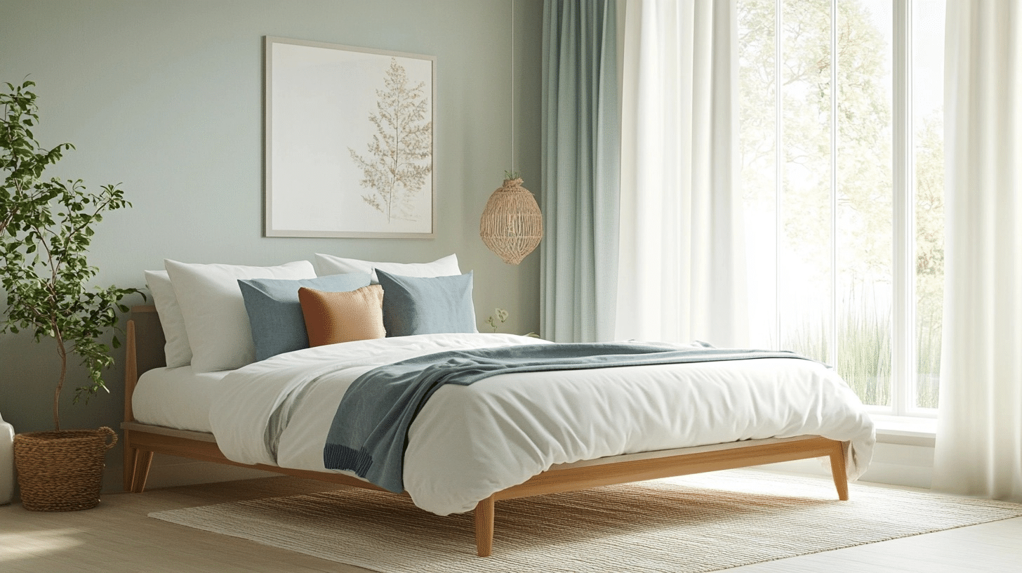
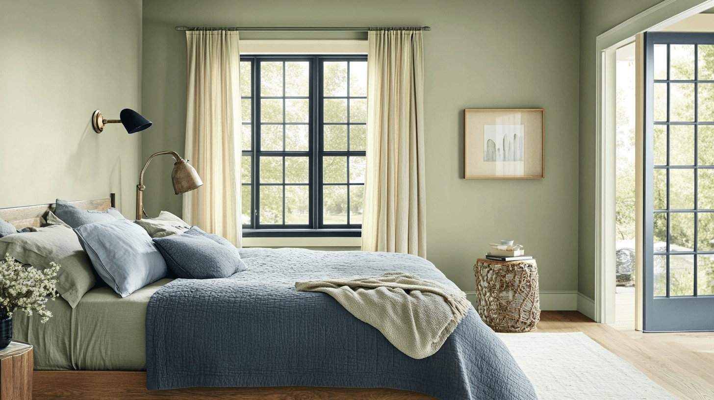
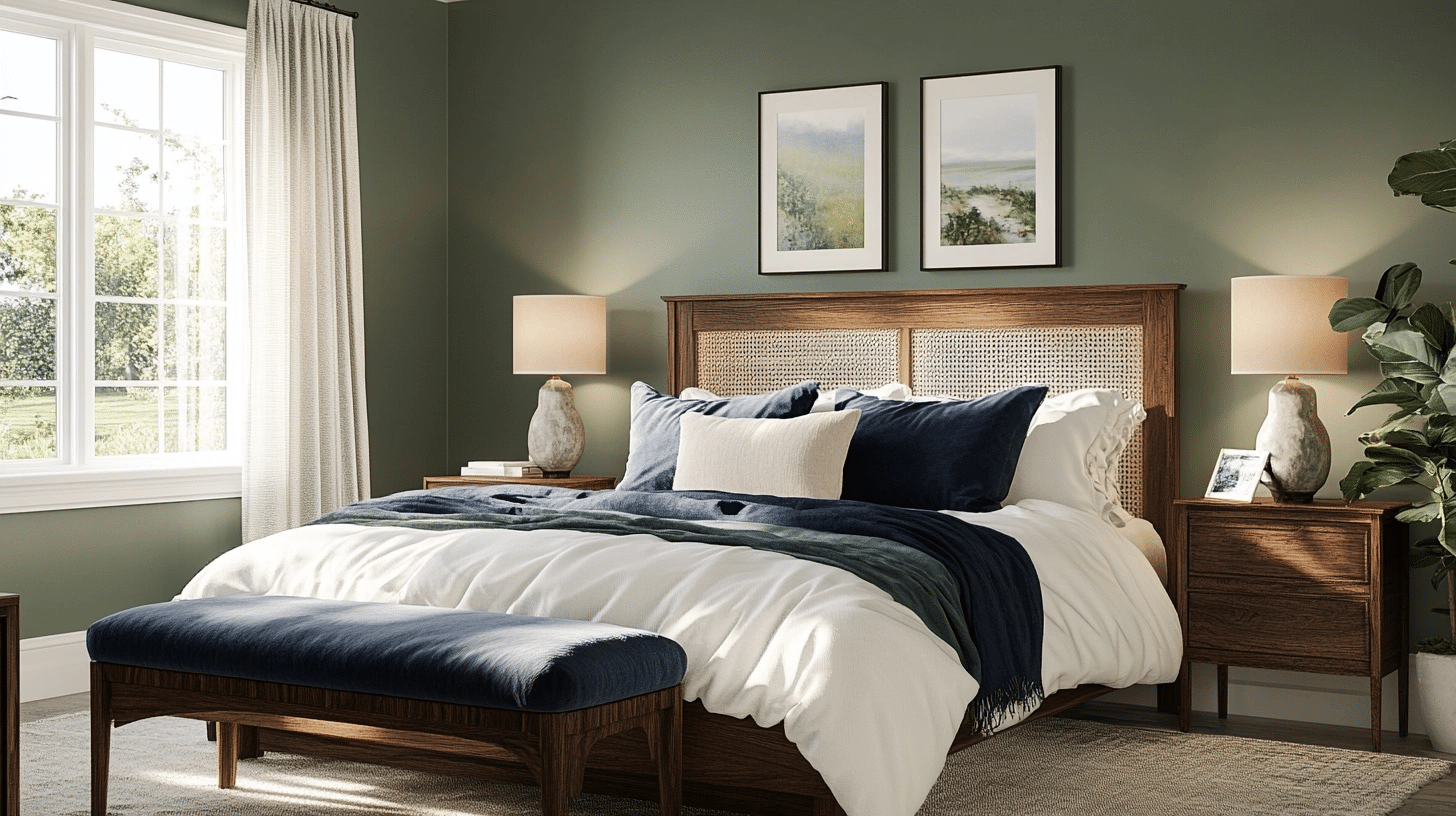
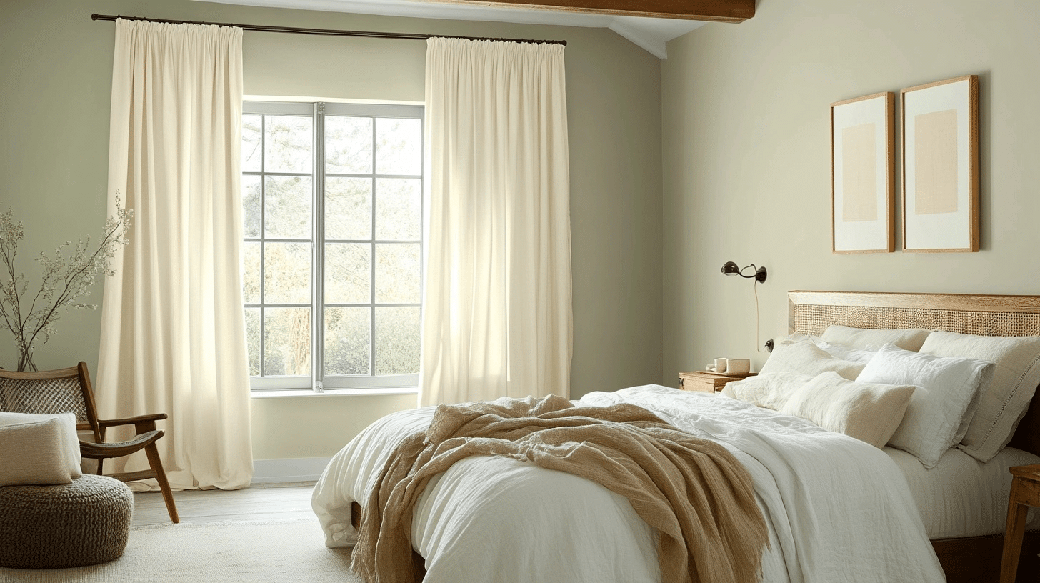
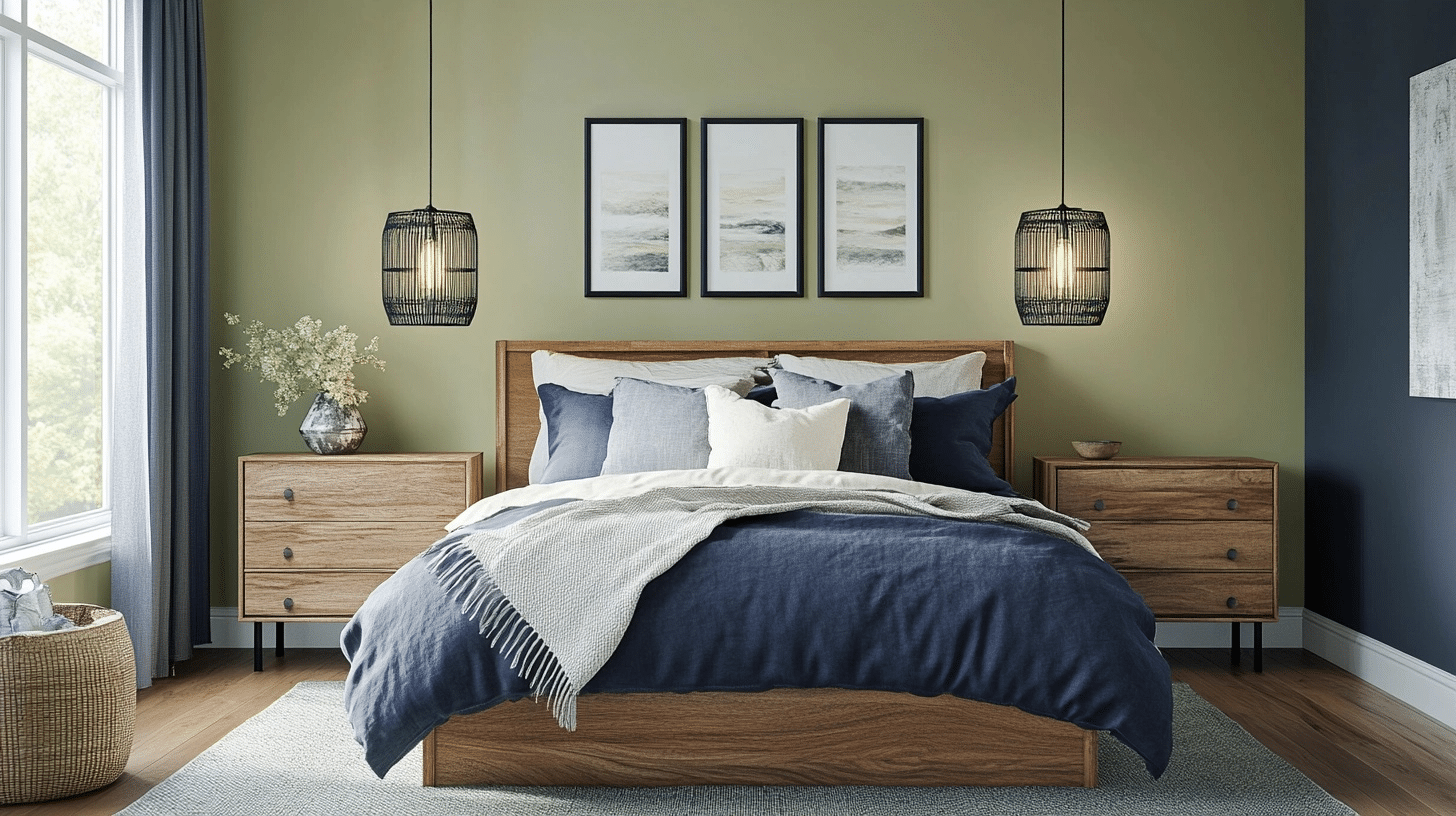
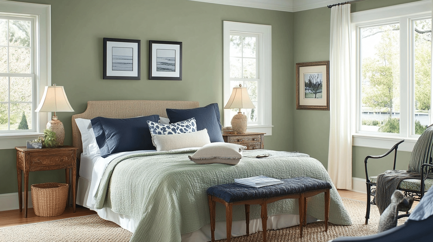
1. Dark Sage + Deep Blue + Warm Beiges
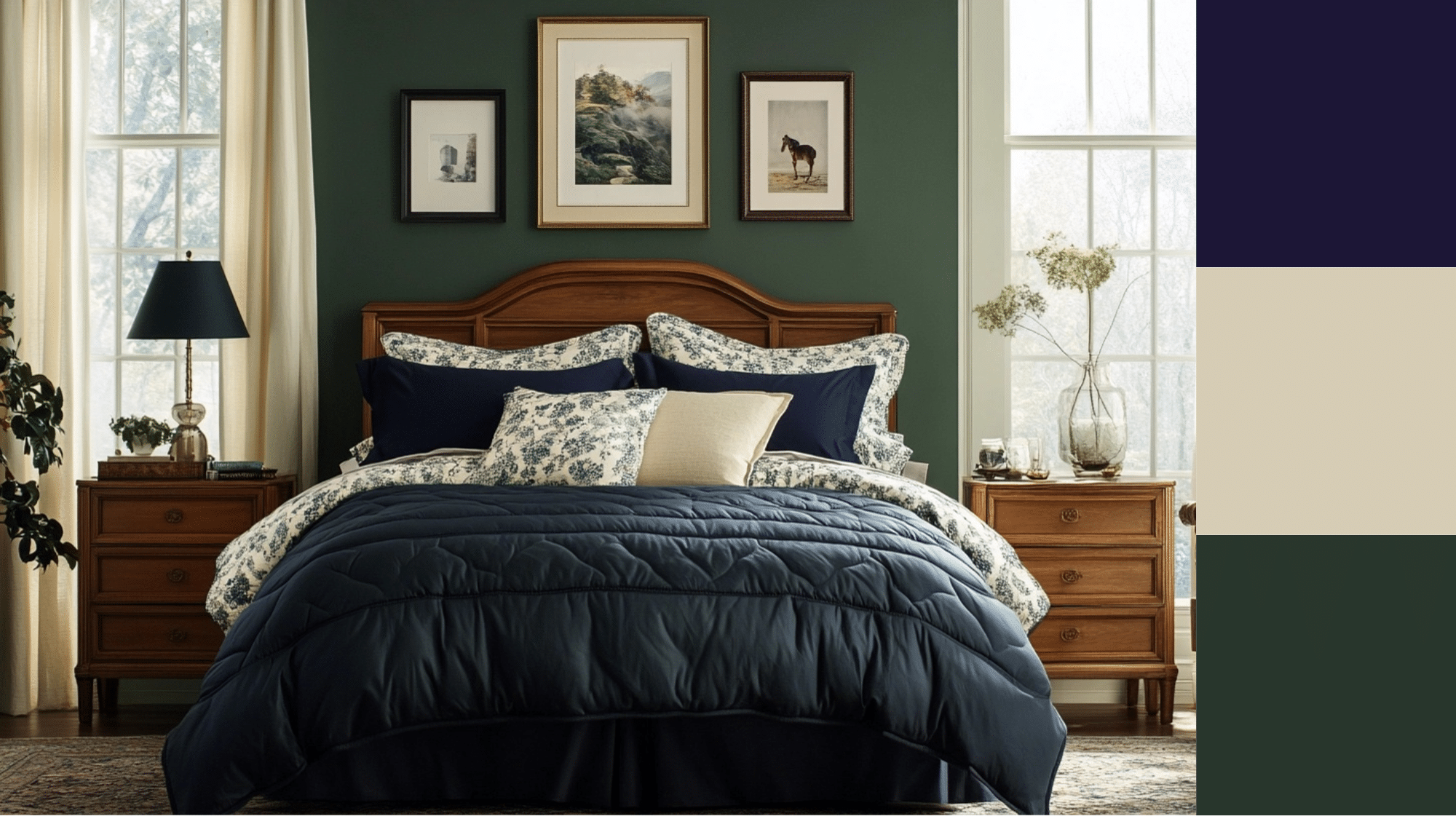
This pairing offers a grounded but refined vibe. The warm undertones of sage make it feel comforting, while navy adds depth and contrast. Warm beiges soften the look, keeping it balanced and ideal for it’s aesthetics.
-
Decor Aesthetic: Transitional or Modern Traditional Interiors
-
Accents: Brass fixtures, white linen curtains, woven cane baskets
-
Furniture: Walnut or medium-toned oak dressers, navy-upholstered chairs, whitewashed wood beds
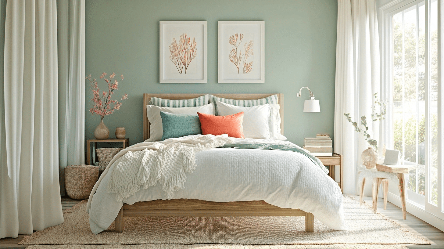
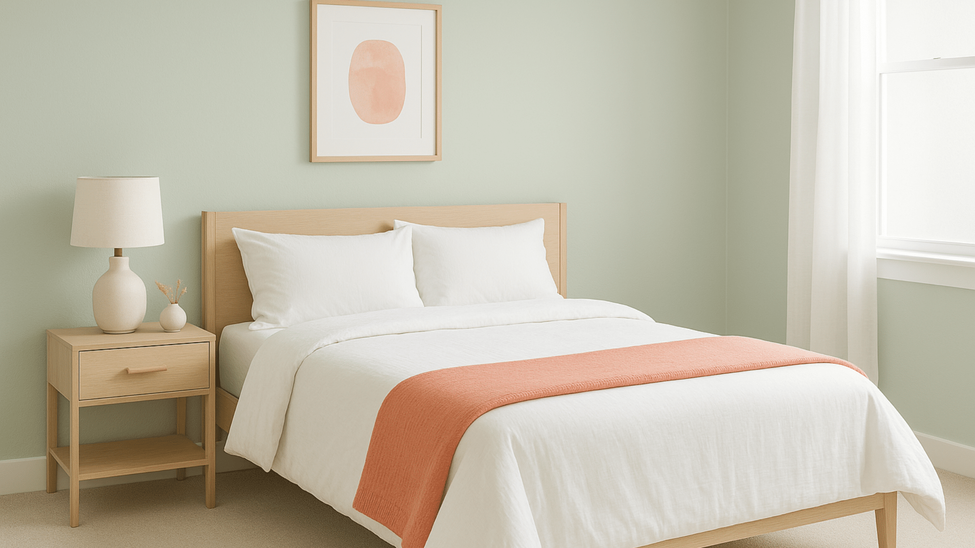
2. Cool Sage + Muted Coral + Crisp White
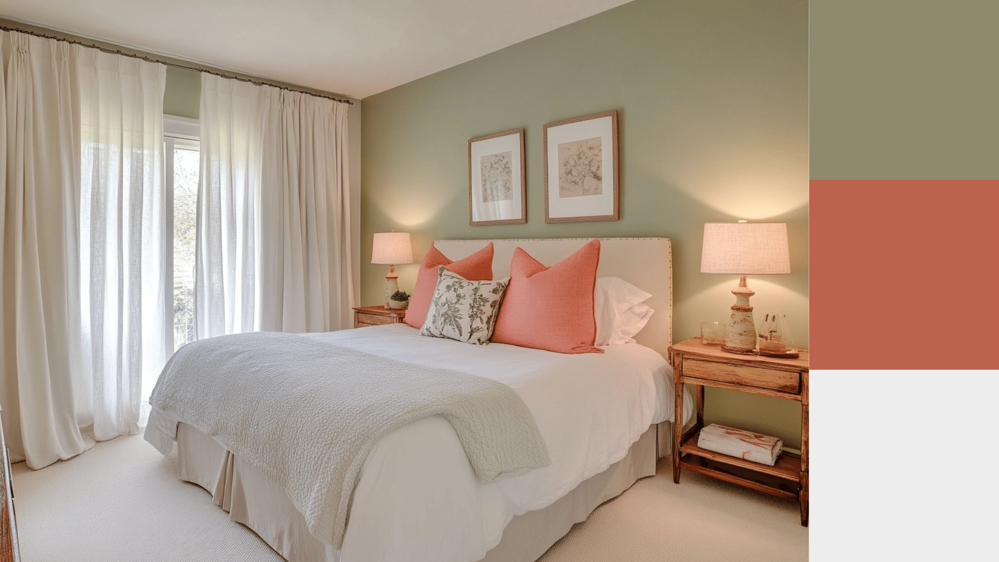
Sea Salt’s cool blue-gray tone works beautifully with muted corals for a fresh yet warm contrast. The coral lifts the coolness while crisp white keeps the space feeling clean and airy; a beautiful combo for light-filled, contemporary spaces.
-
Decor Aesthetic: Spa Minimalism or Soft Scandinavian
-
Accents: Coral artwork, matte white planters, soft blue throws
-
Furniture: Pale ash or light birch wood, white metal lamps, rattan elements
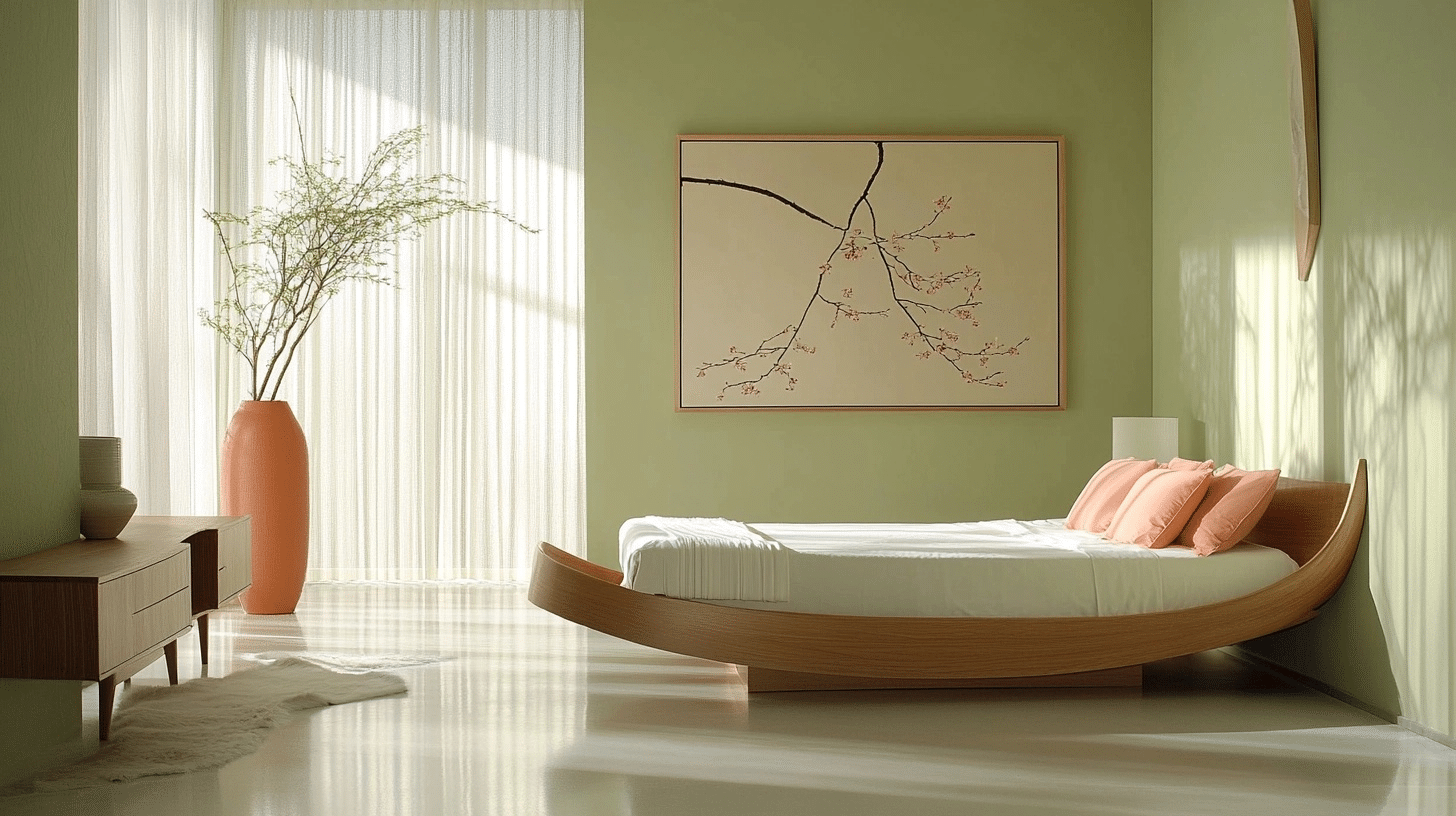
3. Earthy Sage + Terracotta + Creamy Neutrals
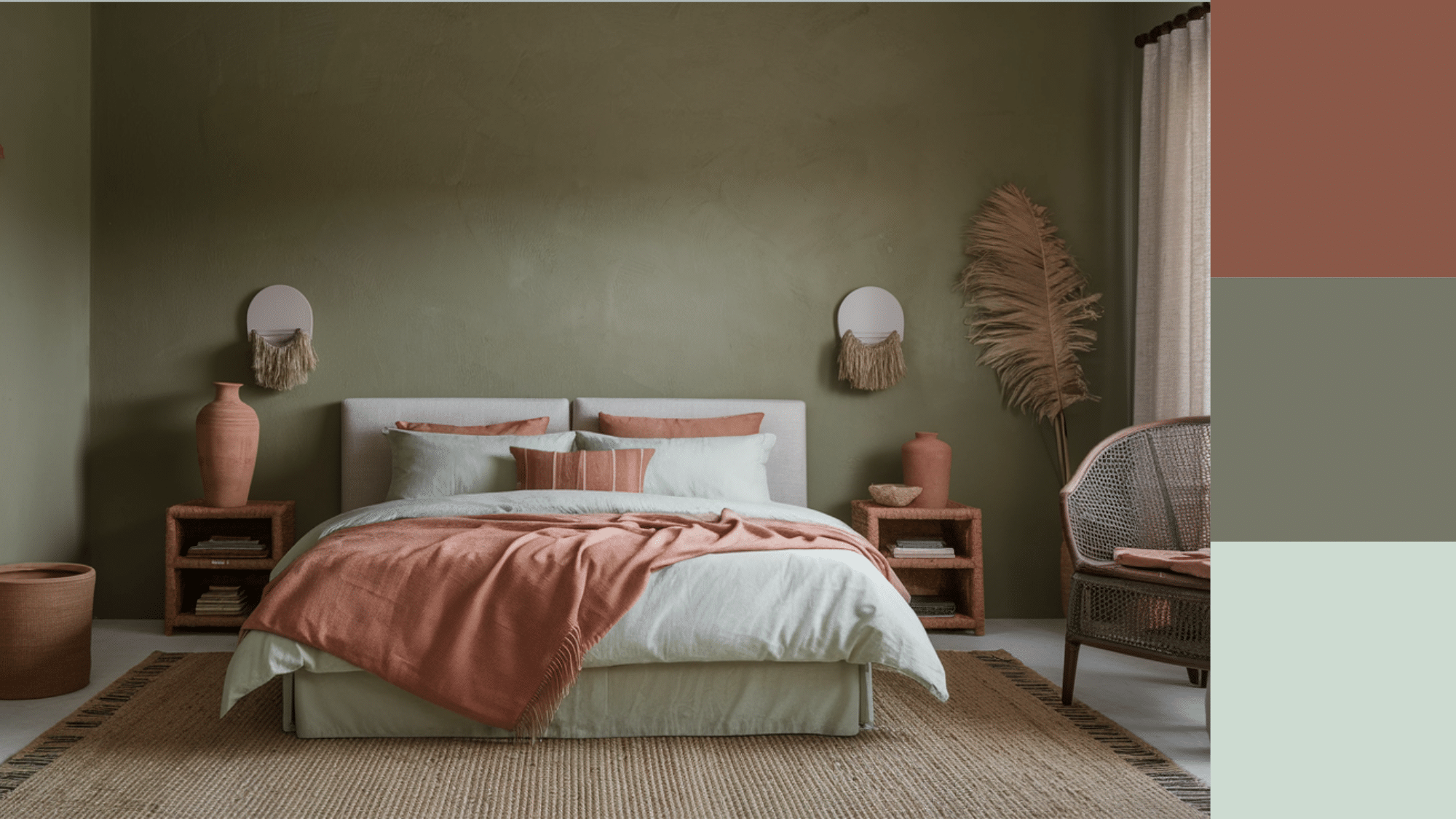
Warm sage greens like Behr Sage Brush or Benjamin Moore Georgian Green pair wonderfully with terracotta, rust, and creamy tones. The result is grounded, organic, and timeless, great for rustic-modern or nature-inspired interior designs.
-
Palette Includes: Terracotta, sand, rust orange, and linen beige/mint
-
Decor Aesthetic: Earth-Toned Organic Modern or Boho Farmhouse
-
Accents: Clay pots, woven textures, cream knits
-
Furniture: Reclaimed wood, tan leather headboards, woven cane chairs
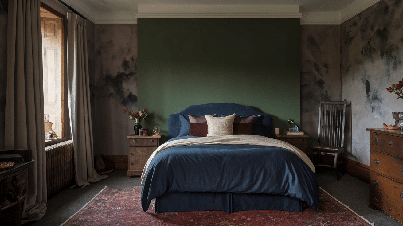
4. Dusty Sage + Lavender + Deep Charcoal
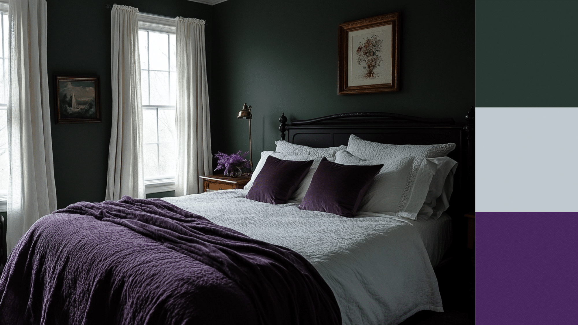
Neutral sage tones like Hollingsworth Green or River Mist mix softly with lavender and rich charcoal. This creates a romantic yet refined color story, especially effective for cozy bedrooms with character.
-
Palette Includes: Lavender gray, deep charcoal, pale lilac, foggy gray
-
Decor Aesthetic: French Country or Moody Contemporary
-
Accents: Vintage mirrors, lavender-scented candles, charcoal linens
-
Furniture: Whitewashed or distressed wood, tufted headboards, matte black accents
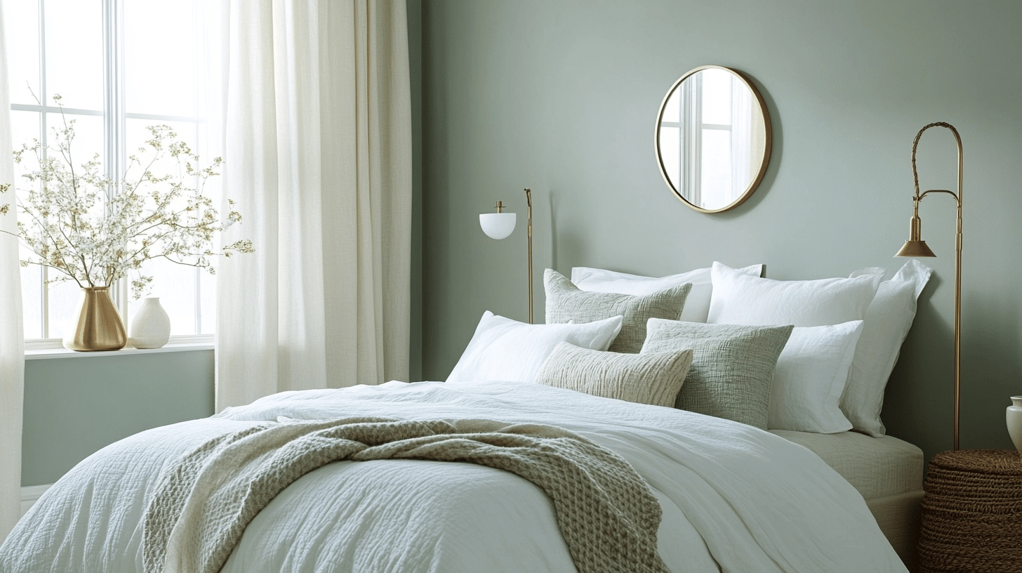
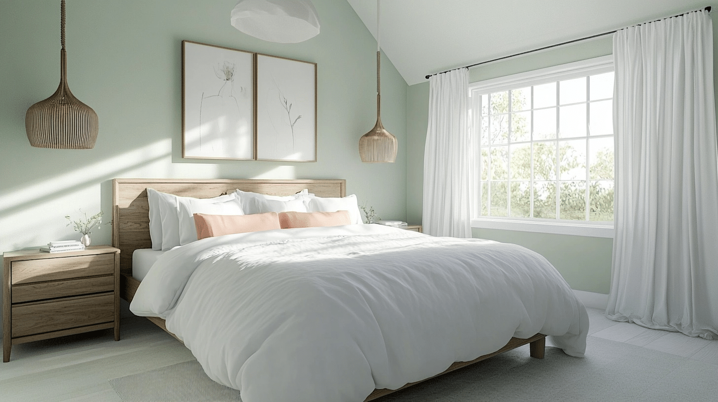
5. Misty Sage + Blush Pink + Natural Wood Tones
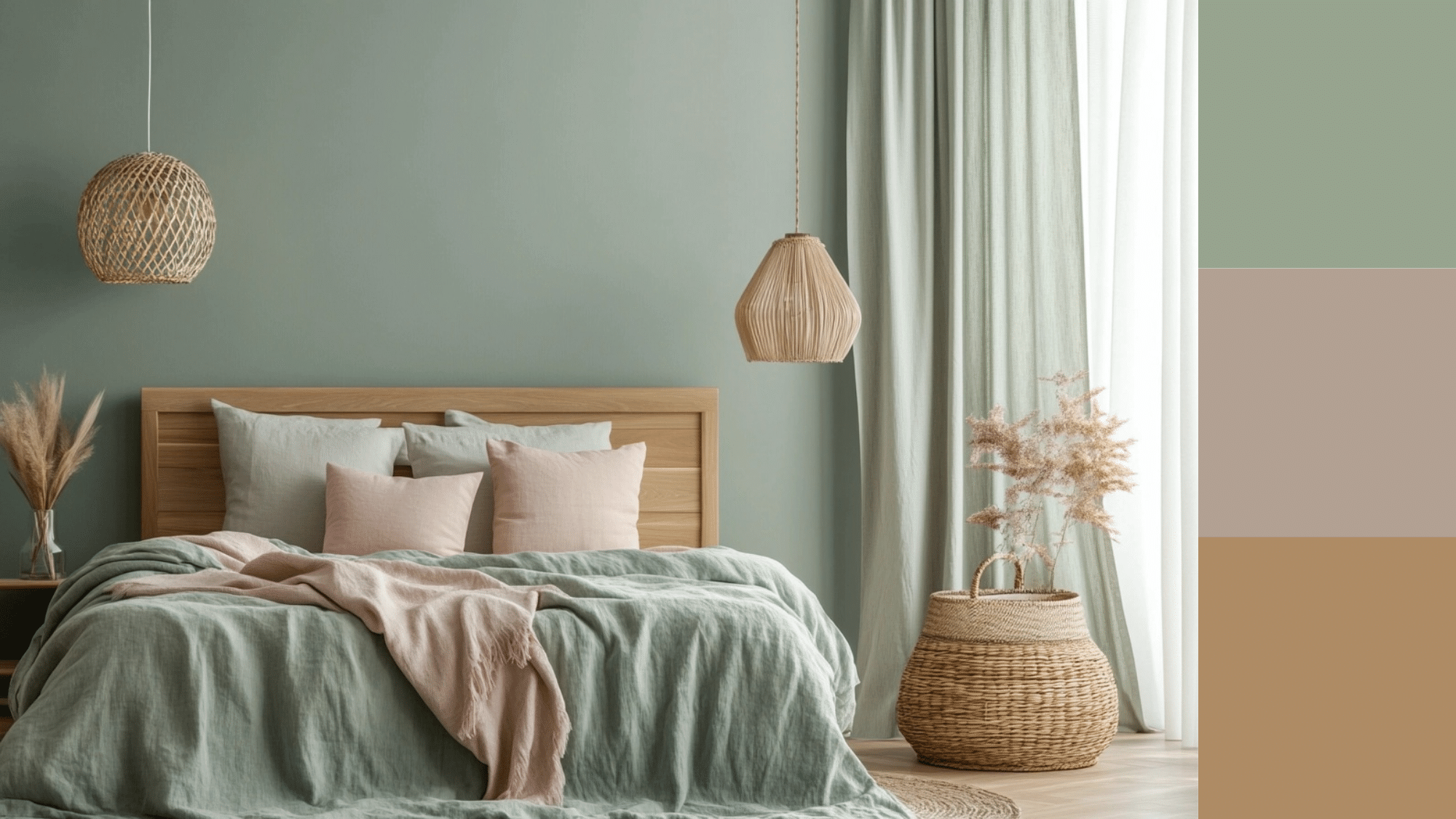
Very pale sage greens like Behr Juniper Breeze or Moss Mist come alive with soft blush pinks and organic wood tones. This palette feels airy and comforting, perfect for minimalist or Japandi-style rooms.
-
Palette Includes: Blush, light oak, ivory, pale gray
-
Decor Aesthetic: Japandi, Nordic Minimalist, or Soft Modern
-
Accents: Blush cushions, natural fiber rugs, frosted glass decor
-
Furniture: Oak platform beds, white bedside tables, wood-framed mirrors
Silver Sage and Seafoam Sage Variations
When exploring the full range of sage green options, you’ll encounter silver sage and seafoam sage variations that offer unique characteristics for different design needs. Silver sage brings metallic undertones that create an elegant, reflective quality ideal for formal dining rooms or modern living spaces. Meanwhile, seafoam sage introduces aquatic hints that work wonderfully in bathrooms or coastal-inspired rooms where you want to evoke a sense of oceanic calm.
Wrapping Up
You now have access to the most comprehensive collection of proven sage green paint colors, complete with technical specifications and real-world insights.
Because choosing the right sage green change your entire space from ordinary to on-trend. You’re no longer gambling with paint colors or settling for “close enough.”
Order samples and test them on your walls during different times of day. The technical details I’ve provided will help you, but seeing the colors in your actual space will seal the deal.