

Ever walked into a room and just thought, “Wow, this feels perfect!”?
Benjamin Moore’s Edgecomb Gray (HC-173) is more than just paint; it’s super famous in the design world. In fact, many design experts have even picked it as a top color choice!
Picture a color that works for any style, from fancy to relaxed. It makes your living room feel cozy, your kitchen welcoming, and even makes hallways seem bigger.
This color is like a magic trick; it looks great in all kinds of light and helps your furniture and decorations truly shine.
Want to see how this popular color can change your home? Keep reading! We’re going to talk all about why Edgecomb Gray is so awesome, and I’ll show you some great colors that go perfectly with it.
What Makes Edgecomb Gray So Special?
Edgecomb Gray has earned its reputation as one of the most beloved neutral paint colors, and for good reason.
This beautiful greige masterfully balances warm beige undertones with cool gray elements, creating a color that feels both contemporary and timeless.
Undertones of Edgecomb Gray
Edgecomb Gray has very mild color hints that change slightly based on what’s around it. This means it won’t fight with your furniture or decorations—instead, it works well with almost everything.
Edgecomb Gray’s LRV and Hex Code Values
Light Reflectance Value (LRV): 63.09
Hex Code: #D7D0C2
Edgecomb Gray Benjamin More in Different Corners of The House
Edgecomb Gray’s versatility shines when you see how it transforms different spaces throughout your home, from cozy bedrooms to bright kitchens.
We’ll find out how this popular neutral perform in living rooms, bedrooms, kitchens, and bathrooms, showing you real examples of how lighting and décor can completely change its appearance from space to space.
Living Rooms and Common Areas
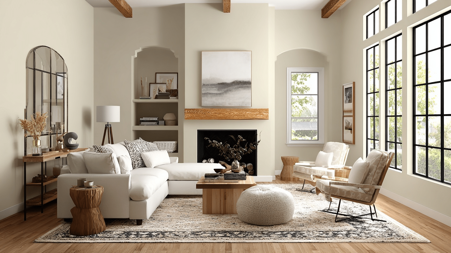
Edgecomb Gray is a fantastic choice for living rooms and other shared spaces because it brings a lovely warmth without making the room feel too heavy or dark.
Think of it as a super-friendly gray – it’s so neutral that it creates a welcoming and adaptable vibe.
It helps create a smooth, connected feeling throughout your home without making different areas feel choppy or disconnected. It’s so neutral that it creates a welcoming and adaptable vibe that works for everyone in your family.
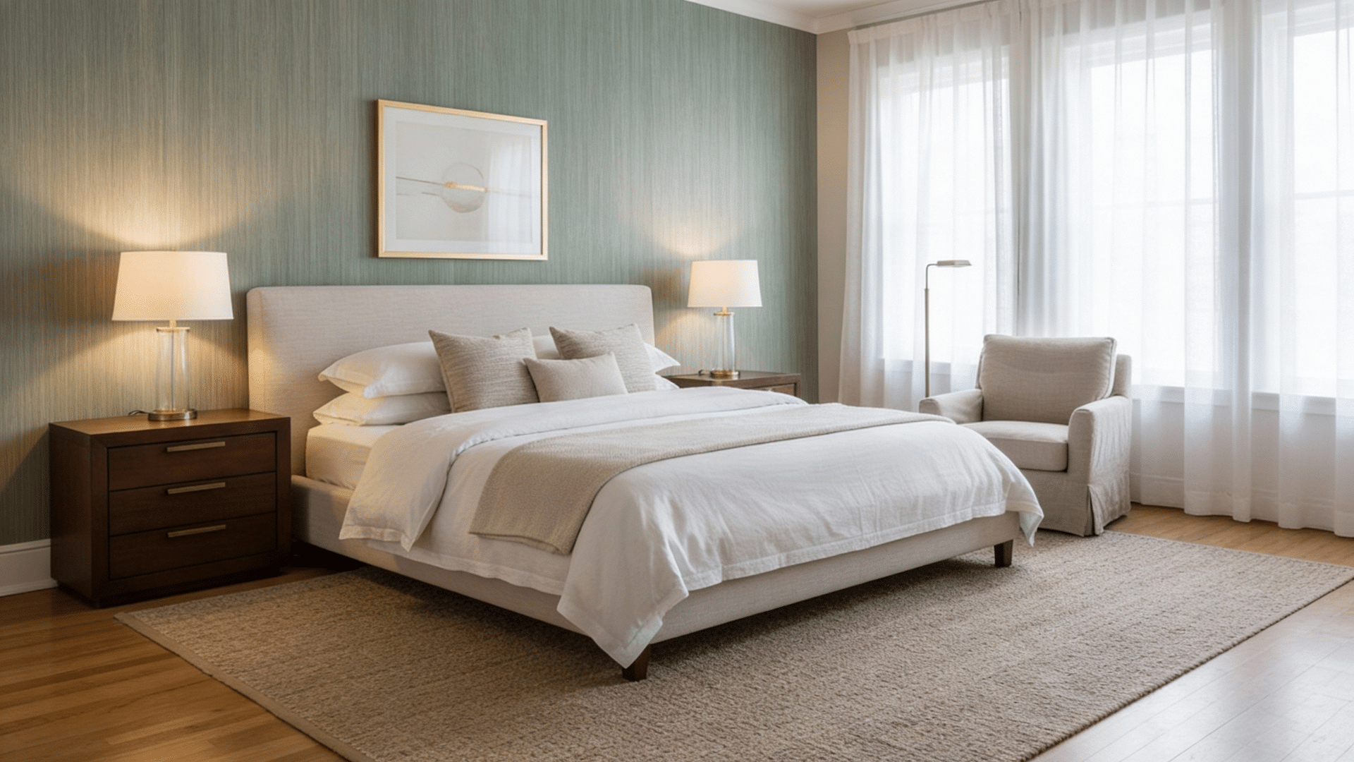
Bedrooms
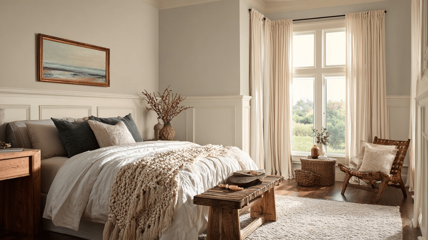
I love how Edgecomb Gray Benjamin Moore makes bedrooms feel calm and cozy at the same time.
Unlike cold gray colors, this one feels warm and welcoming. It works perfectly with white sheets, wood furniture, and any decorative pieces I choose. My sister’s bedroom feels like a peaceful, stylish retreat.
Whether you choose bright, colorful throw pillows, artwork, or decorative pieces, this neutral background makes everything look intentional and pulled together.
Kitchens and Dining Rooms
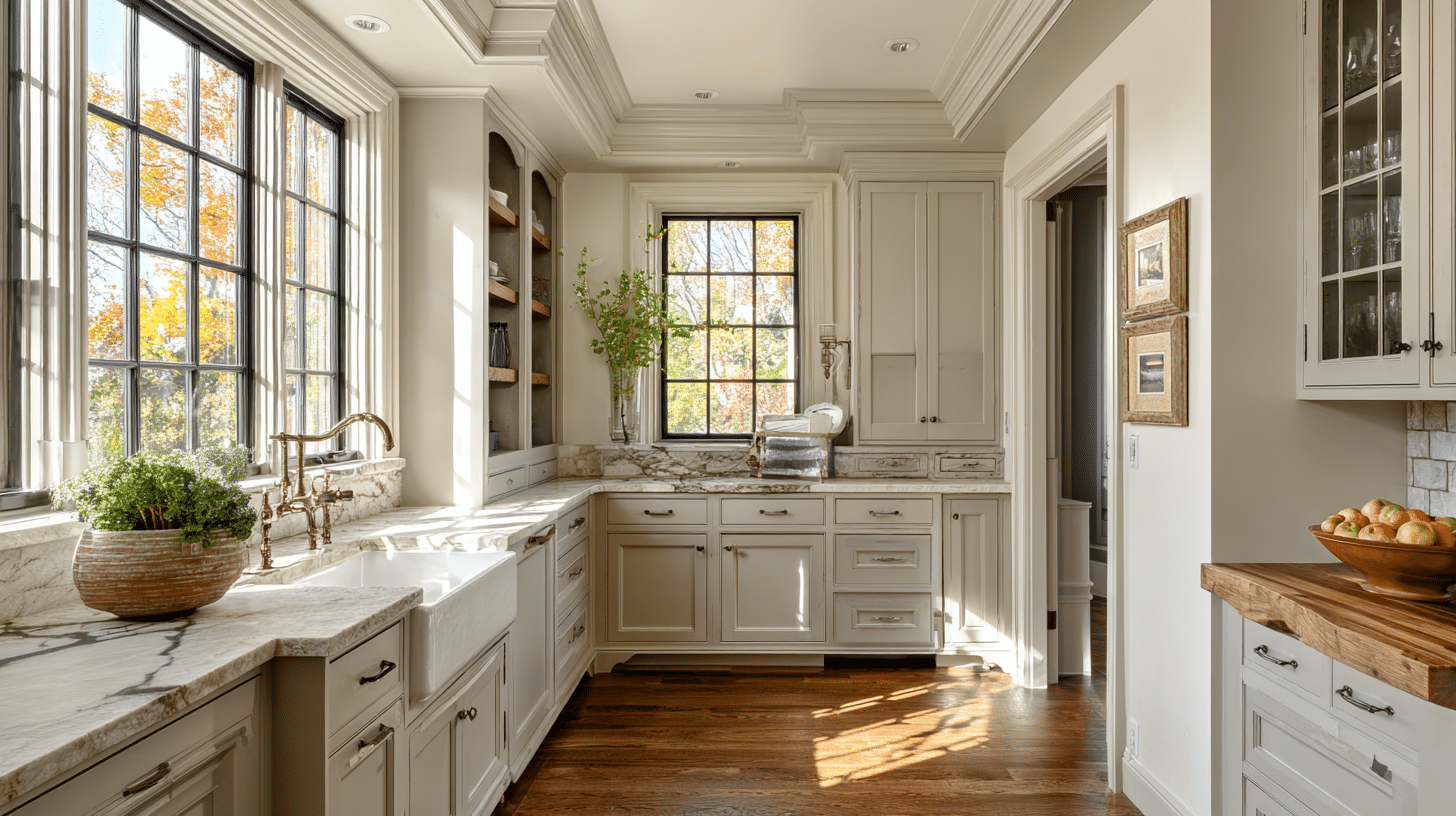
I find Edgecomb Gray Benjamin Moore perfect for kitchens and dining areas. It’s a fantastic neutral backdrop that works with any style, from modern to rustic.
It keeps kitchens feeling light and airy, beautifully complementing both white and wood cabinets. In dining rooms, it makes everything else pop, creating a warm, inviting space for cozy meals and lively conversations.
Your artwork looks more vibrant, your furniture stands out beautifully, and even your dishes and decorative pieces seem to shine against this classy backdrop.
Office Rooms and Home Workspaces
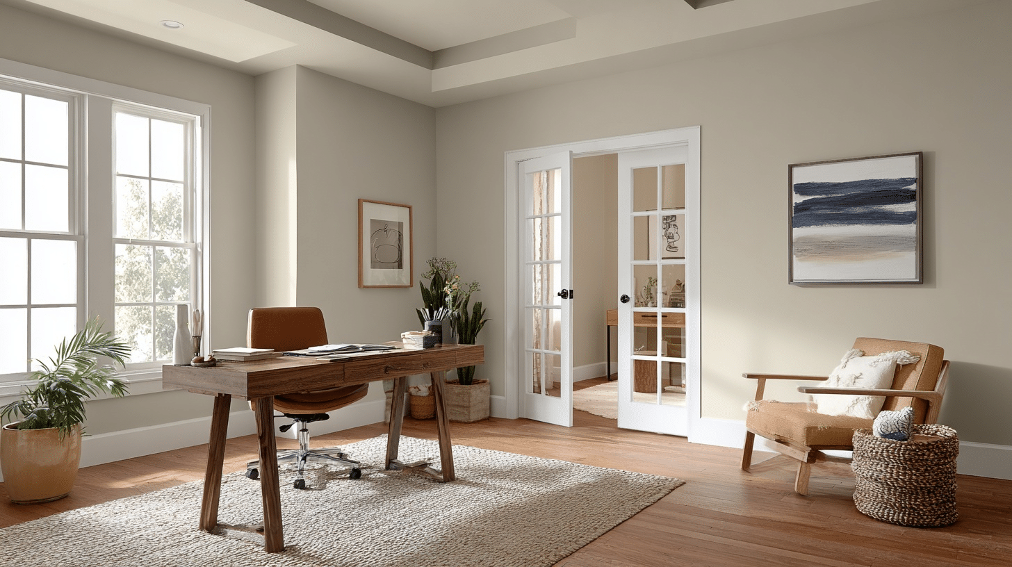
Home offices and dedicated work areas benefit tremendously from Edgecomb Gray’s balanced nature. The color creates a professional yet welcoming atmosphere that promotes focus without feeling cold.
Its neutral warmth helps reduce eye strain during long work sessions, while the beautiful undertones help you look professional on video calls and virtual meetings.
The color also works great with all kinds of office furniture, whether you have a modern white desk, warm wood pieces, or even black office chairs. Everything looks coordinated without you having to stress about matching colors perfectly.
Staircase and Hallway
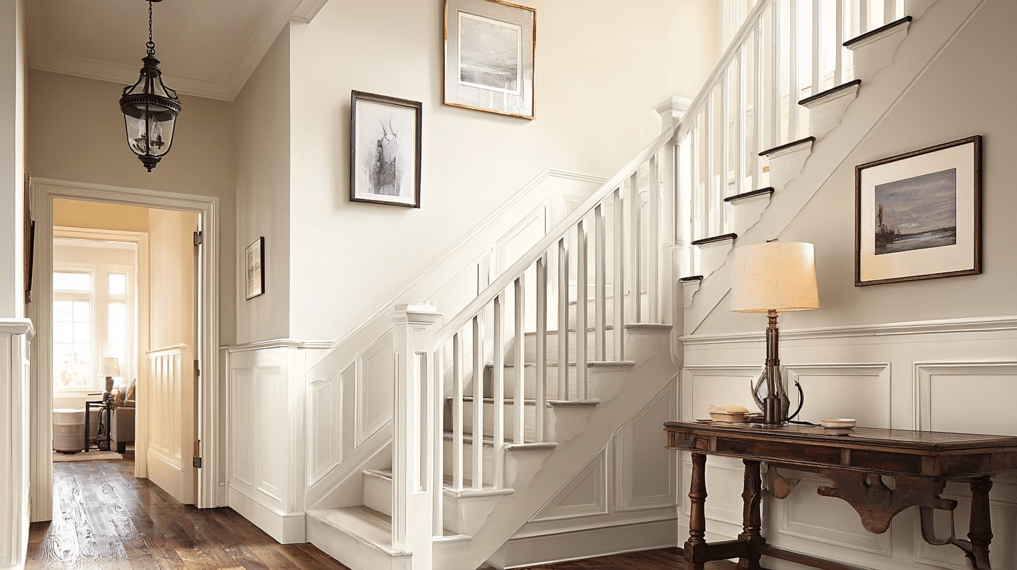
Edgecomb Gray by Benjamin Moore is great for stairs and hallways because it makes your home feel connected, like one smooth path. It lights up these often-small spaces without making them look too plain or bright.
This soft color makes everything feel open and welcoming, letting your pictures and decorations stand out while keeping the whole area feeling nice and continuous.
Since hallways and stairs get lots of footsteps and touching from hands on railings and walls, Edgecomb Gray hides fingerprints and scuffs better than pure white would, keeping your home looking clean and fresh with less maintenance.
Edgecomb Gray Benjamin Moore vs Other Colors
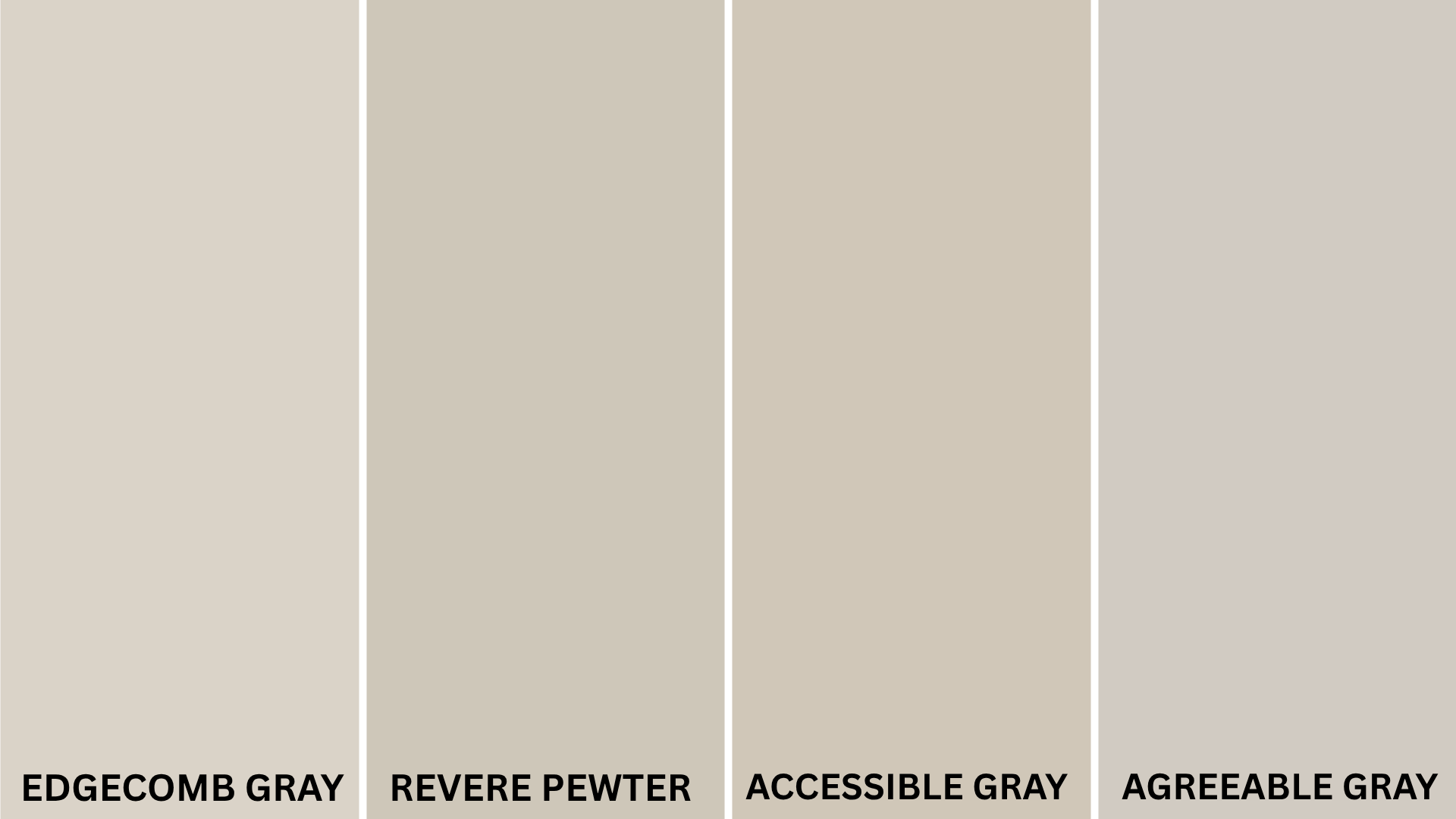
| Color Name | Hex Code | Tone & Undertone | Compared to Edgecomb Gray | Best Use / Feel |
|---|---|---|---|---|
| Revere Pewter (HC-172) | #CCC9C0 | Cooler greige with subtle green hints | Darker and moodier than Edgecomb; can lean green in cool light | Deeper, more grounded spaces |
| Pale Oak (OC-20) | #EAE3D3 | Very light warm greige/off-white | Lighter and more subtle, Edgecomb has more presence and warmth | Soft, clean, airy interiors |
| Chantilly Lace (OC-65) | #F8F8F5 | Pure bright white, no undertones | High-contrast crisp white makes Edgecomb’s warmth stand out | Trim, ceilings, modern accents |
| Feather Down (OC-6) | #E6E1D3 | Light creamy gray-beige | Slightly lighter and less defined; more off-white feel | Subtle walls or pairing with darker tones |
| Balboa Mist (OC-27) | #DCD7CD | Warm light gray with purple/violet undertone | Slightly cooler and more muted than Edgecomb | Calm and elegant neutrals |
| Classic Gray (OC-23) | #E1DED4 | Soft, warm gray with subtle beige | Lighter and grayer than Edgecomb; less beige warmth | Very neutral, works in modern or soft spaces |
Pairing Edgecomb Gray with Other Colors
Its subtle undertones allow it to pair beautifully with a variety of accent colors, making it a versatile choice for both modern and traditional spaces.
If you’re looking to elevate your palette, here are four stunning colors that go well with Edgecomb Gray:
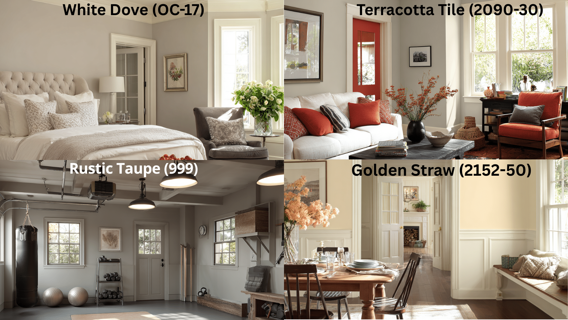
White Dove (OC-17)
A perennial favorite, White Dove is a warm off-white that glows next to Edgecomb Gray. It’s ideal for ceilings, trim, and cabinetry to maintain warmth while still offering crisp contrast.
Hale Navy (HC-154)
A rich, calm navy blue that creates beautiful contrast against Edgecomb Gray’s warm neutrals.
This deep blue makes your beige walls pop while adding a timeless, elegant feeling to any room. Perfect for accent walls, kitchen islands, or built-in cabinets that need to make a statement.
Golden Straw (2152-50)
A buttery, sunlit yellow with soft gold undertones, Golden Straw injects warmth and cheer into your palette. It’s much brighter and more expressive than Bleeker Beige but still refined enough for elegant interiors.
Why it works: Edgecomb Gray’s understated greige balance makes Golden Straw pop without feeling overpowering. Together, they create a light-filled, inviting space—perfect for kitchens, breakfast nooks, or hallways that need a lift.
Rustic Taupe (999)
This rich, earthy taupe adds warmth and grounding to a palette centered on Edgecomb Gray. It’s ideal for an accent wall, furniture pieces, or even flooring undertones.
Why it works: Rustic Taupe deepens the palette while echoing the greige foundation, adding depth without harshness.
Terracotta Tile (2090-30)
Looking for something more saturated and warm? Terracotta Tile is a warm, spicy rust tone with clay-red undertones that pairs surprisingly well with the neutrality of Edgecomb Gray, giving you a southwestern or Mediterranean flair.
Why it works: Edgecomb Gray’s calm, greige base grounds the boldness of Terracotta Tile, creating a high-contrast but harmonious palette for feature walls, niches, or even accent furniture.
Simply White (OC-117)
This clean, crisp white creates fresh contrast without being too harsh. Simply White trim with Edgecomb Gray walls is a match made in design heaven; it makes both colors look their absolute best while keeping your space feeling bright and airy.
Conclusion
Choosing the perfect paint color doesn’t have to be hard when you have a reliable neutral like Edgecomb Gray.
No matter if you’re updating one room or planning colors for your whole house, Edgecomb Gray offers the perfect mix of beauty and practicality.
It works with different lighting, goes with various furniture styles, and serves as a great background for both simple and bold decorations.
You won’t get those nasty surprises where your paint looks completely different at various times-Edgecomb Gray stays consistently beautiful no matter what.