Looking for the perfect cream paint that actually works everywhere? You’ve found it. Benjamin Moore’s Mascarpone color is taking over homes for all the right reasons, and we’re about to show you why.
In this guide, we’ll break down exactly what makes Benjamin Moore Mascarpone special and why designers can’t stop using it. You’ll realize the simple color facts that matter, learn which rooms look amazing with this creamy shade, and get practical ideas for using it on walls, trim, and even accent features.
Even if you are planning a kitchen makeover or just want to freshen up your living room, we’ve got everything you need to make Mascarpone work beautifully in your home.
Let’s get started.
Why Choose Mascarpone Color? Understanding the Basics
Choose Benjamin Moore Mascarpone because it gives you the best of both worlds- warmer than plain white but not too much like heavy creams. With its super high light reflection (89% LRV), it makes rooms look bigger and brighter, which is perfect for any space.
The trustworthy yellow undertones create consistent warmth all day without weird color changes that surprise you. It works everywhere in your home, from busy kitchens to calm bedrooms.
Plus, it goes perfectly with popular design choices like wood and brass, so decorating is easy.
Best part? This evergreen color won’t look outdated next year, making it a smart long-term choice for your home.
This evergreen color won’t look outdated next year, making it a smart long-term choice for your home. While trendy colors come and go, cream has been popular for decades and will continue to be stylish for years to come. This means you won’t need to repaint in a few years when the latest color trend changes.
Color Terminology You Need to Know
| Property | Details |
|---|---|
| Color Family | Off-White / Cream |
| Hex Code | #F9F5E7 |
| Undertone | Warm – Soft Yellow/Creamy Beige |
| LRV (Light Reflectance Value) | 89 |
| RGB | R: 249, G: 245, B: 231 |
These official details show why Mascarpone works so well in homes. The highlight reflection and warm yellow undertones make it reliable and easy to use anywhere.
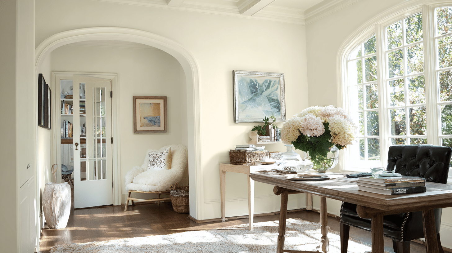
Perfect Spaces Where Mascarpone Shines
Mascarpone’s creamy warmth and perfect light-reflecting properties make it a versatile choice that adapts magically to any room’s purpose and lighting.
From high-traffic kitchens to peaceful bedrooms, this refined cream creates the perfect backdrop for comfortable, stylish living.
Kitchens
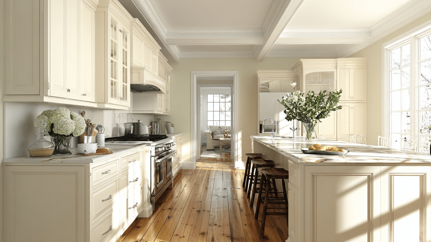
My kitchen was modified entirely when we painted the cabinets in Mascarpone color. This warm, creamy tone makes our space feel so cozy yet still bright and airy.
Every guest who visits comments on how inviting and classy it looks – honestly, it’s been my favorite home improvement decision ever.
Using the bright white trim with our Mascarpone walls creates beautiful definition and contrast. But if we’re using Mascarpone on cabinets, keeping the same color for trim creates this smooth, seamless flow throughout the kitchen that feels so cohesive and polished.
Living Rooms
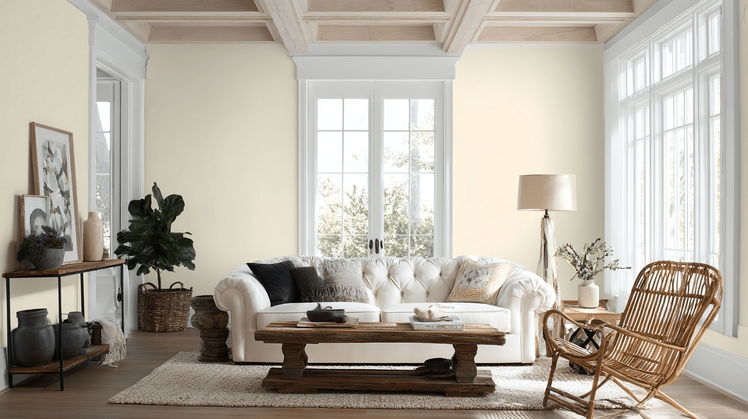
Our living room was modified when we painted it Benjamin Moore Mascarpone, and it became the perfect backdrop for all our family gatherings. This soft, neutral tone works beautifully with both our dark leather sofa and lighter accent pieces.
It strikes that ideal balance of being graceful without feeling overdone, which is exactly what we needed for our main entertaining area.
Using bright white Chantilly Lace Trim creates those crisp, clean lines that make our whole space feel more polished and classy. It lets Mascarpone’s natural warmth take center stage while adding just the right amount of contrast to keep everything looking fresh and inviting.
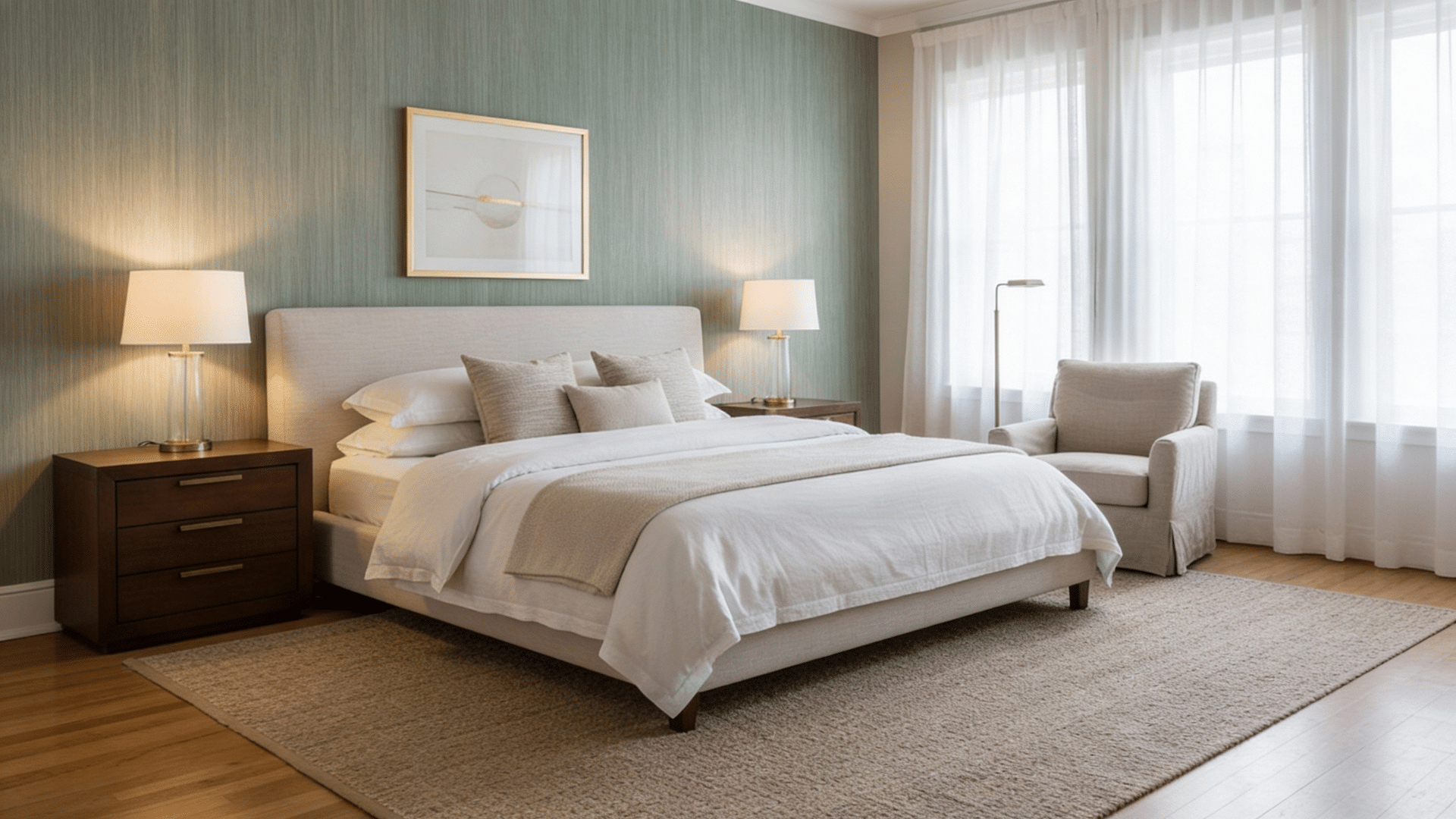
Bedroom
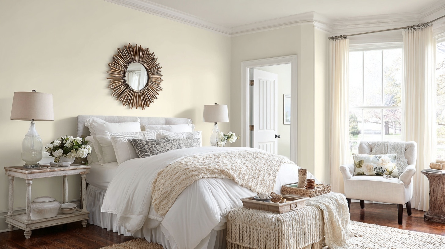
Painting bedroom in Mascarpone was absolutely the right choice for a peaceful sanctuary. Those warm undertones make her space feel so cozy when she’s winding down at night, while the creamy brightness keeps everything feeling fresh and airy during the day. It created the perfect calming atmosphere she needed.
Using the same Mascarpone shade on both walls and trim creates this seamless, cocoon-like feeling that’s incredibly soothing. It wraps the whole room in that soft, creamy warmth, perfect for a bedroom where rest and relaxation are the main goals.
Kids’ Rooms
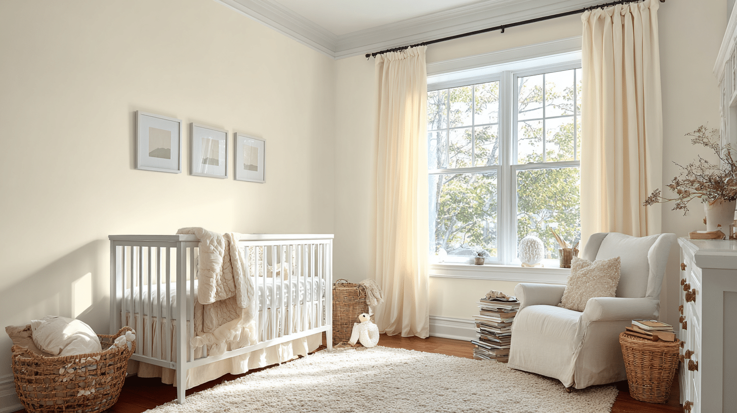
Choosing Mascarpone for the children’s bedroom is such a smart decision. This gentle, creamy shade grows with child as she gets older – it’s soothing enough for peaceful bedtimes but still bright and cheerful during her playtime. I love how it works beautifully with whatever theme or decor changes she dreams up next.
This crisp white gives a softer contrast that feels playful yet clean. It’s so forgiving when little fingers leave their marks, and it keeps the room looking fresh no matter how much wear and tear it gets from daily life.
Home office
The soft, buttery tone makes those marathon work sessions so much easier on my eyes, and I’ve noticed my concentration stays sharper throughout even my longest days.
Using the Crisp Oxford White Trim gives the graceful look that provides just enough contrast without distracting me from work. It actually makes my office feel more professional while keeping that calm, focused environment I need to stay productive.
Which Finish Works Best with Mascarpone Color?
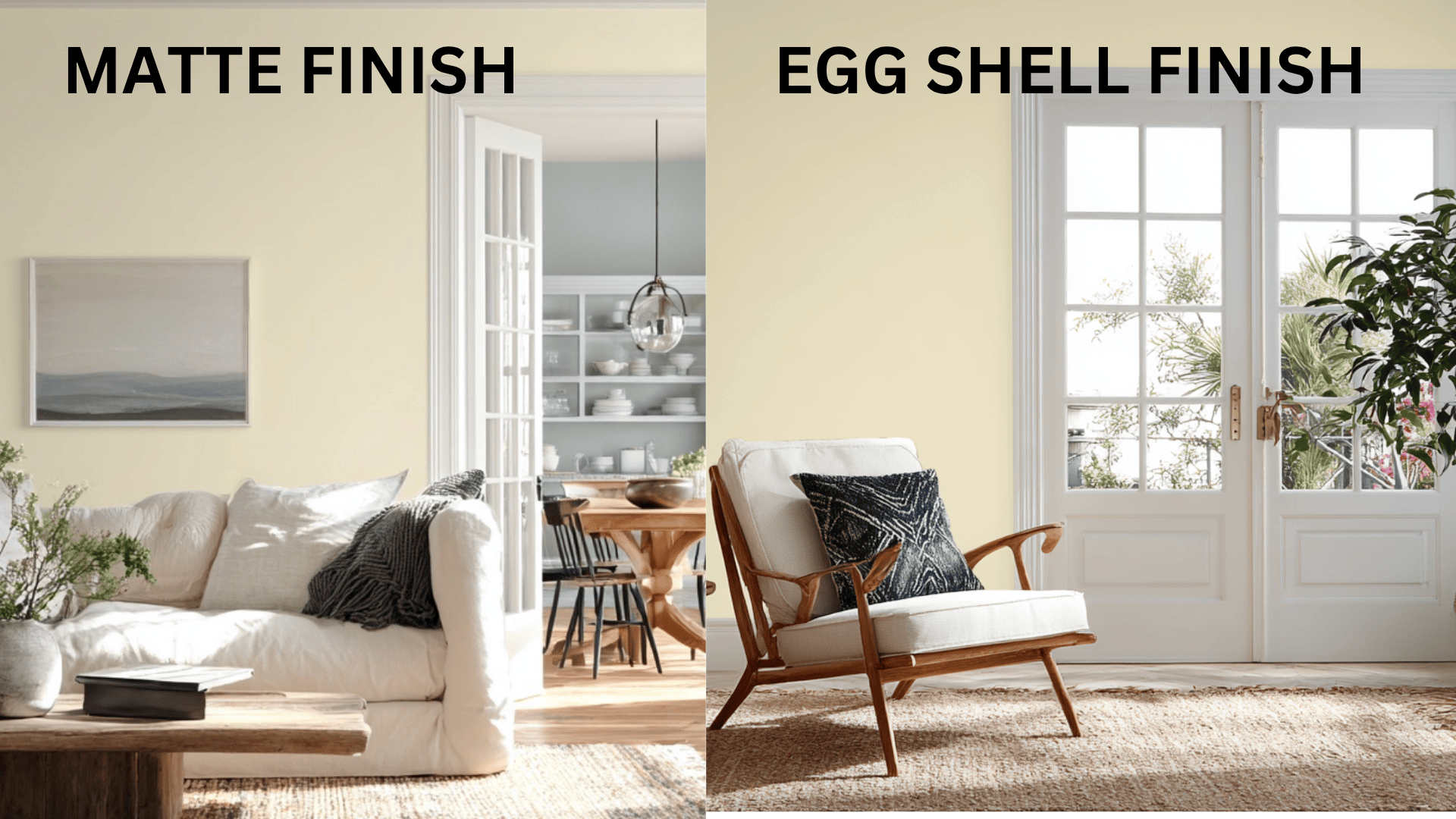
Matte finish hides wall imperfections and creates a soft, fancy look for bedrooms and living rooms. Eggshell finish is more durable and washable, making it perfect for kitchens, bathrooms, and high-traffic areas where you need easy cleaning.
Here’s when to use each finish with Benjamin Moore Mascarpone:
Using the Matte Finish When:
- You want walls that look smooth and fancy
- Your walls have small cracks or bumps you want to hide
- You prefer no shine at all on your walls
- You don’t need to scrub the walls often
Using the Eggshell Finish When:
- You need to wipe down walls regularly
- You want a bit of soft glow on your walls
- You need paint that lasts longer with daily use
- You’re painting trim, doors, or cabinets
Pick a matte for peaceful rooms where walls stay clean. Pick eggshell for busy areas where you’ll need to wash the walls.
The Artificial Lighting Solutions for Benjamin Moore Mascarpone
The right lighting can make or break how Mascarpone paint looks in your space. Choosing the proper fixtures and bulb temperatures will improve this creamy color’s natural warmth and create the perfect ambiance for any room.
- Use warm white LED bulbs (2700K–3000K) to improve its creamy tone.
- Install recessed ceiling lights for soft, even brightness.
- Add wall sconces with fabric shades to create a cozy ambiance.
- Use under-cabinet lighting in kitchens to highlight surfaces.
- Choose brass or gold-toned fixtures to complement the warm undertone.
- Add floor or table lamps with beige or ivory shades for a subtle glow.
- Use dimmable lighting to adjust mood and depth.
- Try pendant lights in natural or woven materials for a cozy touch.
- Install LED strip lighting behind furniture or shelves to add soft background illumination.
- Use chandeliers with warm-toned bulbs in dining or entry areas to perfect a graceful and warm atmosphere.
Perfect Colors to Pair with Mascarpone
Adding one painted accent wall can completely change your room’s look without repainting everything.
Mascarpone works perfectly as your main color, while bold accent walls create amazing focal points that make spaces feel more interesting and stylish.
1. Olive Green
Olive green adds an earthy, natural feel to Mascarpone. This combo works great in living rooms or kitchens, giving off a cozy and grounded look. It’s perfect if you like a warm, nature-inspired style that still feels soft and welcoming.
2. Dusty Blue
Dusty blue brings a peaceful, airy vibe to Mascarpone’s creamy tone. The mix feels fresh but not too bright, ideal for bedrooms, bathrooms, or coastal-themed rooms. It helps calm the space while still looking graceful and soft.
3. Terracotta
Terracotta’s warm, reddish-orange tone adds energy to Mascarpone. This pair creates a cozy, sun-kissed look that works well in rustic or bohemian spaces. Use it in living areas or kitchens for a warm and friendly feel that’s still stylish.
4. Navy Blue
Navy blue makes Mascarpone pop in a bold but classy way. The dark blue adds depth, while Mascarpone keeps things light and soft. This pairing looks great in offices, dining rooms, or any space where you want contrast without being too harsh.
5. Charcoal Gray
Charcoal gray gives Mascarpone a modern and sleek edge. This pairing is clean and timeless, often used in kitchens or bathrooms. The dark gray makes Mascarpone’s creamy tone stand out while keeping everything balanced and neutral.
6. Sage Green
Sage green is a gentle, muted green that feels calming next to Mascarpone. This combo works well in bedrooms or any space that needs a peaceful mood. It’s soft, soothing, and brings a hint of nature indoors without being too bold.
7. Soft Blush
Soft blush is a light, pinkish color that pairs beautifully with Mascarpone for a romantic and gentle feel. Great for nurseries, bedrooms, or reading nooks, this pairing feels light, loving, and cozy without being too colorful or loud.
8. Warm Taupe
Warm taupe is a soft brown-gray color that blends smoothly with Mascarpone. It keeps the look warm and graceful perfect for living rooms or open spaces. This pairing works well if you want something timeless, simple, and easy to decorate around.
Comparing Benjamin Moore Mascarpone with Other Paints
| Paint Color | LRV | Undertones | Best Use Case |
|---|---|---|---|
| Simply White | 92 | Clean with subtle yellow | Great for modern spaces needing brightness without coolness |
| White Dove | 83 | Off-white with gray-yellow | Perfect for trim, cabinetry, and transitional interiors |
| Swiss Coffee | 82 | Creamy beige | Excellent for traditional spaces and north-facing rooms |
| Cloud White | 87 | Gentle taupe-warmth | Works well in older homes and soft contemporary palettes |
| Chantilly Lace | 90 | Clean with a hint of gray | Best for crisp trim, ceilings, or modern minimalist designs |
| Linen White | 84 | Yellow-cream | Ideal for historic homes, trim, and softly styled rooms |
| Bone White | 78 | Warm creamy beige | Great for creating depth on walls or in traditional color palettes |
Conclusion
Choosing paint doesn’t have to be stressful anymore. Benjamin Moore Mascarpone gives you everything you want: warmth without being too yellow, style without being cold, and it actually works in real homes with everyday lighting.
This cream brightens any space with its amazing light reflection and never surprises you with weird color changes.
If you have painting cabinets, updating your living room, or making a cozy bedroom, Mascarpone fits perfectly.
Best of all, it goes with everything: stainless steel equipment, wood furniture, brass fixtures, and any accent colors you love. Unlike trendy colors that look outdated quickly, this classic cream keeps your home looking fresh for years.
Ready to try it? Your rooms will look perfect.