The two very similar paint colors, Pale Oak and Edgecomb Gray, both looked perfect online, but they left me confused about which one would actually work.
Both are popular Benjamin Moore greiges that promise to be the perfect neutral. Yet they can look completely different once they’re on your walls.
So, in this blog, I’m breaking down the real differences between Pale Oak vs Edgecomb Gray for anyone struggling to decide what to paint their home.
Continue reading to see how each shade looks in various rooms, which colors pair best with them, and the most common mistakes people make when using either one.
Pale Oak vs Edgecomb Gray : Understanding the Key Differences
When I first compared pale oak vs edgecomb gray, two Benjamin Moore favorites, I noticed they’re both greiges but with distinct personalities.
Pale Oak features warm gray undertones that subtly echo the natural look of white oak wood. It strikes a beautiful balance, ideal for clients who want something softer and more inviting than a true gray.
Edgecomb Gray, on the other hand, leans slightly more toward a beige tone. It feels like the warmer, more approachable cousin of typical greige tones, creating an instantly cozy and welcoming atmosphere in any room.
Profile Breakdown:
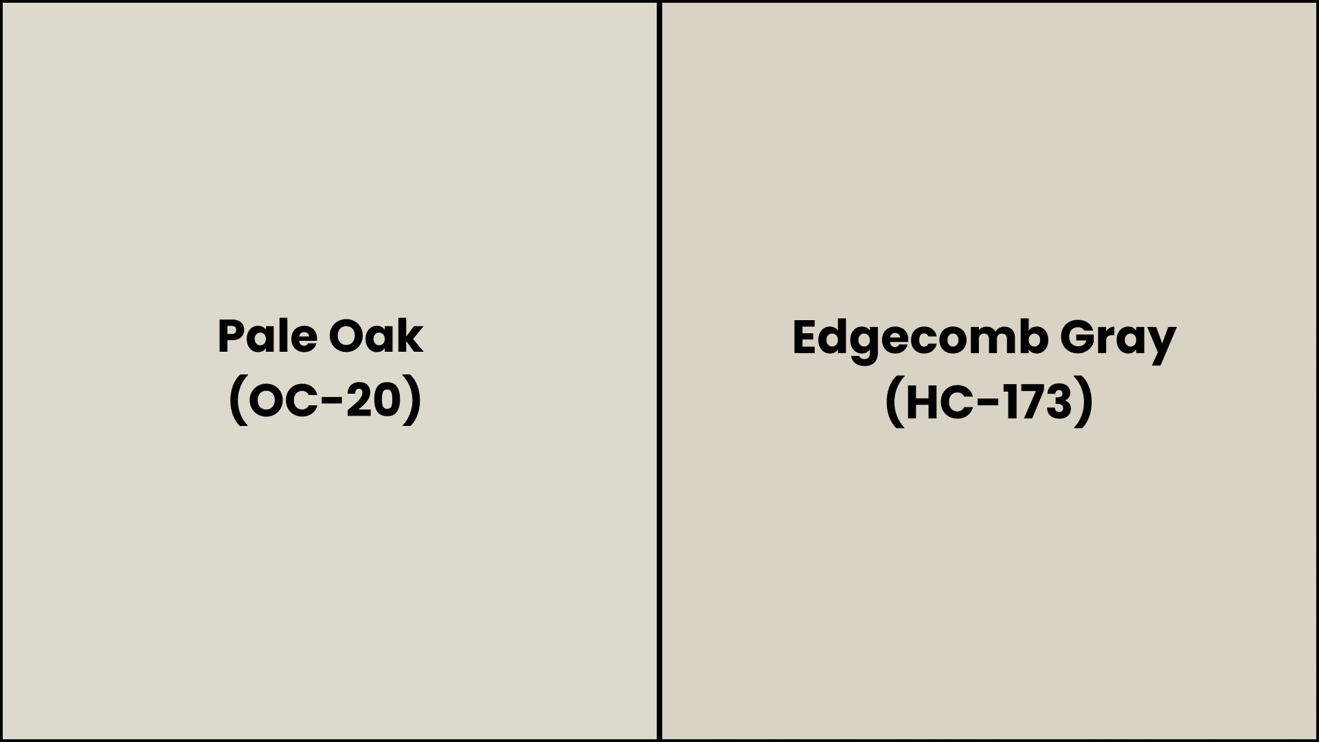
| Specification | Pale Oak (OC-20) | Edgecomb Gray (HC-173) |
|---|---|---|
| Color Family | Off-White | Gray |
| Hex Code | #DDD9CE | #D9D3C4 |
| LRV | 68.64 | 63.09 |
| RGB | 232, 228, 212 | 212, 207, 192 |
| Undertones | Warm Gray, Beige | Gray, Beige |
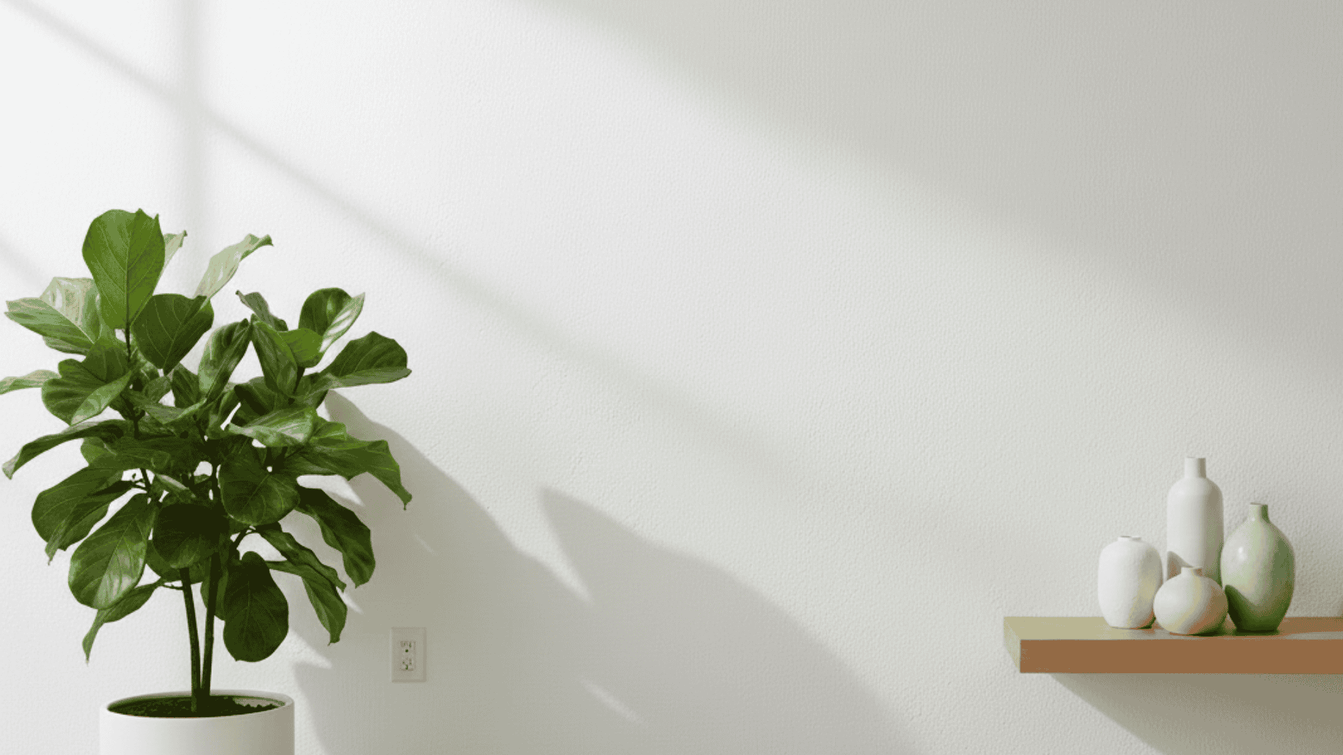
How Undertones and Lighting Affect These Neutrals?
The pale oak surprised me with its complexity.
The main undertone is a warm yellow-beige that makes rooms feel cozy. But I noticed something interesting in certain lights – it can show faint pink or purple hints. This typically occurs in artificial lighting or during late afternoon sun.
Edgecomb Gray Under Different Lighting
- Morning Light: Green undertones become more prominent, creating a cooler, grayer appearance.
- Evening Light: Shifts towards a softer, muted gray, with less noticeable green undertones.
- North-Facing Room: Appears cooler and grayer, with more pronounced green undertones, enhancing the calming vibe.
- South-Facing Room: Green notes are intensified, creating a more dynamic and less predictable appearance.
- East-Facing Room: Cooler and grayer in the morning, with more visible green undertones, then warms up slightly in the afternoon.
- West-Facing Room: Warmer and less gray in the afternoon, with slightly muted green undertones.
- Artificial Light: Green undertones are muted, resulting in a softer, more subtle gray appearance.
How Pale Oak Looks Under Different Lightings
- Morning Light: Slightly cooler and grayer, but still maintains its overall balanced appearance.
- Evening Light: Warmer, beige tones become more prominent, creating a cozier, inviting atmosphere.
- North-Facing Room: Looks cooler and grayer, with slightly more noticeable green undertones, but remains relatively balanced.
- South-Facing Room: Warmth is enhanced, bringing out more beige tones and creating a more inviting atmosphere.
- East-Facing Room: Slightly cooler in the morning, then warms up and becomes more balanced in the afternoon.
- West-Facing Room: Warmer and more beige in the afternoon, creating a cozier, inviting ambiance.
- Artificial Light: Beige tones are enhanced, creating a warmer, more inviting atmosphere.
Best Coordinating Colors for Pale Oak and Edgecomb Gray
Once you’ve understood the difference between pale oak vs edgecomb gray, the next step is finding colors that complement them perfectly.
The right coordinating palette can make or break your design, and each color has its own personality that works better with certain shades. Let me share the combinations I’ve found work best with each.
Best Colors to Pair with Pale Oak
I’ve found Pale Oak works best with colors that match its warm, welcoming nature. It creates a cozy, lived-in feel that never looks too formal or sterile.
1. Soft greens – Think sage or olive tones that complement the warmth
2. Warm whites – Creamy whites like Cloud White or Simply White
3. Muted blues – Dusty blues or soft powder blues for contrast
4. Warm metallics – Brass, gold, or warm bronze fixtures and accents
Best Colors to Pair with Edgecomb Gray
Edgecomb Gray pairs beautifully with colors that honor its refined, muted character. The green-gray undertones make it perfect for creating refined, calming spaces. I love how it handles both earthy and moody color combinations.
1. Earth tones – Warm browns, terracotta, or mushroom shades
2. Rich neutrals – Charcoal, cream, or warm taupe
3. Moody greens – Forest green or deep sage for drama
4. Rich navy or denim blues – Deep blues that enhance the gray undertones
Styling Pale Oak vs Edgecomb Gray Room by Room
I’ve tested both colors in various rooms across different projects, and each space tells a distinct story.
The way these greiges perform varies dramatically depending on the room’s function, lighting, and existing elements. Here’s what I learned about using each color in specific spaces.
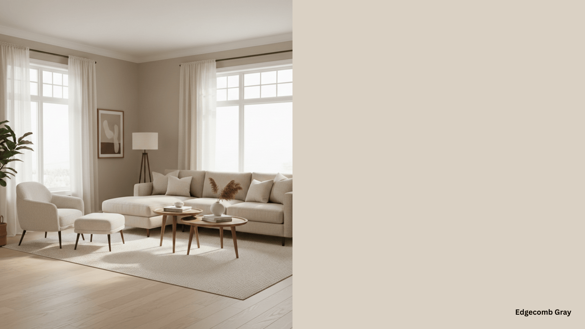
Living Rooms
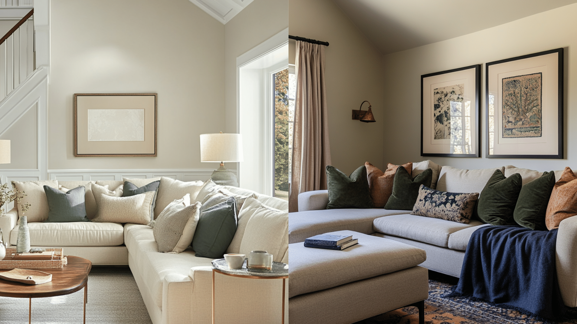
Pale Oak makes living rooms feel larger and brighter, especially when paired with white trim and soft-toned furniture.
Edgecomb Gray, by contrast, offers more warmth and depth. It brings a cozier, lived-in feeling, great for large or formal living spaces that need grounding. It suits transitional and traditional aesthetics.
| Element | Pale Oak | Edgecomb Gray |
|---|---|---|
| Furniture | Light linen or beige sofas | Taupe or warm brown sectionals |
| Accents | Sage green, powder blue pillows | Forest green, navy, or mushroom tones |
| Fixtures | Brass or gold hardware | Bronze or matte black fixtures |
| Style Vibe | Airy, relaxed, subtly modern | Cozy, grounded, refined |
Kitchens
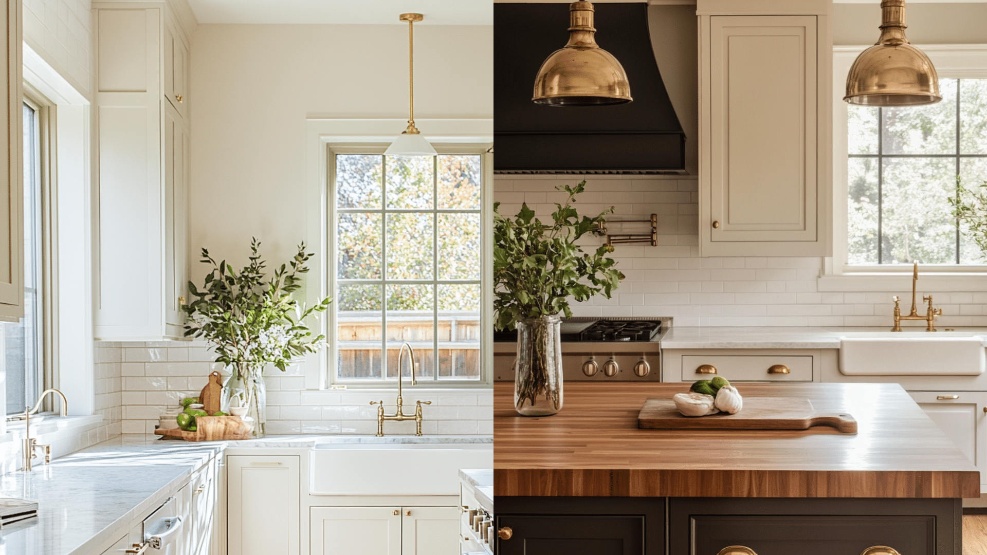
Pale Oak looks stunning in kitchens with white shaker cabinets and marble counters. It leans into a clean, minimalist look, yet still adds subtle warmth.
Edgecomb Gray suits more classic or rustic styles. It brings warmth and depth to kitchens. Its timeless tone pairs beautifully with traditional design elements.
| Element | Pale Oak | Edgecomb Gray |
|---|---|---|
| Cabinets | White or light taupe cabinetry | Dark wood or warm cream cabinetry |
| Counters | White marble or quartz | Butcher block or light stone |
| Backsplash | Simple white subway tile | Beige ceramic or textured tiles |
| Style Vibe | Clean, fresh, light and bright | Warm, classic, rustic comfort |
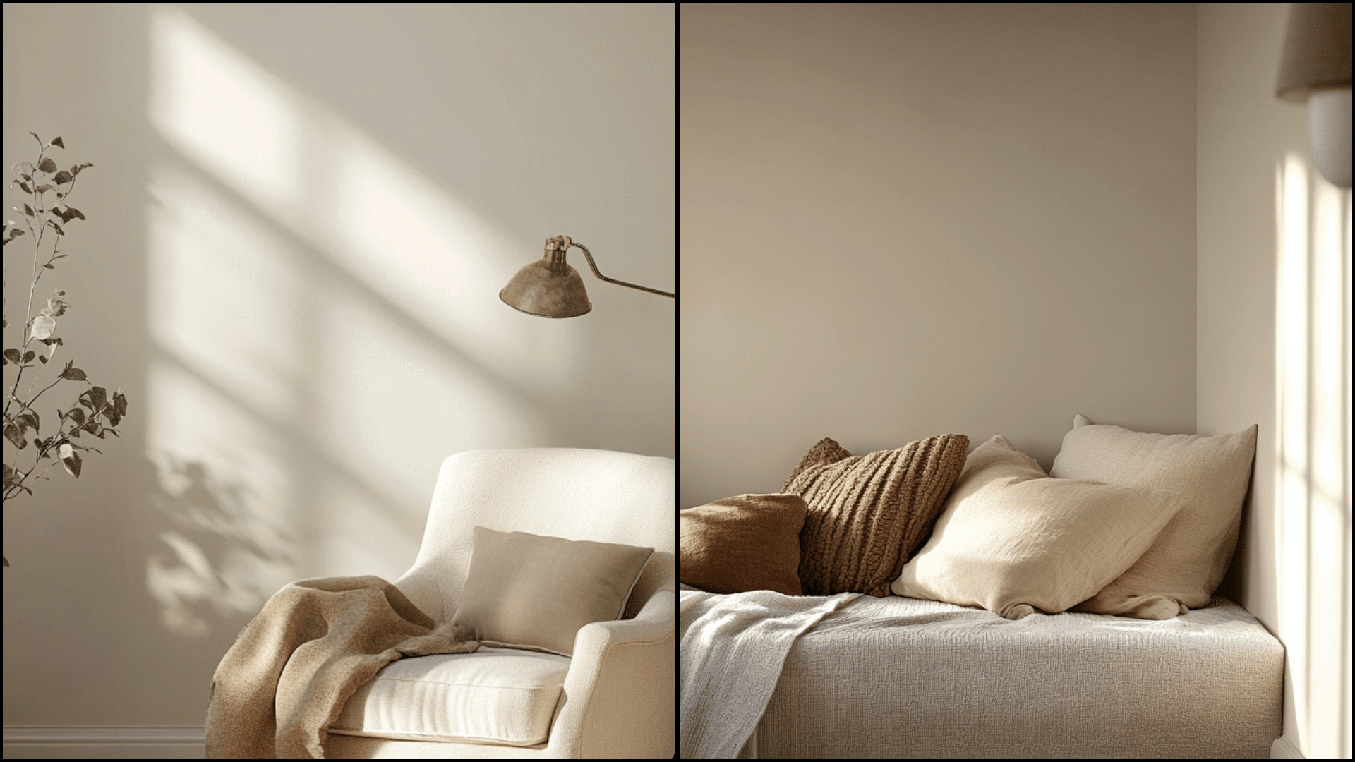
Bedrooms
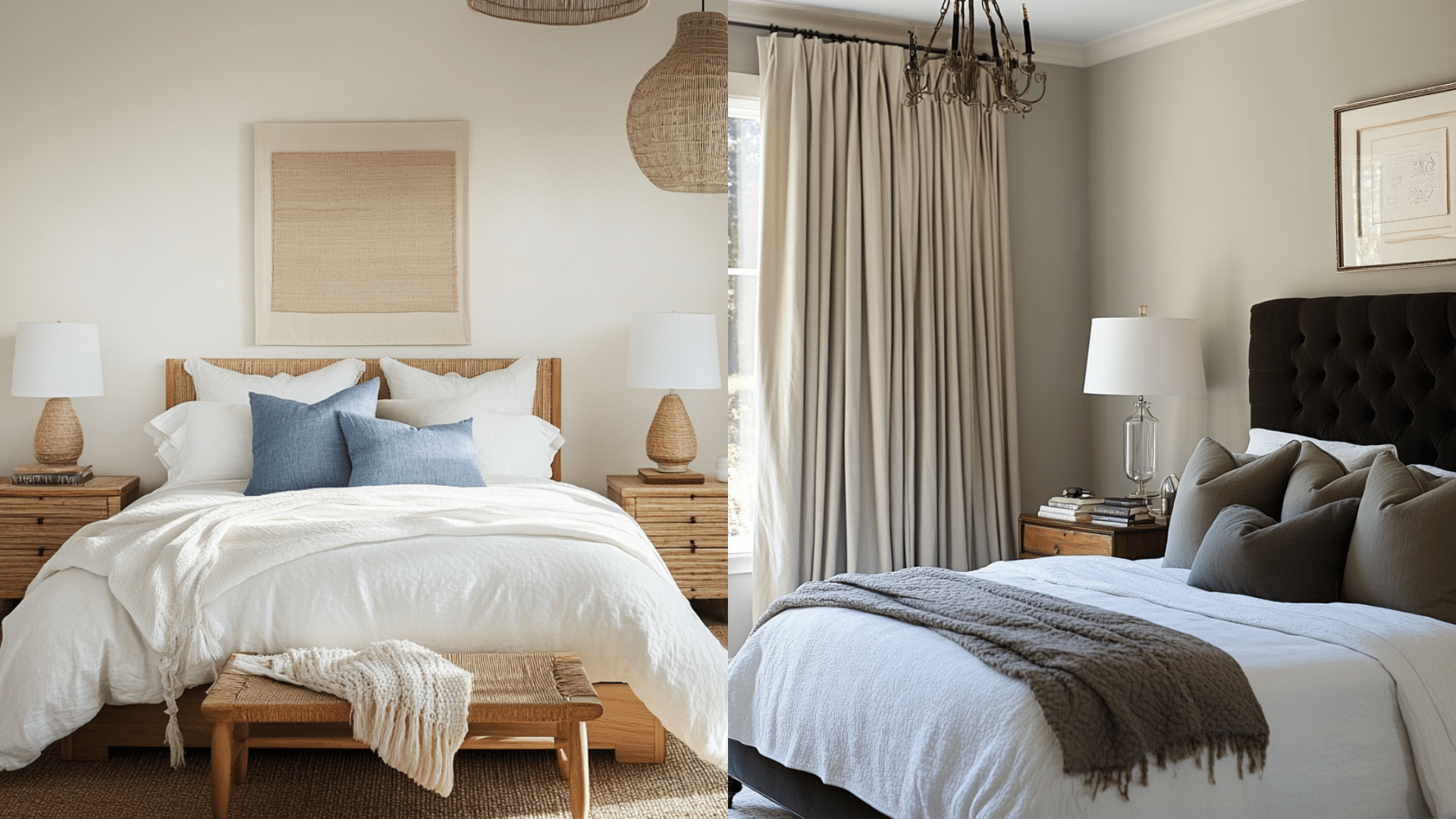
Pale Oak is my go-to when designing bedrooms meant to feel peaceful and airy. It brings a light, tranquil warmth that complements natural materials and soft white bedding beautifully. Edgecomb Gray, on the other hand, creates a moodier and more grounded bedroom. It feels cozier, more structured.
| Element | Pale Oak | Edgecomb Gray |
|---|---|---|
| Bedding | White, cream, or pale blue linen | Taupe, navy, or mushroom bedding |
| Furniture | Light oak or rattan bed frames | Dark wood or upholstered headboards |
| Accents | Soft green, muted blue, natural fibers | Deep sage, bronze, and darker woods |
| Style Vibe | Serene, soft, nature-inspired | refined, moody, hotel-like |
Bathrooms
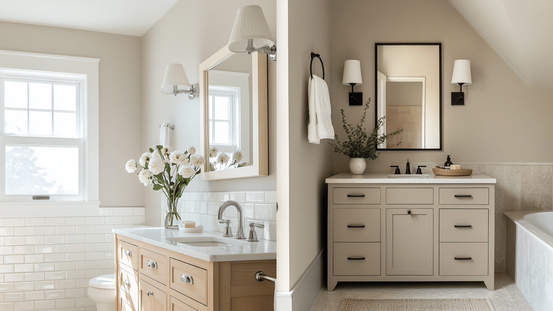
Bathrooms benefit greatly from either of these neutrals. Pale Oak makes compact bathrooms feel larger and fresher. It enhances a spa-like atmosphere without feeling cold.
Edgecomb Gray brings a subtle warmth to bathrooms. Paired with natural stone or warm ceramic tiles, it feels timeless and grounded.
| Element | Pale Oak | Edgecomb Gray |
|---|---|---|
| Tile | White subway, marble-look | Stone, travertine, or beige ceramic |
| Vanity Finish | White or pale wood | Warm wood or taupe cabinetry |
| Accents | Chrome or brass fixtures | Bronze or black finishes |
| Style Vibe | Fresh, soft, spa-like | Warm, timeless, understated luxury |
Mistakes to Avoid with Pale Oak and Edgecomb Gray
I made several costly mistakes when I first started working with these colors, and I want to save you from the same frustrations.
Here are the biggest pitfalls I’ve encountered and how to avoid them:
- Don’t trust digital swatches alone: I learned this the hard way when Pale Oak looked completely different on my wall than on my phone screen. Always order samples and test them in your actual space.
- Test in your specific lighting first: Both colors shift dramatically based on your home’s natural light. What looks perfect at noon might disappoint you at 6 PM.
- Avoid assuming other brands match: I thought I could save money with a similar color from another brand. The undertones were completely off, and it looked nothing like the original Benjamin Moore.
- Check your trim colors carefully: Bright white trim can make Edgecomb Gray look muddy, while cream trim might clash with Pale Oak’s undertones.
- Consider your ceiling color: white ceilings work well with both, but off-white or cream-colored ceilings can create awkward color clashes that you won’t notice until it’s too late.
Final Thoughts
After testing both colors extensively in my own home, I can say that there is no universal “better” choice between Pale Oak vs Edgecomb Gray.
Your decision comes down to what feeling you want to create. Pale Oak brings brightness and warmth, perfect for rooms that feel larger and more welcoming. Edgecomb Gray offers refinement and a calm feel.
The key is understanding your lighting conditions and testing samples in your actual rooms.
What’s your experience with these popular greige colors? Have you tried Pale Oak or Edgecomb Gray in your home? Comment below, I’d love to hear which one worked better for your space.