I stumbled across Moscow Midnight Sherwin Williams while scrolling through Sherwin-Williams’ latest color drops, and honestly? I was skeptical. Another dark paint with a dramatic name, I’ve seen plenty of those come and go.
But there’s something different about SW 9142 that caught my attention.
This isn’t your typical black or navy. Moscow Midnight sits in this interesting space between deep blue and charcoal, and it’s got this moody feel that is both timeless and current. I’ve been testing it in different lighting conditions, and the way it shifts throughout the day is pretty remarkable.
If you’re considering it for an accent wall or going bold with a whole room, this color deserves a closer look. Let me walk you through what makes Moscow Midnight special.
What Color Is Moscow Midnight Sherwin Williams?

Moscow Midnight Sherwin Williams (SW 9142) is a rich, deep blue color with cool undertones that lean toward navy, softened by subtle hints of gray. The hex code of Moscow Midnight is #204652 and the LRV of 5.
When I look at this color, I see a classy, elegant shade that offers both drama and versatility. It’s perfect for creating a moody, intimate atmosphere in spaces like bedrooms or living rooms, while still maintaining a polished and modern look.
Its cool blue undertone gives it a tranquil, almost mysterious feel, making it adaptable to different lighting conditions and pairing beautifully with soft neutrals like white or beige. I find it equally striking as an accent wall or cabinetry color, giving any room a stylish depth without overwhelming the space.
Key Features of Moscow Midnight Sherwin Williams
Moscow Midnight Sherwin Williams (SW 9142) is a deep, sophisticated blue that blends navy with subtle gray undertones.
It creates dramatic spaces while maintaining a refined, versatile appeal suitable for both modern and traditional interiors.
1. Deep Color with Cool Undertones
Moscow Midnight features a rich, navy blue base improved by subtle gray undertones. These cool undertones prevent the color from feeling overly saturated or harsh, making it adaptable across various lighting conditions.
This gives the paint a versatile nature that helps it blend well with numerous design styles and color palettes.
2. Creates Dramatic and Intimate Spaces
With its very low Light Reflectance Value (LRV) of about 5, Moscow Midnight absorbs most light, producing cozy, intimate atmospheres.
This makes it ideal for accent walls, bedrooms, or dens where a dramatic yet inviting mood is desired. Its dark depth adds visual interest without overwhelming the space.
3. Versatility in Pairing with Colors and Styles
I appreciate how Moscow Midnight pairs beautifully with both warm and cool accents. It works well alongside metallics like brushed gold or brass and complements colors such as mustard yellow or emerald green.
This makes it easy for me to create layered, harmonious looks, whether I prefer traditional or contemporary designs.
4. Increases Architectural Details and Texture
This paint’s depth gives walls a rich, velvety texture that enhances architectural features and textured surfaces like wainscoting or plaster.
Its subtle undertones create interesting light play and shadows that bring out fine details, adding character and dimension to a room.
5. Hides Imperfections and Maintains Richness Over Time
Moscow Midnight’s dark and complex shade masks minor wall imperfections effectively, which helps keep interiors looking polished.
Additionally, Sherwin-Williams offers this paint in durable finishes that resist fading and wear, ensuring the color remains rich and consistent even with regular cleaning or in high-traffic areas.
Practical Applications of Moscow Midnight Sherwin Williams
1. Entryway
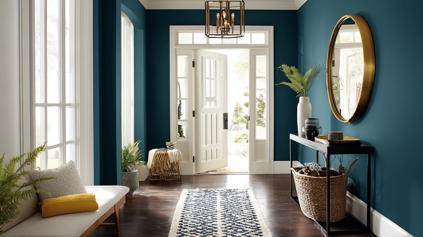
I love how Moscow Midnight transforms my entryway into a bold yet welcoming space. The rich teal-blue walls contrast perfectly with the white trim and door, while gold accents and greenery create a sophisticated first impression that feels both modern and inviting.
2. Porch
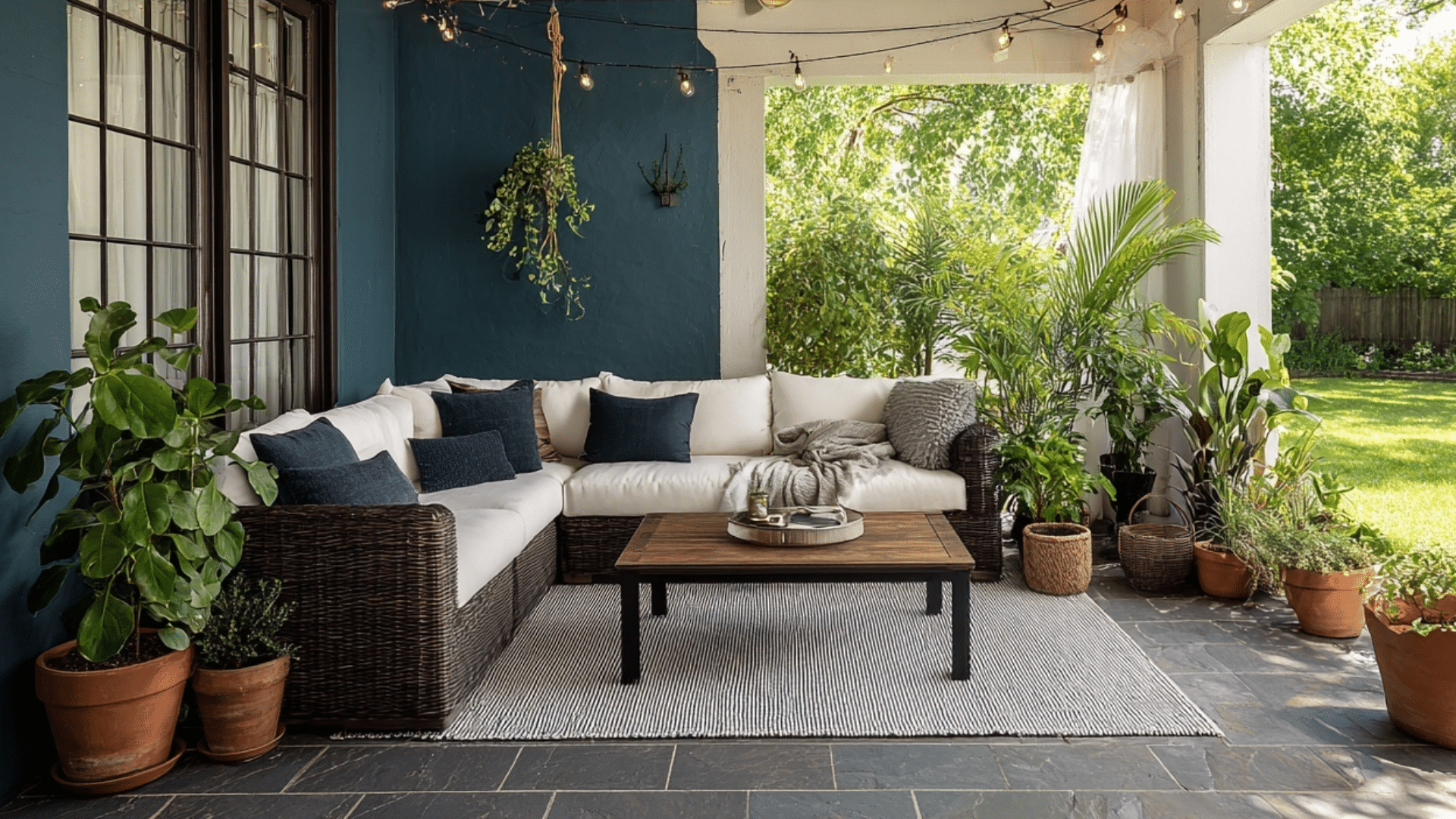
My porch feels like a cozy oasis thanks to Moscow Midnight. The deep hue makes the greenery pop and adds a cool, serene vibe. Paired with rattan furniture, soft lighting, and neutral cushions, it’s my go-to place for relaxing or entertaining guests outdoors.
3. Kitchen
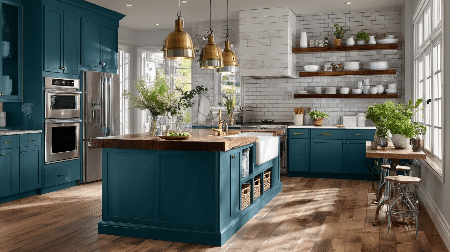
I adore how Moscow Midnight adds depth to my kitchen cabinets, bringing drama and style. The color highlights the warm wood tones and white tile backsplash, while brass lighting and fixtures give the space a refined, upscale charm. It’s functional and stunning all at once.
4. Bathroom
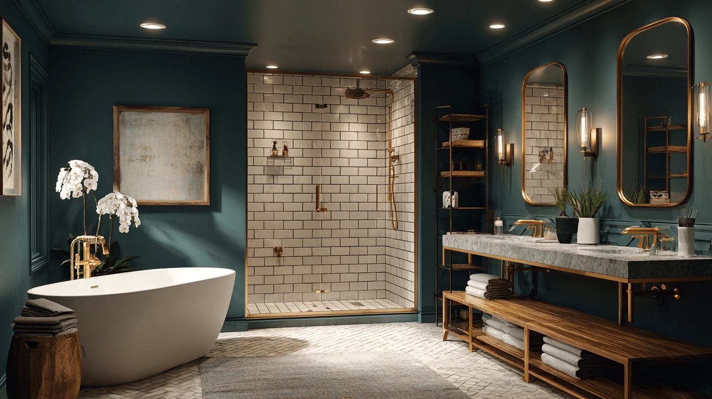
This bathroom is my spa retreat. Moscow Midnight wraps the room in calm beauty, perfectly framing the crisp white tile and marble counters. Gold fixtures elevate the space, and the soft lighting makes every soak in the tub feel luxurious and indulgent.
5. Bedroom
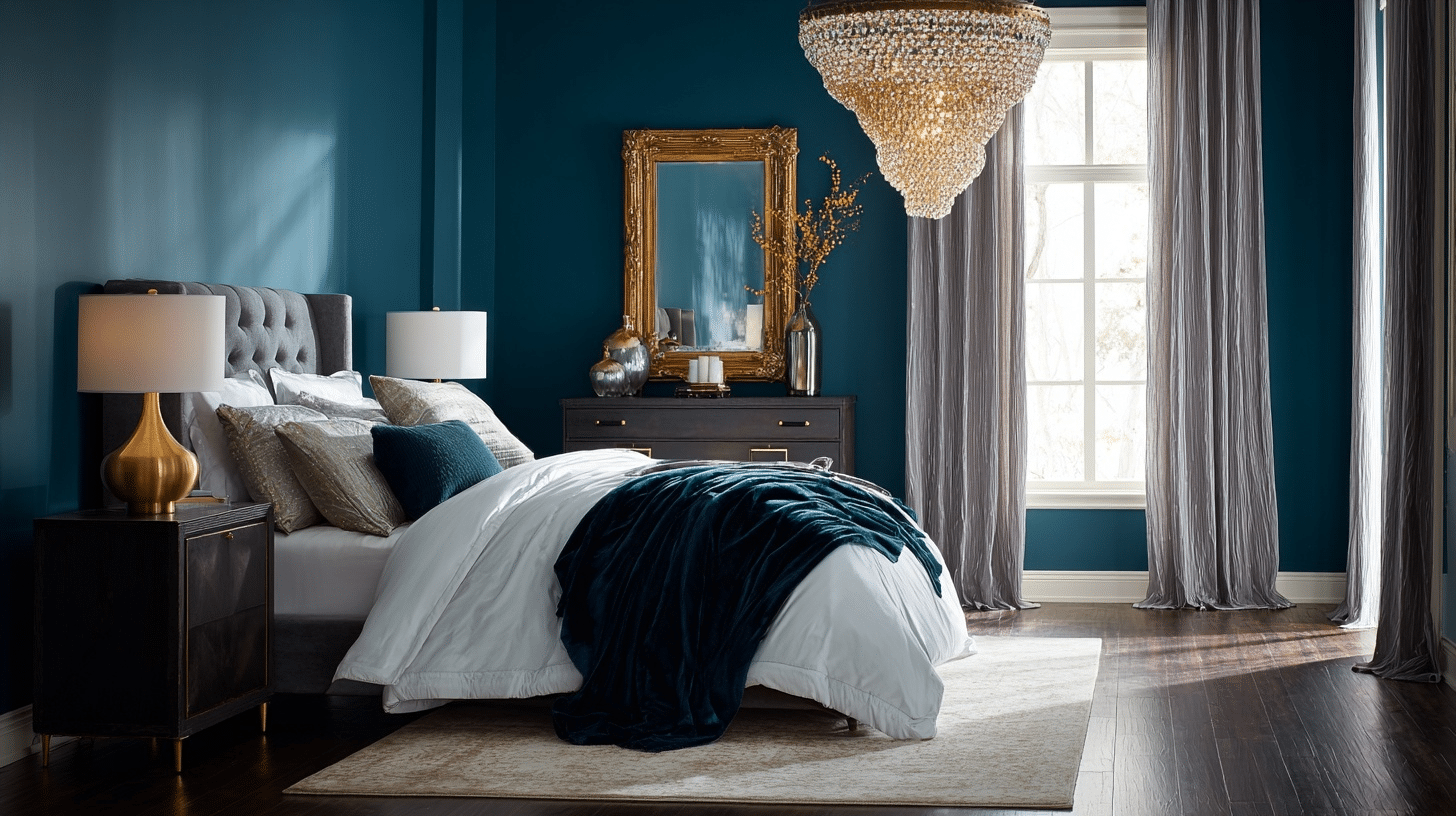
My bedroom feels serene and sophisticated with Moscow Midnight enveloping the walls. The color adds intimacy and contrast to the light bedding and velvet throw, while gold and crystal accents give it a touch of glamour. It’s a peaceful retreat I look forward to every night.
6. Living Room
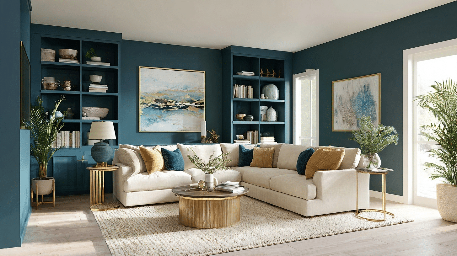
Moscow Midnight gives my living room a rich, cozy backdrop that’s perfect for unwinding. The neutral sectional and gold decor elements shine against the deep blue, and built-in shelves create a chic, gallery-like vibe. It’s a stylish, comfortable space for everyday living and entertaining
Pros and Cons of Moscow Midnight SW 9142
Moscow Midnight SW 9142 by Sherwin-Williams is a striking, rich navy-blue with cool undertones. This color adds a bold, dramatic touch to interiors and exteriors, often used to create a cozy, moody, or luxurious atmosphere.
| Pros | Cons |
|---|---|
| Ideal for creating dramatic interiors or beautiful exteriors. | In small or poorly lit spaces, it may make rooms feel smaller or darker. |
| Pairs beautifully with brass, white, greige, and wood tones. | Needs sufficient natural or artificial light to shine without feeling gloomy. |
| Complements both contemporary and traditional aesthetics. | Its boldness may not suit every taste or setting, especially rentals or resale. |
| Increases whites, creams, and grays, creating crisp contrast. | Darker paints may highlight wall flaws more than lighter tones. |
| Looks luxurious with proper sheen selection. | Matching the exact shade after drying can be difficult. |
The Bottom Line
After living with Moscow Midnight Sherwin-Williams for several weeks now, I can confidently say it’s earned its place in my top paint recommendations.
This color doesn’t just look good – it changes spaces in ways I didn’t expect.
Sure, it’s not for everyone. Dark colors rarely are. But if you’ve been craving something with real personality, something that makes a statement without screaming for attention, Moscow Midnight delivers.
The key is trusting the process. Yes, it’ll feel dramatic at first. But give it time to settle into your space, watch how it plays with your lighting, and I think you’ll find what I did, a color that’s both bold and surprisingly livable.
Sometimes the best design choices are the ones that make you a little nervous at first.