

Matching wall colors to wood floors isn’t complicated, but you need a simple process that works.
This blog shows exactly how to match wall colors with wood floors so your room looks its best.
You’ll learn which tones work together, which colors pair with different floors, common mistakes to avoid, and practical tips you can use right away.
Start with the Tone of Your Wood Floor
Your wood floor’s tone sets the foundation for your entire color scheme.
- Light Hardwood Floors: Make rooms feel bigger and brighter. Pair with soft whites, pale grays, and light blues.
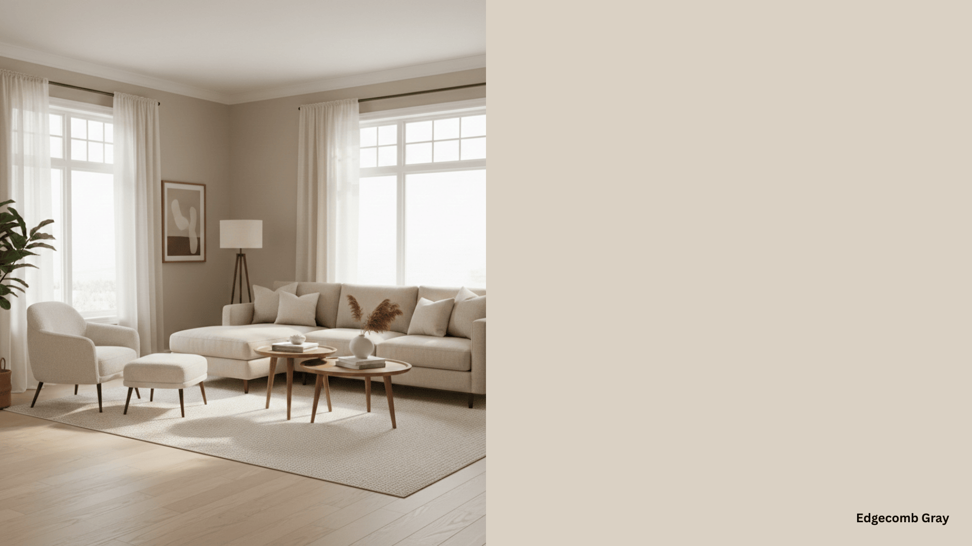
- Medium-Toned Wood Floors: Bring balance to spaces. Use neutral walls like greige, gray, or soft tan that won’t compete.
- Dark Wood Floors: Add richness, but can shrink spaces. Pair with white, cream, or pale gray to reflect light.
- Red-Toned Wood Floors: Have a strong personality. Balance with soft beige, warm cream, or light tan.
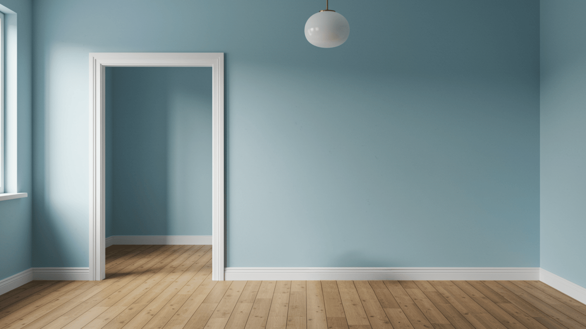
- Gray-Toned Wood Floors: Offer modern style. Pair with cool whites, light grays, or soft blues. Handle both warm and cool colors well.
Matching Wall Color with Wood for Existing Floor
You will see how to match the wall color with the wood floor. Here are tested color combinations that work.
1. Soft White with Honey Oak
Soft white walls brighten up honey oak floors without clashing.
The heat of the oak shines through while the walls keep things fresh. This combo works great in kitchens and living rooms where you want a clean, inviting feel.
Watch out for: Don’t choose stark white; it makes the oak’s orange undertones look too strong.
2. Greige with Cherry Wood
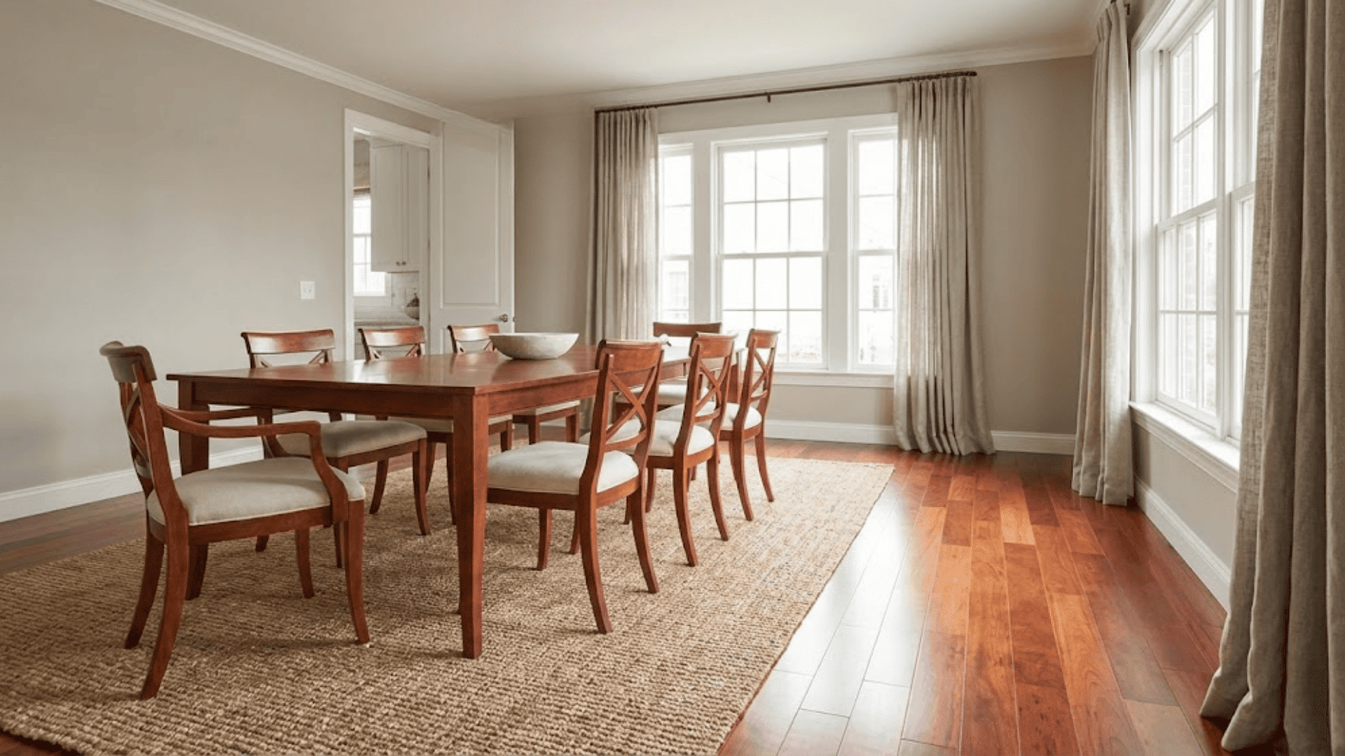
A gray-beige blend calms the reddish tones of cherry wood. It creates balance without hiding the floor’s natural beauty. This pairing feels modern yet effortless, perfect for bedrooms and dining areas.
Common error: Skipping a test swatch, greige can lean too gray or too beige depending on your light.
3. Pale Blue with Maple
Pale blue walls create a cool contrast with maple’s cordial yellow undertones.
The result feels fresh and beachy. This combination opens up smaller spaces and adds character to plain rooms.
Mistake to skip: Using blue that’s too bright, it fights with the floor instead of complementing it.
4. Gray with Walnut
Gray respects walnut’s deep brown tones while keeping rooms light. The gray’s heat prevents that cold, unwelcoming feeling.
This pairing works in offices, bedrooms, and modern living spaces.
Don’t do this: Choosing cool gray clashes with walnut’s generous undertones and feels off.
5. Cream with Pine
Cream walls bring out the pine’s natural golden glow. The two sociable tones work together to create a cozy atmosphere.
This is perfect for country-style homes or casual family spaces.
Avoid this slip-up: Going with pure yellow makes the pine look too orange and dated.
6. Sage Green with Ash
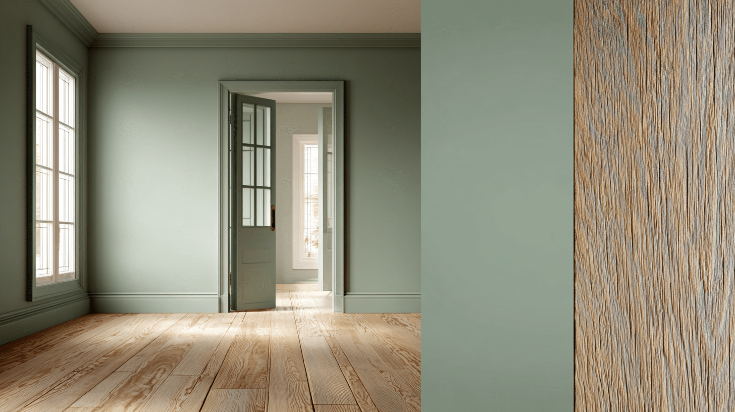
Sage green complements ash wood’s gray undertones beautifully.
The muted green adds life without overpowering the subtle floor color. This combo feels calm and works well in bathrooms and bedrooms.
Error to avoid: Picking bright green is too loud and makes the floor visually disappear.
7. Taupe with Hickory
Taupe balances hickory’s varied grain and color shifts. It’s neutral enough to let the floor’s character show through.
This pairing suits rural and traditional homes where the wood is a focal point.
Skip this mistake: Using the flat taupe test, it becomes some versions look muddy with hickory.
8. Pale Yellow with Bamboo
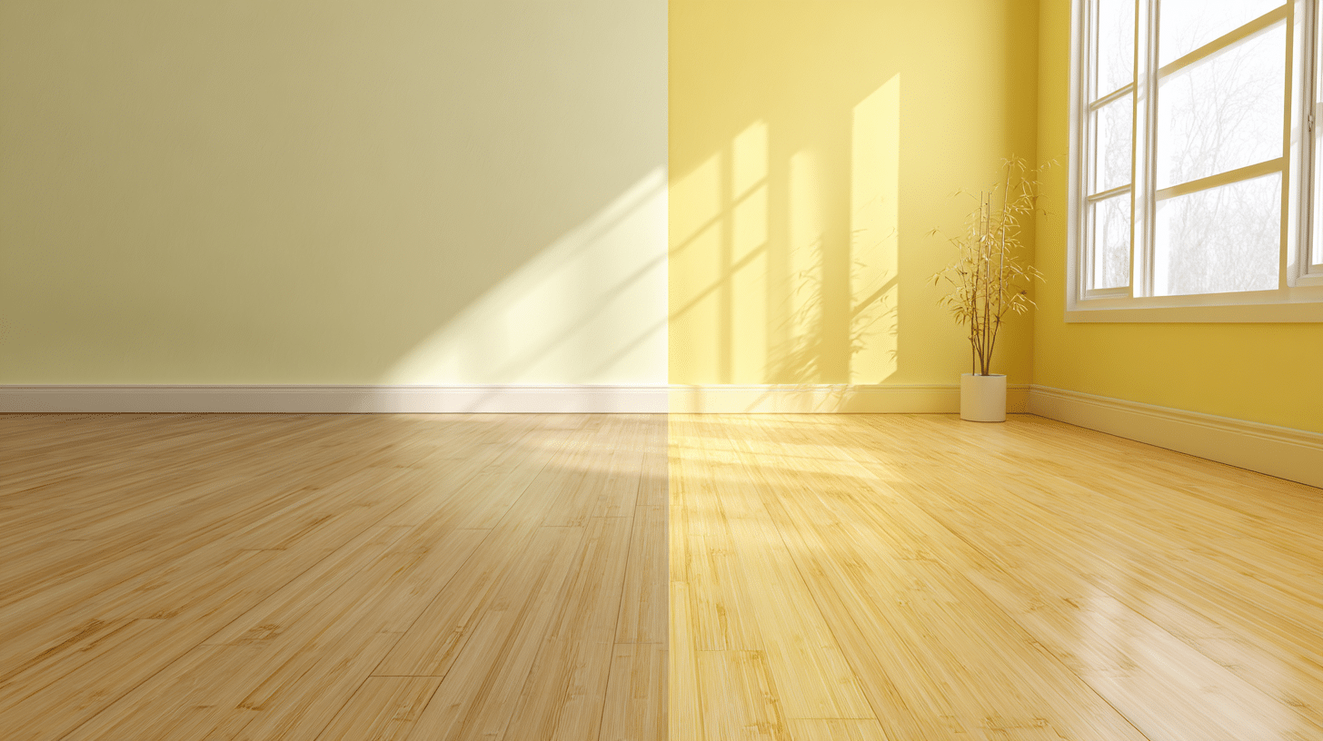
Pale yellow improves bamboo’s light, natural tone. It adds heat without making the room feel small.
This combination works great in sunny rooms and spaces where you want a cheerful vibe.
Don’t fall for: Choosing yellow that’s too saturated, it overpowers the floor’s subtle beauty.
9. Soft Gray-Blue with White Oak
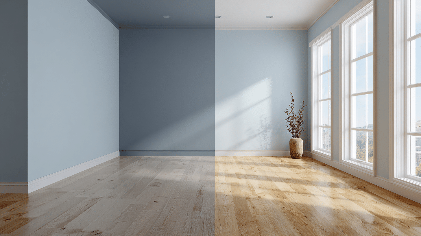
Soft gray-blue creates a modern look with white oak’s light, neutral base. The cool tone keeps things current, while the oak adds heat.
This is ideal for open-plan spaces and modern designs.
Common pitfall: Forgetting about your lighting test, the color in morning and evening light first.
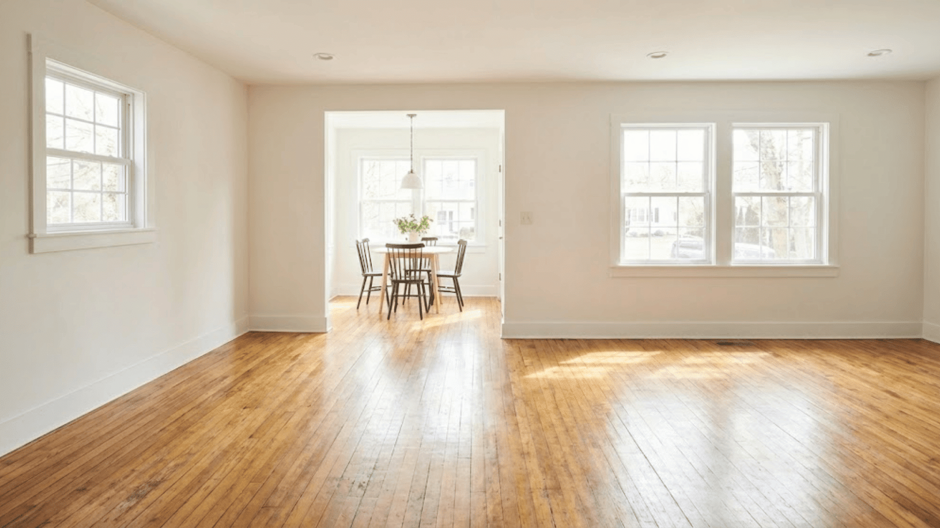
Should the Flooring Be Lighter or Darker than the Walls?
There’s no strict rule here. Both options work, depending on what you want to achieve.
Lighter floors with darker walls create a grounded, cozy feel. The dark walls draw your eye up while the light floor keeps things open. This works well in larger rooms where you want intimacy.
Darker floors with lighter walls are more common. They make rooms feel taller and more spacious.
The contrast adds definition without overwhelming the space.
Prefer this approach in smaller rooms. Consider your ceiling height and the amount of natural light.
Low ceilings need light walls. Rooms with lots of windows can handle darker walls. Test both scenarios with samples before committing.
Complementary vs. Contrasting Color Schemes
| Aspect | Complementary Colors | Contrasting Colors |
|---|---|---|
| What It Means | Colors that sit near each other on the color wheel | Colors that sit opposite each other on the color wheel |
| Visual Effect | Creates a calm, cohesive look | Creates drama and bold impact |
| Best For | Small rooms, relaxing spaces | Large rooms, statement spaces |
| Example | Honey oak floors with warm beige walls | Dark walnut floors with crisp white walls |
| Intensity | Subtle and soothing | Eye-catching and energetic |
| Risk Level | Low, hard to mess up | Medium needs careful balance |
| When to Use | When you want harmony | When you want visual interest |
| Common Pairing | Medium wood with taupe or tan | Light floors with dark walls or vice versa |
How to Test Paint Colors the Right Way
Testing paint colors properly prevents expensive mistakes.
- Get Sample Sizes: Buy small sample containers ($5-10 each) of your top 2-3 color choices instead of full gallons.
- Paint Large Swatches: Paint at least 2×2 foot swatches directly on your wall. Small paint chips don’t show true color in your space.
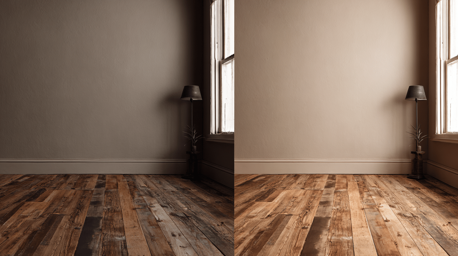
- Test in Multiple Spots: Paint samples in different areas. Colors look different near windows versus darker corners. Test walls with morning and afternoon light.
- Live with It for Days: Don’t decide immediately. Live with samples for 2-3 days minimum. Check them in morning, afternoon, and evening light. Colors shift dramatically based on lighting.
- Compare Against Your Floors: Stand back and see how samples interact with your wood floors.
- Consider the Finish: Sample the actual finish you’ll use, matte, eggshell, or satin. Finishes
Final Thoughts
You’ve learned the basics of matching wall colors with wood floors. The key is patience. Don’t rush to the paint store without testing first.
Take time with samples and watch how light changes throughout the day. Trust what you see.
Start small if you’re nervous. Paint one room first, see how it feels, then move forward with confidence.