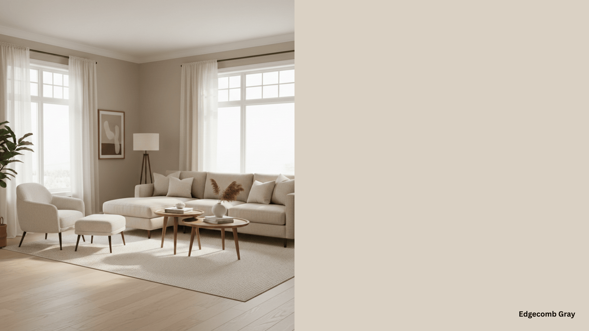


You’re staring at paint samples again. And you keep coming back to that one shade that caught your eye. Hale Navy Benjamin Moore has this way of stopping people in their tracks. It’s not just another dark blue; there’s something special about it.
I’ve been testing paint colors for years, but this one made me pause. The way it shifts from deep navy to almost black depending on the light? That’s what we call magic in a paint can.
Let’s discuss what makes Benjamin Moore Hale Navy a worthwhile investment. I’ll share what I learned after living with this color for months in my own home.
Decoding the Color
Hale Navy Benjamin Moore (HC-154) is a graceful navy blue from Benjamin Moore’s Historical Colors collection, inspired by classic American architecture. Here’s what makes this paint color special:
|
Attribute |
Value |
|---|---|
|
LRV (Light Reflectance Value) |
8.36 |
|
Undertones |
Primarily gray with a slight hint of green |
|
Color Family |
Navy blue, Historical Colors collection |
With an LRV of 8.36, Moore Hale Navy absorbs most light, creating a bold, dramatic effect that’s perfect for statement walls or furniture. Its gray undertones, with a touch of green, give it a refined edge, preventing it from feeling too stark or veering into purple tones.
This balance of warm and cool undertones makes it a “use-anywhere” shade with a classic maritime feel. The Moore color performs beautifully in paint Aura, paint Regal, and paint Ben lines.
A Visual Gallery Featuring Hale Navy Benjamin Moore
I love showing you real examples of how colors work in homes. Here are some of my favorite Hale Navy projects that show this paint color’s true potential.
These spaces prove why Benjamin Moore Hale has become such a popular choice for homeowners looking for versatile paint colors.
1. Home Office
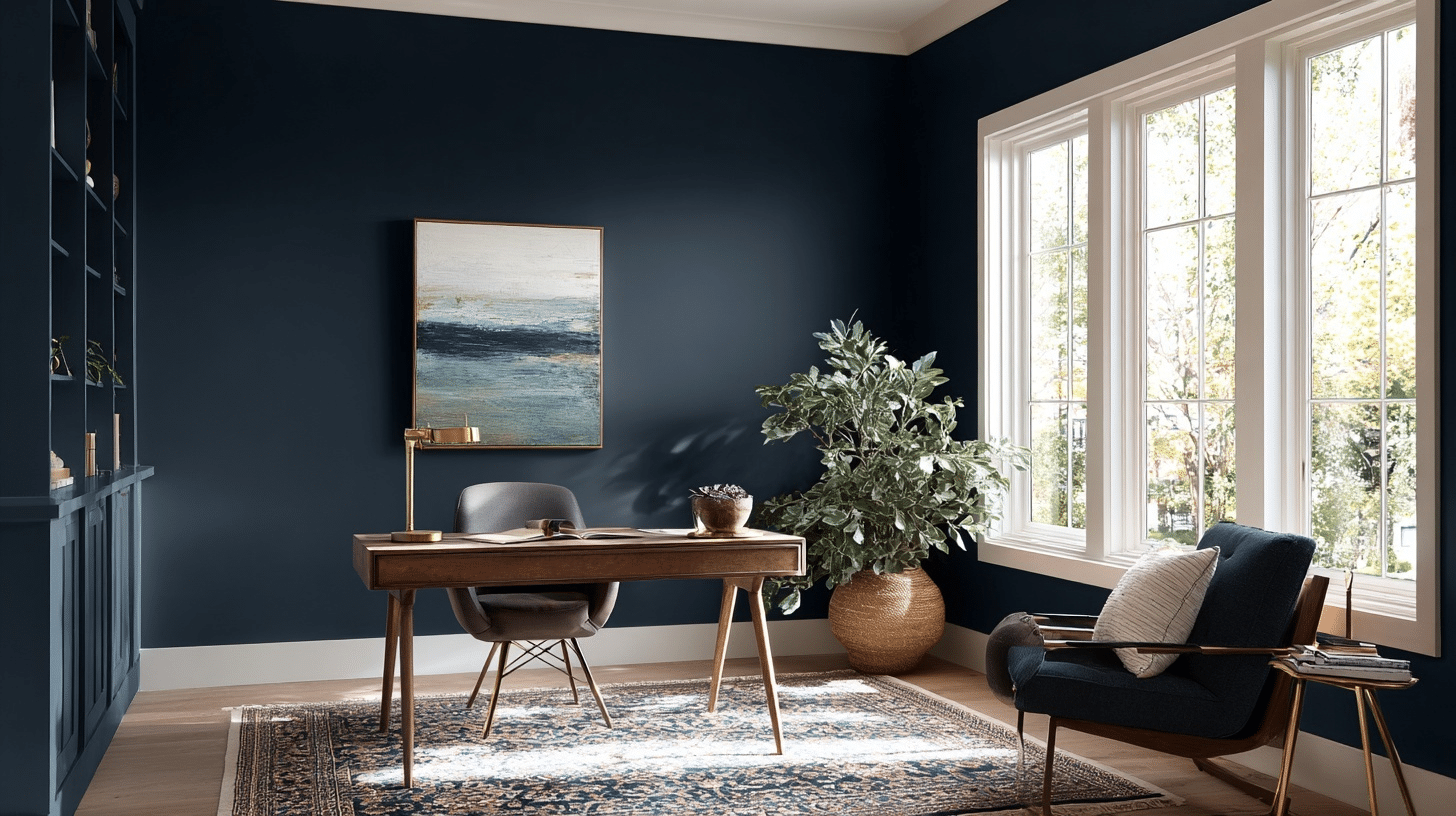
I recently worked on a client’s home office. We painted a board-and-batten wall in Hale Navy with an eggshell finish. The other walls got Benjamin Moore Simply White.
The result? A workspace that felt both professional and welcoming. The navy wall looked rich during the day, bathed in natural light. At night, it felt cozy under soft lighting.
We added light wood desks and linen chairs. A white bead chandelier completed the look. This created a nice mix of modern and classic styles. Even in a small space, Hale Navy made the room feel important. The contrast with the white walls made the navy stand out.
2. Powder Bath
For a small powder bath, I painted the cabinets in Hale Navy semi-gloss. The walls got Behr Castle Path, a soft gray color. The navy cabinets added luxury to the space. The glossy finish helped reflect light. This made the small room feel bigger than it was.
The gray walls let the navy cabinets stand out. We added a star-shaped light and a round mirror. The look was classy but not too much. This shows how Hale Navy can turn a basic bathroom into something special with the right paint product.
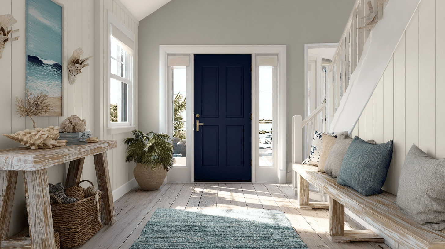
3. Interior Front Door
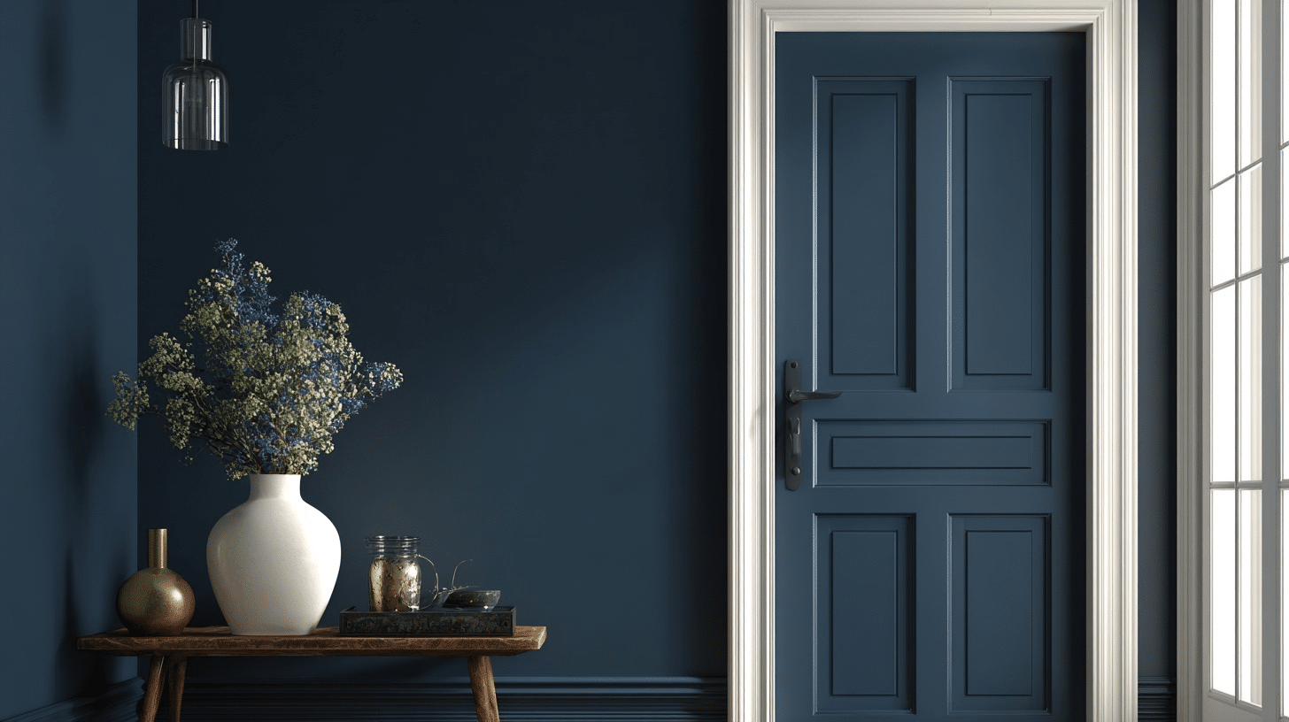
One of my favorite uses for Hale Navy is on interior doors. I recently painted a front door in this color. The walls stayed Simply White.
This created a bold welcome for guests. The navy door became the primary focus of the entry. We added coastal touches like a striped rug. Even with less natural light, Hale Navy looked rich and inviting. It’s a simple way to add character to your entrance with interior paint.
4. Den
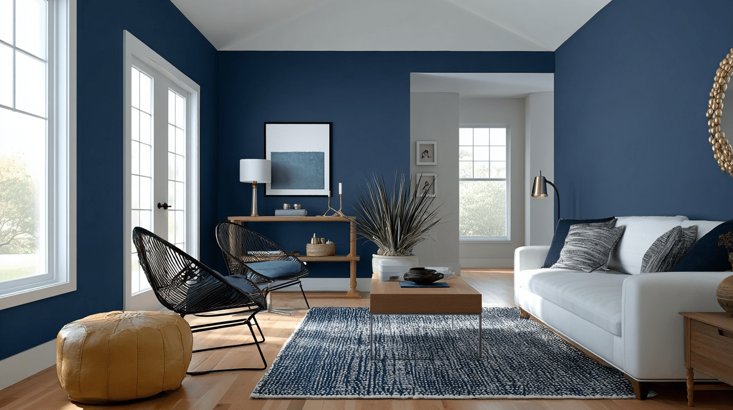
In a cozy den, we used Hale Navy on one feature wall. The wall had board and batten details. We paired it with a linen sofa and a round wood coffee table. White linen curtains kept things light. The navy wall made the space feel grounded and warm. The neutral furniture balanced out the bold wall color.
We added a gallery wall with large frames. This created a personal touch. The final result was both cozy and stylish.
Paint Color Review: Complementary Colors
Hale Navy’s versatility lies in its ability to pair seamlessly with a wide range of colors. Here are some of my favorite combinations, drawn from my projects and expert recommendations:
Whites:
- Simply White: A crisp, clean contrast that brightens Hale Navy.
- White Dove: A warmer white for a softer look.
- Glacier White: A cool white for a fresh, modern vibe.
Grays:
- Revere Pewter: A warm gray that complements Hale Navy’s depth.
- Effort Gray: A soft, versatile gray for a subtle contrast.
- Agreeable Gray: A popular gray for accent walls.
- Stonington Gray: A cooler gray for a modern feel.
- Coventry Gray: A classic gray with a hint of warmth.
These pairings, recommended by sources such as Carla Bast Design and Life On Virginia Street, enable Hale Navy to adapt to any style, from minimalist to vibrant. Finding color matches among different paint colors helps create cohesive designs.
Using Hale Navy Benjamin Moore in Different Aesthetics
Hale Navy’s neutral quality makes it a chameleon, fitting seamlessly into various design styles. Here’s how I’ve seen it shine across different aesthetics, inspired by the aesthetic genres from my design resources. This color review covers both interior and exterior applications.
1. Traditional
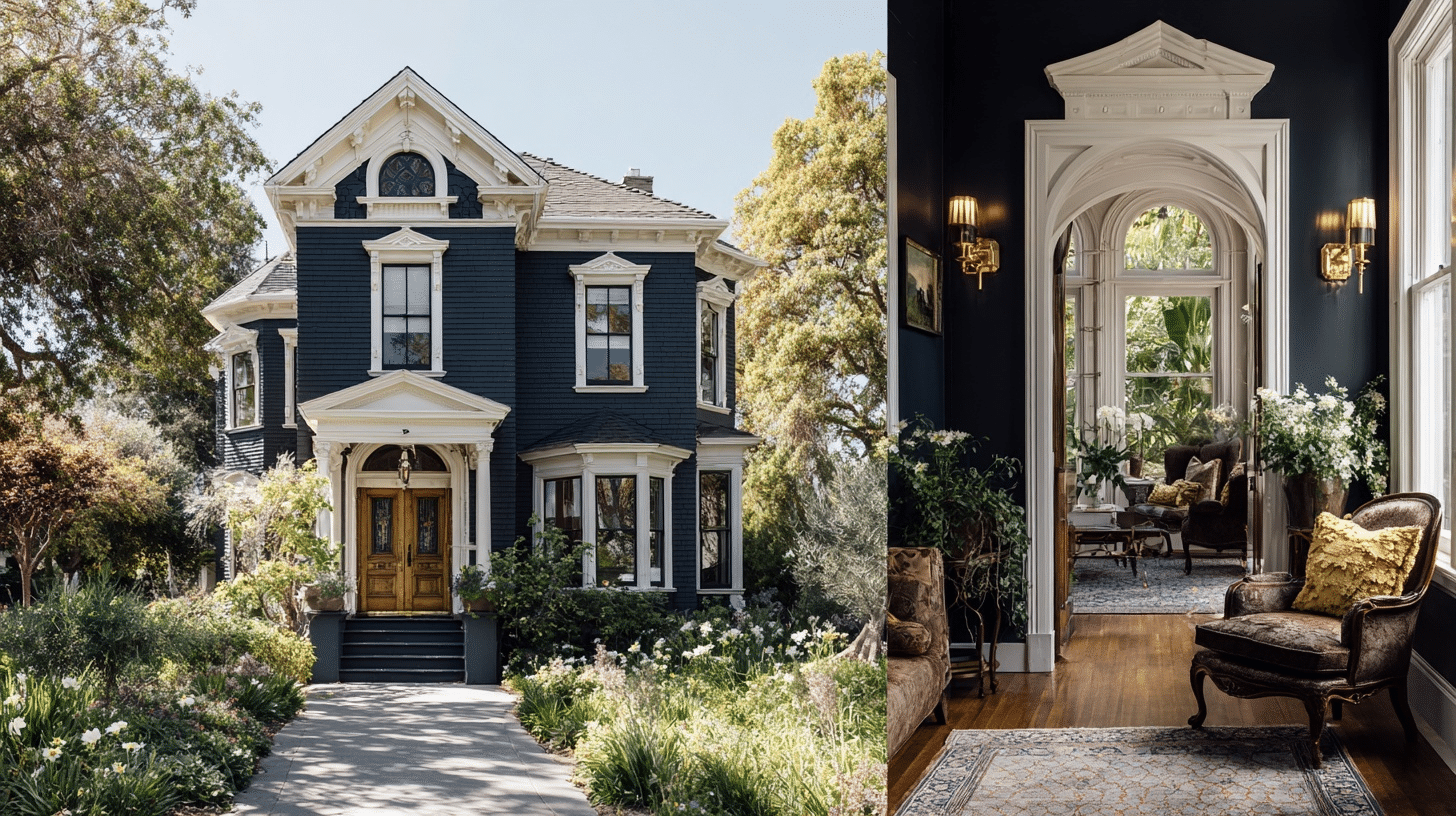
Hale Navy is a natural fit for traditional spaces. I’ve used it on the exterior of a Victorian home as exterior paint, paired with white trim and brass hardware, for an everlasting, graceful look. The deep navy adds grandeur, while the lighter accents keep it balanced. It’s also stunning on interior elements like wainscoting or cabinetry, as seen in Carla Bast Design’s review.
- Colors: Deep blues, warm woods, crisp whites
- Vibe: Classic, graceful, rooted in heritage
- Room Tips: Use Hale Navy on wainscoting or cabinetry, paired with white trim and antique brass fixtures. Add classic furniture and rich textiles for a polished look.
2. Coastal
For a coastal vibe, Hale Navy evokes the sea’s depth. I painted a front door in Moore Hale Navy and paired it with light wood furniture and white accents, creating a breezy, nautical feel. This look, inspired by Life On Virginia Street’s coastal entryway, is perfect for beach houses or spaces craving a relaxed, seaside charm.
- Colors: Soft blues, seafoam greens, sandy beiges, crisp whites
- Vibe: Breezy, relaxed, inspired by the beach
- Room Tips: Use Hale Navy on walls or furniture, paired with whitewashed wood and linen fabrics. Add sea-inspired decor, such as shells and driftwood, for a coastal touch.
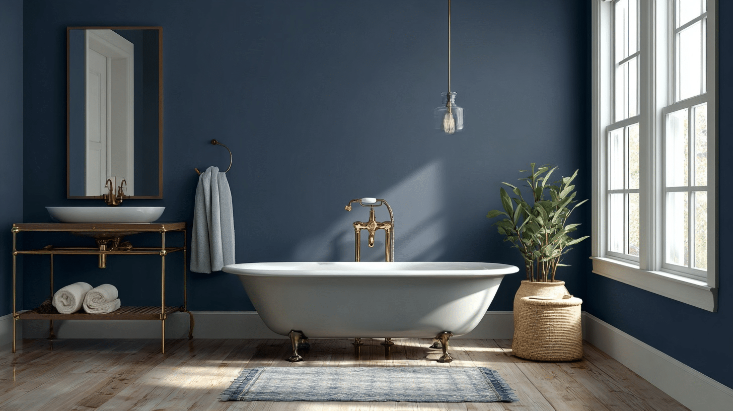
3. Modern
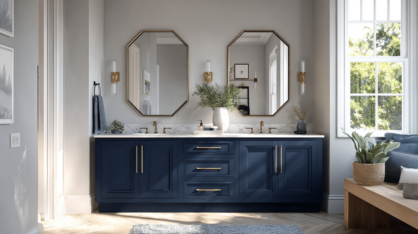
In modern settings, Hale Navy adds modern looks without overwhelming. I used it on a bathroom vanity with crisp white shiplap and sleek nickel fixtures, creating a clean, contemporary look. The navy’s depth contrasts beautifully with minimal decor, as noted in Chrissy Marie Blog’s bathroom project.
- Colors: Neutral grays, metallics, crisp whites
- Vibe: Sleek, minimalist, worldly
- Room Tips: Use Hale Navy on a feature wall or furniture with clean lines. Pair with metallic accents and simple decor for a modern aesthetic.
4. Farmhouse
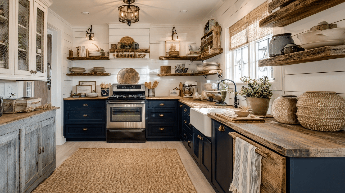
For a farmhouse aesthetic, Hale Navy works wonders on board-and-batten walls or kitchen cabinets. I paired it with distressed wood furniture and jute rugs for a cozy, lived-in feel. The navy adds grace without sacrificing the rustic charm, as seen in Life On Virginia Street’s den design. The right paint makes all the difference in achieving this look.
- Colors: Warm neutrals, distressed woods, soft whites
- Vibe: Cozy, rustic, inviting
- Room Tips: Use Hale Navy on accent walls or cabinets, paired with natural textiles and weathered wood furniture. Add simple, rustic decor for a farmhouse feel.
5. Eclectic
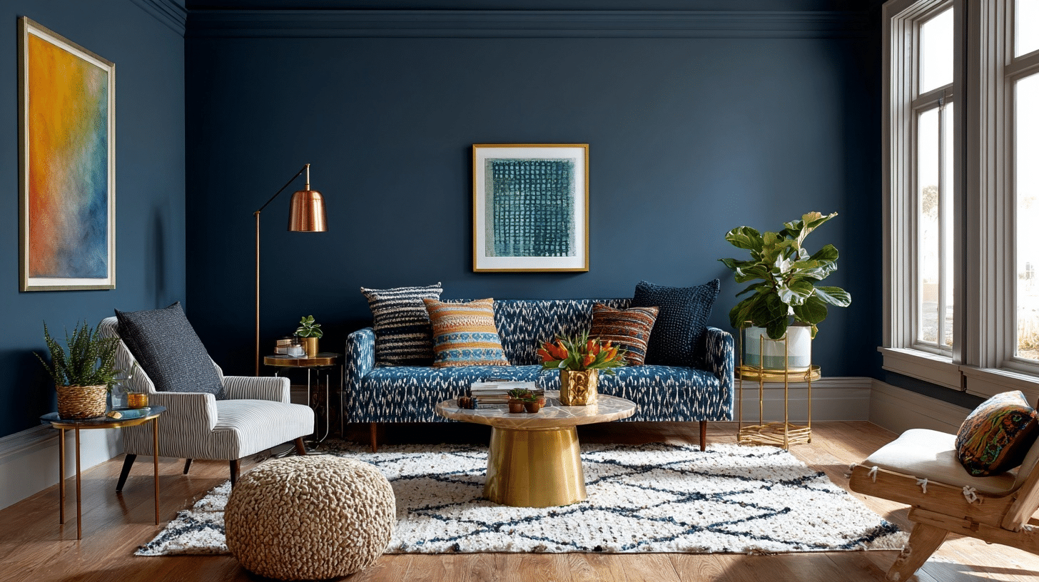
Hale Navy’s neutral quality makes it ideal for eclectic spaces. I’ve seen it used as a base for mixing bold patterns, such as florals or stripes, with metallics like brass or copper. Its versatility allows it to anchor diverse elements without clashing, creating a cohesive yet vibrant look.
- Colors: Bold patterns, metallics, vibrant accents
- Vibe: Creative, vibrant, unique
- Room Tips: Use Hale Navy as a grounding color for walls or furniture. Mix with bold patterns, textures, and metallic accents for an eclectic, personalized space.
Competitor Colors for Benjamin Moore Hale Navy
| Brand | Paint Color | LRV | Undertones | Description |
|---|---|---|---|---|
| Sherwin-Williams | Naval (SW 6244) | 4 | Warm purple with hints of green-gray | A bright navy that’s darker than Hale Navy. Creates bold, dramatic effects. |
| Behr | Midnight Blue (N480-7) | 9 | True blue, less gray than Hale Navy | A deep navy very close to Hale Navy’s depth. Less muted than Hale Navy. |
| Farrow & Ball | Stiffkey Blue (No. 281) | 10 | Subtle green | A rich, true navy inspired by the Norfolk shoreline. Slightly lighter than Hale Navy. |
| Clare | Nearly Navy | 7 | Teal tinge | A deep navy with a modern twist. Slightly darker than Hale Navy. |
| Backdrop | School Blazer Blue | Not specified | Hint of gray | A deep navy blue that’s versatile for bedrooms and bathrooms. |
Finishing It Up
After using Hale Navy Benjamin Moore in numerous projects, I can say it’s a color that never disappoints.
Its depth, versatility, and everlasting appeal make it a designer’s dream. It works well in both cool- and warm-toned rooms, and even shines in north-facing or darker spaces when paired with light contrasts, such as white or gray. When choosing paints, always get a sample first to see how it looks in your specific lighting.
Ready to bring the Hale Navy into your home? Start small with an accent wall, a piece of furniture, or even a front door to see its transformative power.
You can explore more ideas and order samples at Benjamin Moore’s Hale Navy page.
I’d love to hear how you plan to use Hale Navy; share your ideas in the comments below!