")
White paint shouldn’t look yellow.
But you’ve probably experienced this. You pick a warm white from the paint chip. It looks perfect in the store.
Then you paint your walls, and suddenly your room feels like the inside of a banana. It’s disappointing and expensive to fix.
I’ve tested 10+ warm white paints that stay true to their color. No yellow cast, no regrets.
Understanding Understones
Undertones make or break your paint choice. They’re the hidden colors beneath the surface.
Warm whites have yellow, red, or orange undertones. Cool whites lean blue or green; you can’t always see undertones on a tiny paint chip.
Your room’s lighting reveals them. Natural light shows the true color. Artificial light can shift it completely.
I test paints on my walls before committing. Paint a large sample board. Move it around the room. Check it in morning light and evening light.
That’s how you spot undertones.
How to Check the Undertone of Any Color?
I use a simple trick to spot undertones. Paint a large sample on a white poster board. Hold it next to pure white paint.
Here’s what I do:
- Check the sample in natural daylight first
- Look at it again under your artificial lights
- Compare it to a true white reference
- Notice which color emerges – yellow, pink, or green
The undertone will pop out when you compare colors side by side. I also paint samples directly on my wall.
That shows me exactly how the color will look in my space.
Best Warm White Paints That Don’t Look Yellow on Walls
Choosing the right warm white can transform your space. I’ve tested these paints extensively in different lighting conditions.
Here are my top picks that stay beautifully neutral without turning yellow.
1. Simply White
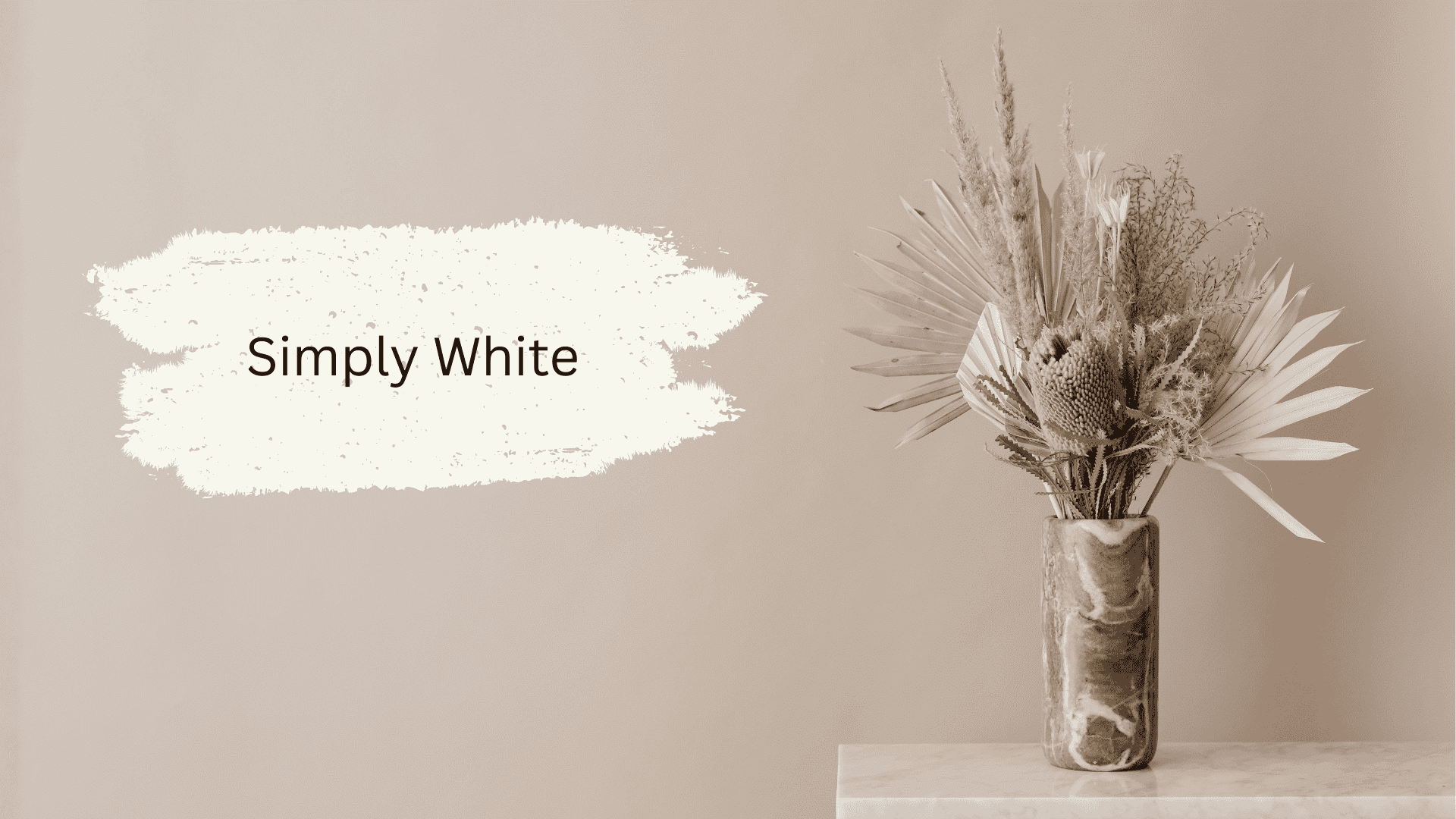
Simply White (OC-117) lives up to its name with a clean, crisp finish.
I find it slightly cooler than other warm whites on this list. It’s ideal for modern spaces that demand brightness.
The paint reflects light beautifully without looking stark or cold in your rooms.
People often compare Simply White vs. White Dove, but I had both colors in my old house, and these two are very different colors.
2. White Dove
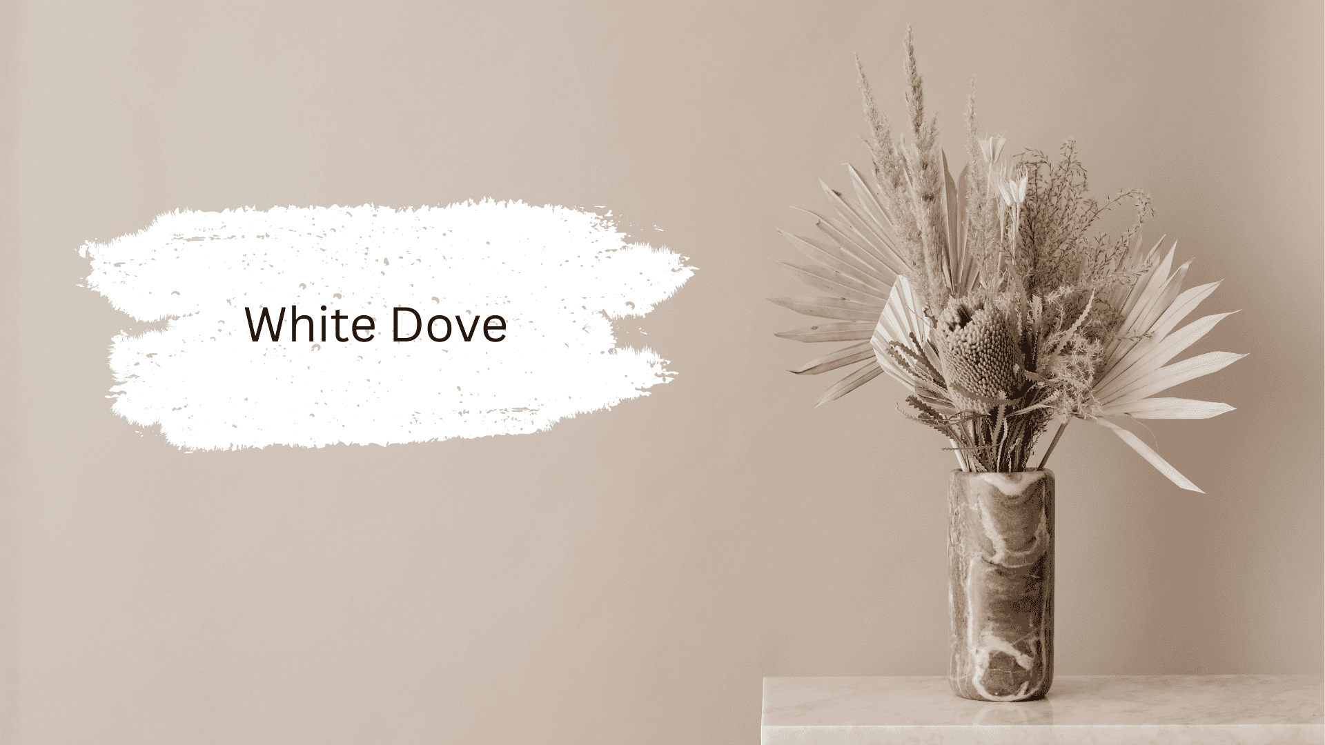
White Dove (OC-17) is a classic that never disappoints me. It leans slightly warm but keeps its white integrity.
You can use it for whole-house painting projects. The color works well with both warm and cool accent colors, making decorating easier for you.
White Dove is also one of those Benjamin Moore White Paint Colors that rank among the most popular.
3. Egret White
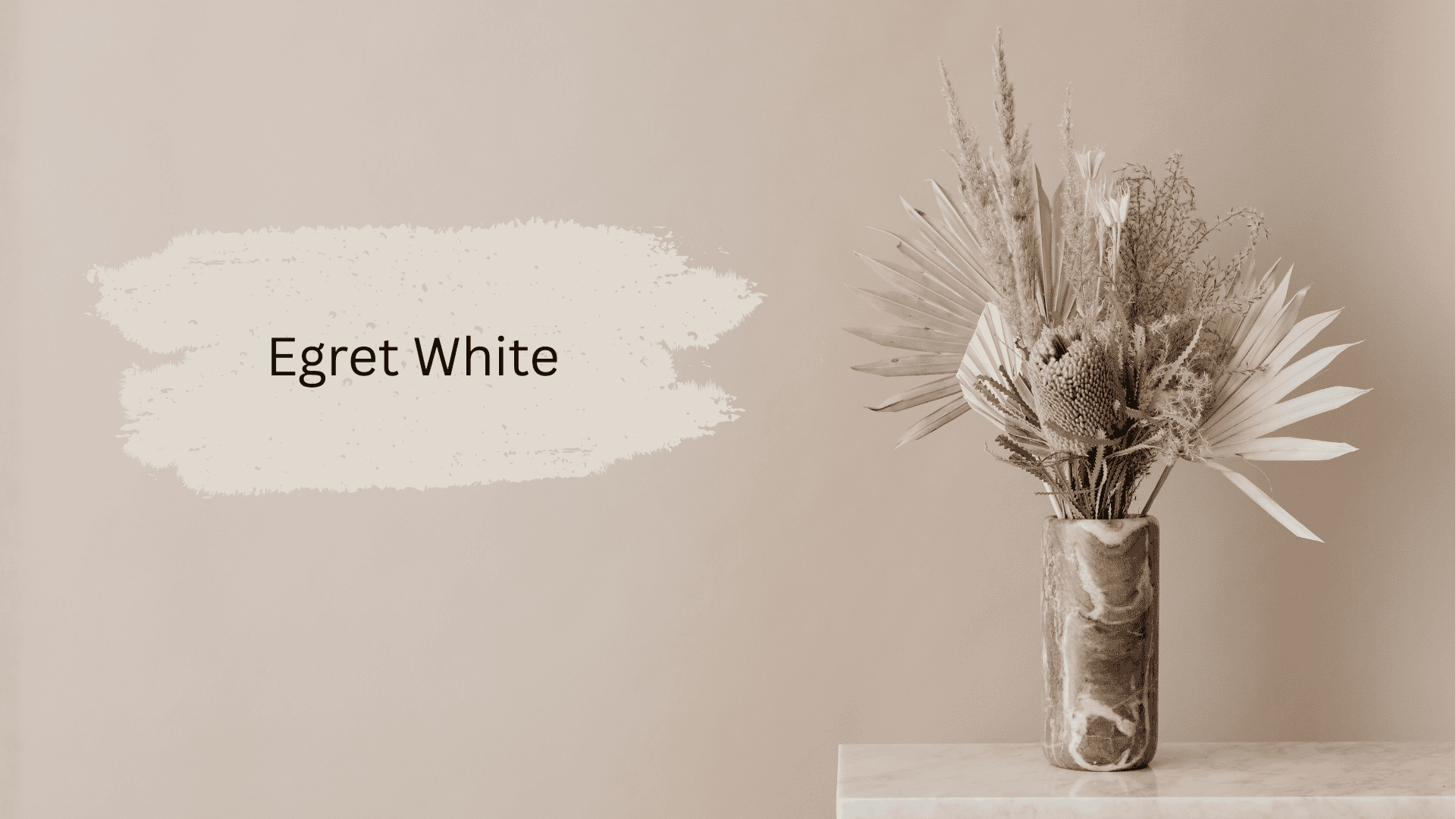
Egret White (SW 7570) offers a soft, creamy tone without any yellow cast. I love how it maintains its clean appearance in both natural and artificial light.
It’s perfect for living rooms and bedrooms where you want warmth but not heaviness.
4. Kestrel White
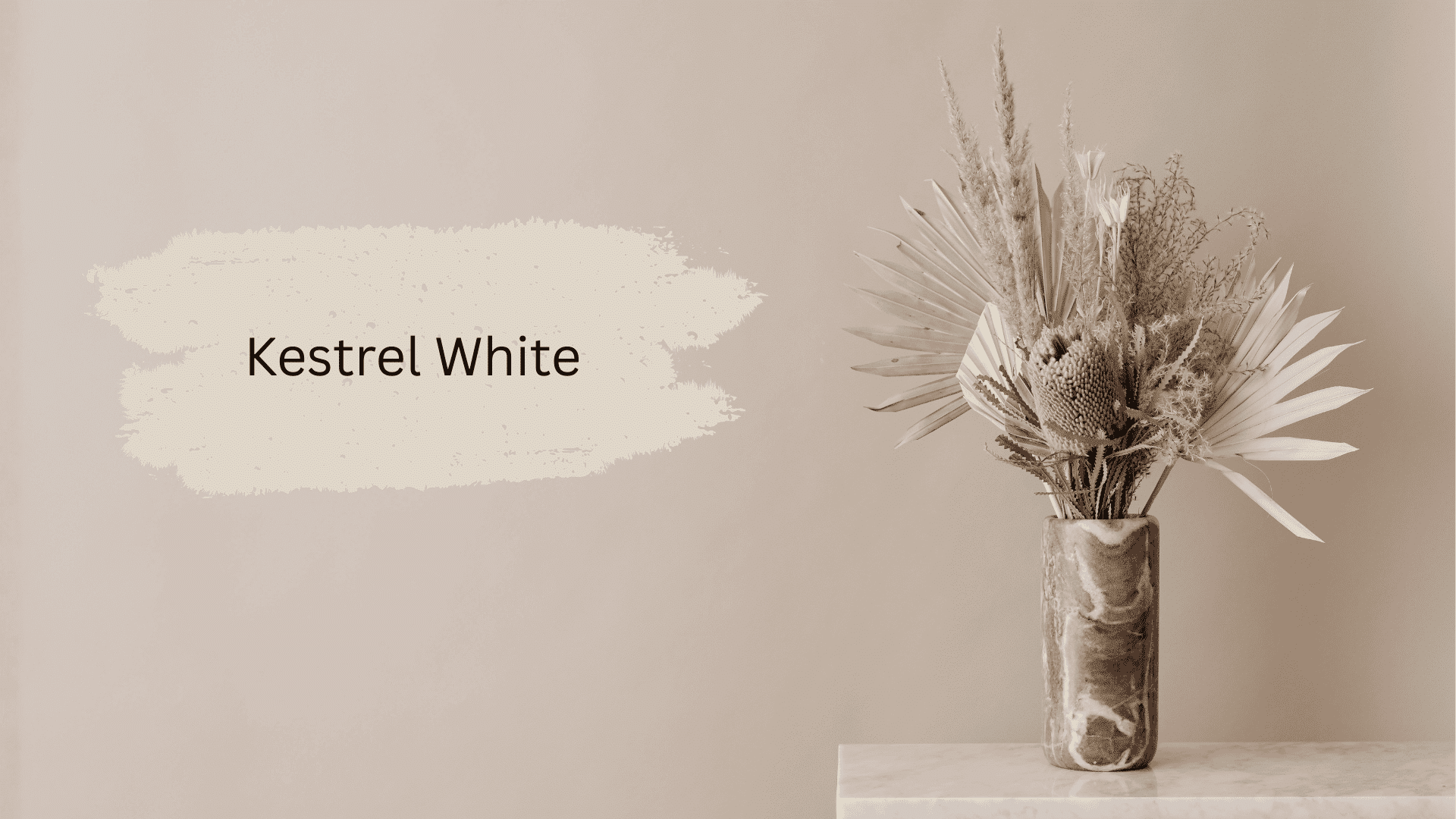
Kestrel White (SW 7516) is my go-to for spaces with lots of natural light.
It has subtle gray undertones that prevent yellowing. I’ve used it in kitchens and bathrooms where brightness matters.
The color stays consistent throughout the day, which I really appreciate.
5. Alabaster
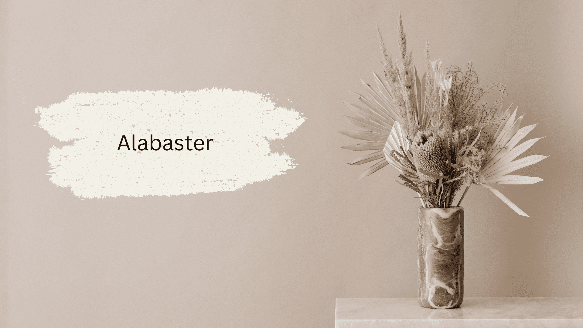
Alabaster (SW 7008) gives you warmth with a hint of beige undertone.
I’ve painted entire homes with this color and never regretted it. It creates a cozy feel without crossing into yellow territory.
The shade works particularly well in rooms with north-facing windows that need extra warmth.
6. Greek Villa
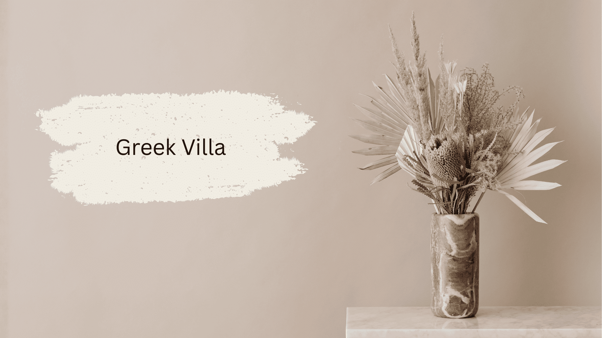
Greek Villa (SW 7551) brings Mediterranean charm to your walls without the yellow problem.
I like its balanced undertones that shift slightly between warm and neutral.
It’s versatile enough for any room in your home. The color pairs wonderfully with natural wood tones and stone accents.
7. Cotton White
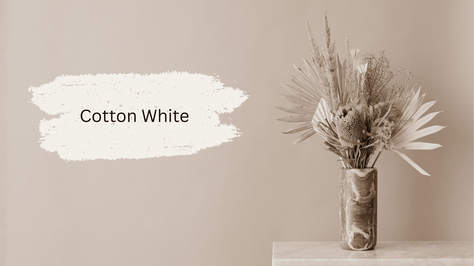
Cotton White (SW 7140) delivers a soft, clean look that feels fresh and inviting.
I’ve used it in bedrooms where comfort is key. The color has minimal undertones, so it stays true throughout the day.
It’s a great choice if you don’t want any risk of yellowing.
8. Intricate Ivory
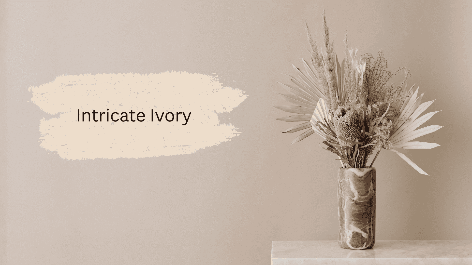
Intricate Ivory (SW 6350) brings subtle warmth with a touch of cream.
I find it works beautifully in both traditional and modern spaces. The color doesn’t shift dramatically under different lighting conditions.
It’s one of my favorites for creating a welcoming atmosphere in living areas.
9. Only Natural
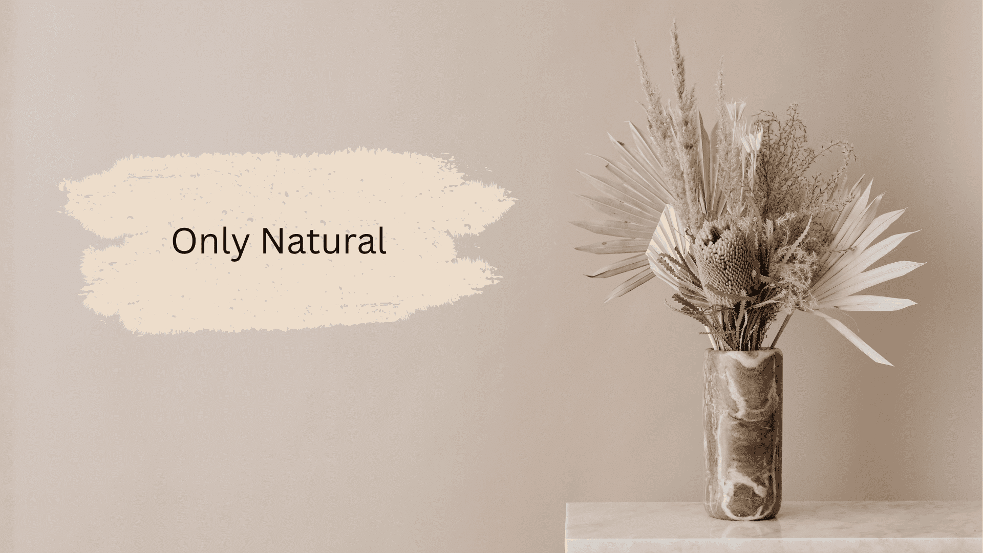
Only Natural (SW 7596) is aptly named for its authentic, understated warmth.
I recommend it for open-concept spaces where consistency matters. The paint maintains its character without looking too beige or yellow.
It’s a safe bet when you’re unsure about committing to bolder warm tones.
10. Bone China
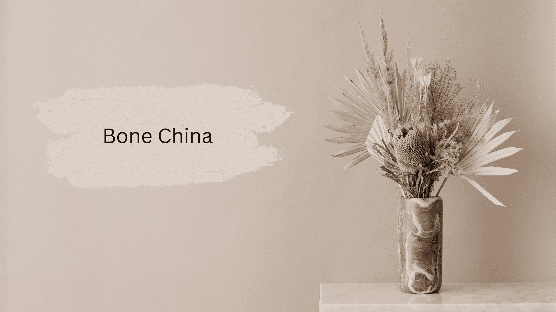
Bone China (CC-429) offers a refined, sophisticated warmth that I adore.
It has just enough depth to feel interesting on walls. I’ve used it in dining rooms where you don’t want coldness.
The color complements both silver and gold hardware, making it incredibly versatile for styling.
11. Schoolhouse White

Schoolhouse White (No.291) gives you that classic, timeless look I love in farmhouse-style homes.
It’s warmer than pure white but never crosses into yellow. I find it perfect for trim work and walls together.
The color creates a clean backdrop for any decorating style you prefer.
12. Heavy Cream
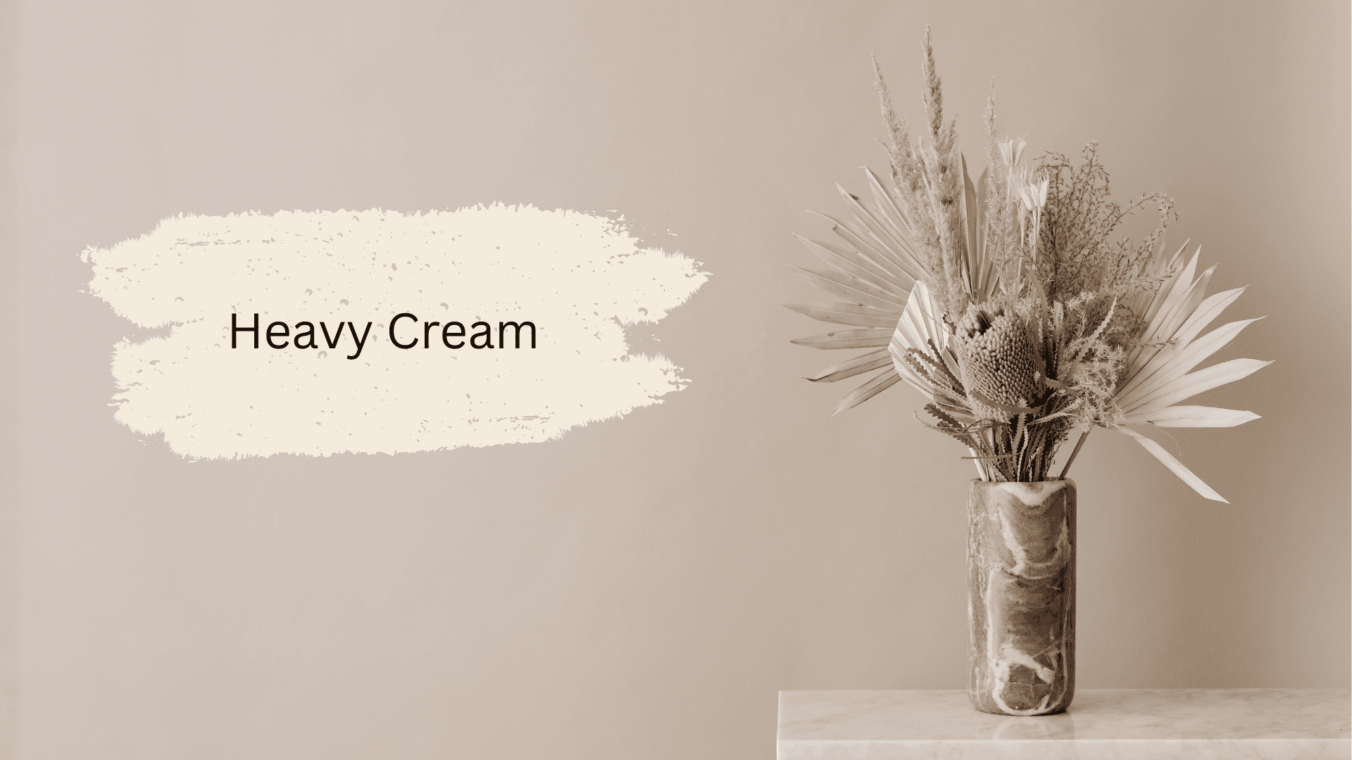
Heavy Cream (PPU5-10) sounds rich, but actually stays surprisingly neutral on walls.
I like how it adds depth without cluttering the space. The color works well in rooms with limited natural light.
It brings brightness, which is exactly what many spaces need for balance.
13. Pointing
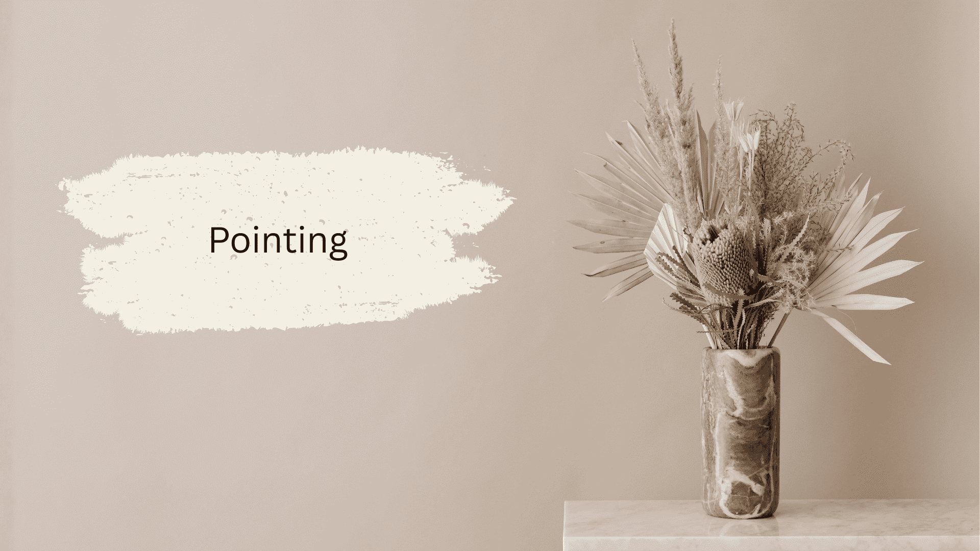
Pointing (No. 2003) is a classic I’ve fallen in love with over the years.
It has complex undertones that read as warm without looking dated. The color develops character as light changes, staying interesting all day long.
14. Creamy
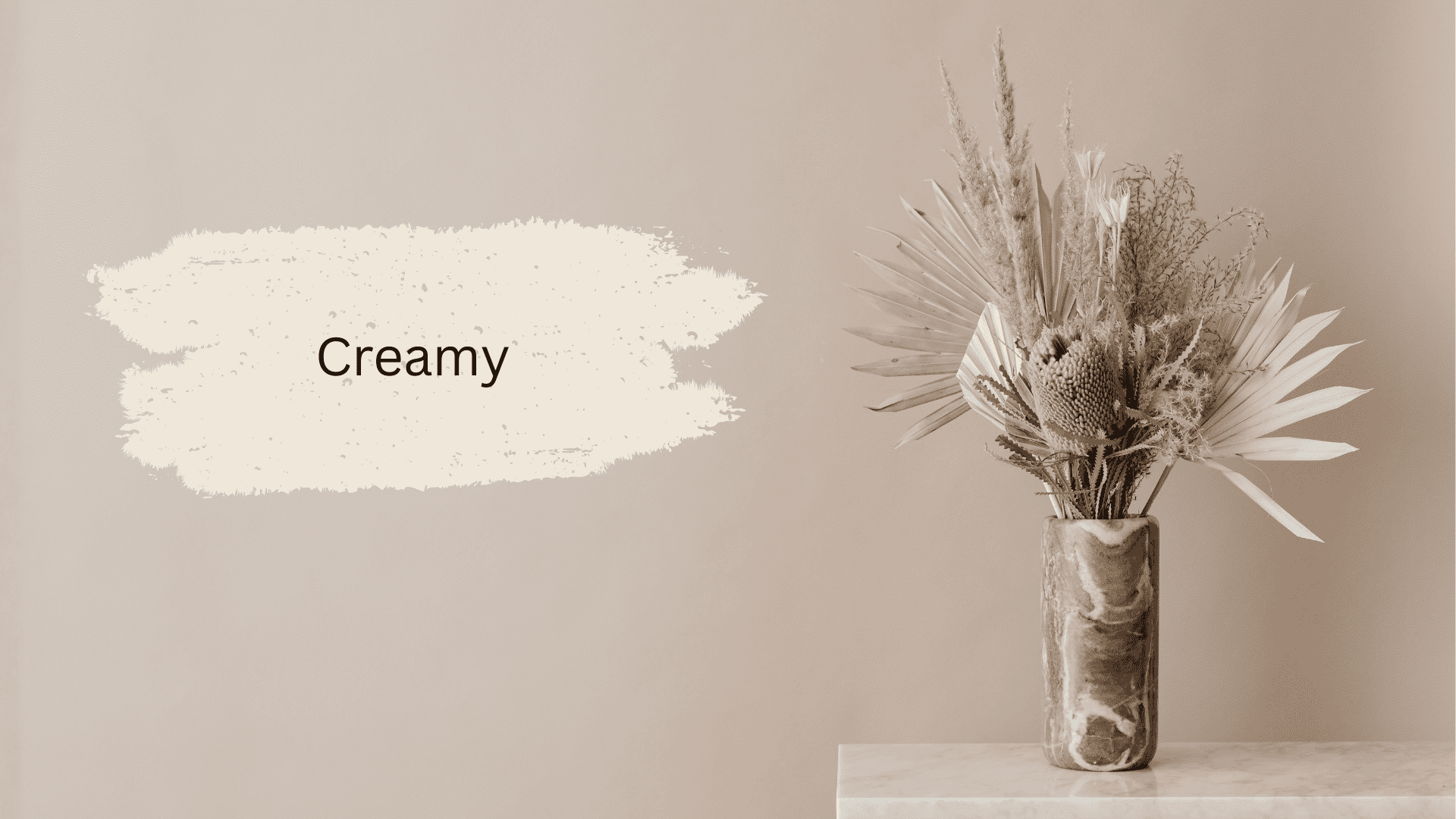
Creamy (SW 7012) delivers exactly what its name promises with no yellow surprises.
I trust this color for people who want safe, warm whites.
It has a buttery quality that feels rich but stays clean. The paint works in any room and with virtually any decor style you choose.
15. Lime White
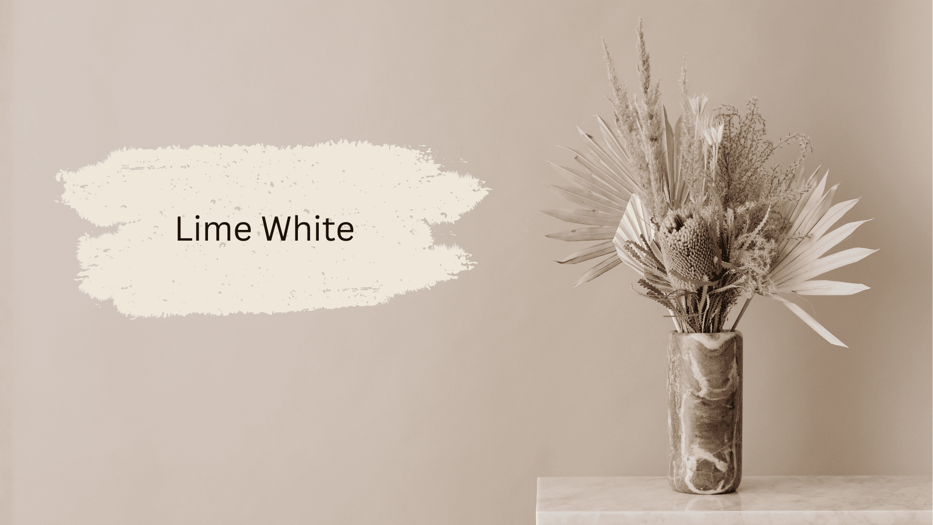
Lime White (CW-95) might sound unusual, but it’s a beautiful, warm white option.
The color feels fresh and modern while maintaining warmth. It’s perfect for bathrooms and kitchens where you want brightness with a gentle, welcoming feel.
A Safe Way to Style Your White Rooms
I’ve learned that white rooms need layers to avoid looking flat or sterile. The key is mixing textures and materials.
Here’s my approach:
- Add natural wood furniture for warmth and contrast
- Layer different white tones – pure white trim with warmer wall paint
- Include soft textiles like linen curtains and wool throws
- Bring in plants for life and color
I also recommend adding one or two accent colors through artwork or pillows. This keeps things interesting without overwhelming your space.
Remember, white is your canvas. Don’t be afraid to make it personal with items you love.
Wrap Up
Finding the right warm white doesn’t have to feel like guesswork anymore.
Remember to test samples in your actual space. Lighting changes everything, and what works in my home might look different in yours.
Start with one room if you’re nervous. See how the color feels. You can always expand from there.
Got questions about any of these colors? Drop a comment below. I’d love to help you choose the right white for your space.
Frequently Asked Questions (FAQs)
1. What Primer Prevents Warm Whites from Turning Yellow on Walls?
Use tinted gray primer (e.g., Zinsser 1-2-3) to neutralize undertones, ensuring even coverage and true color payoff.
2. Can Warm Whites Like Pure White Stay Non-Yellow in Bathrooms?
Sherwin-Williams Pure White maintains a neutral warmth in humid spaces when paired with proper ventilation and high-sheen finishes.
3. Which Warm White Paint Ranks Best for Open-Concept USA Homes?
Benjamin Moore Aesthetic White delivers versatile warmth, no yellow, blending seamlessly across living-dining walls