Choosing the perfect white paint can feel overwhelming. With hundreds of options available, how do you know which one will truly work in your space?
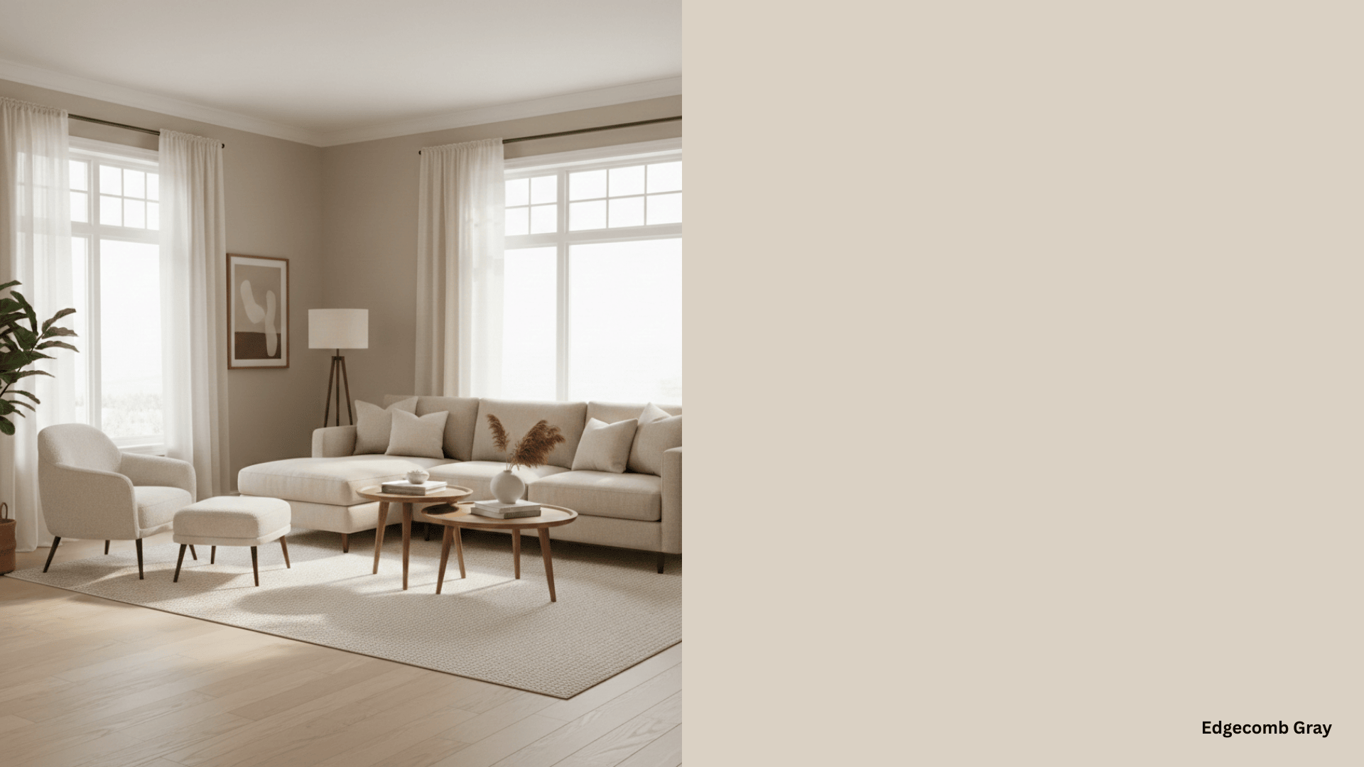
Benjamin Moore White Down has become a favorite among homeowners and designers alike. But what makes this particular shade so special? This warm, creamy white offers the perfect balance – not too stark, not too yellow. It creates a welcoming atmosphere while still feeling fresh and clean.
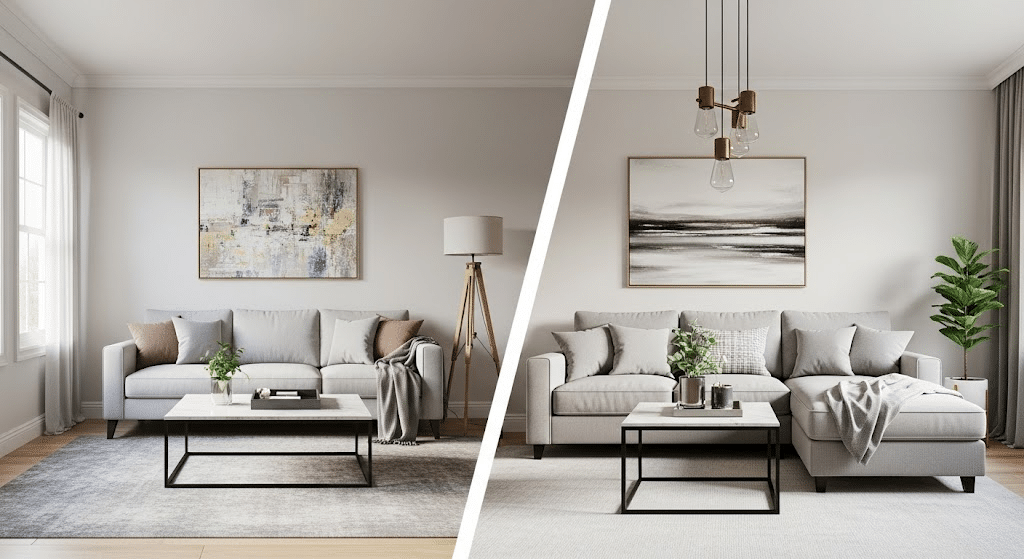
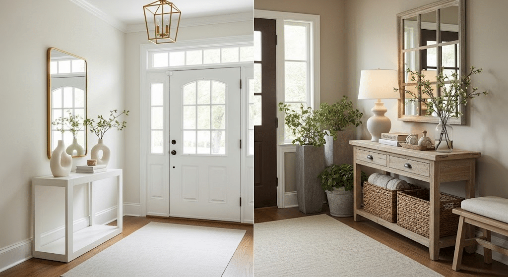
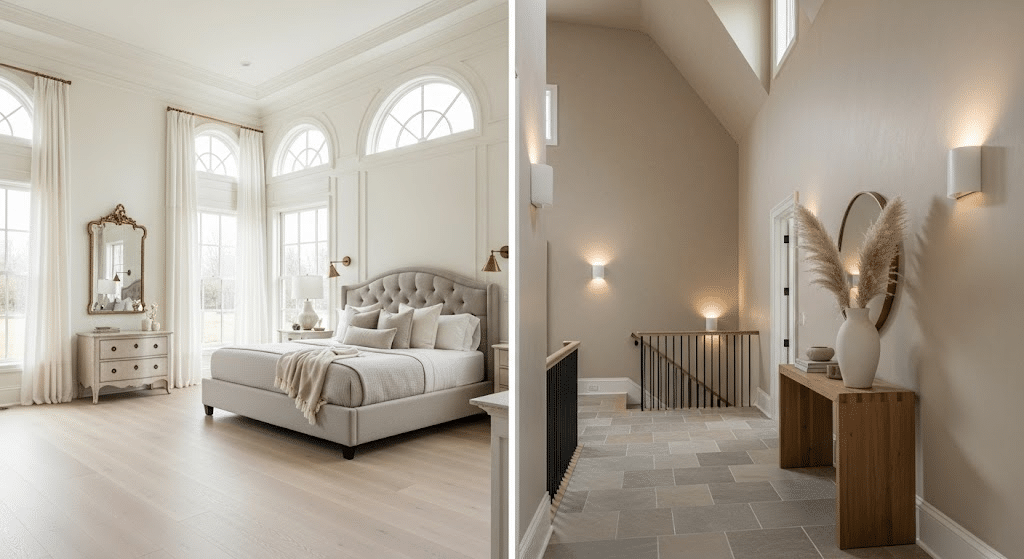
It doesn’t matter if you’re painting your living room or bedroom, White Down Benjamin Moore adapts beautifully to different lighting conditions throughout the day.
Let me walk you through everything you need to know about this popular paint color, from its undertones to the best rooms where it shines.
Benjamin Moore White Down (OC-131) Paint Specifications
When considering White Down, understanding its technical details is helpful. These specifications will give you a clear picture of how this paint color behaves in different spaces and lighting conditions.
| Specification | Details |
|---|---|
| Paint Code | OC-131 |
| LRV (Light Reflectance Value) | 76.69 |
| Hex Color Code | #F5F3F0 |
| Undertones | Warm beige and cream |
| Color Family | Off-white |
The high LRV means White Down reflects most of the light that hits it, making rooms feel brighter and more spacious. Its warm undertones prevent that cold, sterile feeling you sometimes get with pure whites.
What Colors Pair Well with Benjamin Moore White Down?
White Down’s warm, creamy base makes it incredibly friendly with other colors. I’ve seen this paint work beautifully with both bold and subtle color combinations in my projects.
Neutral Companions
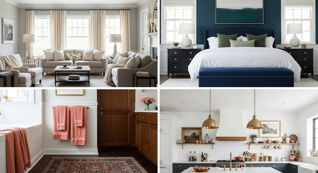
Soft grays and warm beiges create a calming, layered look with White Down. Try pairing it with Benjamin Moore Revere Pewter or Sherwin-Williams Accessible Beige for trim or accent walls. These combinations feel modern without being boring.
- Benjamin Moore Revere Pewter– perfect for trim and accent walls
- Sherwin-Williams Accessible Beige– creates a refined layering
- Cream and ivory fabrics – linen curtains, wool rugs, cotton pillows
- Warm gray tones – add depth without overwhelming the space
Bold Accent Colors
Navy blue makes White Down really shine. Use navy for furniture, artwork, or textiles against White Down walls. This classic combination works in both traditional and coastal-style homes.
- Navy blue – classic choice for furniture and textiles
- Forest green – brings natural, outdoorsy vibes indoors
- Deep teal – works well in bathrooms and bedrooms
- Rich burgundy – adds warmth in dining rooms and studies
Warm Accent Options
Soft corals and peach tones complement White Down’s warm undertones beautifully. These colors work especially well in bedrooms and bathrooms where you want a gentle, feminine touch.
- Soft coral – gentle and feminine for bedrooms
- Peach tones – perfect for bathrooms and powder rooms
- Warm browns – great for furniture and window treatments
- Rich chocolate – adds grounding through accessories and decor
Metal Finishes That Work
Brass and gold fixtures look stunning against White Down walls. These warm metals improve the paint’s creamy character. Try brass light fixtures or gold picture frames for a stylish touch.
This combination works particularly well in kitchens and bathrooms.
- Brass fixtures – improve the warm, creamy character
- Gold accents – picture frames and decorative pieces
- Matte black hardware – modern contrast for kitchens and baths
- Warm copper – adds rustic charm in farmhouse-style spaces
Comparing White Down to Other Cream Paint Colors
Now we know that White Down serves as the perfect middle ground in the warm white family. It offers just enough cream and beige undertones to feel welcoming without leaning too yellow or too gray.
This balanced approach makes it a reliable choice that adapts well to different lighting conditions and design styles.
Now let’s compare it with other popular white and cream shades. I have tried all of these shades differently while working with clients, and each has its own charm.
White Down vs Creamy
Sherwin-Williams Creamy (SW-7012)
Creamy offers a slightly cooler approach to the warm white family. It has subtle gray undertones mixed with cream, making it feel more contemporary.
This color tends to look cleaner and more modern compared to White Down’s warmer personality.
The Key Difference
White Down leans warmer with its beige undertones, while Creamy has a cooler, more neutral base. If you want cozy and inviting, choose White Down. If you prefer clean and fresh with just a hint of warmth, Creamy is your pick.
White Down vs Ivory Lace
Sherwin-Williams Ivory Lace (SW-7013)
Ivory Lace brings more cream depth than White Down with rich, buttery undertones. It feels warmer and more saturated, creating a cozy, cottage-like atmosphere. This color can sometimes appear too yellow in bright sunlight.
The Key Difference
Use White Down in south-facing rooms with lots of natural light. Choose Ivory Lace for north-facing spaces or rooms with limited windows that need extra warmth.
White Down vs Natural Linen
Sherwin-Williams Natural Linen (SW-9109)
Natural Linen has beige and taupe undertones that make it earthier than White Down. It feels more grounded and substantial, like linen fabric. This color pairs beautifully with natural wood and stone materials.
The Key Difference
Pick White Down for formal dining rooms and entryways where you want sophistication. Select Natural Linen for family rooms and dens where earthy comfort matters most.
White Down vs Snowbound
Sherwin-Williams Snowbound (SW-7004)
Snowbound offers a cooler take on off-white with subtle gray undertones. It feels crisp and clean without White Down’s creamy warmth. This color works well in modern spaces that need brightness without starkness.
The Key Difference
Go with White Down for traditional homes and cozy reading nooks. Choose Snowbound for modern offices and minimalist spaces that need bright, clean walls.
White Down vs Accessible Beige
Sherwin-Williams Accessible Beige (SW-7036)
Accessible Beige moves beyond white territory into true beige with warm gray undertones. It provides more color depth than White Down while staying neutral enough for any decor style.
This shade works as a suave alternative when pure whites feel too stark.
The Key Difference
Choose White Down for master bedrooms and guest rooms where soft grace matters. Pick Accessible Beige for hallways and transition spaces where you want a subtle color without commitment.
Effects of Lightning on Benjamin Moore White Down
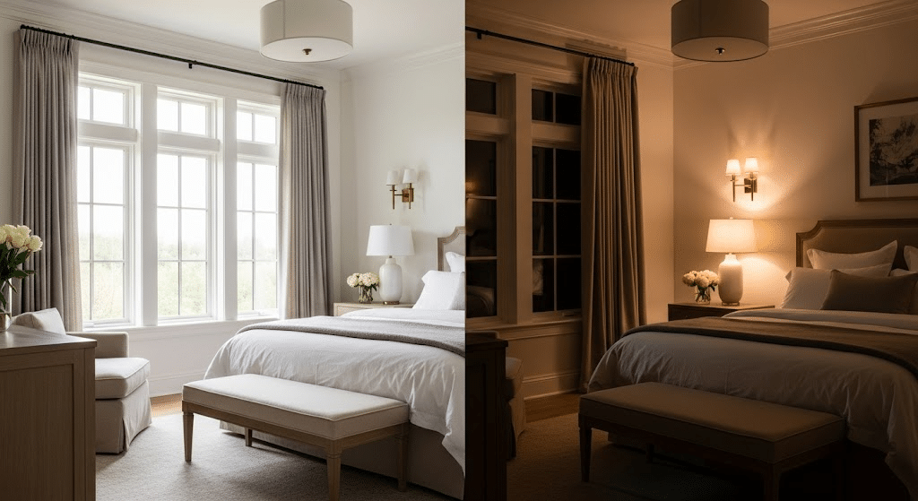
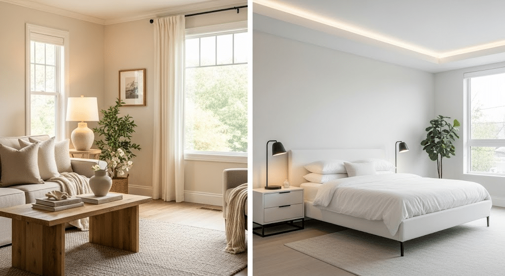
Lighting can completely change how Benjamin Moore White Down looks in your space. I’ve noticed this color shifts beautifully throughout the day, which is part of its charm.
The warm undertones respond differently to various light sources, creating unique moods in each room.
In my experience, this paint color adapts better than most whites to different lighting conditions. Here’s what I’ve observed:
- Natural sunlight – Appears crisp and fresh in the morning, with a slight creamy glow
- Afternoon light – Shows its true warm undertones, feeling cozy and inviting
- North-facing rooms – Maintain warmth without looking gray or cold
- South-facing rooms – Stays balanced, never appearing too yellow or stark
- Artificial lighting – Works well with both warm LED bulbs and cool fluorescent lights
- Evening mood – Becomes soft and soothing under table lamps and overhead fixtures
This flexibility makes White Down a reliable choice for any room in your home.
Finishing It Up
Benjamin Moore White Down proves itself as a reliable choice for homeowners seeking warmth without overwhelming color. Its balanced undertones work across different rooms and lighting conditions, making it a safe yet beautiful option.
This paint color adapts to your style preferences and pairs well with various accent colors. From cozy bedrooms to bright kitchens, it creates the welcoming atmosphere most people want in their homes.
Have you used White Down in your home? Comment down below and share your experience with this popular paint color.