

While choosing the right paint color, you’ve probably spent hours scrolling through endless swatches, feeling more confused than when you started.
There’s one shade that works in almost any space.
Benjamin Moore Pale Oak has been quietly winning over people and designers for years.
This neutral adapts to your lighting and pairs beautifully with both modern and traditional styles.
It’s not too beige, not too gray, just right. This blog defines why Pale Oak might be precisely what your walls need.
You’ll see what color it is, its undertones, how it looks in different lighting conditions, what people experience, tips, and how to use it throughout your home.
What Color is Benjamin Moore Pale Oak?
Pale Oak sits in that sweet spot between beige and greige.
It’s a soft, neutral shade with calm undertones that shift throughout the day.
The color has a chameleon-like nature. It picks up hints from surrounding colors and lighting conditions.
You won’t find any harsh yellow or pink tones here. Instead, it offers a calm, balanced feel.
Think of it as oatmeal with a touch of culture. It’s light enough to brighten spaces but has enough depth to avoid looking flat. This flexibility makes it work in nearly every room.
Undertones
Knowing undertones helps you predict how Pale Oak will behave in your space.
This color primarily carries calm gray, beige undertones with an LRV of 68.64 and RGB 232, 228, 212.
But they’re subtle. You won’t see obvious yellow or orange peeking through.
The greige quality means gray and beige work together here. Sometimes one shows up stronger than the other.
It depends on what’s around it and how much light enters the room.
The undertones stay muted no matter what. That’s why decorating with Pale Oak feels so forgiving.
Pale Oak in Natural Daylight
Natural light brings out Pale Oak’s true character. Morning sun makes it glow with heat and softness.
Afternoon light shifts things slightly cooler. You’ll catch more of that greige quality.
North-facing rooms keep it on the grayer side all day. South-facing spaces amplify the heat beautifully.
Pale Oak Under Artificial Lighting
LED bulbs with hot tones improve the beige notes. Cool white LEDs push it toward gray.
Incandescent lights make it feel more traditional and inviting.
Test samples under your actual bulbs first. The difference can surprise you. Evening lighting tends to soften Pale Oak into a gentle, neutral backdrop.
Pale Oak Compared to Similar Colors
Wondering how Pale Oak stacks up against other popular neutrals? Here’s a quick comparison to help you decide:
| Color Name | Undertone | Warmth Level | Best Use |
|---|---|---|---|
| Revere Pewter | Cool greige | Slightly cool | North light |
| Edgecomb Gray | Soft beige-gray | Warm | Traditional style |
| Balboa Mist | Green-gray | Cool-neutral | Coastal homes |
| Classic Gray | True greige | Balanced | Modern spaces |
| Accessible Beige | Pure beige | Very warm | Cozy feel |
Benjamin Moore Pale Oak in Different Rooms
Pale Oak adapts beautifully to every space in your home. How it performs room by room:
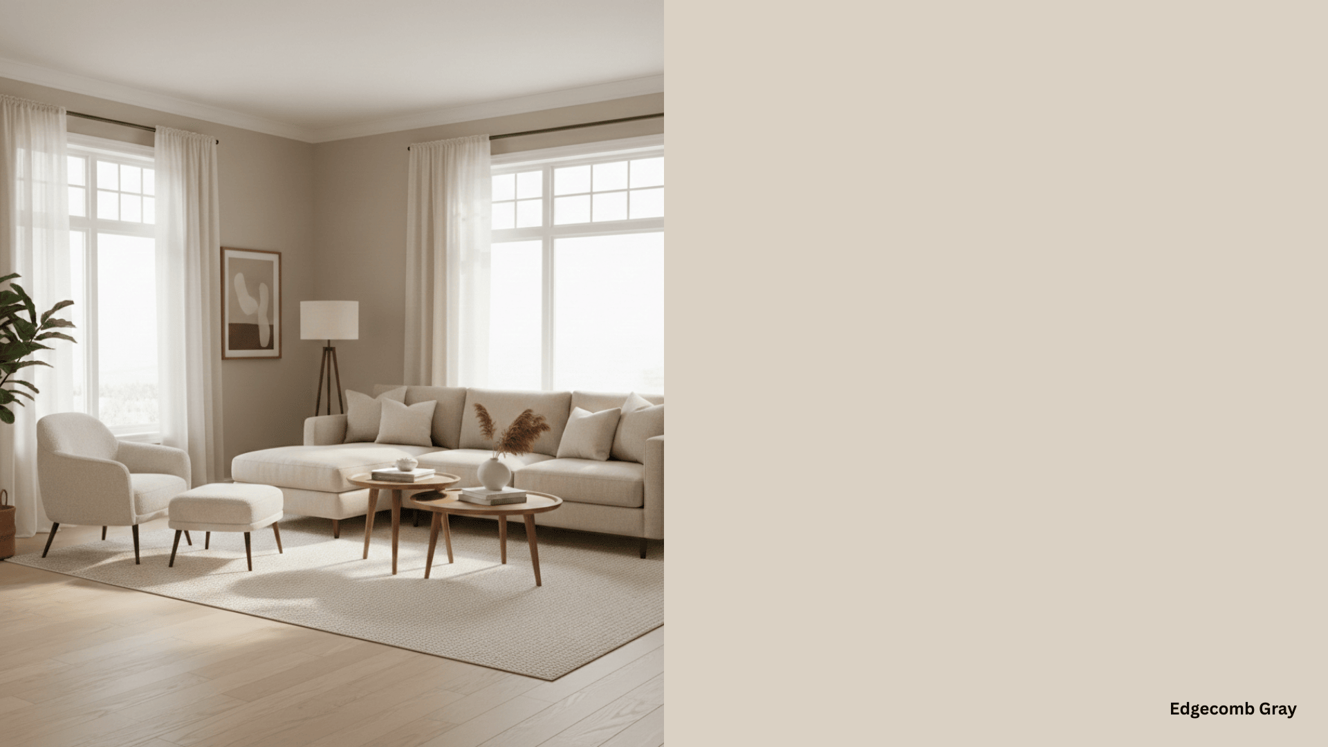
1. Living Room
It creates an inviting backdrop for your living space. It works with any furniture style you have.
The color stays neutral enough for bold accent pieces or calm modern looks. Large windows make it glow. Lower light keeps it refined and grounded throughout the day.
2. Dining Room
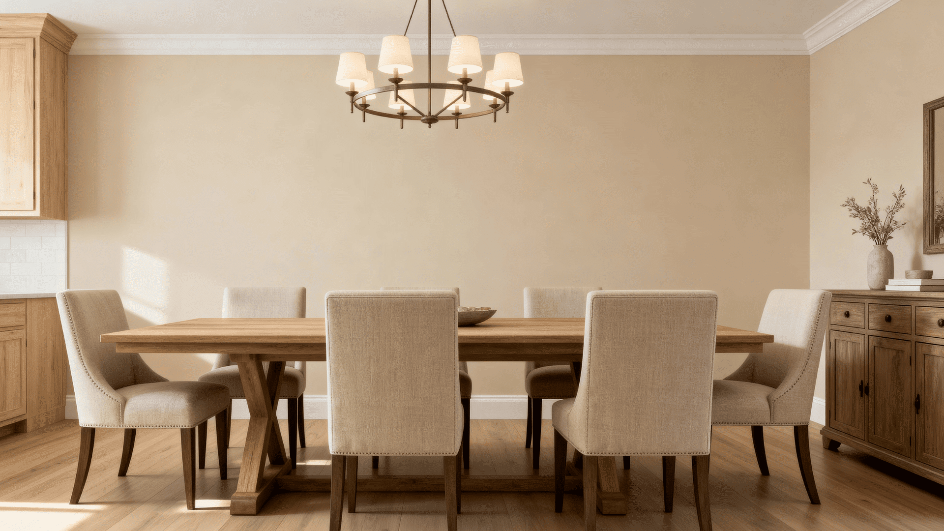
This shade sets a perfect tone for meals and gatherings. It won’t compete with your table settings or artwork.
Candlelight brings out its softest qualities. Chandeliers and pendant lights play nicely against its neutral base.
3. Bedroom
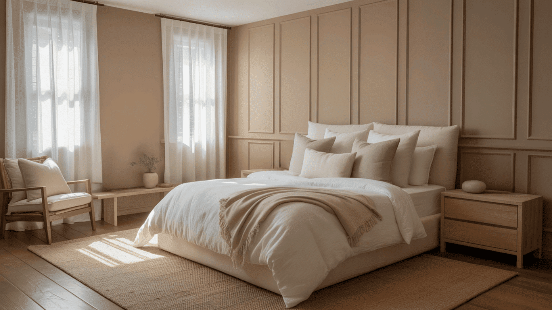
Pale Oak turns bedrooms into restful retreats. The gentle heat promotes relaxation and sleep. It pairs well with crisp white bedding or layered textures.
Morning light wakes the room softly. Evening hours wrap the space in calm. You can go bold or subtle with your decor choices here.
4. Bathroom

Bathrooms look clean and spa-like in Pale Oak. It handles moisture-prone areas beautifully.
The color makes small bathrooms feel larger and brighter. White fixtures pop against it nicely. Chrome or brass hardware both work well.
Steam and humidity won’t make it look dingy or yellowed over time.
5. Kitchen
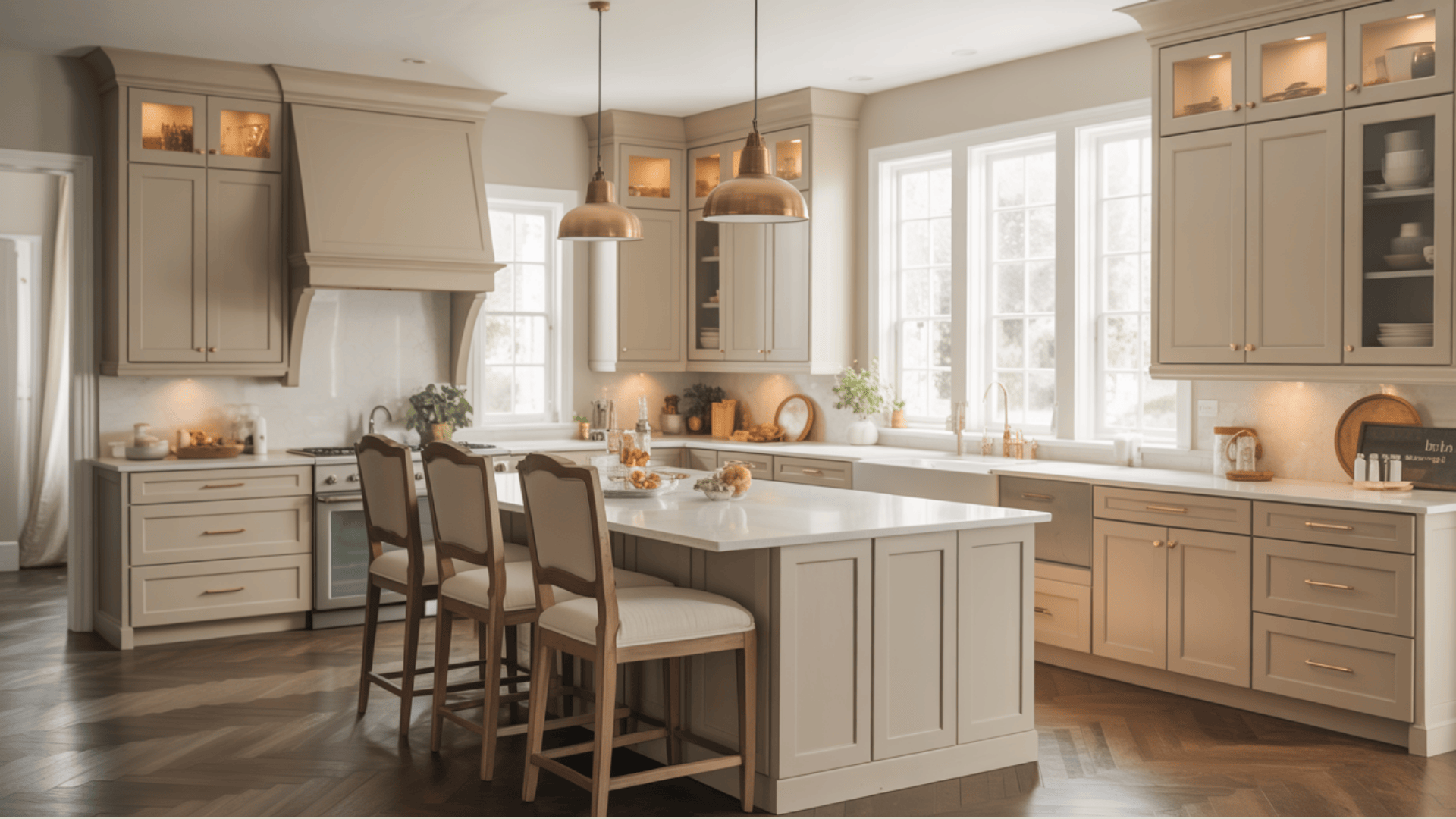
Kitchens get a fresh, effortless feel with Pale Oak. It complements both white and wood cabinetry.
The shade handles kitchen lighting from multiple sources gracefully. Stainless steel appliances look modern against it. Natural stone counters find a balanced partner.
It hides everyday wear better than stark white walls do.
Using Benjamin Moore Pale Oak in Exteriors
A refined choice for people who want a light exterior that feels more generous and more organic than a stark, traditional white.
Modern Farmhouse Outer Exterior
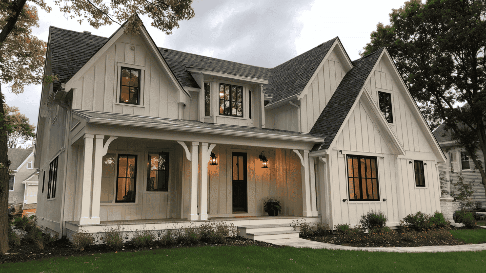
Pale Oak works well with many siding and plaster colors.
In direct afternoon sun, it glows like a calm white oak, while in the shade, its gray and beige undertones provide a refined, grounded depth.
It pairs beautifully with crisp Chantilly Lace trim for a high-contrast, clean-lined modern look.
The Statement Front Door
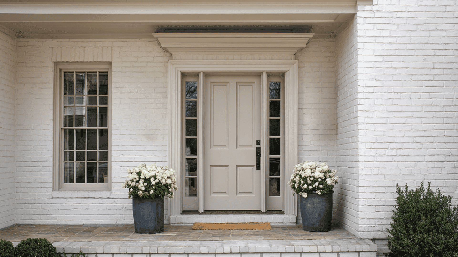
The front door painted in Pale Oak offers a soft, neutral look that works with many home styles.
The generous tone adds depth without feeling heavy. It creates a calm, inviting entry that stands out gently and gives the exterior a clean, finished appearance.
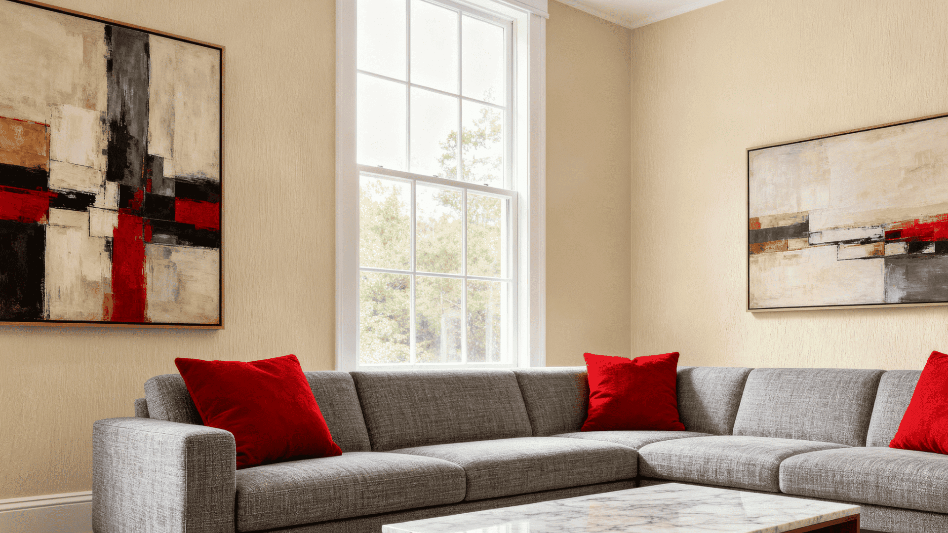
Benjamin Moore Pale Oak vs Edgecomb Gray
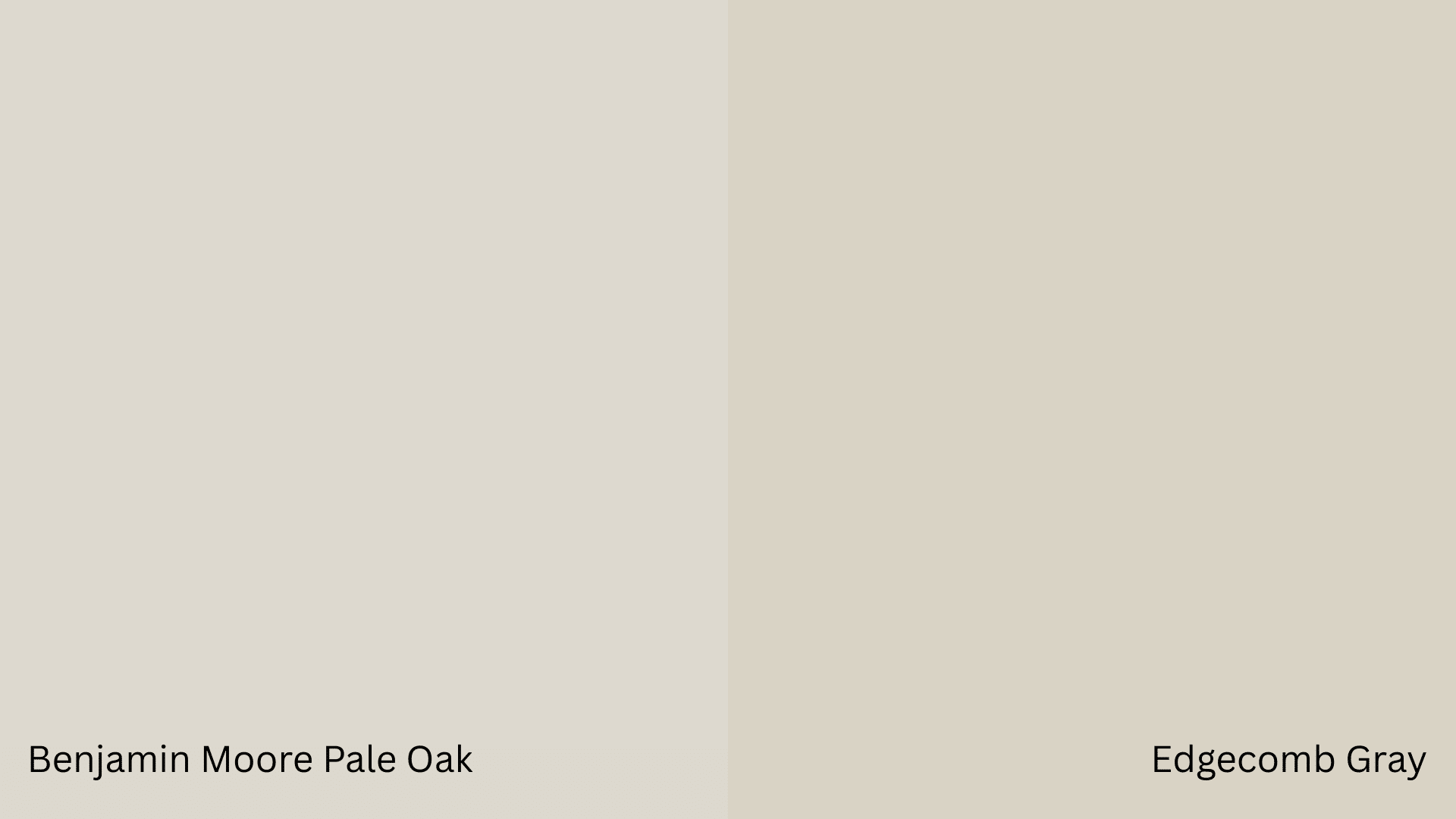
Benjamin Moore Pale Oak and Edgecomb Gray are celebrated neutrals with distinct personalities.
Pale Oak is a lighter greige with a medium-friendly tone and strong gray influence, ideal for bright, modern spaces.
Its color varies between gray and beige with light, giving an airy, adaptable feel. Contrarily, Edgecomb Gray provides a slightly deeper, more generous presence.
As a beige-gray with noticeable yellow notes, it remains consistently cozy and inviting in any lighting condition.
While Pale Oak blends traditional styles with a fresh look, Edgecomb Gray’s earthy tone leans more conventional.
Ultimately, choose Pale Oak for a crisp, dynamic backdrop or Edgecomb Gray for consistent, reliable heat.
What People Say About This Shade
Many people say Benjamin Moore Pale Oak looks very different once it’s on the wall.
In bright, east-facing rooms, several people noticed a purplish or pink-gray cast that felt unexpected.
This reaction showed up often in living rooms and bedrooms with intense natural light.
Some users expected a soft neutral but felt disappointed after sampling.
Others suggested lighter options like Navajo White, Classic Gray, or Shoji White, with mixed feedback on pink tones.
The biggest takeaway was that Pale Oak can look beautiful in some homes, but lighting and surroundings strongly affect how it looks in the appearance.
When Benjamin Moore Pale Oak May Not Work Well
- Rooms with very little natural light may look too gray and dull.
- Spaces with intense orange or yellow lighting can make it appear muddy.
- Ultra-modern homes seeking stark white walls won’t get that crisp look.
- Small, windowless spaces could feel closed in rather than brightened.
- If you want a true beige, Pale Oak leans too gray for that goal.
- Exteriors in shaded areas may look flat and lack dimension.
- Rooms already filled with gray tones might feel monotonous.
- Spaces needing dramatic contrast won’t get enough punch from this neutral.
- Cool-toned tile or flooring can pull out unwanted gray undertones
Final Thoughts
Benjamin Moore’s Pale Oak offers the flexibility most people crave in a neutral.
It shifts with your lighting, works across rooms, and pairs well with different styles.
You have seen its undertones, trim options, and explained where it shines brightest. You’ve seen the comparisons and learned when it might not fit your needs. Your walls deserve a color that works as hard as you do.
Grab a sample, paint it on your wall, and watch how it changes throughout the day.
Give Pale Oak a try and see if it’s your perfect neutral match.