

Choosing the right neutral paint color can make or break your room’s vibe. I’ve been there, standing in the paint aisle, staring at color chips that all look the same under those harsh store lights.
Today, I’m going to settle the debate between two of the most popular neutral paints: Accessible Beige vs Agreeable Gray.
In this blog, I’ll break down the key differences between these colors, show you their undertones, compare how they look in different lighting, and give you practical tips on where to use each one.
By the end, you’ll know exactly which neutral deserves a spot on your walls.
Accessible Beige vs Agreeable Gray
When I first looked at these two colors side by side, I thought they were nearly identical. But here’s what I learned after testing them in real rooms.
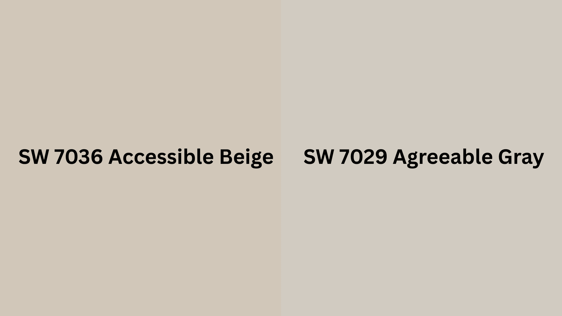
Accessible Beige (SW 7036) leans warmer with its beige base and yellow undertones, giving walls a cozy, earthy feel. It’s like wrapping your room in a soft blanket. While SW Accessible Beige makes spaces feel intimate
Agreeable Gray (SW 7029), on the other hand, brings more warmth to the table. This greige has gray as its foundation with subtle beige undertones and just a hint of green. Agreeable Gray opens them up and creates that clean, airy vibe everyone’s after. Both are versatile, but they serve different moods in your home.
If you’re interested in buying or want to learn more, hop over to Sherwin-Williams Accessible Beige and Agreeable Gray on the Sherwin-Williams website. You’ll find all the details you need!
| Feature | Accessible Beige | Agreeable Gray |
|---|---|---|
| Undertones | Warm yellow and taupe undertones | Balanced greige with subtle green and blue undertones |
| LRV | 58 – medium-light reflectance | 60 – slightly higher reflectance for added brightness |
| Light Sensitivity | Shifts warmer in natural sunlight; golden tones become more pronounced | Adapts well to various lighting; can appear cooler or warmer depending on the time of day |
| Color Family | Warm neutral (leans more toward beige) | Greige (a blend of gray and beige) |
Room-Wise Comparison of Accessible Beige vs Agreeable Gray
I’ve tested both colors in various spaces throughout my home, and the results might surprise you. Here’s how they stack up room by room:
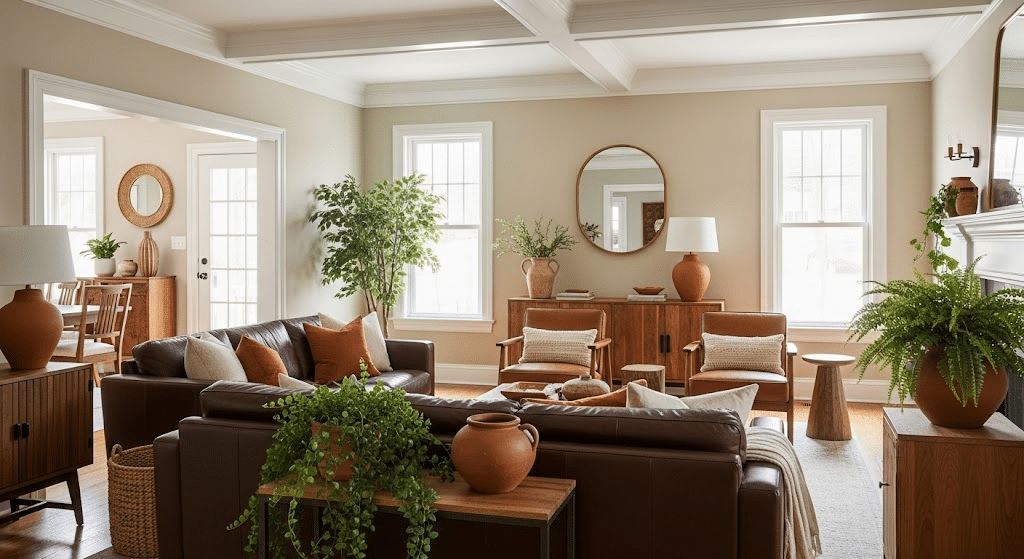
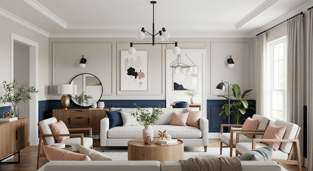
Living Rooms
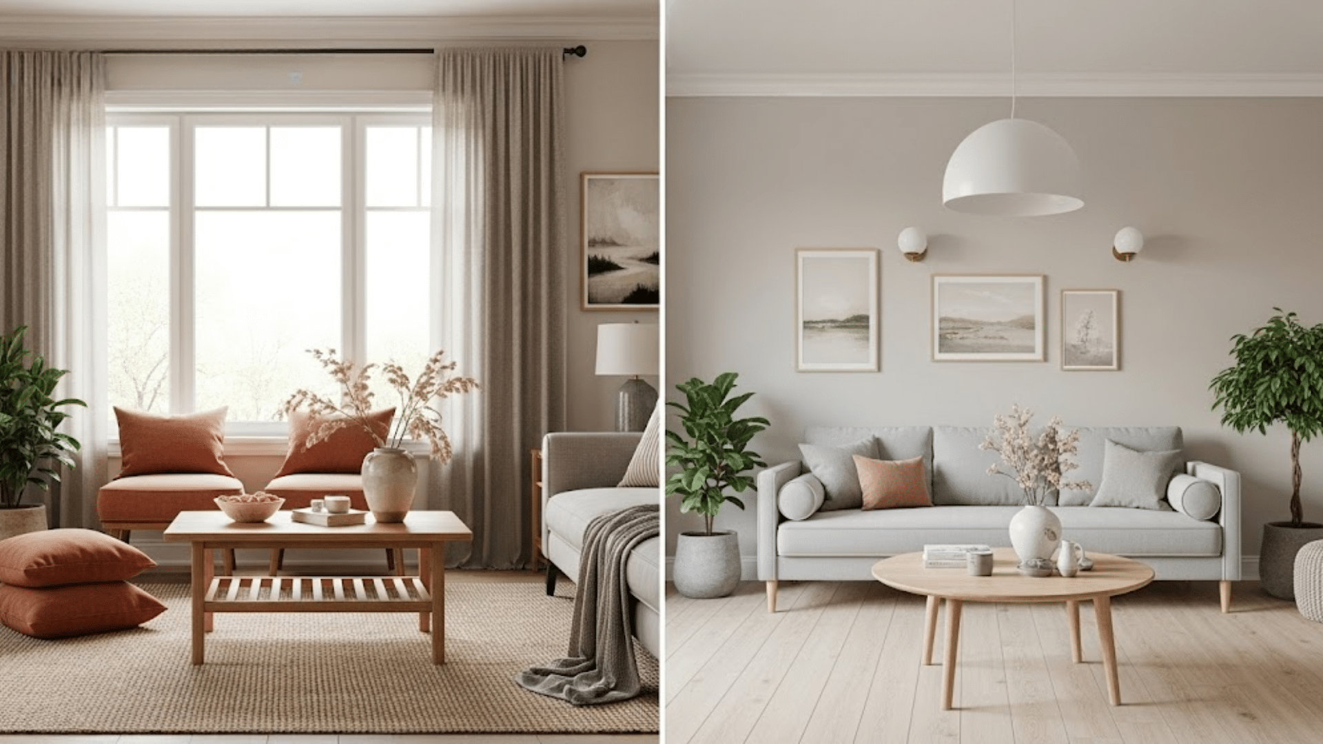
Accessible Beige: Creates that perfect “gather around” atmosphere. The warm undertones make evening conversations feel more intimate, and it pairs beautifully with cozy furniture.
Agreeable Gray: Offers a more classy, pulled-together look. It’s ideal if you want your living room to feel fresh and modern rather than traditional and cozy.
Bedrooms
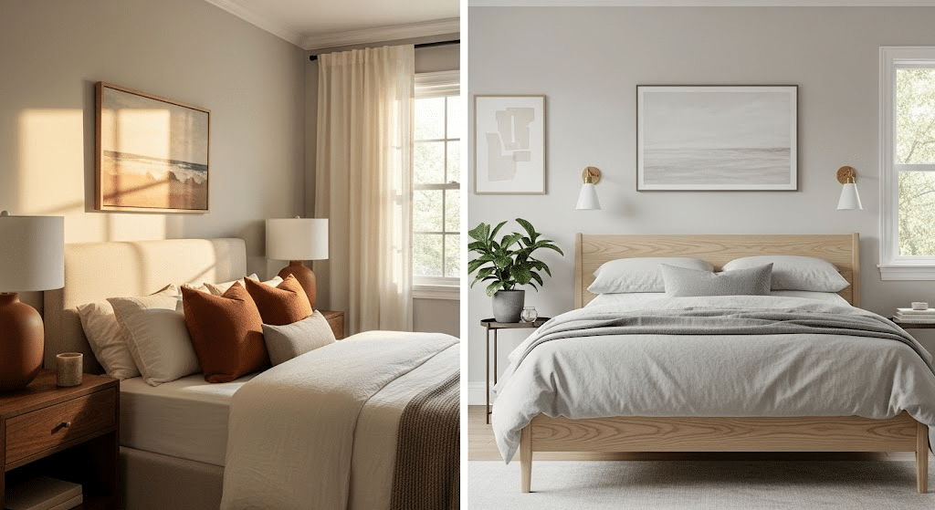
Accessible Beige: Wins hands down for creating a restful retreat. The warmth helps you unwind, and it looks gorgeous with soft linens and natural textures.
Agreeable Gray: Works well in master bedrooms where you want a hotel-like, serene vibe. It’s calming without being too warm or stimulating.
Kitchens
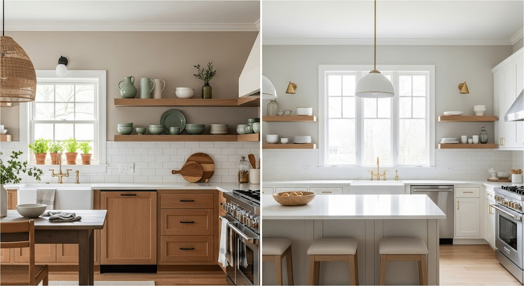
Accessible Beige: Can feel too warm in kitchens, especially with wood cabinets. It tends to make the space feel smaller and less clean.
Agreeable Gray: Absolute winner here. It keeps kitchens feeling fresh, works with any cabinet color, and doesn’t compete with busy countertops or backsplashes.
Bathrooms
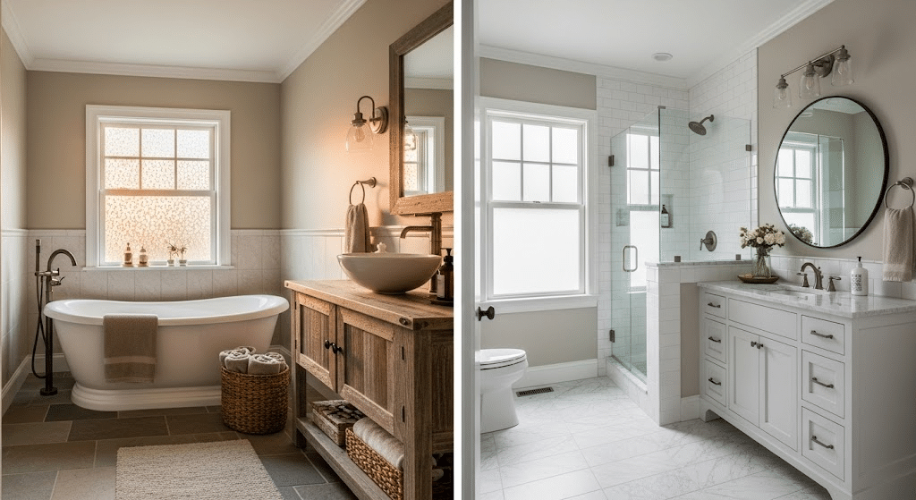
Accessible Beige: Nice for powder rooms where you want warmth, but can feel heavy in smaller spaces.
Agreeable Gray: Perfect for creating that spa-like feeling. It makes small bathrooms feel larger and works beautifully with white fixtures.
Coordinating Colors and Styling Tips
The beauty of these neutrals really comes to life when you start building a color palette around them. I’ve experimented with both colors in my client’s home, and the styling possibilities are endless once you understand what works.
What Pairs Well with Accessible Beige?
Rich Browns: This is a no-brainer combination that never fails. I love pairing Accessible Beige walls with chocolate brown leather furniture or dark walnut wood pieces. The contrast creates depth while keeping everything warm and inviting.
Terracotta: Here’s where things get interesting. Terracotta accents, such as pottery, throw pillows, or artwork, beautifully bring out the warm undertones in Accessible Beige. It’s like they were made for each other.
Creamy Whites: Skip the stark whites and go for something with a hint of warmth. Colors like ivory or cream create a soft, layered look that feels rich but not stuffy.
Muted Greens: Sage green and olive tones work wonderfully with Accessible Beige. I’ve used these in botanical prints and throw blankets to bring a natural, earthy vibe to the space.
Styling Tips for Accessible Beige:
- Wood accents are your best friend here. I love mixing different wood tones maybe a reclaimed wood coffee table with oak side tables. It adds texture without competing with the wall color.
- Soft textiles make all the difference. Think linen curtains, wool throws, and cotton pillows in those coordinating colors we talked about. The key is layering different textures to create visual interest.
- For the overall look, I lean into rustic-modern décor. Clean lines mixed with natural materials work perfectly. A sleek sofa paired with a live-edge wood dining table captures this vibe perfectly.
What Works with Agreeable Gray?
Crisp Whites: This is where Agreeable Gray really shines. Pure white trim and bright white accents create a fresh, modern contrast that never looks dated. I use this combination in almost every room where I paint with Agreeable Gray.
Navy Blue: The sophistication level goes through the roof when you add navy blue accents. Navy throw pillows, artwork, or even a statement wall create a timeless, classic look.
Black: Don’t be afraid of black accents with Agreeable Gray. Black window frames, light fixtures, or furniture pieces add drama and ground the space beautifully.
Soft Blush: This might surprise you, but soft pink tones work incredibly well with Agreeable Gray. It adds warmth without compromising the modern, clean feel.
Styling Tips for Agreeable Gray
- Metallic accents are key to making Agreeable Gray pop. I love mixing brass and black metals, maybe brass cabinet hardware with black light fixtures. It adds just the right amount of glamour.
- Keep furniture minimal and let the architecture shine. Clean-lined sofas, simple dining tables, and uncluttered surfaces work best. The color does the talking, so you don’t need busy furniture competing for attention.
- Transitional design themes work perfectly here. It’s that sweet spot between traditional and contemporary. Think classic furniture shapes with modern finishes, or traditional patterns in contemporary colors.
Popular Neutral Paint Colors Accessible Beige Versus Similar Options
When choosing between neutral paint colors, it helps to see how beige Sherwin Williams options stack up against other popular choices. Let me share my color review insights from testing these paints side by side.
Accessible Beige vs Repose Gray: While both are SW Accessible favorites, Repose Gray reads cooler with its true gray base. If you’re torn between beige paint and gray paint, Repose offers that perfect middle ground without the warmth of beige.
Accessible Beige vs Benjamin Moore Revere Pewter: Benjamin Moore’s Revere Pewter is often compared to gray Accessible options, but Pewter leans more toward greige. Both work beautifully, though Revere has slightly more depth.
Accessible Beige vs Alabaster: Sherwin Williams Alabaster provides a crisp white alternative when beige versus white is your debate. Alabaster pairs wonderfully with both our main contenders.
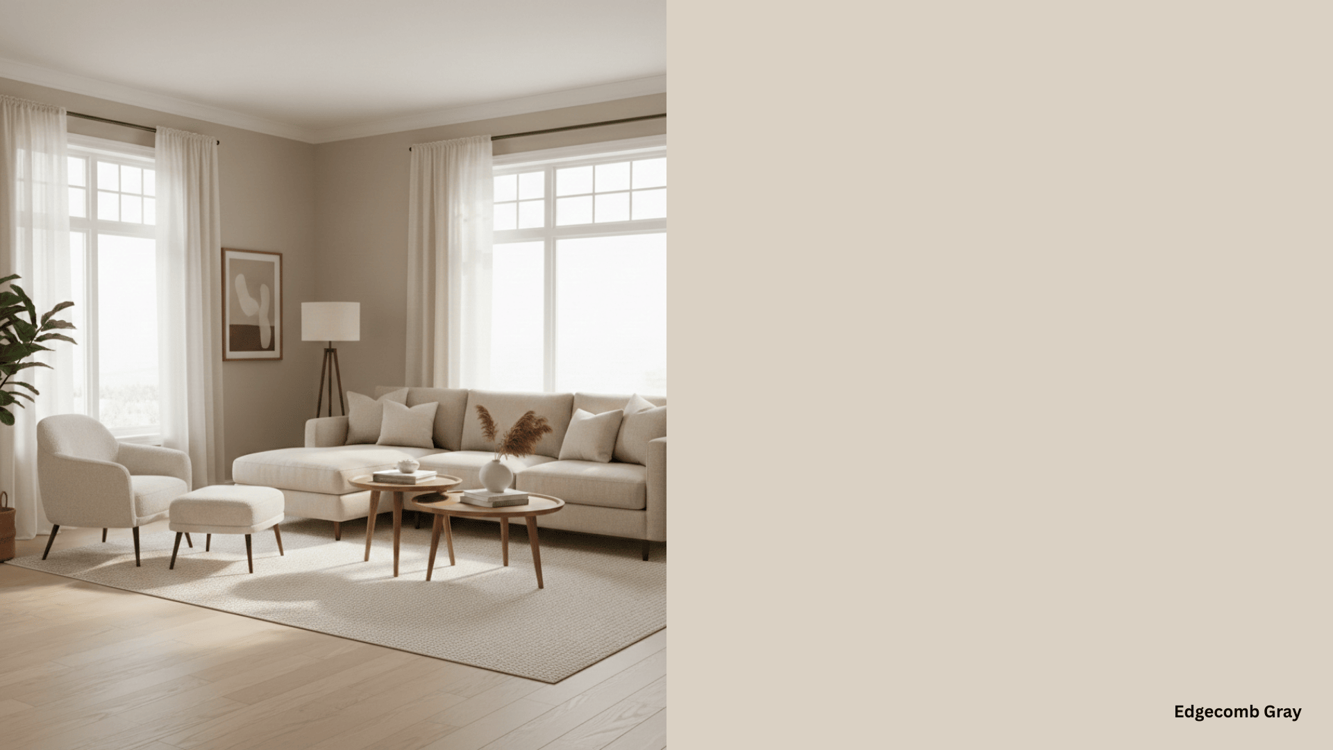
Other Notable Mentions: Benjamin Moore Edgecomb Gray and Collingwood offer similar warmth to Accessible Beige but with different undertones that might suit your specific lighting better.
Avoid These Mistakes While Making Your Best Choice
Here are the biggest pitfalls I’ve seen (and made myself) when working with these colors:
1. Don’t pair Accessible Beige with cool white trim – I learned this the hard way. The cool whites make Accessible Beige look muddy and dated. Stick with warm whites or creams for trim and ceilings.
2. Skip Agreeable Gray in rooms with orange-toned wood – Oak cabinets or honey-colored hardwood floors will clash with Agreeable Gray’s subtle green undertones. The room ends up looking confused rather than cohesive.
3. Avoid using both colors in the same open space – They’re too similar but not quite the same, creating an awkward, almost-match that looks unintentional. Pick one and stick with it throughout connected areas.
4. Don’t use high-gloss finishes with either color – These neutrals work best in eggshell or satin finishes. High gloss makes them look cheap and emphasizes any imperfections in your walls.
5. Never choose based on tiny paint samples alone – Both colors can look completely different depending on your lighting. Always test large swatches on your actual walls and observe them at different times of day before committing.
Final Thoughts
Accessible Beige vs Agreeable Gray have earned their spots as top neutral choices, but your decision comes down to the feeling you want to create.
If you’re drawn to cozy, grounded spaces that feel like a warm hug, Accessible Beige is your winner. For those who prefer fresh, modern vibes with maximum versatility, Agreeable Gray takes the crown.
The key is understanding your space, your lighting, and your personal style preferences. Ready to make your decision? Grab those sample sizes and test them on your walls.
Your perfect neutral is waiting, and once you find it, you’ll wonder why you waited so long to make the change.