

I have been through more sample pots than I would like to admit.
After all of that, Cheviot Sherwin Williams was the one who finally made me stop looking.
SW 9503 sits right in the middle. Not stark, not creamy.
Just soft, clean, and balanced in a way that makes a room feel pulled together without any extra effort.
Whites look identical on chips.
That number is the only thing standing between you and accidentally bringing home the wrong one.
Sherwin Williams Cheviot: The White That Earns Its Place
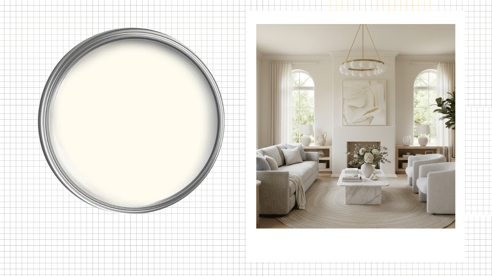
Cheviot is a Sherwin Williams paint color with the official code SW 9503.
It lives in the white family but does not act like a typical white person. It has just enough softness to feel soft without tipping into beige territory.
| Category | Details |
|---|---|
| Color Name | Cheviot |
| Brand | Sherwin-Williams |
| Color Code | SW 9503 |
| Color Family | White / Warm Neutral |
| General Description | Soft luminous white with a gentle creamy warmth |
| Light Reflectance Value (LRV) | 89 |
| RGB Values | 246 / 242 / 232 |
| HEX Code | #F6F2E8 |
| Primary Undertones | Soft yellow, subtle gray |
| Warm or Cool | Warm-leaning white |
The Colors You Will Actually See on Your Wall
This is where it gets interesting.
Cheviot does not commit hard to any one direction.
- It does not pull yellow
- It does not lean pink
- It does not read gray in most lights
It just stays soft and clean, which is honestly harder to find than it sounds.
Are Cheviot and Benjamin Moore’s White Dove the Same?
White Dove comes up a lot in the same conversation as Cheviot, and the difference is subtle but real.
White Dove carries a slightly more noticeable warm quality that shows up reliably across lighting conditions.
Cheviot stays more restrained. The warmth is there but it doesn’t announce itself. In rooms with a lot of warm wood, that distinction actually matters.
Cheviot’s LRV: What it Actually Means for Your Walls
LRV stands for Light Reflectance Value. It tells you how much light a color throws back into the room.
Cheviot sits at 89, which means it reflects a lot of light back.
1. In Bright Natural Light
When sunlight hits Cheviot directly, it looks crisp and clean.
That soft warmth stays quiet in the background, and the white comes forward in the best way.
South facing rooms with big windows are where this color really performs.
You will notice it shifts slightly as the light moves through the day, which keeps the room feeling alive without any effort on your part.
2. In Low Light
In the evening or in rooms that do not get much natural light, Cheviot gets a little cozier.
That subtle creaminess becomes more noticeable, and the white softens into something that feels warm rather than bright.
It works well in bedrooms or smaller spaces where you want comfort over contrast.
Just make sure your artificial lighting is warm toned so the color stays balanced rather than flat.
Cheviot Undertones
Undertones are the quiet colors sitting beneath the surface.
You do not always notice them right away, but they shift depending on the light and what is around them.
| Undertone | When It Shows Up | What It Does |
|---|---|---|
| Subtle Creamy Warmth | Warm artificial lighting, evening light | Adds softness and stops Cheviot from reading as a flat, cold white. Keeps it feeling lived in and comfortable. |
| Soft Neutral Base | Bright natural light, south facing rooms | Pulls the warmth back and lets the clean white quality come forward. Stops it from tipping into beige territory. |
| Faint Cool Quality | North facing rooms, low light, cool daylight | Balances the creaminess so it never goes too yellow. Adds a crispness that keeps it feeling fresh. |
The faint cool quality in north-facing rooms is the one that catches people off guard most.
If your room faces north, the creamy warmth you loved on the sample chip may not show up consistently on the wall.
That doesn’t mean Cheviot won’t work – it means pair it with warm artificial lighting and warm wood accents to bring that quality back.
Using Sherwin William’s Cheviot in Interior Spaces
You do not have to commit to Cheviot in every single room to make it work.
Some spaces just bring out the best in it, and knowing where it performs well saves you from a lot of second guessing later.
1. Living Rooms
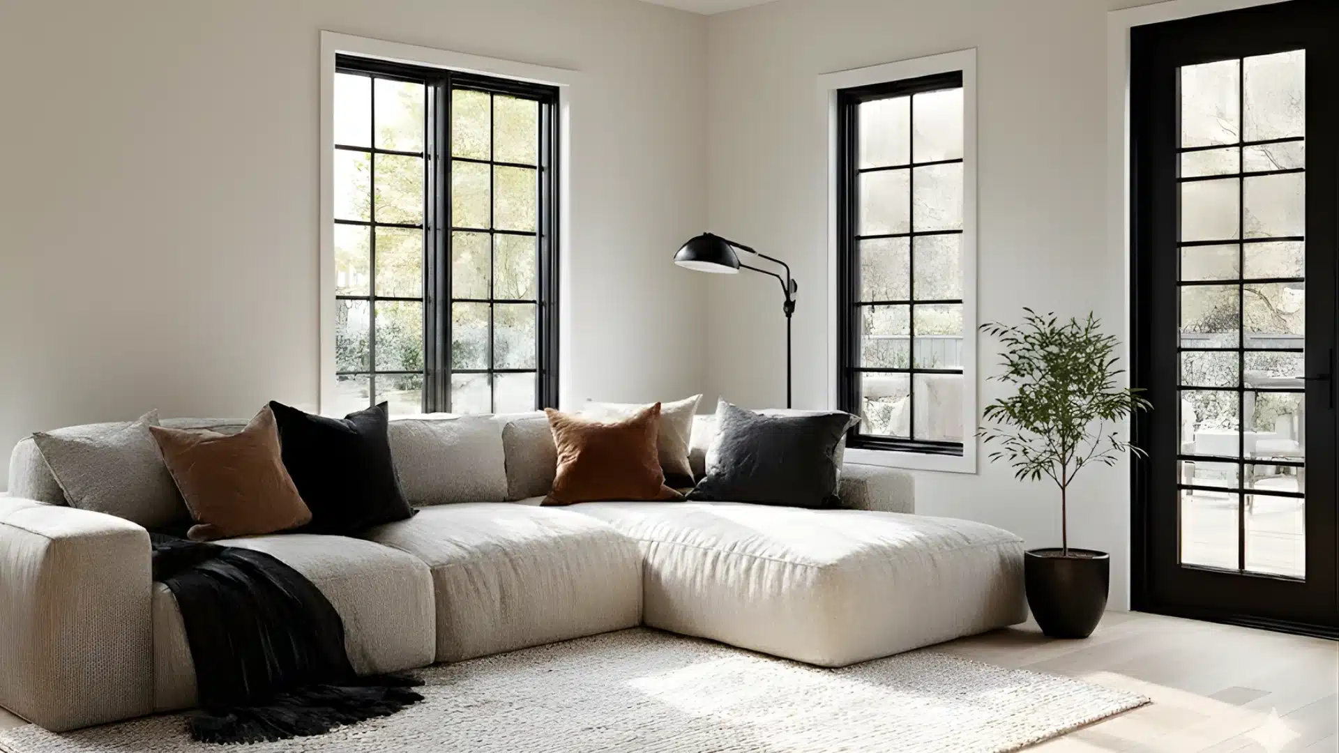
Living rooms are honestly where Cheviot does its best work.
I have seen it used as a full-wall color, and as a simple backdrop behind a bold sofa, and in both cases, it just clicked.
It does not compete with your furniture. It lets everything else in the room breathe.
This is what makes it work in living rooms:
- Makes darker furniture and artwork stand out without any effort
- Keeps the space feeling open even in larger rooms
- Gives you a clean base that works with almost any accent color
2. Bedrooms
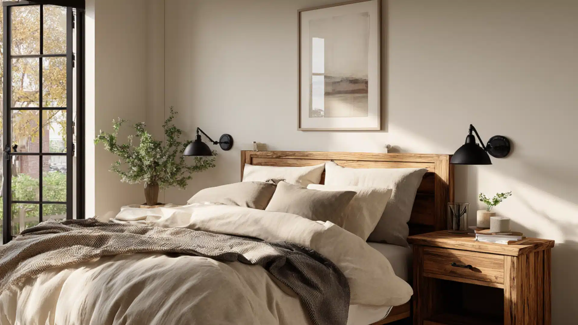
Bedrooms are where Cheviot really earns its spot.
It is soft enough to feel restful but not so flat that the room looks unfinished.
Pair it with warm wood nightstands or linen bedding, and the whole space comes together with minimal styling effort.
Decor tip: Soft brass or matte black fixtures against Cheviot walls add just enough contrast to keep the room from feeling one-note.
3. Kitchens and Cabinets
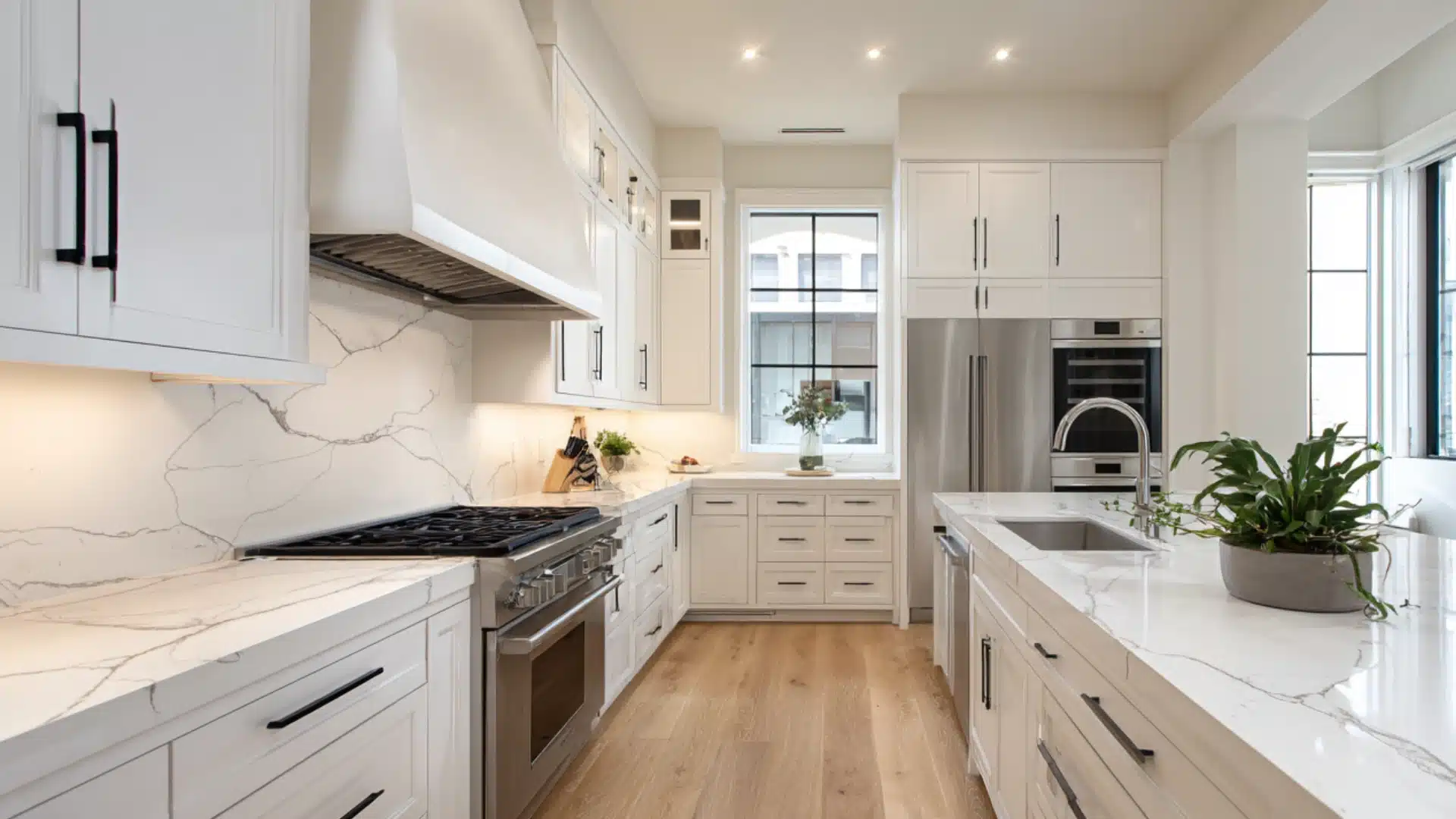
This one surprised me the first time I saw it done well.
Cheviot on kitchen cabinets looks clean and sharp without that cold, sterile feeling that brighter whites can give off.
For me, this is why it works well in these spaces:
- Keeps the space feeling light without going stark white
- Works with both wood hardware and matte black fixtures
- Holds up well under the bright lighting most kitchens have
4. Bathrooms
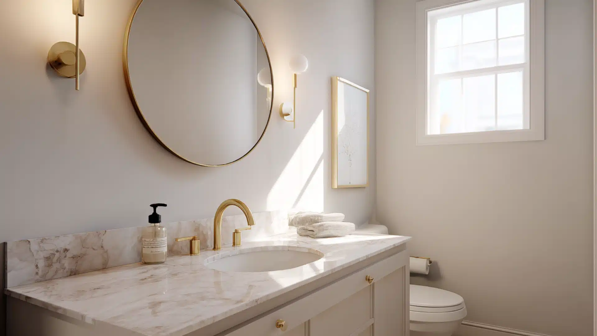
Small bathrooms benefit the most from Cheviot.
The high LRV means it reflects light back into the room, which makes even tight spaces feel less closed in.
No heavy styling needed here. Just clean lines and good lighting, and the color does the rest.
5. Hallways and Entryways
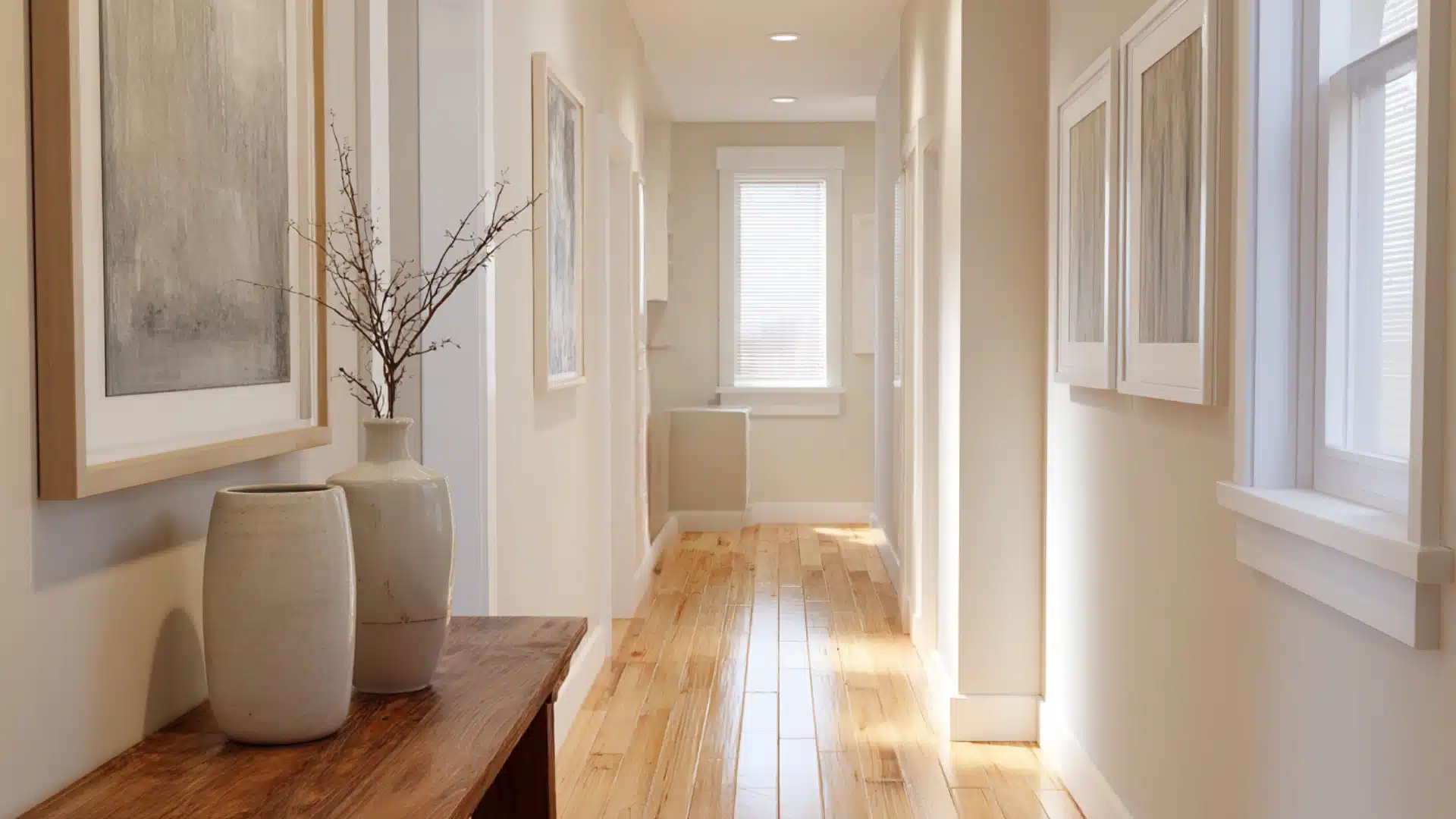
Narrow hallways tend to swallow color.
Cheviot sidesteps that problem completely. It keeps things bright and open without making the space feel like a blank wall.
It is one of those colors that works even harder in the spaces most people forget about.
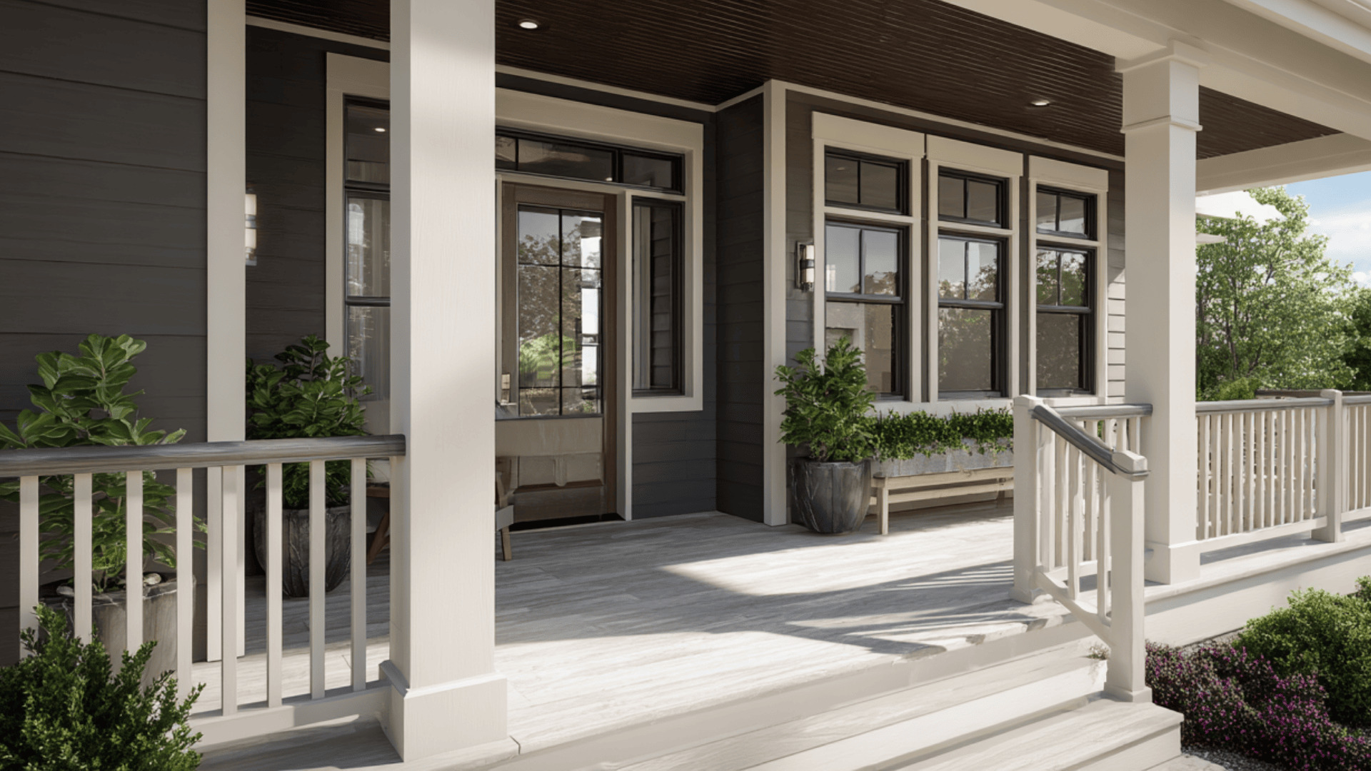
Cheviot Sherwin-Williams on Exteriors
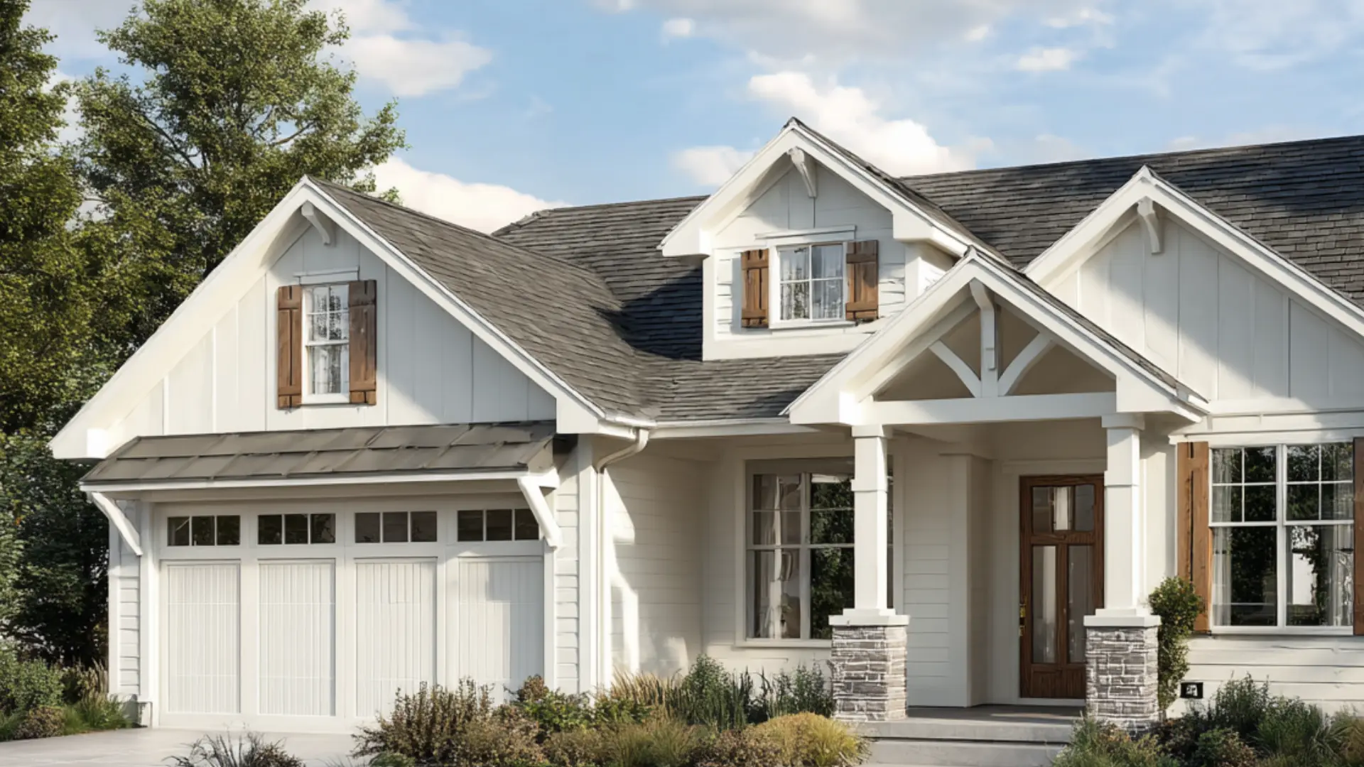
Do you think Cheviot is not just an indoor color?
It holds up surprisingly well outside, too!
1. Exterior Walls
Cheviot works well on the main body of a home, especially on craftsman, colonial, or farmhouse style exteriors.
In natural daylight, it reads clean and bright without looking stark against the surrounding landscape.
Pair it with a deeper trim color, and the whole facade feels balanced.
In full afternoon sun, Cheviot on exterior walls can read almost pure white.
That’s not a problem, but it does mean your trim color needs rethinking.
A bright white trim that would create nice contrast indoors can disappear entirely outside in direct sun – go one shade deeper on the trim than you think you need to.
2. Front Door Surround
Using Cheviot around a front door entry rather than on the door itself frames the space without overpowering it.
It lets a bold door color, think deep navy or forest green, do the talking while keeping the surrounding area soft and clean.
Decor tip: Matte black house numbers or light fixtures against the Cheviot exterior walls look sharp and put together with little effort.
3. Trim and Soffits
Cheviot makes a solid trim color on exteriors when the main body is a deeper shade.
It adds definition without going full bright white, which can sometimes feel too contrasting in softer, nature inspired color schemes.
4. Porches and Ceilings
Porch ceilings painted in Cheviot stay light and airy without the harshness of a pure white.
It is a small detail that makes the whole front of a home feel more considered and complete.
SW Cheviot Coordinating Colors
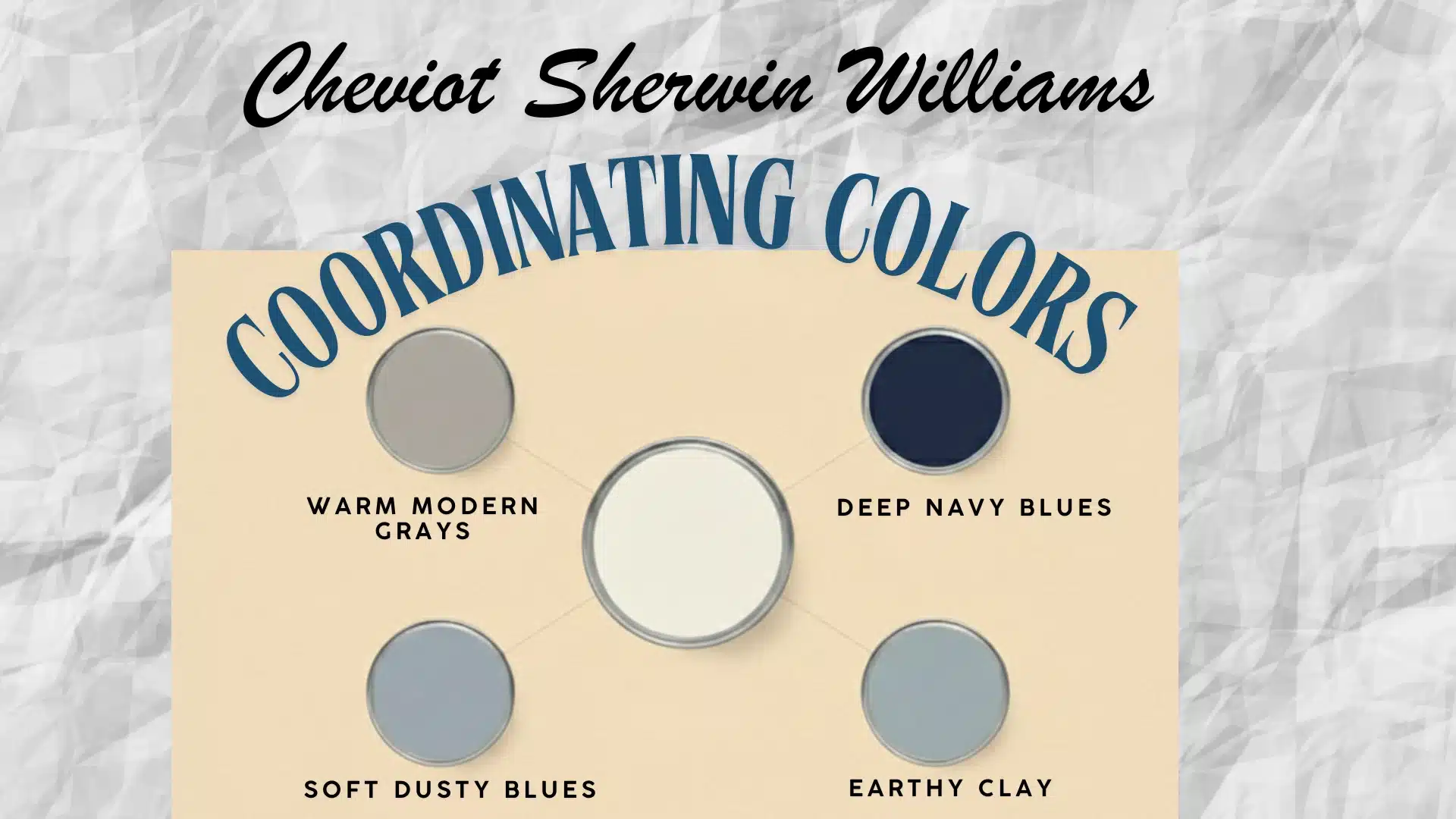
Cheviot is soft, lightly warm, and easy to work with.
The colors that pair best are ones that either balance its warmth or create clean contrast without pushing them into creamy territory.
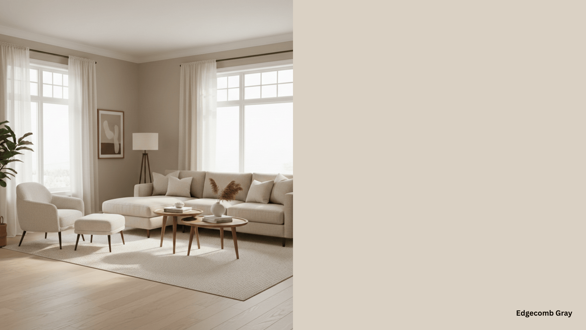
1. Warm Modern Grays
Warm grays sit comfortably next to Cheviot without making it look yellow.
Sherwin Williams: Repose Gray (SW 7015)
Repose Gray is one of the most balanced warm grays out there. It creates a gentle contrast next to Cheviot without pulling the room cold.
Benjamin Moore: Classic Gray (OC-23)
Classic Gray is light and airy with just enough warmth to feel cohesive. It keeps the pairing soft rather than stark.
2. Deep Navy Blues
Navy does something interesting next to Cheviot.
It makes the white look crisper and brighter while the contrast feels sharp and considered rather than jarring.
Hale Navy by Benjamin Moore sits slightly softer and works well in traditional and transitional rooms. It is the perfect pairing for Cheviot!
Decor tip: Use navy on built ins or a single feature wall with Cheviot Sherwin Williams on the surrounding walls. The contrast feels intentional without taking over the whole room.
3. Soft Dusty Blues
Muted blues cool Cheviot’s warmth down slightly and create a calm, easy combination.
Behr: Light French Gray (720E-2)
Light French Gray sits right between blue and gray, making it one of the most versatile options on this list.
It adds softness without changing the overall mood of the room.
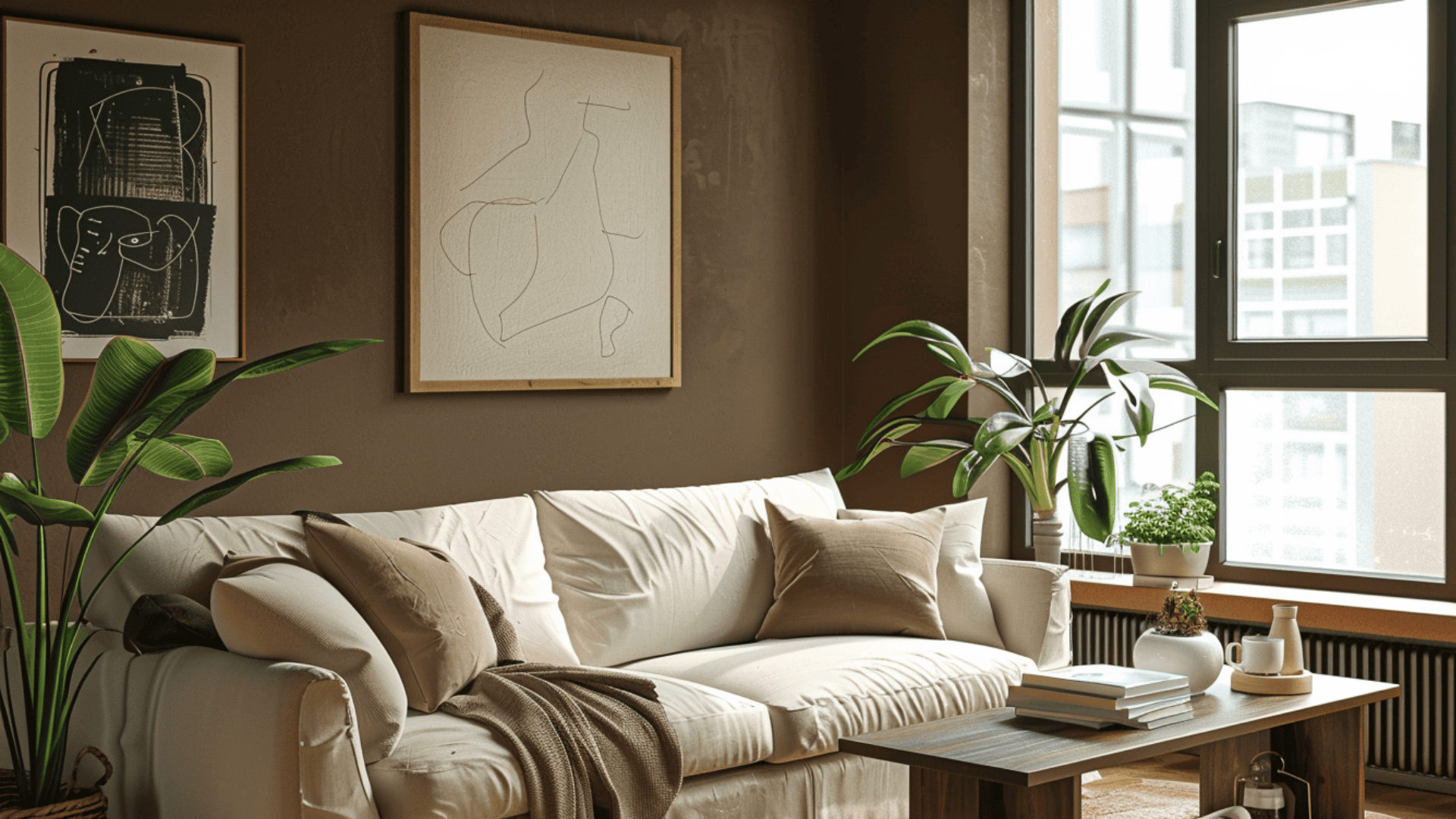
4. Earthy Clay and Terracotta Tones
This is where Cheviot’s subtle warmth really comes to the fore.
Earthy tones bring out that creamy quality, creating a layered, grounded palette that feels lived-in and natural.
Sherwin Williams: Cavern Clay (SW 7701)
Cavern Clay is a warm terracotta that adds bold character. It brings energy to the pairing without feeling out of place next to Cheviot’s softness.
Benjamin Moore: Rustique (AF-275)
Rustique is a deeper clay tone with enough richness to create real contrast. It works well as an accent in rooms that need a grounding color.
Behr: Canyon Dusk (S210-4)
Canyon Dusk is softer and more muted than a classic terracotta. It brings warmth without overwhelming the lighter tones in the room.
5. Rich Olive and Moss Greens
Deeper greens create contrast with Cheviot while keeping the space feeling balanced.
They bring out the warmth in the white without pushing it yellow.
Sherwin Williams: Ripe Olive (SW 6209)
Ripe Olive is an earthy, complex green that feels grounded and organic.
Behr: Vine Leaf (N400-7)
Vine Leaf goes deeper and works best in rooms with strong natural light, so the space does not feel too heavy.
Cheviot Trim Options: The Detail That Changes Everything
The wrong choice can make Cheviot look flat or overly creamy. The right one pulls the whole room together.
Trim color is one of those decisions that feels minor until you see it on the wall.
1. Brighter White Trim
This is the combination I come back to most often.
A bright white trim against Cheviot Sherwin Williams creates a clean, defined edge that makes the walls feel intentional. It adds structure without feeling harsh.
Pure whites like Extra White or Pure White work well here. The contrast is firm but never overwhelming.
2. Soft Cream Trim
If a brighter white feels too strong for your space, a soft cream trim brings things down a notch.
The difference between wall and trim is still there, but it reads as gentle rather than bold.
I used this in a transitional living room once, and it made the whole space feel warmer without losing any of its polish.
Something like Alabaster or White Dove fits this approach perfectly.
3. Matching Trim
I have done this a handful of times, and it is not for every room.
Painting the trim the same color as the walls creates a wrapped, cohesive look that works best in modern or minimal spaces with clean architecture.
When it works, it really works!
Cheviot vs Similar Sherwin Williams Whites
People ask me about these comparisons all the time.
They all look similar on a chip, but put them on a wall, and the differences show up fast.
| Category | Cheviot | Alabaster | Pure White | Greek Villa |
|---|---|---|---|---|
| Color Family | Warm White | Creamy White | Soft White | Warm White |
| General Description | Soft luminous white with gentle warmth | Soft creamy white with a cozy feel | Clean white with subtle softness | Warm white with creamy elegance |
| Light Reflectance Value (LRV) | 89 | 82 | 84 | 84 |
| RGB Values | 246 / 242 / 232 | 237 / 234 / 224 | 237 / 236 / 230 | 240 / 234 / 219 |
| Primary Undertones | Soft yellow, slight gray | Creamy yellow | Very subtle gray | Creamy yellow / beige |
| Warm or Cool | Warm-leaning white | Warm white | Neutral-to-slightly warm | Warm white |
1. Alabaster (SW 7008)
Alabaster leans creamier and warmer.
Next to Cheviot Sherwin Williams, the beige quality in Alabaster becomes much more visible. Cheviot keeps that warmth quiet and controlled.
2. Pure White (SW 7005)
Pure White reads crisper and slightly cooler.
Cheviot carries just a touch more softness, which stops it from feeling sharp or clinical. Pure White works well in modern spaces with cooler finishes and minimal wood tones.
Cheviot feels more forgiving, especially in homes with warm wood floors or brass fixtures.
3. Greek Villa (SW 7551)
Greek Villa is warmer and more traditional.
Under artificial lighting, it can show a noticeable creamy yellow quality that Cheviot simply does not have.
Cheviot stays lighter and more restrained across different lighting conditions.
Simple designer rule:
-
Bright modern white → Cheviot
-
Classic warm white → Alabaster
-
Neutral versatile white → Pure White
-
Soft warm creamy white → Greek Villa
Mistakes to Avoid When Using Cheviot Sherwin-Williams
Sampled Cheviot in a north facing bedroom, loved it, painted the whole room.
Big mistake. At night, that creaminess crept in and changed everything. Always check after dark before you commit.
A tiny paint chip is lying to you. Cheviot shifts with light, and a chip never shows the full picture.
Cool blue gray floors and Cheviot do not always get along. Test them together before you decide they are best friends.
White is not just white. I have watched people grab Alabaster, thinking it was Cheviot, because the chips looked identical. Save SW 9503 in your phone right now.
Paint a two foot sample on the actual wall. Morning light, afternoon light, evening light. Three checks, no surprises.
Give it three days before you buy the full can. Day one feels exciting. Day three tells the truth.
One thing worth knowing: if you’re painting Cheviot over a medium or dark wall color, a tinted primer matched close to Cheviot saves you a third coat.
White paint over dark walls without primer almost always needs more coats than the can suggests, and the undertones look uneven until it’s fully built up.
How to Test Cheviot for Your Home?
After way too many sample pots and more painted swatches on my walls than I care to admit, this is what I figured out.
Go for it when you:
- Want a white that feels soft and bright without any drama
- Have warm wood tones, natural textures, or warm metals in the space
- Need something that behaves well in both natural and artificial light
Skip it when you:
- Prefer cool, sharp whites with zero warmth
- Have a dark room with barely any natural light
- Own cool gray or blue toned furniture that would clash with its subtle warmth
Honestly, Cheviot wasn’t my first choice.
It was not even my third. But after everything else either went too creamy or too cold, this one just landed right.
The Final Call
I did not land quickly on Cheviot.
After more sample pots than I can count, Cheviot was the one that kept making sense. But after all of that, this was the white that kept making sense.
It does not try too hard. It does not fight with your furniture or shift unexpectedly under evening light.
Grab a sample pot. Put it on your actual wall!
Check it morning, afternoon, and night. If it still looks good on day three, you have your answer.
Frequently Asked Questions
1. Is Cheviot Sherwin Williams a Good Color for Rental Properties?
Yes, its soft and neutral quality makes it a safe, crowd pleasing choice that works across different furniture styles and tastes.
2. Does Cheviot Work Well with Wallpaper Accents?
It does, especially with botanical or neutral patterned wallpaper that shares warm or earthy tones.
3. What Sheen Level Works Best for Cheviot on Walls?
Eggshell is the most popular choice as it adds just enough sheen to be wipeable without looking glossy.
4. Can Cheviot Work in a Home with Cool Toned Marble Countertops?
It can, but pair it with warm wood or metal accents nearby to stop the cool marble from pulling it flat.
5. How many Coats Does Cheviot Typically Need for Full Coverage?
Two coats over a good primer usually deliver smooth, even coverage without any patchiness showing through.