

Walked into a room and felt instantly at ease?
Soft autumn colors create calm, inviting spaces that are subtle instead of bold.
Most people struggle to pick the right shades. They often end up with rooms that feel wrong.
This blog features how a soft autumn color palette works in a real home. You’ll learn which colors pair well together, textures, furniture, and how to use them in different rooms.
You’ll know exactly how to bring this cozy, muted palette into your space.
Defining the Soft Autumn Color Palette
The soft autumn palette draws from gentle, earthy tones you see in nature during foggy season.
Muted golds, hot browns, and soft greens, these aren’t bright or intense colors.
They’re toned down, which makes them easy on the eyes.
You’ll find shades like olive green, camel brown, terracotta, and dusty rose. The keyword here is soft.
Every color has a grayed quality to it. Nothing jumps out or demands attention. Instead, these hues blend naturally, creating rooms that feel calm and inviting.
Key Features of Soft Autumn Colors in Interiors
What makes these colors work so well in homes? The main characteristics that define this palette:
- Low Contrast: These shades sit close to each other on the color spectrum. They don’t create sharp differences, which helps rooms feel peaceful.
- Warm Undertones: Every color leans toward heat. You won’t find cool blues or icy grays here. Think sunset tones rather than winter shades.
- Muted Saturation: The colors aren’t pure or vivid. They’re dulled down, as if someone added a touch of gray to each one.
- Earthy Foundation: Browns, tans, and mossy greens form the base. These ground the palette and connect your space to the natural world outside.
- Gentle on the Eyes: Nothing feels harsh or overpowering. Your eyes can rest comfortably on any surface without feeling overstimulated or tired.
Soft Autumn Color Palette Textures and Materials

Colors alone won’t work. You need the right textures to complete the look.
| Material | Why It Works | Where to Use |
|---|---|---|
| Linen | Soft, natural feel | Curtains, cushions, bedding |
| Wool | Adds heat and depth | Rugs, throws, upholstery |
| Wood | Brings earthy tones | Floors, furniture, accents |
| Clay | Organic and matte | Pottery, tiles, planters |
| Leather | Aged appearance | Chairs, sofas, accessories |
| Cotton | Breathable and cozy | Pillows, blankets, covers |
| Stone | Natural texture | Countertops, walls, decor |
| Jute | Rural and textured | Rugs, baskets, wall hangings |
Creating a Soft Autumn Color Palette for Interiors
Let’s get specific about which colors work best in each room of your home.
1. Living Room
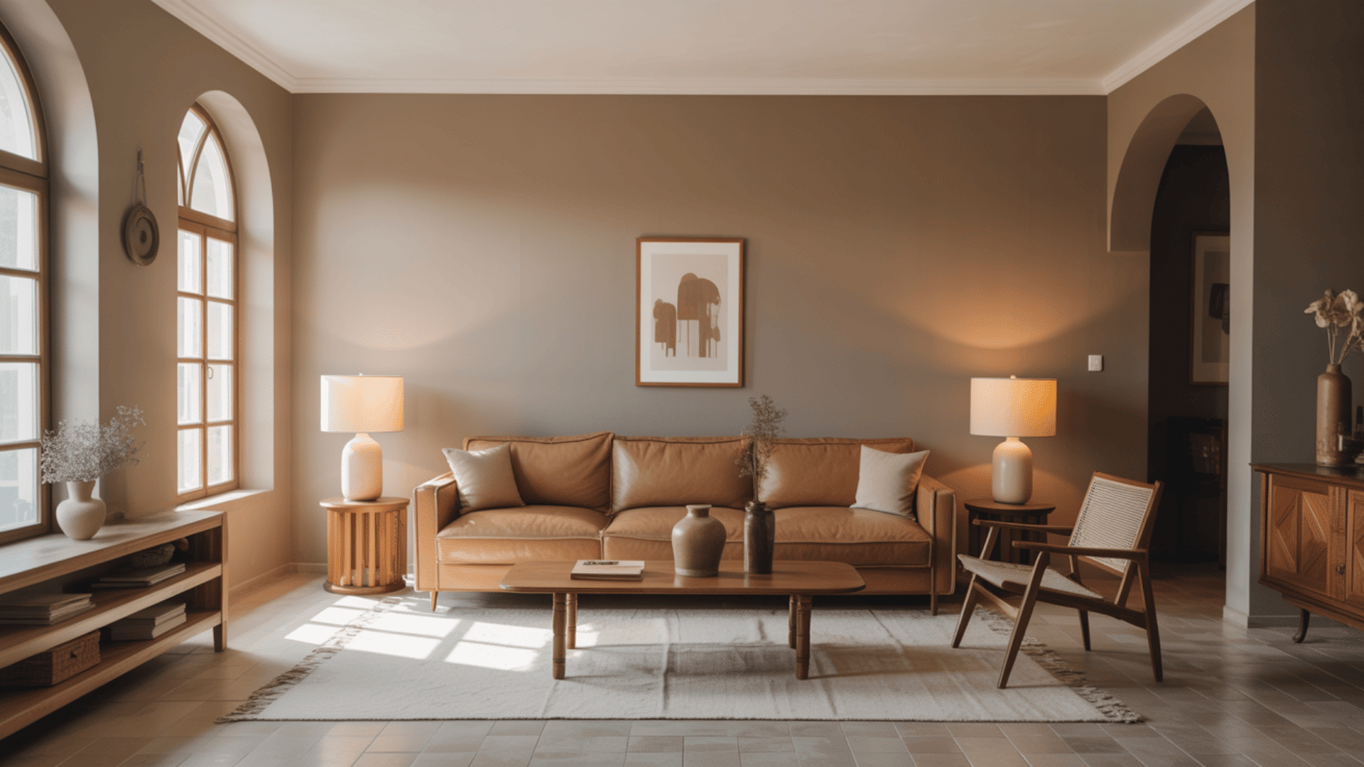
Go for taupe or mushroom beige on the walls. These create a neutral backdrop that works with everything.
For paint, try Accessible Beige. Natural light brings out their heat during the day, while lamps give them a cozy glow at night.
Common Mistake to Avoid: Using too many gray tones that turn the space cold instead of warm.
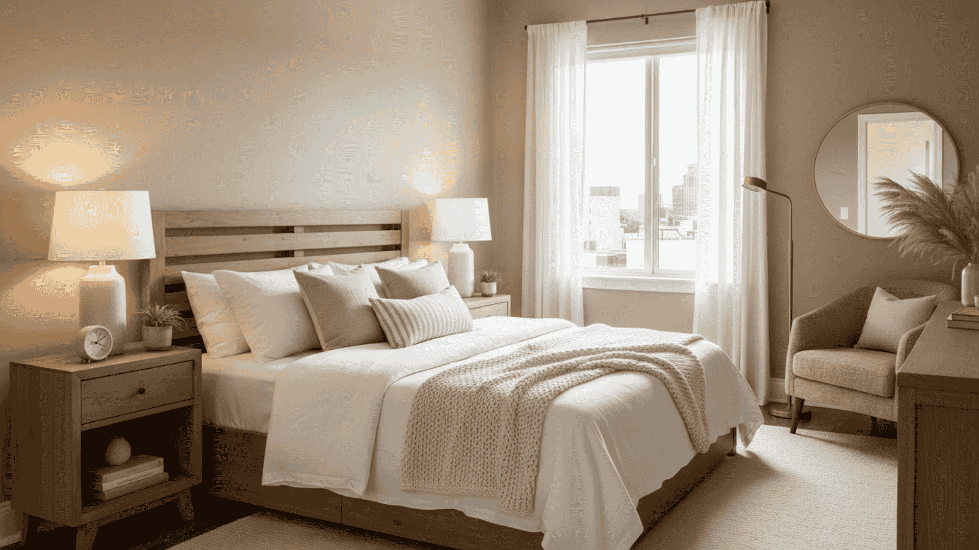
2. Bedroom
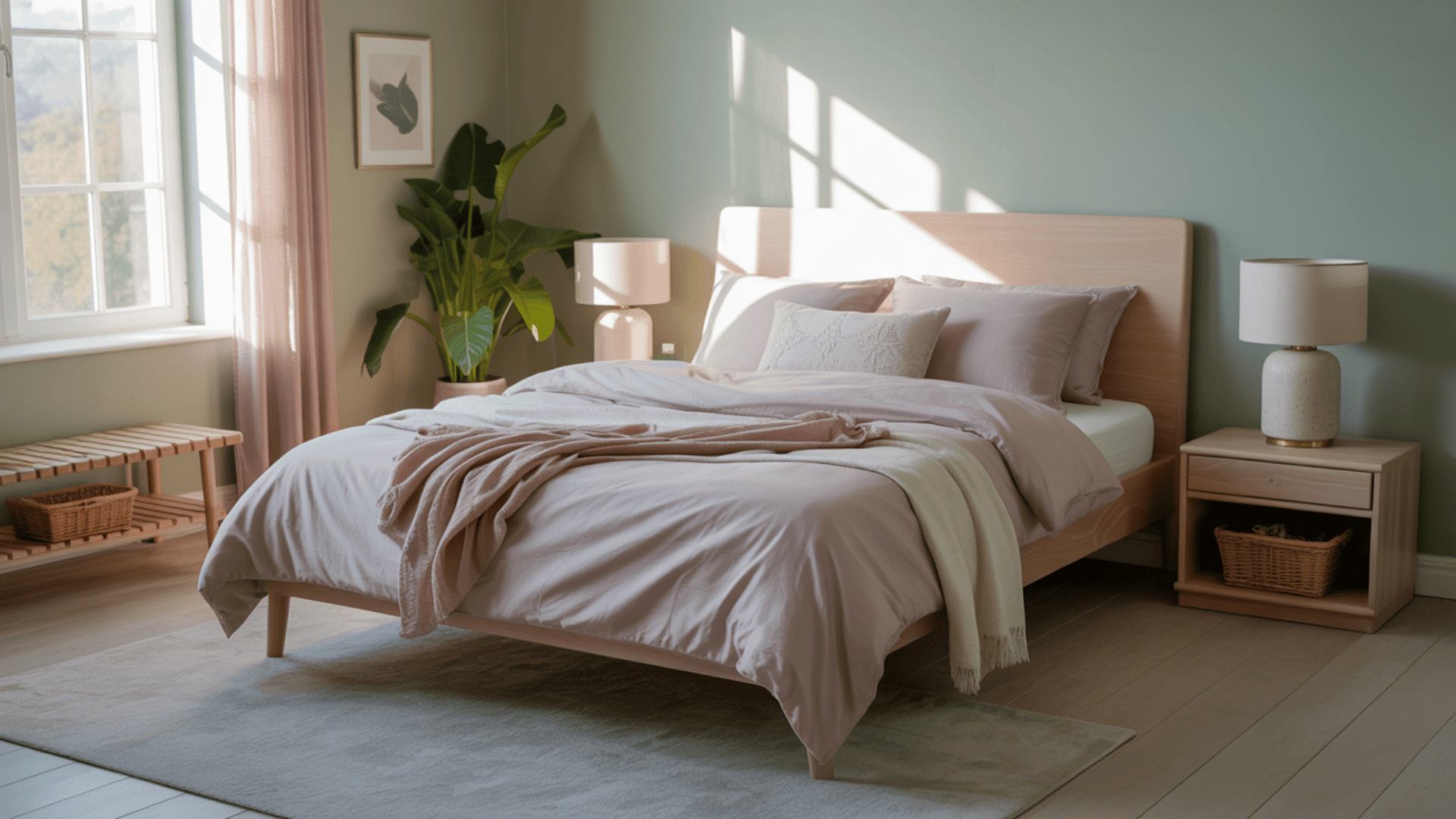
Soft sage green or dusty mauve work beautifully on bedroom walls. These colors promote rest without feeling boring. Consider October Mist or Retreat.
Morning light makes these shades feel fresh, while evening light turns them soothing.
Common Pitfall: Choosing colors that are too dark, making the room feel heavy and closed in.
3. Kitchen
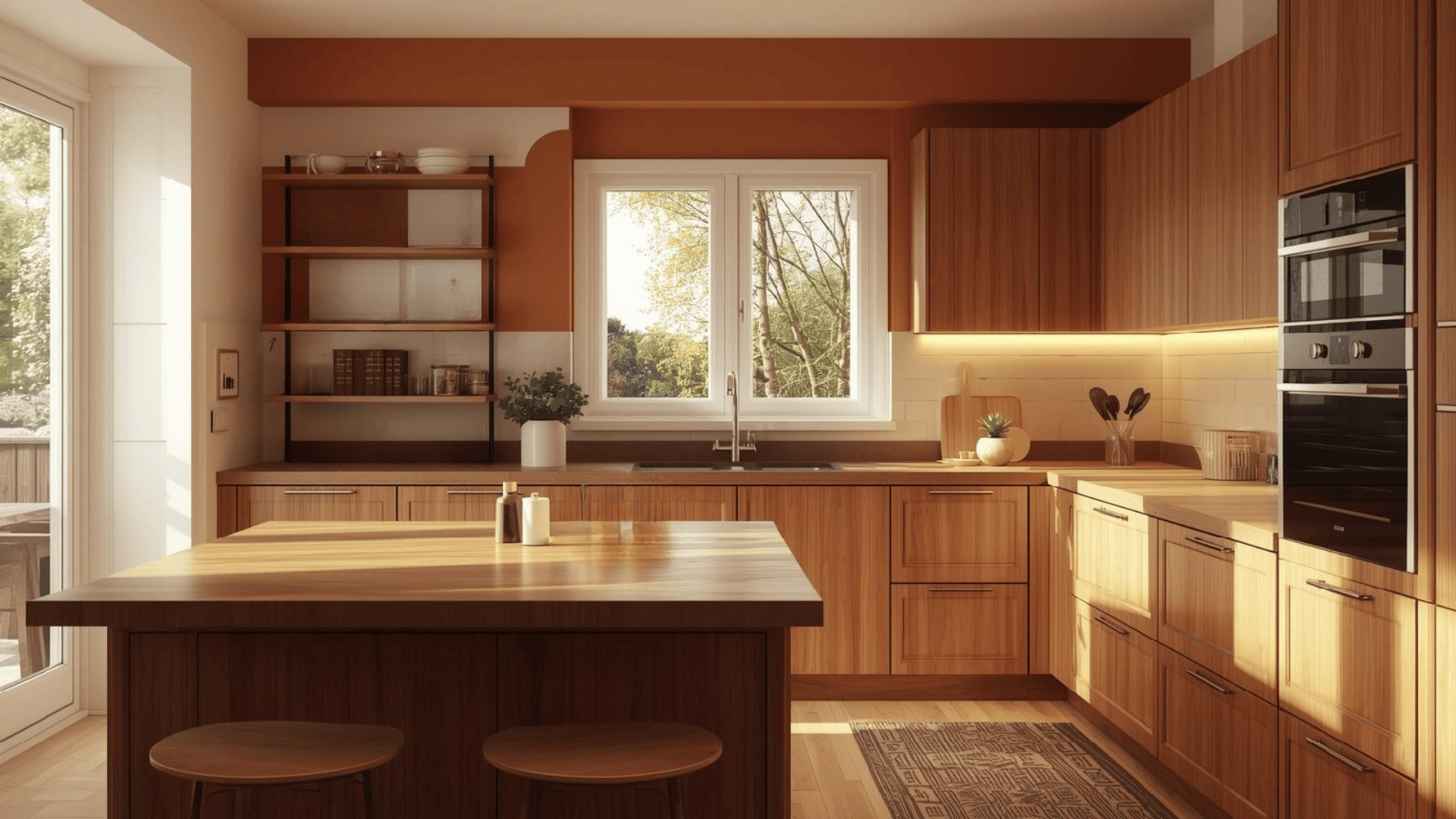
Cream or soft terracotta walls keep kitchens feeling open and friendly.
Navajo White or Smokey Taupe are excellent paint choices. Natural daylight makes colors shine, with under-cabinet lighting adding heat at night.
Watch Out For: Pairing autumn colors with stark white, which creates an uncomfortable contrast.
4. Bathroom
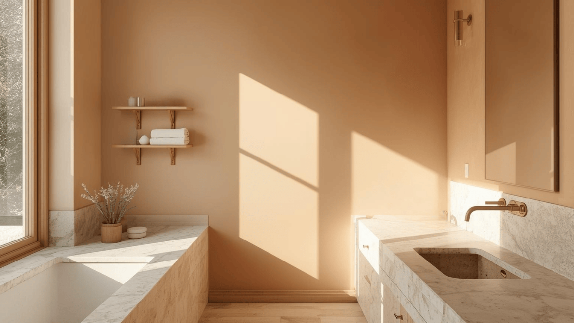
Choose soft peach sand tones for bathroom walls. These make small spaces feel larger and more inviting.
Try Pale Almond or Sand Dollar for paint colors, brightened by natural daylight. Use waterproof lighting that mimics natural light at night.
Mistake to Skip: Using glossy finishes that make muted colors look cheap and plastic-like.
5. Home Office
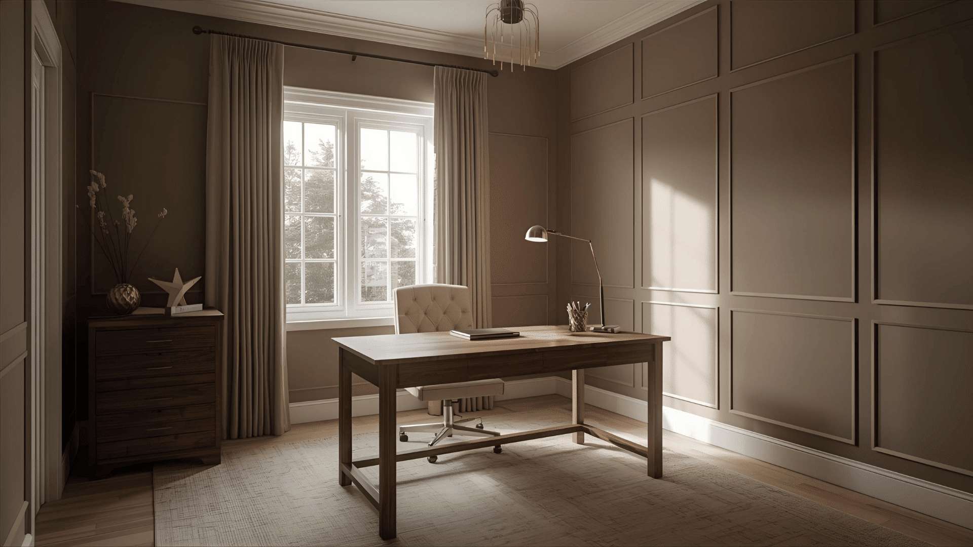
Gray-brown or soft olive walls suit home offices, keeping you alert without distraction.
Edgecomb Gray is a good paint option. Place your desk near windows with natural light to improve these colors.
Don’t Make This Error: Forgetting to test paint samples in different lighting before committing to a color.
Furniture Colors that Match Soft Autumn Homes
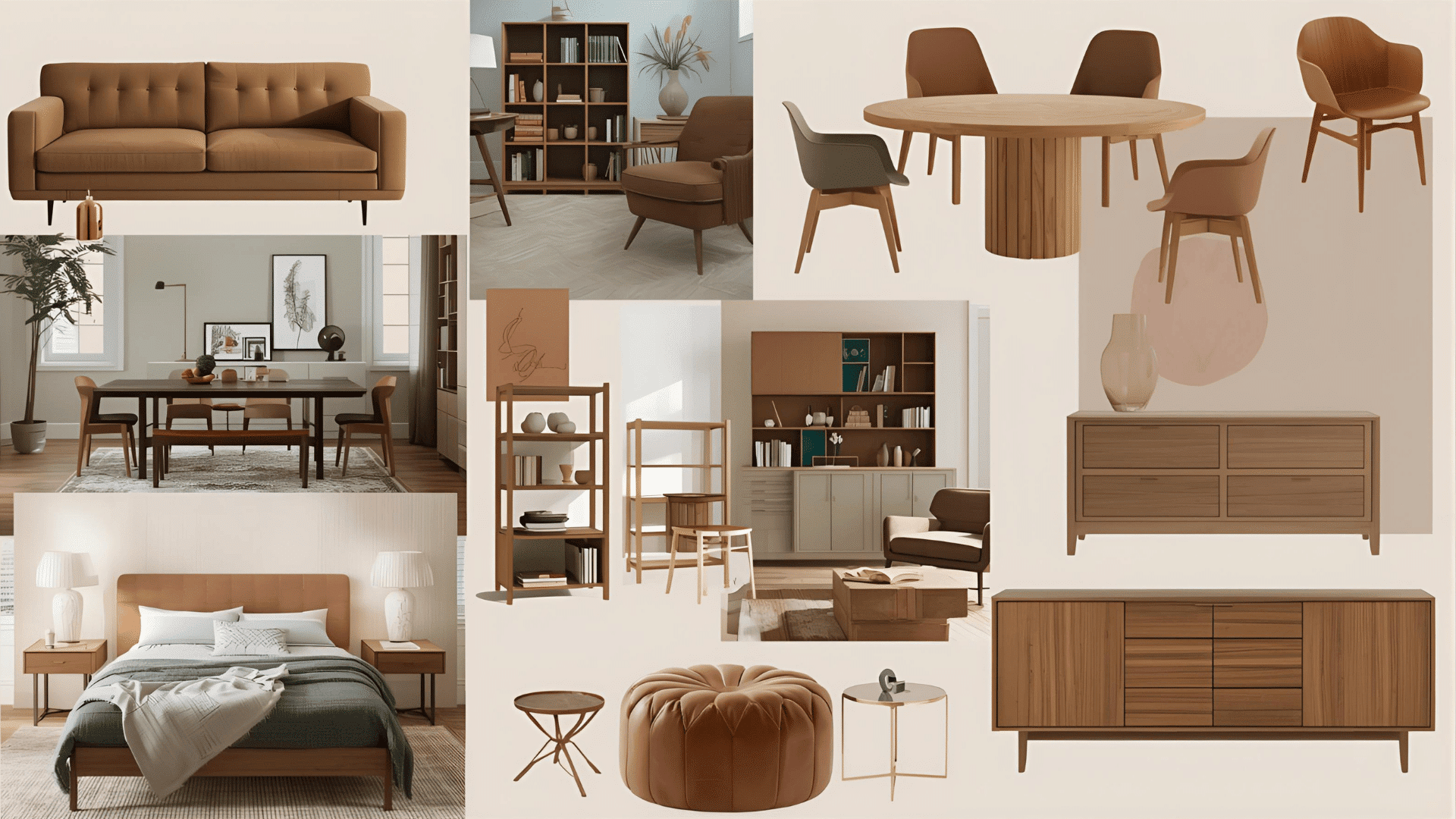
Your furniture choices can make or break the soft autumn vibe in your space.
| Furniture Type | Best Colors | Style Notes |
|---|---|---|
| Sofas | Camel, mushroom, taupe | Avoid bright whites |
| Dining Tables | Walnut, oak, and honey wood | Skip dark espresso |
| Chairs | Olive, terra cotta | Steer clear of black |
| Bed Frames | Natural wood, light brown | Pass on painted frames |
| Dressers | Oak, pecan, teak | No gray-washed finishes |
| Coffee Tables | Medium wood tones, amber | Skip glass or metal |
| Bookshelves | Brown, natural pine | Avoid stark white |
| Cabinets | Sage, muted green, tan | Stay away from the navy |
| Side Tables | Copper, brass, metal | Don’t use Chrome |
| Ottomans | Cognac leather, burnt orange | Skip cool-toned fabrics |
Soft Autumn vs Other Popular Interior Color Styles
How does soft autumn stack up against other color schemes? Here’s what sets it apart from the competition
Soft Autumn vs Scandinavian
Scandinavian style features cool whites and grays with the tiniest color, focusing on a crisp, clean look.
Soft autumn introduces heat with earthy tones and richer hues, feeling cozy and grounded. Both favor natural materials, but autumn adds more color depth.
Soft Autumn vs Bohemian
Boho interiors feature bright colors and bold patterns, while soft autumn tones are muted with shades for calm.
Boho can feel chaotic; soft autumn offers visual serenity. Less is more versus more is more.
Soft Autumn vs Modern Farmhouse
Modern farmhouse uses black and white contrasts with shiplap textures. Soft autumn avoids stark contrasts, favoring gentle color transitions.
Farmhouse feels crisp, whereas soft autumn remains calm. Both value rural elements differently.
Soft Autumn vs Coastal
Coastal style uses blues, whites, and sandy neutrals for a breezy feel.
Soft autumn highlights earth tones without cool undertones. Coastal evokes the beach, while soft autumn brings the forest indoors, shifting from refreshing to comforting.
Soft Autumn vs Industrial
Industrial design features exposed brick, metal, and concrete with gray schemes, evoking urban edginess, while soft autumn uses fabric and wood for a cozy, approachable feel.
Totally different vibes.
How to Build a Soft Autumn Color Flow Between Rooms
- Let hallways serve as transition spaces with lighter shades.
- Repeat accent colors in at least three different rooms.
- Keep flooring consistent or in the same color family.
- Layer different shades of the same color from room to room.
- Use rugs to connect open floor plans visually.
- Paint adjacent rooms in colors that share similar undertones.
- Place similar decor items in doorways where rooms meet.
- Keep metal finishes consistent throughout your home.
Key Takeaway
Soft autumn color palette gives your home a heat that’s hard to beat.
You have seen the key shades, textures, and room-by-room applications. You now have what you need to start.
The real magic happens when you trust your instincts. Don’t be afraid to adjust things to fit your taste.
Your home should reflect you, not just follow rules. Start small if you’re nervous.
Paint one room or add some autumn-toned pillows. See how it feels. You can always build from there.
What room will you transform first?