

Choosing between two popular white paint colors can be overwhelming when trying to make the right decision for your home. You’ve probably heard about Benjamin Moore’s White Dove and Simply White, but which one actually works best for your space?
Here’s the thing – picking the wrong white can make your room feel cold, dingy, or just plain wrong. But when you choose correctly, it changes everything.
What if I told you there’s a simple way to pick between these two favorites?
I’m going to break down the key differences between white dove vs simply white so you can pick the perfect shade. You’ll learn about their undertones, how they look in different lighting, and which rooms they work best in.
Ready to make your decision?
Why Choosing the Right White Matters
White paint isn’t just white, and that’s where many homeowners get surprised. Each white has its own personality, and the wrong choice can make your room feel off.
I’ve seen rooms painted with the wrong white that looked cold and unwelcoming.
The lighting felt harsh, and the space never felt quite right. On the flip side, the right white makes everything click into place. White affects how your furniture looks, how natural light bounces around, and even how big your room feels. Some whites have warm undertones that make spaces cozy.
Others have cool undertones that create a crisp, clean feel.
That’s why comparing White Dove and Simply White matters so much. These two popular choices create completely different moods in your home.
Overview of Benjamin Moore White Dove vs Simply White
When you’re choosing between these two Benjamin Moore favorites, understanding their basic characteristics helps narrow down your decision.
Both are popular for good reason, but they serve different purposes in home design.
| Attribute | White Dove | Simply White |
|---|---|---|
| LRV | 83.16, slightly darker, adds depth for cozy settings. | 89.52, brighter, improves light in open or modern spaces. |
| Hex Color | #E7E3D7, soft and neutral. | #F7F2E8, crisp and warm. |
| Undertone | Greige (gray + beige), neutral and balanced. | Yellow and green, warm and inviting. |
| Color Family | Off-white, ideal for traditional or coastal designs, perfect for walls. | Off-white suits, modern or farmhouse styles, are great for trim. |
Applications of White and White Dove in Your Home
Choosing the right white for different spaces in your home can make all the difference in how each room feels and functions.
When comparing white dove vs simply white, it’s helpful to think about where each one shines brightest. Simply White works best in spaces where you want brightness and energy, while White Dove excels in areas where you prefer a softer, more relaxed feel.
The key is matching the paint’s personality to the room’s purpose. Let me break down how each color performs in different spaces throughout your home.
Simply White Applications
Simply White brings energy and brightness to any space. Its warm undertones make it perfect for areas that need to feel fresh and lively.
Best rooms for Simply White:
- Kitchens and bathrooms are where you want maximum brightness
- Home offices and workspaces that need an energizing feel
- Rooms with limited natural light that need extra help feeling bright
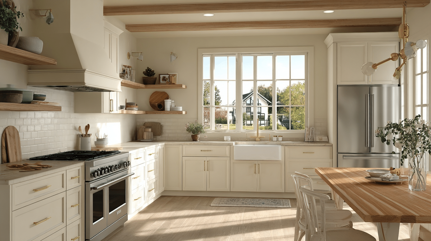
Kitchen
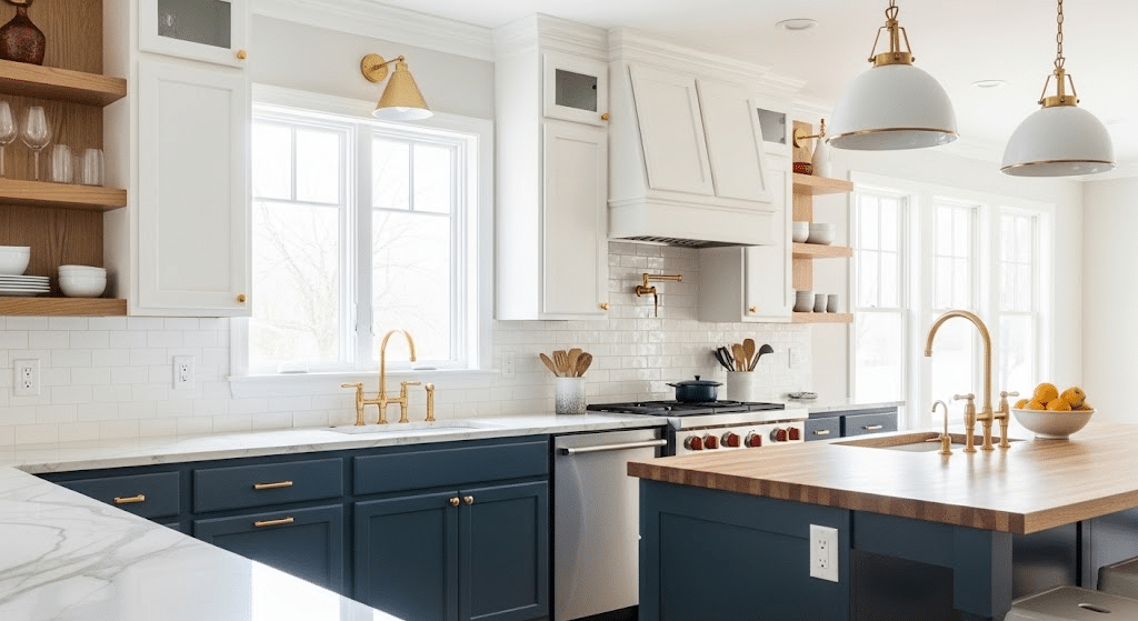
Simply White makes kitchens feel clean and spacious. The warm undertones prevent it from looking too clinical while still giving you that crisp, fresh look you want in a cooking space.
- Cabinet Colors: Pairs beautifully with navy, forest green, or natural wood tones. I used Benjamin Moore’s Hale Navy for my sister’s kitchen, and it turned out to be stunning.
- Countertop Options: Works with both warm and cool materials like marble or quartz
- Lighting Effects: Reflects natural light well, making small kitchens appear larger
Bathroom
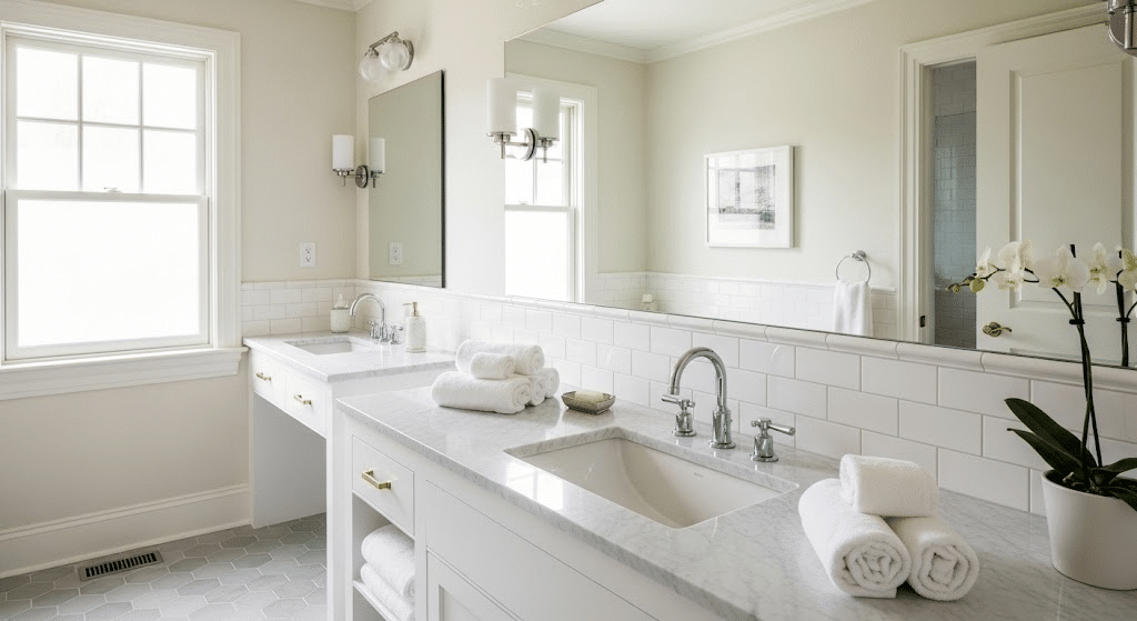
This color works particularly well in bathrooms because it reflects light beautifully. It creates a spa-like atmosphere while maintaining the brightness you need for daily routines.
- Fixture Compatibility: Complements both chrome and brass fixtures perfectly
- Tile Combinations: Looks great with subway tiles, marble, or colorful accent tiles
- Mirror Placement: Improves the reflection of light around vanity areas
Home Office
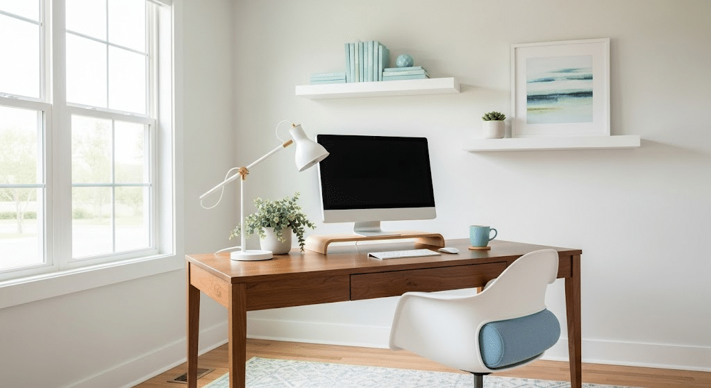
Simply White helps create focus and energy in workspaces. The brightness keeps you alert, and the warm undertones prevent eye strain during long work sessions.
- Furniture Pairing: Works well with dark wood desks or modern white furniture
- Accent Colors: Pairs nicely with blues, greens, or warm gray accents
- Natural Light: Maximizes daylight while reducing harsh shadows on computer screens
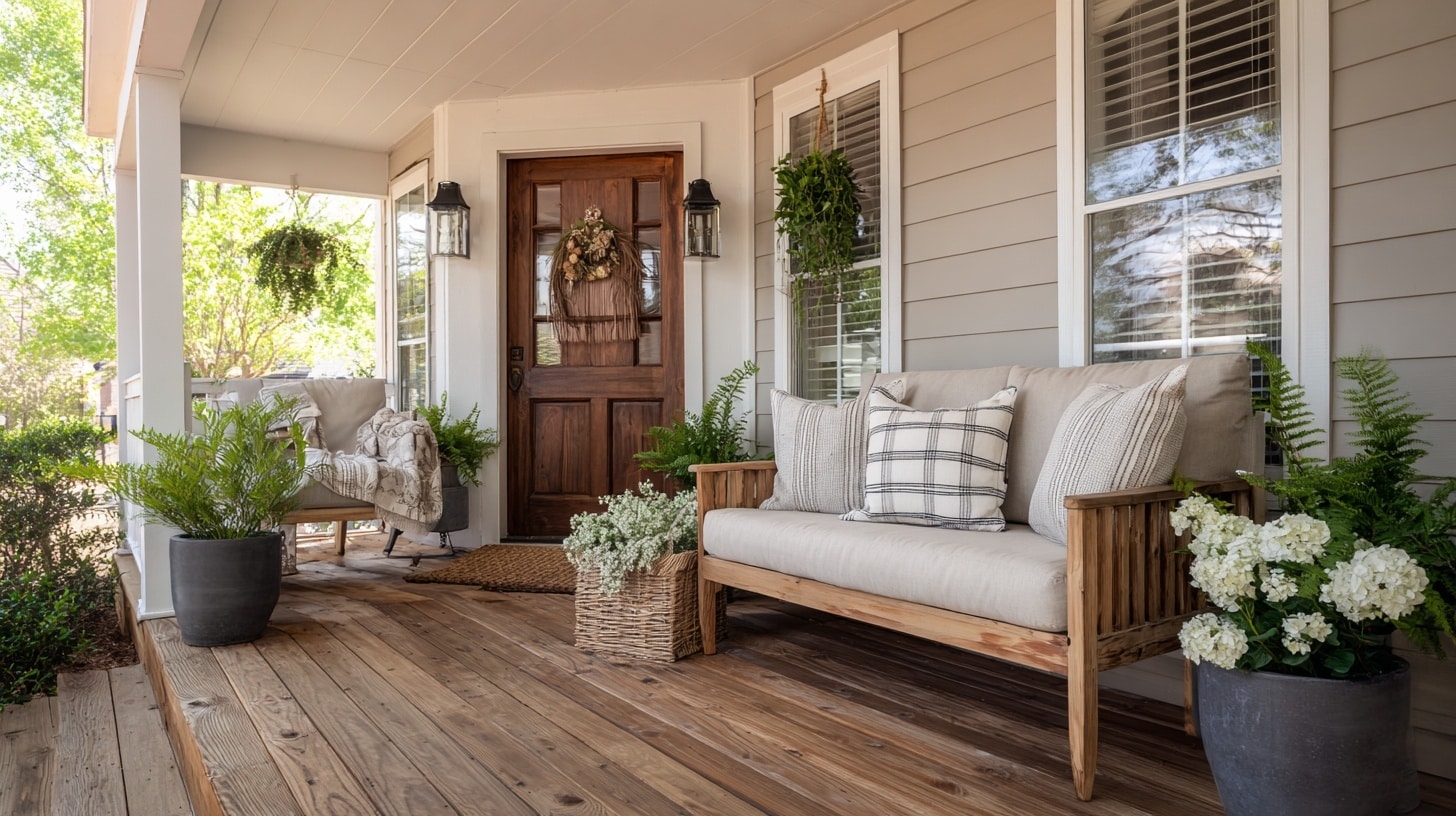
White Dove Applications
White Dove creates a more relaxed, comfortable atmosphere. Its subtle gray undertones make it perfect for spaces where you want to unwind.
Bedroom
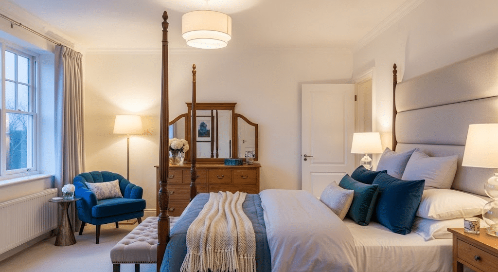
White Dove creates a peaceful sleeping environment. The soft gray undertones help your mind relax, making it easier to wind down at the end of the day.
- Bedding Combinations: Looks beautiful with soft pastels, warm grays, or rich jewel tones
- Furniture Styles: Complements both traditional wood and modern upholstered pieces
- Lighting Considerations: Creates a cozy atmosphere with table lamps and soft overhead lighting
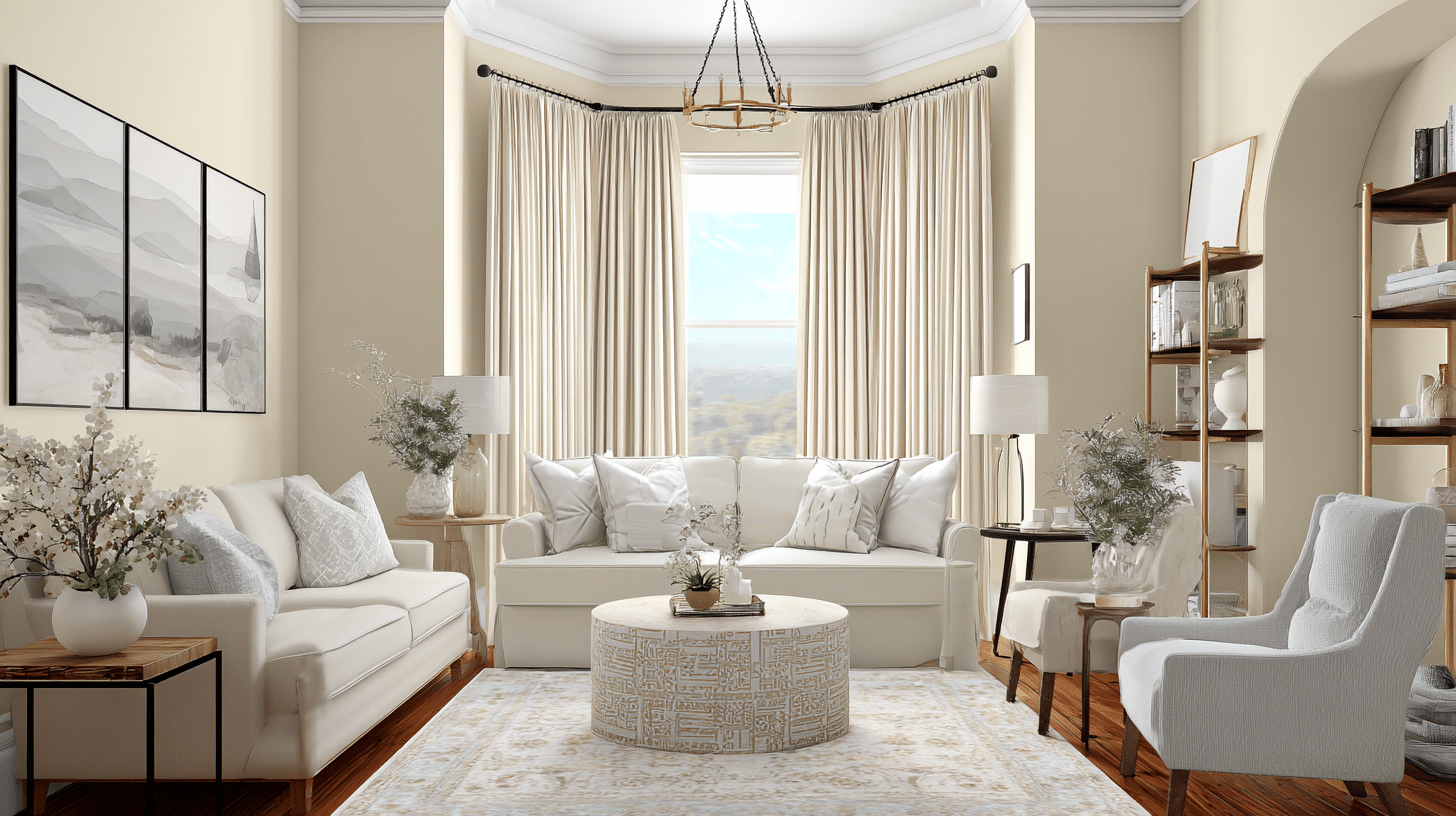
Living Room
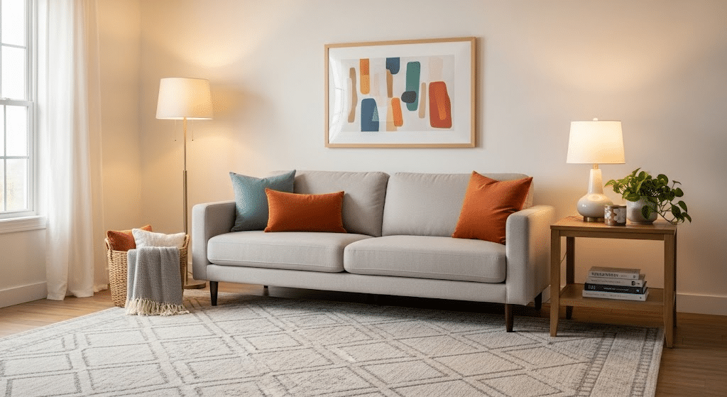
This color provides a perfect neutral backdrop for your furniture and decor. It’s suave enough for entertaining but comfortable enough for family time.
- Sofa Colors: Works with everything from bold blues to neutral beiges and grays
- Artwork Display: Provides a clean backdrop that makes colorful art pop
- Seasonal Decor: Easy to update with different throw pillows and accessories
Dining Room
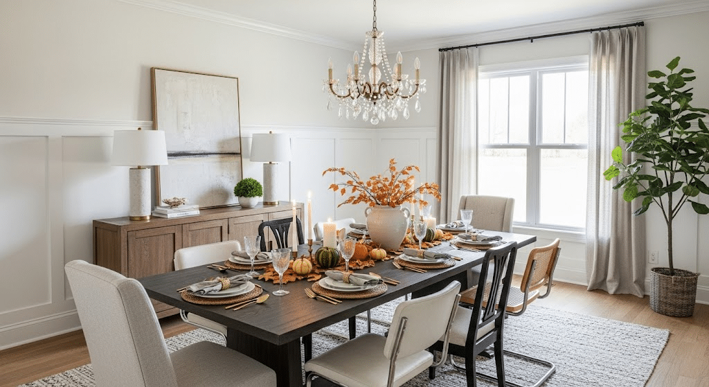
White Dove gives dining rooms a graceful feel without being too formal. It works beautifully with both warm and cool accent colors, making it easy to change your decor seasonally.
- Table Settings: improves both casual family meals and formal dinner parties
- Chandelier Styles: Complement traditional crystal or modern metal fixtures
- Wall Treatments: Perfect base for wainscoting or accent wall colors
Comparing Undertones: Simply White vs White Dove
Understanding undertones is crucial when making your final decision between these two popular whites.
The subtle differences in undertones can dramatically change how each color looks in your space, especially as lighting changes throughout the day.
Here’s a direct comparison of white dove vs simply white undertones to help you see which works better for your home.
| Aspect | Simply White | White Dove |
|---|---|---|
| Primary Undertone | Yellow/Cream | Gray/Cool |
| Secondary Undertone | Slight green hints | Subtle beige notes |
| Morning Light | Appears bright and fresh | Looks soft and calming |
| Afternoon Light | Maintains warmth | Shows more gray tones |
| Evening/Artificial Light | Can look slightly yellow | Appears more neutral |
| Best Lighting Conditions | North-facing rooms, dim spaces | South-facing rooms, bright spaces |
| Temperature Feel | Warm and cozy | Cool and modern |
Wrapping It Up
Making the right choice between white dove vs simply white comes down to understanding your space and lighting. Simply White brings warmth and energy to kitchens and offices, while White Dove creates calm, modern atmospheres in bedrooms and living areas.
Remember, the undertones matter more than you might think. Simply White’s yellow base works well in cooler, north-facing rooms.
White Dove’s gray undertones shine in bright, south-facing spaces. Test both colors with sample patches before committing. Your lighting conditions will be the final judge.
What’s your experience with these paint colors? Comment below and share which one worked best in your home!