

Seeking a paint color that instantly adds grace to your home? Most homeowners struggle to find that perfect neutral shade.
Here’s where Strand of Pearls Benjamin Moore steps in to solve your dilemma.
In this blog, I’ll show you exactly how Strand of Pearls Benjamin Moore can convert your space.
You’ll see real room examples, learn which colors pair beautifully with it, and get practical tips for using this versatile shade throughout your home.
If you love soft neutral paint colors, you may also like coffee color palettes by Benjamin Moore for more creamy white inspiration.
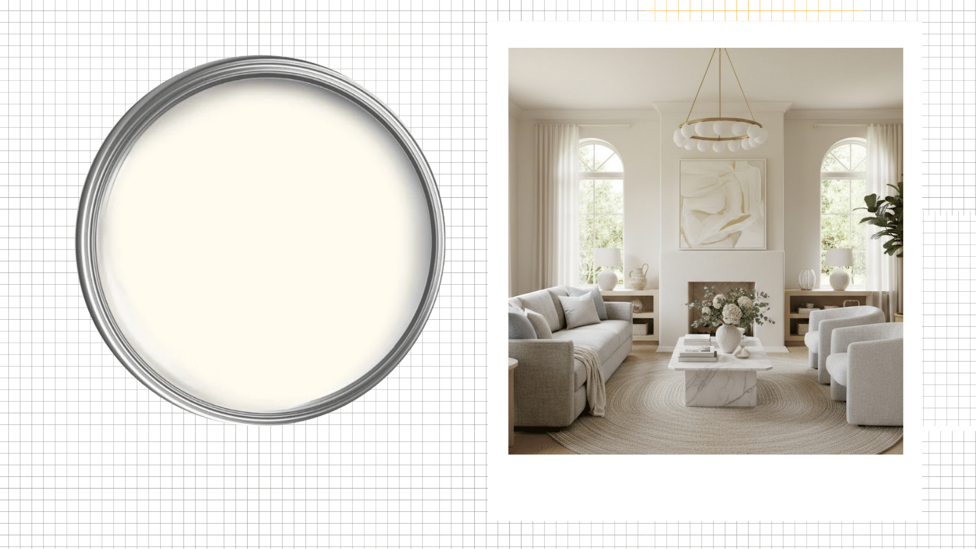
Decoding the Color
Strand of Pearls (CSP-395) by Benjamin Moore is a soft, luminous neutral that sits comfortably between warm white and gentle greige. It’s versatile, calming, and brings a refined touch to any space.
| Attribute | Value |
|---|---|
| LRV (Light Reflectance Value) | 72.29 |
| Hex Code | #E6E1D4 |
| Undertone | Warm, creamy, subtle beige |
| Color Family | Off-White/Neutral |
This color’s high LRV means it reflects plenty of light, making rooms feel airy and open while the warm undertones prevent it from feeling stark or cold. That’s one reason soft off-whites like this remain a favorite in many homes.
I used this color during my sister’s kitchen renovation, and it always surprises me. In morning light, it looks fresh and clean.
By evening, those warm undertones come alive. It’s like having two different colors in one can.
A Visual Gallery Featuring Benjamin Moore Strand of Pearls
Want to see how Strand of Pearls Benjamin Moore works in real spaces? I’ve used this color in several renovation projects, and each room tells a different story.
Let me show you how it converts three key areas of the home.
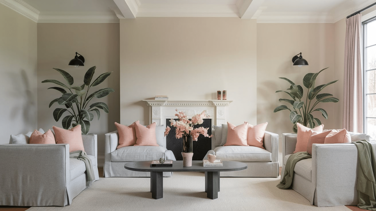
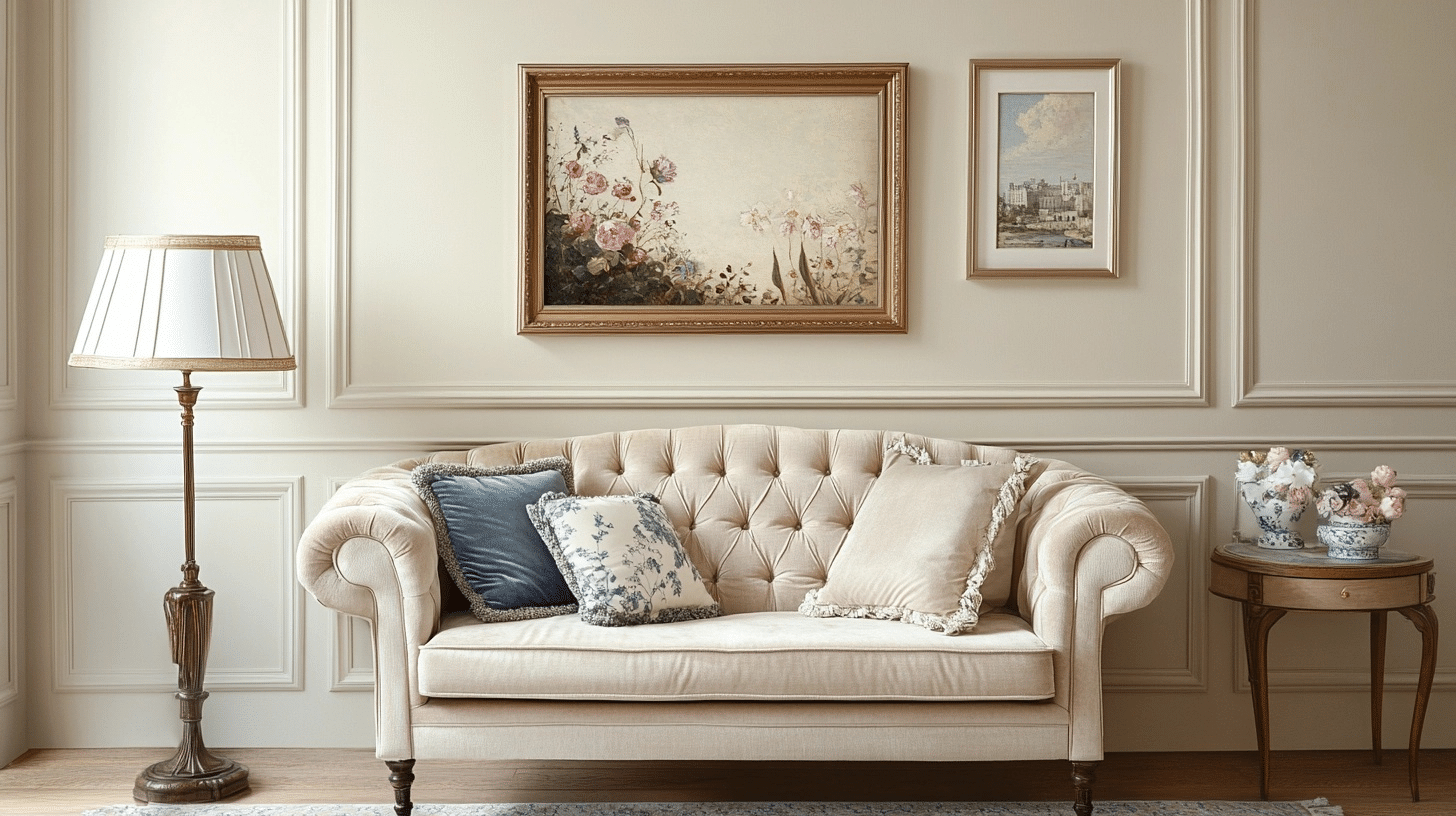
1. Living Room
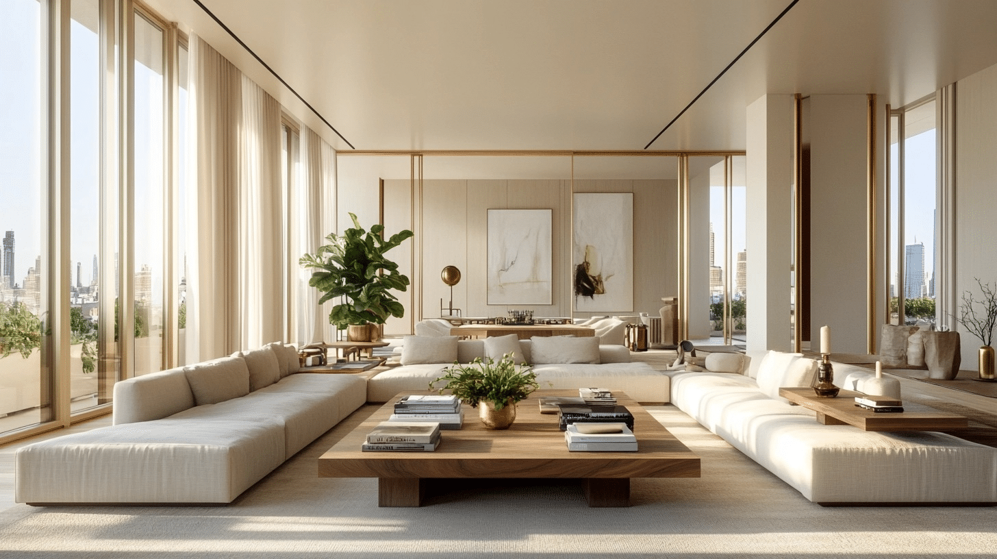
When I walked into my client’s living room project, I knew Strand of Pearls Benjamin Moore would be perfect. We painted the walls, and what a difference it made!
The soft warmth creates a calm backdrop that draws you in. We paired it with natural wood coffee tables and linen sofas. Then we added some potted plants and brass table lamps.
Here’s what I love most – the paint catches light beautifully. Morning sun makes it glow softly. Evening lamplight brings out those cozy undertones. The room feels bigger and so much more welcoming than before.
2. Kitchen
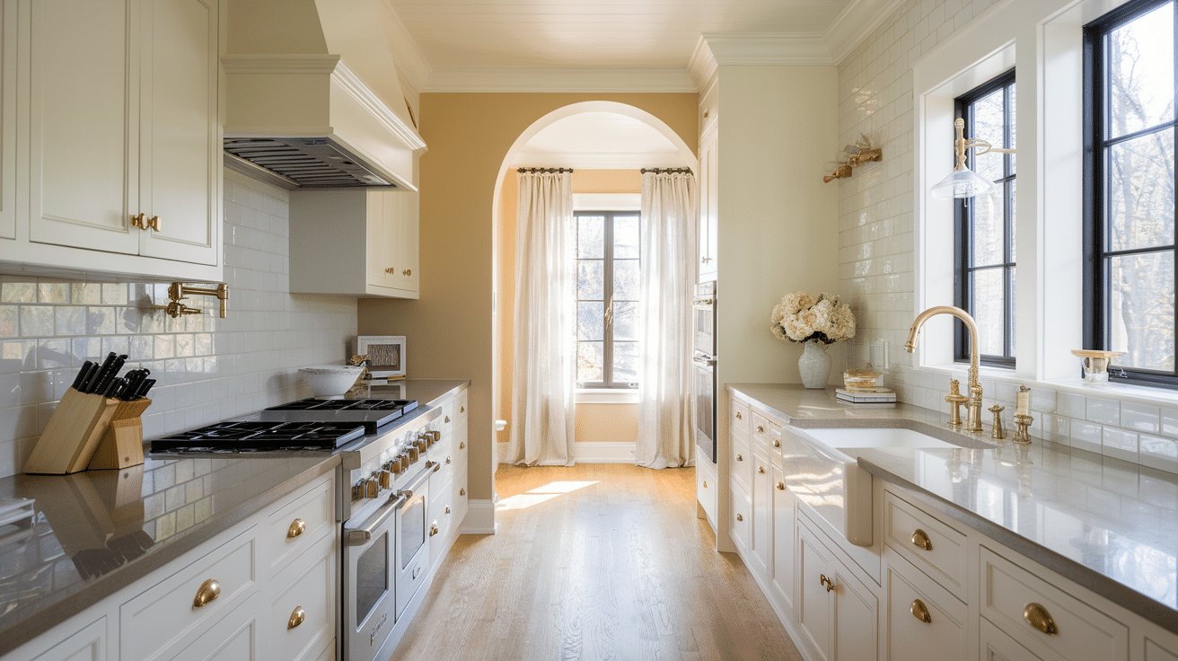
My sister’s kitchen renovation was where Strand of Pearls really shone. We used it on both cabinets and walls. Smart move, if I say so myself.
The neutral warmth looked stunning against marble counters and black cabinet handles. Even with stainless steel appliances, everything felt balanced. No harsh contrasts or cold vibes here.
We added open shelving with white dishes and wooden cutting boards. Under both natural and LED lighting, the color stayed consistent. The kitchen feels clean but lived-in, exactly what we wanted.
3. Bedroom
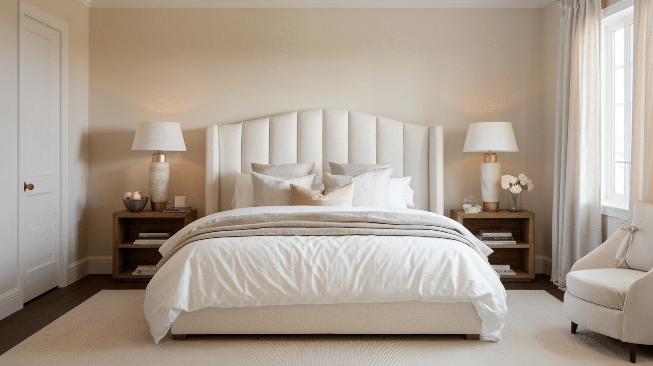
Creating a restful bedroom was our goal, and Strand of Pearls delivered perfectly.
We combined it with soft pink throw pillows and muted green accent walls. The paint became this soothing canvas that made you want to curl up immediately.
And the most beautiful part is that this works with everything. The cool cotton sheets, warm wool blankets, velvet cushions, and chunky throws all looked great.
Complementary Colors
Strand of Pearls pairs effortlessly with a range of hues, making it easy to build a graceful palette:
- Soft Greys: Like Benjamin Moore’s Classic Gray or Gray Owl for a subtle, layered look.
- Muted Greens: Such as sage or olive for a nature-inspired vibe.
- Warm Whites: Chantilly Lace or Simply White for trim and ceilings.
- Blush Pinks: Gentle pinks or peaches for a romantic touch.
- Deep Charcoals: For dramatic contrast in accent pieces or furniture.
Using Strand of Pearls by Benjamin Moore in Different Aesthetics
This color adapts to any design style you throw at it. I’ve seen it work magic in so many different looks during my renovation projects.
Japandi Style
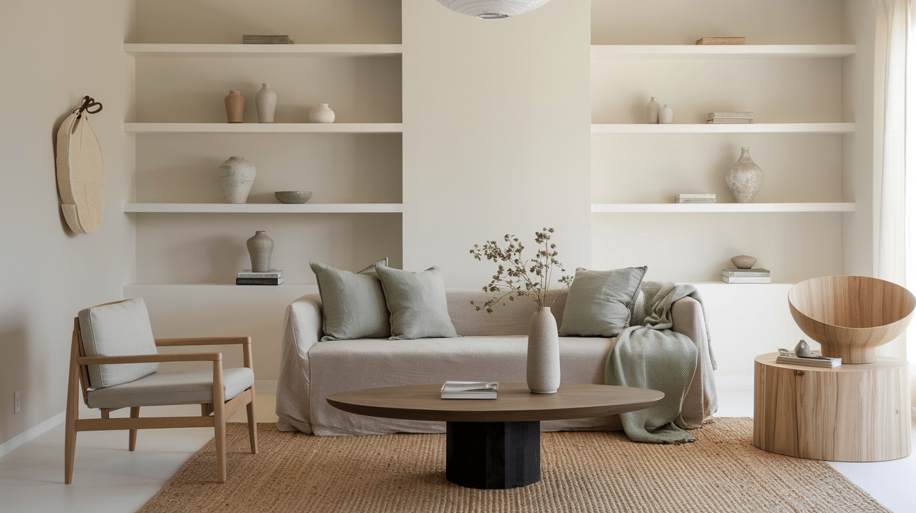
Colors: Warm neutrals, soft grays, muted greens, natural wood tones
Vibe: Minimalist meets cozy – it’s that perfect Japanese and Scandinavian blend. Think calm, functional, and natural all rolled into one.
Room Tips: Go for low-profile furniture that sits close to the ground. Add natural textures like linen and wool. Keep decor simple and clean. Fill the space with light wood pieces and plenty of plants. Strand of Pearls creates the perfect backdrop for this serene style.
Grandmillennial
Colors: Vintage florals, soft pastels, cream whites, muted pinks, and blues
Vibe: Old-soul charm with a fresh twist. It’s traditional but not stuffy – like your grandmother’s house but cooler.
Room Tips: Mix vintage patterns with modern comfort. Use antique brass fixtures and vintage art. Layer different floral prints but keep them in similar color families. Strand of Pearls Benjamin Moore lets all these elements shine without competing.
Wabi-Sabi
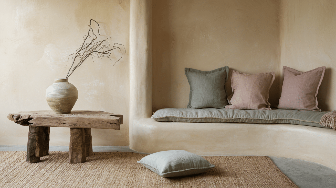
Colors: Earthy browns, muted terracotta, soft beiges, natural clay tones
Vibe: Perfectly imperfect beauty. It celebrates natural wear and the charm of handmade pieces.
Room Tips: Choose handmade ceramics and pottery. Add organic materials, such as raw wood and stone. Let textures tell the story – rough linen, weathered wood, natural fiber rugs. The warm undertones in Strand of Pearls complement this lived-in, genuine feel.
Coastal Cottage Look
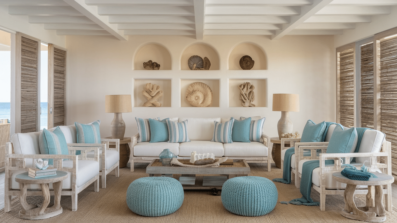
Colors: Ocean blues, seafoam greens, sandy beiges, crisp whites
Vibe: Breezy and relaxed like a permanent beach vacation. Fresh air and sunshine are captured indoors.
Room Tips: Use whitewashed wood furniture and weathered finishes. Add sea-inspired decor, such as driftwood and shells. Choose light, flowing fabrics. Strand of Pearls gives you that sun-bleached, coastal warmth without being too yellow.
Soft Romantic
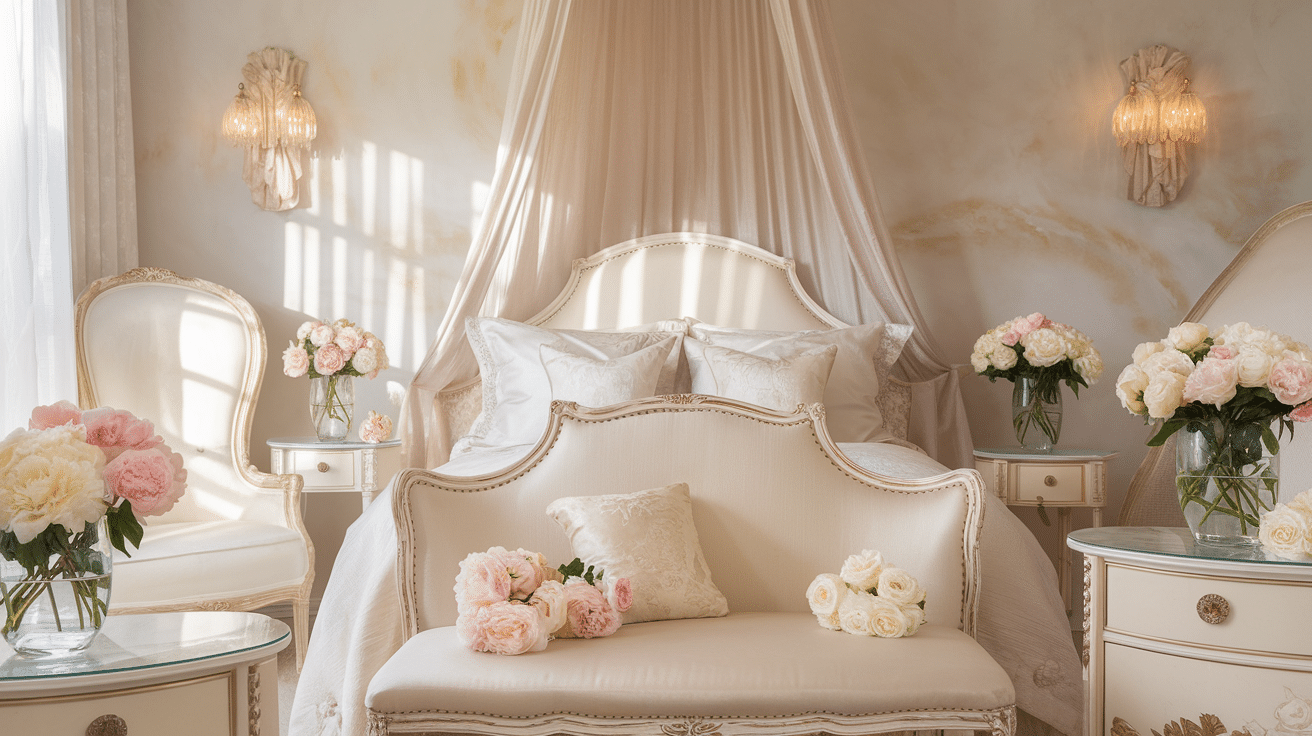
Colors: Blush pinks, lavender, dusty roses, cream whites
Vibe: Dreamy and feminine with gentle, flowing energy. Think fairy tale meets real life.
Room Tips: Layer fine fabrics, such as silk and chiffon. Use vintage-inspired furniture with curved lines. Add fresh flowers and soft lighting. Strand of Pearls provides the perfect neutral canvas, making pastels pop beautifully.
Finishing it Up
After working with Strand of Pearls Benjamin Moore in countless renovation projects, I can honestly say it’s one of those colors that works.
Ready to try it in your own space? Start with one accent wall or a small room. You’ll quickly see why this versatile neutral has become my go-to recommendation for homeowners.
What room will you convert first? I’d love to hear about your painting plans in the comments below!
Frequently Asked Questions (FAQ’s)
1. What is the Undertone of Seapearl?
Seapearl has soft greige undertones with a subtle warmth that keeps it from feeling too stark or overly creamy.
2. Does Strand of Pearls Look Too Yellow?
Strand of Pearls usually stays balanced, though warm lighting can bring out slightly creamy beige tones in darker rooms.
3. What Trim Color Goes Best with Strand of Pearls?
Chantilly Lace, White Dove, and Simply White pair beautifully with Strand of Pearls for clean and graceful contrast.